TAKEAWAY: We take a look at some fantastically informative infographics published in the South China Morning Post AND: Do you know some news apps that deserve to be shown in my book, Storytelling in the Times of the iPad?
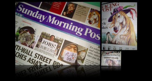
Reviewing three months of South China Morning Posts during this visit
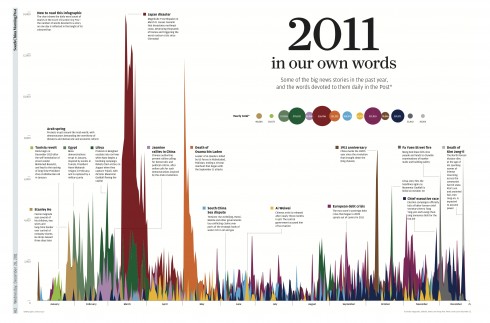
This is one of the most interesting and original infographics I have seen: graphics director Simon Scarr’s graphic explains how many words the South China Morning Post devoted to a variety of topics.It is fascinating to see how some topics hit a high then disappear quickly from the radar, while others linger. The headline: 2011 In Our Own Words: Some of the big stories int he past year and the words devoted to them daily in the Post. It was the Japan disaster, the magnitude 9 earthquake that hit March 11, that took the honors as the most written about story. If you follow the color coding, you can see how much longer that story stayed in the news; the death of Osama Bin Laden took second place; third place, the 100th year anniversary of the revolution that brought down the Qing Dynasty in China.Anyone who produces a daily news report will find this graphic instructive and informative.
See the interactive version of the graphic above :
http://events.scmp.com/news/content/YearEnder/home.html
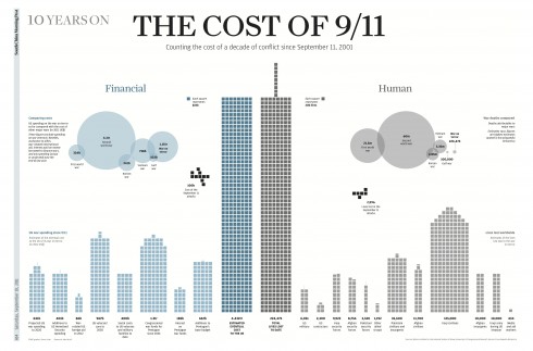
Another Simon Scarr graphic: the financial costs of 9/11
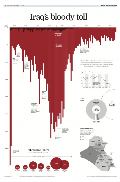
The cost of lives in Iraq; by Simon Scarr; a very dramatic and effective way of presenting the grim statistics
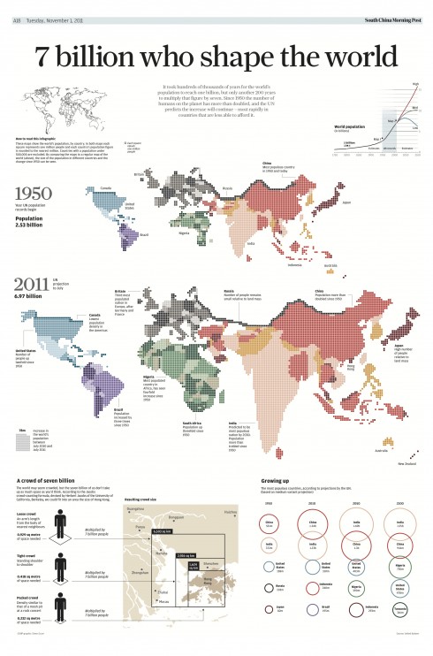
In this graphic, Simon Scarr shows us who we are following the birth of the 7th billion citizen of the world
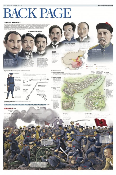
An Adolfo Arranz graphic depicting the main historic events to describe the 1911 China Revolution
This is my first visit of 2012 to the South China Morning Post, which as readers of the blog know,
I spend a great deal of my time now writing what will be my first digital book, Storytelling in the Times of the iPad.. It is exciting to be contemplating all the possibilities that a book especially created for the tablet presents. While I am writing each chapter on all that is possible, I am well aware that the book itself must be an example of all that can be done in this new platform.
Right now I am writing a key chapter in the book, Look & Feel, involving those components that provide us with a design: typography, grids, color, creativity.
I am recruiting you to help me find the best examples. Have you seen news apps with grids that are functional and contribute to well organized design for the content? Or news apps with typography that is easy to read but also beautiful to look at? And how about color use and color palettes? If so, drop me a line and tell me about your favorite news app. I will take a look for possible consideration.
There is still time for you to get involved. How about documentary apps, where a good single story narrative is presented with appeal to all the senses?
I thank you in advance for your contributions.
And in the Ooooooooooops front page category

As seen on Page One of the Belfast Telegraph
One of those days when the promotional strip should have been removed.
But we all know how easy it is to make these mistakes.