
TAKEAWAY: This is the second of a 3-part series devoted to a subject that has many art directors, editors and info graphic artists talking: why did so few infographic entries win at the SND 34 competition? Today: More conversations with judges of the competition and their ideas to make the infographics category more focused.
Miguel Gomez/Gulf News-Dubai
In our Tuesday blog, we began a discussion about the SND 34 contest and particularly the infographics category, with several art directors and designers worldwide stating that they did not think enough good entries were awarded prizes, and asking for clarification in how infographics are evaluated.
Several judges and SND leaders directly involved in the contest presented their views and I believe that we have gotten a good conversation going. My aim for today’s segment is to bring other SND 34 judges in and allow them to explain their role and what they experienced judging infographics.
It is also our goal today to present options that could make the contest more focused, with more clearly defined subcategories.
The Tuesday blog asked if this had been a harsher than usual judging for infographics. I also attempted to create a profile of what I think constitute the best of the best infographics
Competition Coordinator Details Highlights of Contest
Melissa Angle,is SND 34th Edition Competition Coordinator
Melissa had the tough task to organize every detail of the competition, with nearly 9500 entries and enough judges to accommodate a variety of categories, including infographics.
The judging teams are different from category to category and year to year, so it’s nearly impossible to predict which awards will be given. We spend almost a year choosing the judging teams from the list of nominations, and I think the Competition Committee and I worked hard to invite people who are some of the most talented, thoughtful and respected in the industry.
Melissa tells me that she, of course, wasn’t able to watch all their vote uncuppings or medal discussions … but, that when she did, she saw that all five of these judges shared high standards of excellence for the categories they evaluated.
I also know they were judging entries as art directors and journalists but also as first-time readers of the content.
SND 34 judges relate their experiences
Vanessa Wyse is art director of The Grid, chosen for the second consecutive year among the best designed newspapers in the world. Vanessa was a judge in the infographics category for SND 34 and she provides some thoughts about the experience here:
I found the infographics category the most difficult category to judge. It was heartbreaking to see how many amazing entries that I would have been honoured to have published in my paper, not awarded anything. There really was a lot of outstanding work. I thought many of the most successful and creative graphics were coming out of the smaller-mid sized publications. They seemed to be taking more risks and being innovative in their executions.
However, like many of her fellow judges, Vanessa also talked about the overly designed and overdecorated entries, where a graphic was made the protagonist when it did not deserve to be.
There was also a large number graphics that drowned out the content with unnecessarily large renderings or illustrations without much of a payback for the reader. We as designers have to remember that first and foremost that infographics is a storytelling tool.
Go here for a World’s Best slideshow of the *Grid* winning pages, which also highlights some mini “snack” graphics.
http://www.slideshare.net/SNDupdate/snd-worlds-best-newspapers-2013-winners
Juan Velasco,Art Director, National Geographic, and SND 34 contest judge:
Juan’s work at the National Geographic was among the winning entries in the infographics category. Juan was judging in the World’s Best Designed Newspaper category. He expressed some concerns about the judging process:
I’m surprised and concerned as well. I was a judge for the World’s Best Designed Newspaper at SND a couple of weeks ago. As you know the judging for the World’s Best is kept completely separate from the rest of the competition and it happens in a different venue in Syracuse. But I did have a chance to meet some of the judges, including one that was judging graphics. He was surprised too. Apparently, SND had a team judging all visuals, and graphics were judged together with all the photography. I don’t think that has happened before, at least not recently.
Obviously I respect the process and the judges decisions, but it seems quite harsh. The quality of infographics has not diminished and we have seen great samples this year. Asian and Middle Eastern newspapers are now coming out with first rate graphics on a frequent basis with Gulf News, Times of Oman, Al Bayan, South China Morning Post and others. The NY Times is as strong as ever and the Post had a very strong year with their election coverage. The Guardian, Clarin, La Nacion, El Mundo, La Voz del Interior, La Nación in Costa Rica…
Scott Goldman, Director of the National Desk for Advance Digital
It was surprising to see that low a number of winners at the SND competition for graphics, but in nearly 20 years of working with the judging in Syracuse, this does happen from time to time. Sometimes it’s a page design category; sometimes it’s illustration; sometimes it’s photo; sometimes, like this year, it’s graphics. The graphics judging group clearly set a very high standard of excellence this year, and from what I heard, they were “of one mind” in most of the voting.
I’ve always stressed to visual journalists just how hard it is to win anything at the SND judging. An Award of Excellence is just that — excellent. It’s not a consolation prize, by any stretch. And it’s quite an accomplishment to win an SND award. I totally agree with you on the importance of info graphics, and how much innovation has taken place in recent years. The winners this year should be extremely proud of their awards. Clearly they rose above the rest and set themselves apart from the crowd.
Saulo Santana, Art Director, Axel Springer AG, Germany
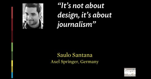
Saulo was a judge in the SND 34 contest:
My biggest wish there was to see more infographics awarded in the book , since I’m a big motivator of visual storytelling. But I think we are in a moment of our industry that its not about quantity, but quality.
Saulo writes that he and his fellow judges in the infographics category went strictly by the instructions they received at the start of the contest, and that message was:
Your goal is to determine which entries represent the best of the best work being done in the worlds news, art and photography departments”
About the experience itself, Saulo feels that he and his fellow judges were almost unanimous on all decisions about the material to be evaluated:
I remember before we start to judge the infographics category, we were all excited, expecting the great job that was about to come (since this year we had so many important events).
But the first round was almost a unanimity of a “0-5 ” votes for NO, with some exceptions. After that, we could see on the faces of all judges the frustration and concern. The second round was better and from that point the level became higher.
It was the longest judging category, since we were all spending a lot of time and attention for each entry. Reading and reading again, getting into the topic, looking for translations (even if it was not there, or were not clear enough, we looked for someone who could translate that) – we were all doing this.
Like so many of the other judges, Saulo mentioned his disappointment with some of the entries on the table:
My biggest disappointment was concerning some few infographics I saw, putting more emphasis on the design than on the information, and to make it worse, some were really confusing and impossible to understand.
“Show me, don’t tell me”, but if you are not able to show me, you’d better at least tell me? I believe that we, as visual journalists, should all reflect about it, and put the reader and the information (I mean journalism) in the first place. Design is an important tool. But here it’s not about design, it’s about visual journalism.
Read about Saulo Santana’s experience judging for SND 34’s infographics category:
www.saulosantana.com
Suggested solutions to improve infographics category
I am happy to report that everyone from SND with whom I have been in touch for this series wants to hear of new ideas and suggestions to improve the contest next year, especially in the infographics category.
In fact, Melissa Angle, who is 34th Edition Competition Coordinator, had this to say:
The Competition Committee is evaluating the categories for Illustrations and Infographics for next year to make sure they are fair and reflect the work being done in the industry. I encourage anyone who’s interested in the process to volunteer to help SND continue to improve the competition or attend the judging next year (either as a facilitator or judge). I have watched the judging in Syracuse for several years as a volunteer, judge and now coordinator … and it is an eye-opening, inspiring and humbling experience.
Nominate future judges here:
http://www.snd.org/competitions/print/judging/
Volunteer to be a facilitator here:
http://www.snd.org/competitions/print/facilitators/
How about the judges who just completed the judging. What are some of their suggestions?
Vanessa Wyse, The Grid, and SND 34 contest judge:
One thing I have thought about a lot since judging is whether it might be helpful to separate infographics and data visualizations into their own categories. Judging these together was a challenge. Data visualizations are one other most rapidly growing methods of storytelling both in print and digitally. Quite often these entries were getting lost due to the complexity of the information. They serve different purposes so separating might help.
Juan Velasco, National Geographic, and SND 34 contest judge:
I think we’ll see an increased presence of interactive graphics when we know the winners of the SND digital competition, as more media are focusing resources into web graphics (and in our case, iPad and iPhone graphics).
Overall, the last couple of years you can see a trend of more “data visualization” and less illustrated infographics. It was clear in the last Malofiej graphics conference. I would have a lot to say about that trend, but maybe newspapers were feeling compelled to submit New York Times-style charts and things that may be really good but have less visual impact if judges are looking at them in a relative rush.
Read about Juan Velasco’s experience judging World’s Best Designed:
http://juanvelascoblog.com/2013/02/17/judging-the-worlds-best-designed-newspaper-contest/
Michael Whitley, ,Assistant Managing Editor for design and graphics at Los Angeles Times, and SND 34 infographics judge
I still think the judging can be improved by improving the call for entries. Better categories for graphics and illustration will create a better environment for judging. But better judging does not automatically mean more winners.
Alex K. Fong, Deputy Design Director, Bay Area News Group and a SND 34 infographics judge:
First of all, dividing judging pools by circulation seems problematic since visual journalism has become increasingly sophisticated, particularly at foreign publications. These newspapers are crushing the smaller American dailies that were once the province of the small circulation categories. That said, these small- to mid-ranged foreign publications shouldn’t have to compete against the resources of the New York Times.
One remedy is creating a category for spot infographics to swing the focus from scale back to storytelling, while opening a viable category in which those publications without dedicated graphic artists and a great deal of news hole may compete. ??
Scott Goldman, National Desk Director, Advance Digital, and 2007 SND President:
I’d agree with Vanessa and Juan that separating out data visualizations from “infographics” would be a good first step. We can create additional “subcategories” in the graphics competition to allow more targeted entries — not quite to the level of detail in Malofiej, but perhaps a step in that direction. There’s always a good deal of post-mortem and tweaking after an SND competition, and I’m sure this year will be no different!
Infographics categories and the Malofiej contest
Several art directors that I have spoken to cite the Malofiej contest for infographics as a very clearly defined program, with categories that are easy to understand. Not that we think SND should duplicate the Malofiej efforts, or have as many categories and subcategories, but perhaps they could break it into five to ten buckets or categories, helping define the type of infographics to enter in the contest.
We also feel that infographics and photos should not be judged by the same teams, as these are two different sets of skills and storytelling techniques.
What some art directors who enter their work in both Malofiej and SND relate to me is something like this:
-Most important thing is that the contest is divided according to categories and subcategories within the infographics field.
For the first time this year, the contest also offers categories for work done for smartphones and tablets.
It is not our intention to suggest that SND modifies its infographics competition to match Malofiej in every category, but it does help those entering to have a more clear idea of what the expectations are. For example, the Malofiej entry form includes:
Category 1: Breaking News category, then under it, some subcategories such as: natural disasters, terrorism, follow ups to the first day of publication
Category 2: Reportages:national/international, local, sports, business, science & technology, culture
If you want specifics, take a look at category #3: one column graphic. (By the way, I would like to see more one column graphics, simple locators, the “mini visual story” that seems to have gone awol lately)
Portfolios is also a category but with subcategories for news, reportage, or individual portfolio.
For information on the upcoming Malofiej workshop/competition:
http://juanvelascoblog.com/2013/01/14/malofiej-21st-infographics-world-summit-announced/
Some views of the SND 34 competition:
Photos by Kenney Marlatt

A passionate Rob Schneider, SND president, makes a point
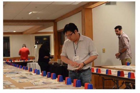
The four judges in the infographics category: Whitley,Wyse, Fong, Santana

Judge Michael Whitley ponders……
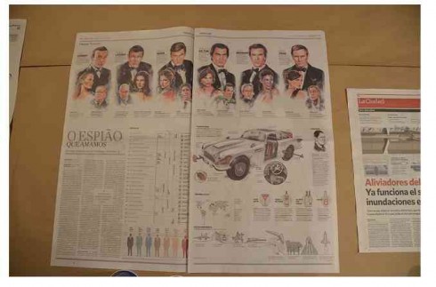
On the wall waiting to be judged: The Spy we all Love
For more Kenney Marlatt photos of the competition:
Of related interest:
SND & Infographics: Part 1
https://garciamedia.com/blog/articles/psnd_amp_infographics_is_it_tougher_to_win_today_p/
Pages we like
Who says that newspapers cannot have fun even with political stories? Today’s Bild is doing just that, asking the question: are these Italian political clowns destroying the Euro?
Where’s Mario until March 2, 2013?
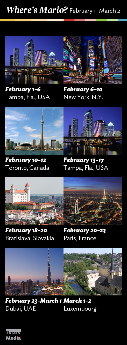
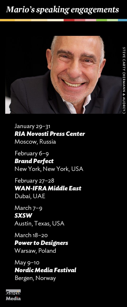
Mario’s upcoming speaking engagements
Take advantage of our iPad Design/Ad Lab workshops

Do you want to take your brand to the next level by creating a tablet edition? Garcia Media can help. We now offer one- to two-day iPad Design Lab workshops on demand to jumpstart your presence on this exciting new platform. We also offer iPad Ad Lab workshops to develop engaging advertising models for your app. Contact us for more information.

Purchase the book on the iBookstore
