TAKEAWAY: Since we now have the ability to present breaking news when it happens and as it evolves, does that mean that the role of design is diminished?

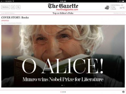
Here is how The Montreal Gazette broke the news of Alice Munro winning the Nobel Prize for Literature

The National Post

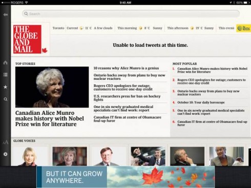
The Globe and Mail

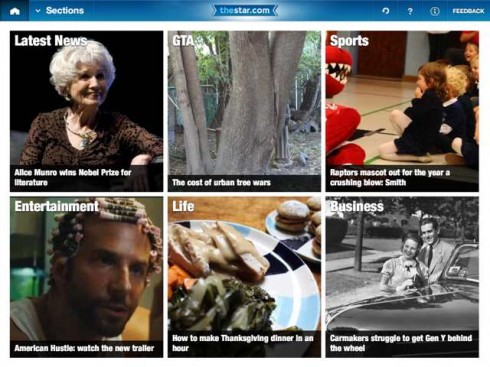
The Star

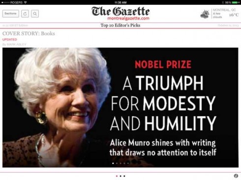
A follow up story in The Montreal Gazette
It was big and happy breaking news for Canadians last week when Alice Munro, the renowned short-story writer whose work explores the never-easy relationships between men and women, won the 2013 Nobel Prize in Literature.
Almost every Canadian newspaper “stopped the presses” to report Ms. Munro’s award. At a time when most breaking news is negative , this was a positive, happy one that would instill pride in every Canadian.
In Montreal, The Gazette, incorporated a playful O Alice headline for its tablet edition.
Walter Buchignani, tablet edition editor, sent us a pdf of his work that day, along with how other Canadian newspapers covered. He also included a timely question:
Obviously this is a big story for us. But does visual impact count in the digital age? Or is it sufficient to label it your top story? Some Canadian examples as the story broke …
Walter included the examples you see here. Walter’s question is one that I have heard before, and always within the following context:
Since we have the ability to update mobile devices instantly, the moment news breaks, then it is not necessary for the design itself to shout, not the way you would in a print edition (of the past), coming out hours after an event took place.
I like what Walter did both the first and second days, assigning via the design, a sense of importance, hierarchy, pomp and circumstance to a story that deserved it.
I don’t equate our ability to break news when it happens with giving it a less impactful visual treatment. Remember, the audience gets visual clues about the importance and consequence of a story via the design, not to mention that there is that important element of visual seduction.
If I have one observation as to why design may not play a key role in the display of breaking news on mobile devices, it is that in a majority of cases there is no art direction involved. Many of our mobile devices work from pure templates, almost 100%. Breaking news filters automatically to the devices and perhaps only a LATEST NEWS label is what differentiates it from the rest. Not that it has to be, but just the reality of the situation. Obviously, in the case of the Montreal Gazette, art direction, reacting visually to the breaking news, is possible.
To me, the Gazette treatments enhanced the power of the story. Well done.