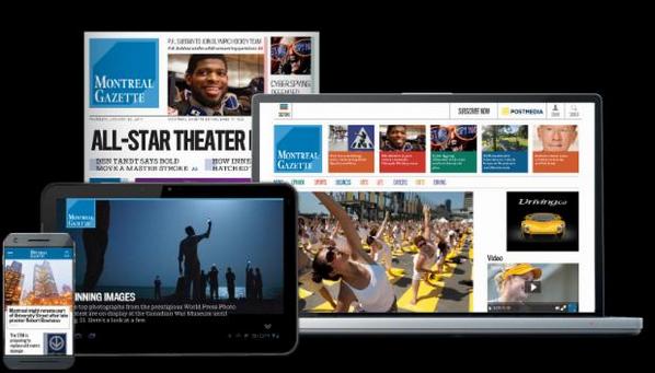
It’s the media quartet for the Montreal Gazette
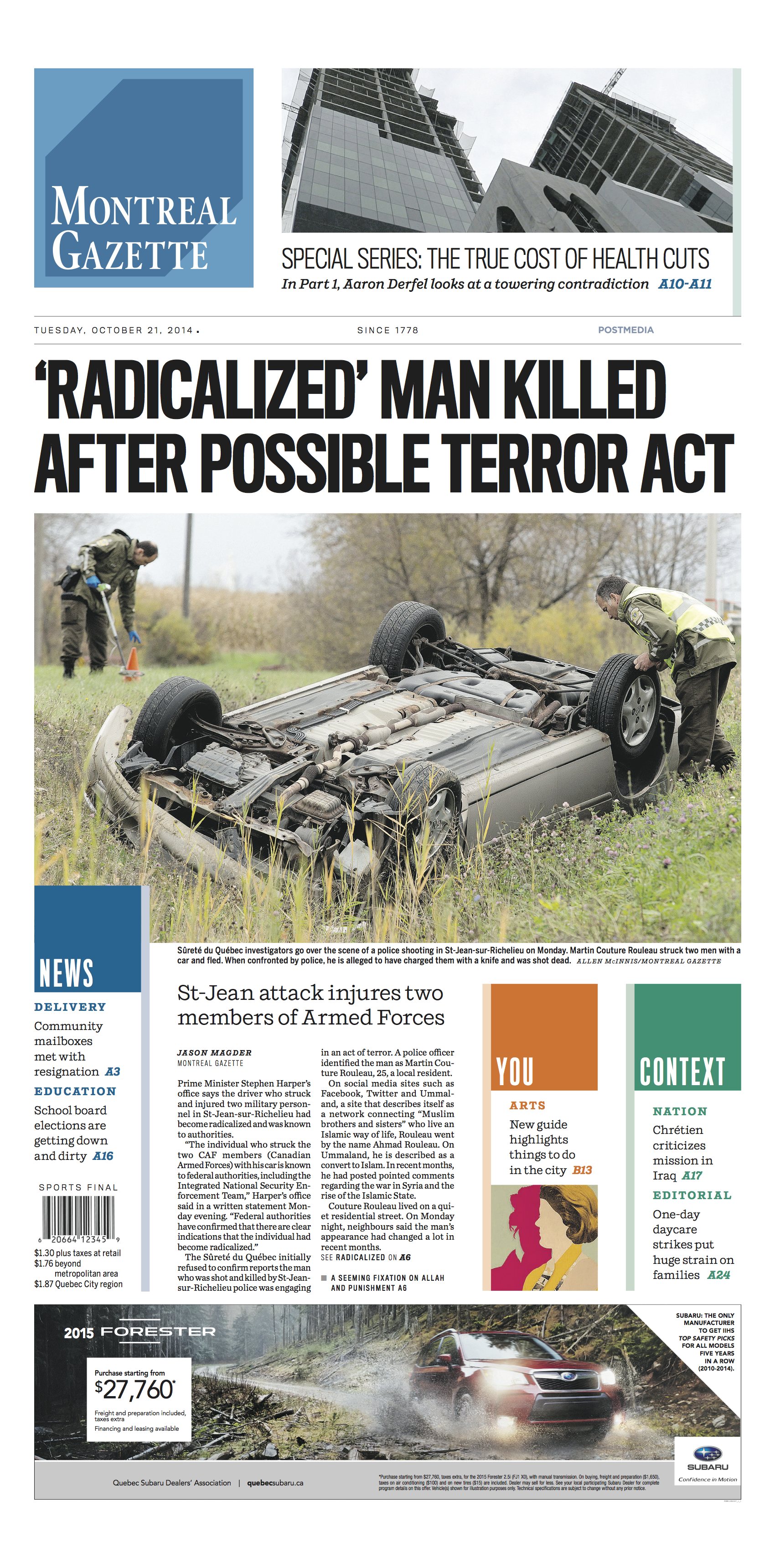
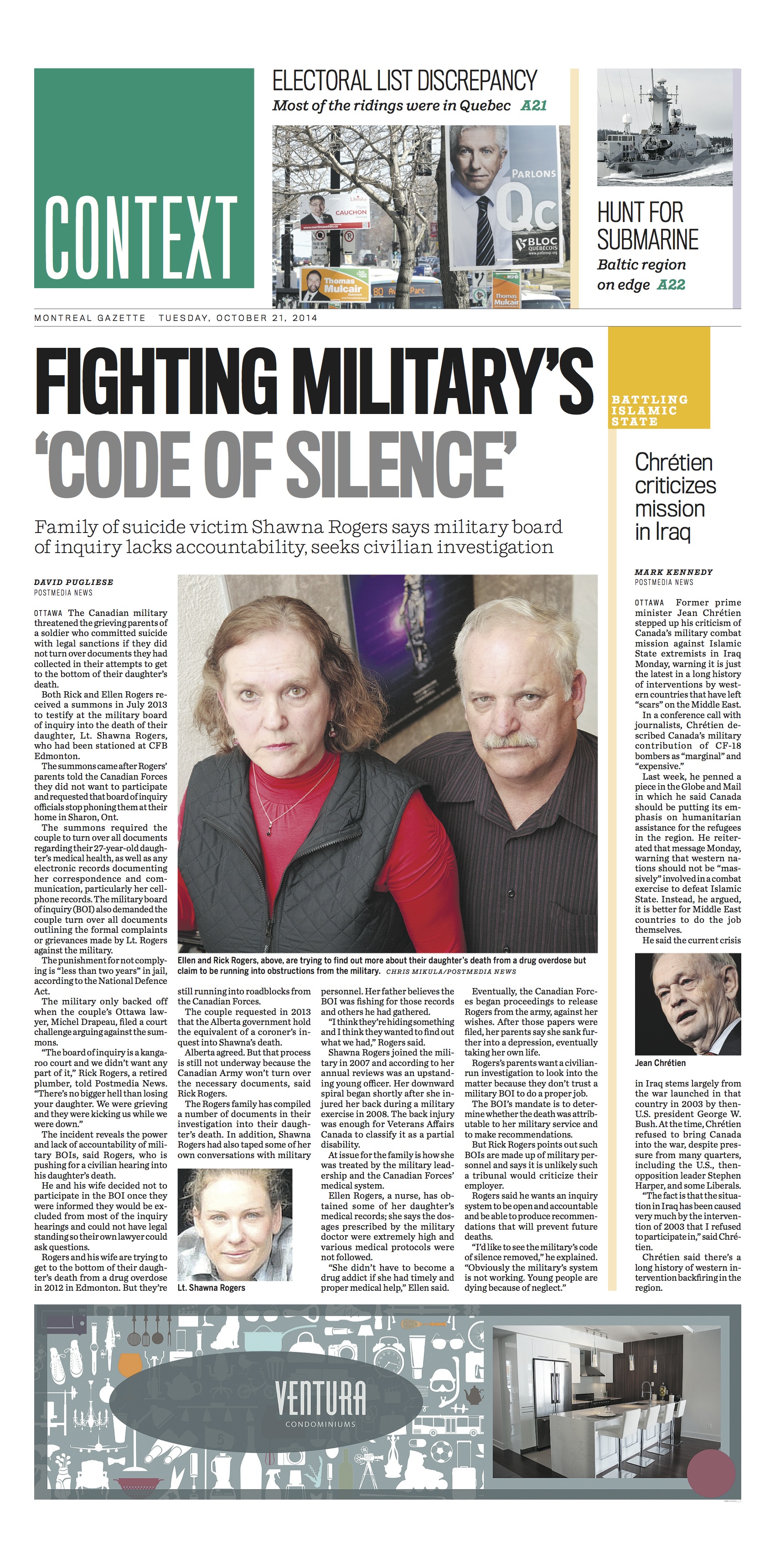
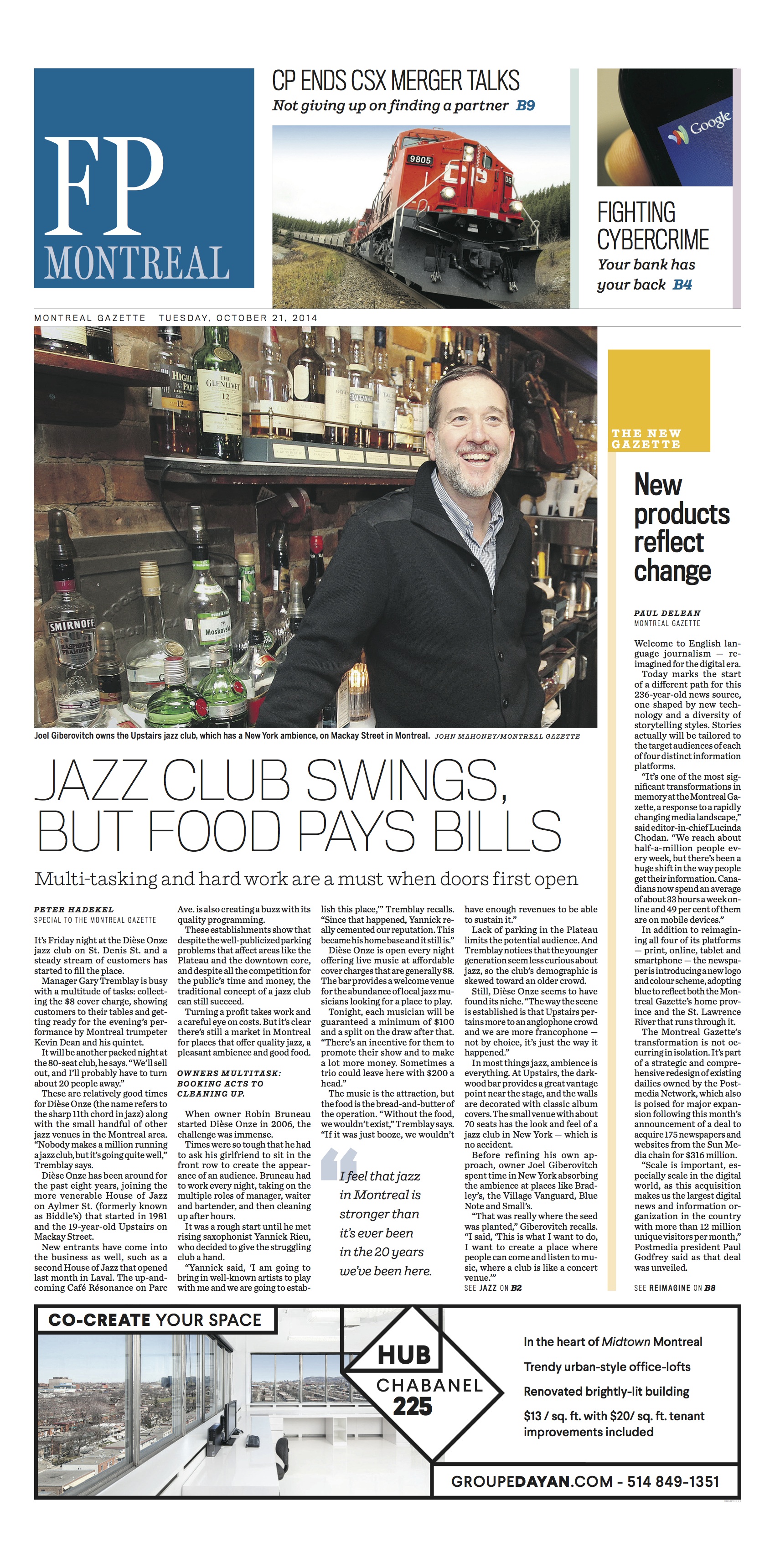
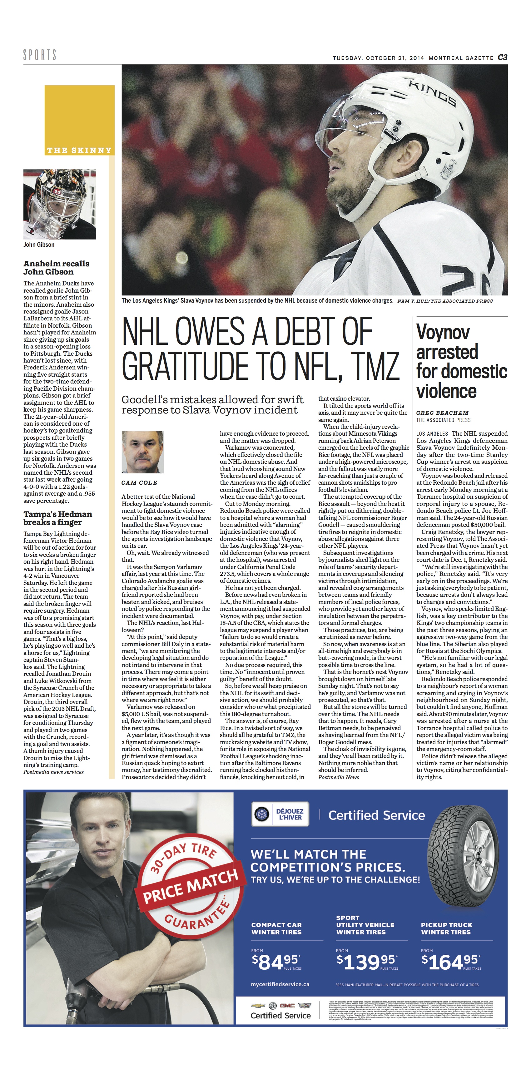
Pages from the print edition of The Gazette

One of the major changes, the nameplate of Montreal Gazette, now a pillbox. The previous blackletter nameplate was designed with great craftmanship by Jim Parkinson.
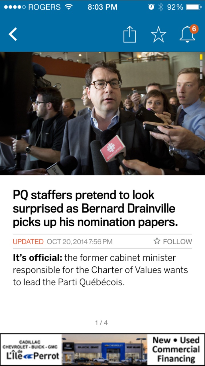
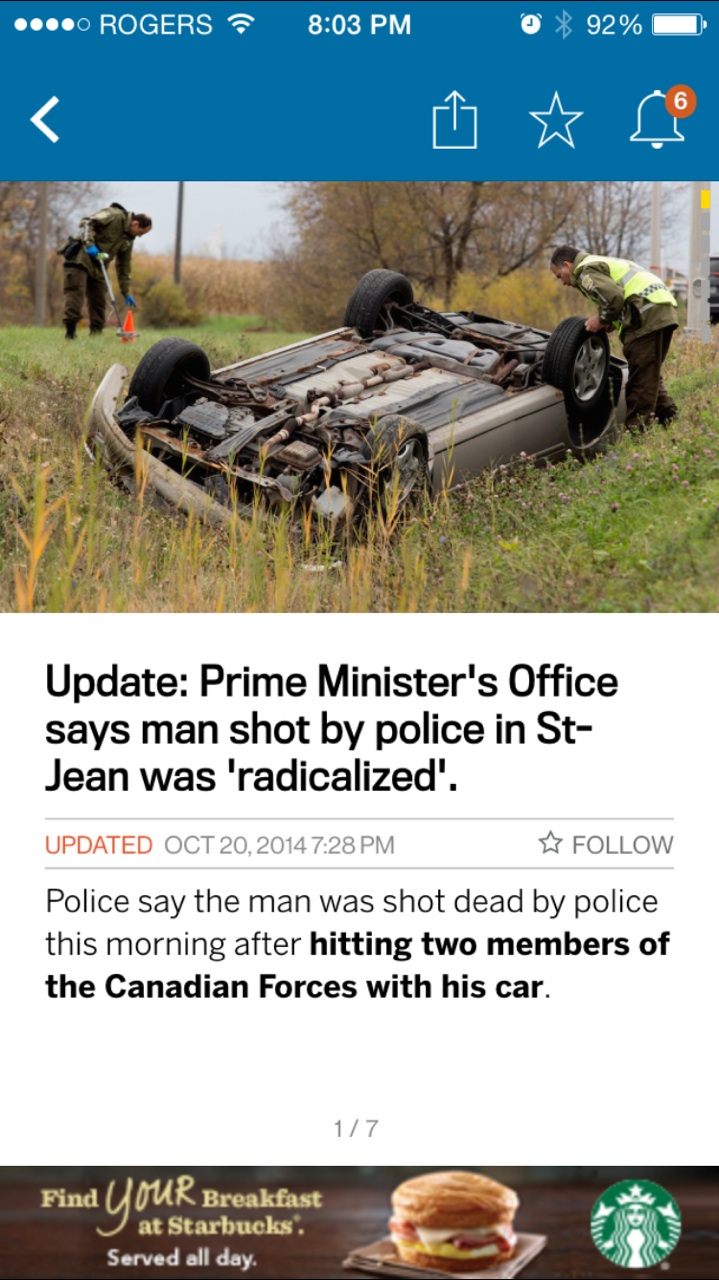
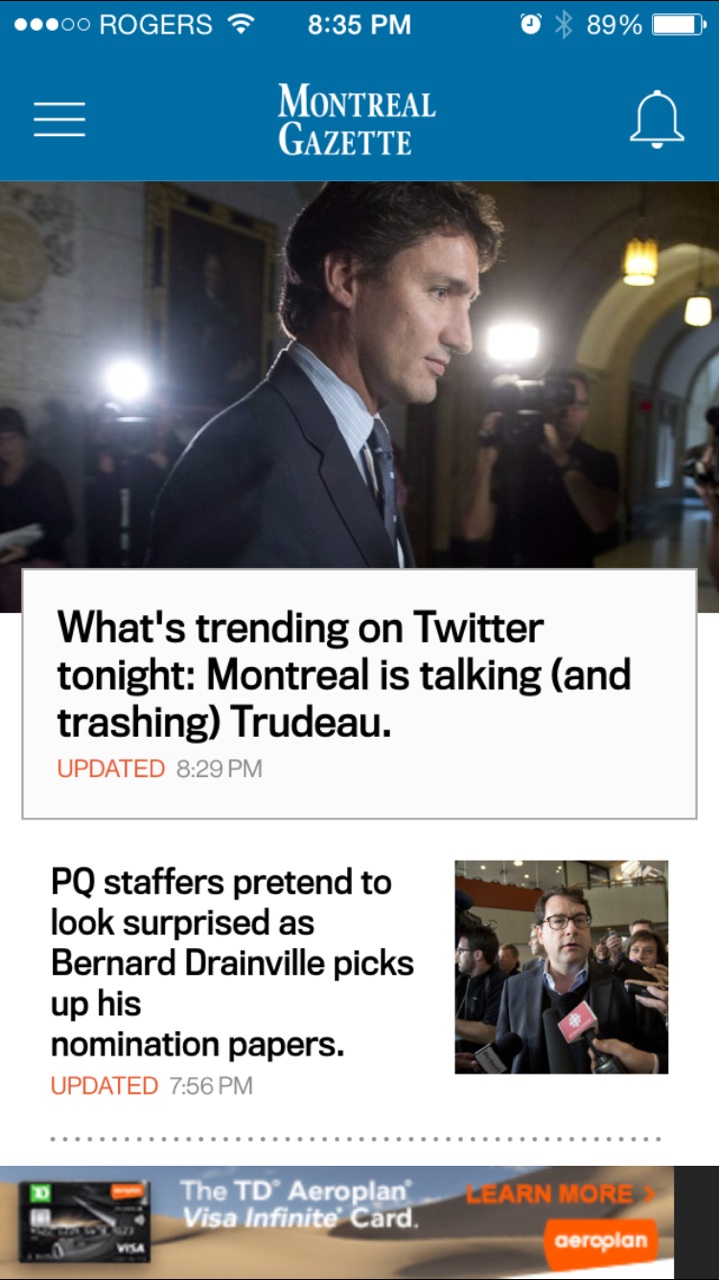


The mobile edition of The Gazette
The Montreal Gazette is the second of eight Postmedia newspapers of Canada to introduce a new look and visual identity. It is also a total rethinking of how news is edited, designed and distributed in the digital age.
We at Garcia Media take pride in our collaboration with Postmedia and its talented team during the past 18 months.
The goal of the Postmedia project is to give each platform—smartphone, website, tablet and print edition—its own place in the “media quartet,” letting the content and design adapt to each.
From our initial briefing, and work with Postmedia Creative Director Gayle Grin, the idea was as follows:
1. Develop an overall editorial philosophy for a deep digital presence across all the newspapers.
2. Create a unified look so that visually there would be common elements running throughout them all.
3. Find ways to adapt stories to the platform in which they appear.
Today, we are happy to introduce to you the changes at The Montreal Gazette. Last May 20, the Ottawa Citizen was the first of the Postmedia newspapers to launch the new storytelling concepts and design across platforms.
In a note to the readers, the editors of the Gazette introduce the changes as follows:
“The articles and visuals on all platforms – print, web, smartphone and iPad – will be tailored to what you have told us you are interested in reading based on how you are accessing The Gazette.
“For the print edition, that means a heightened focus on local news, which will move to the front of the A section every day, along with more emphasis on contextual articles and analysis: less “what happened” and more “how and why.”
Several sections, particularly Extra and Weekend Life, will benefit from new content we will introduce over the next couple of weeks. “
The new tablet edition of The Montreal Gazette
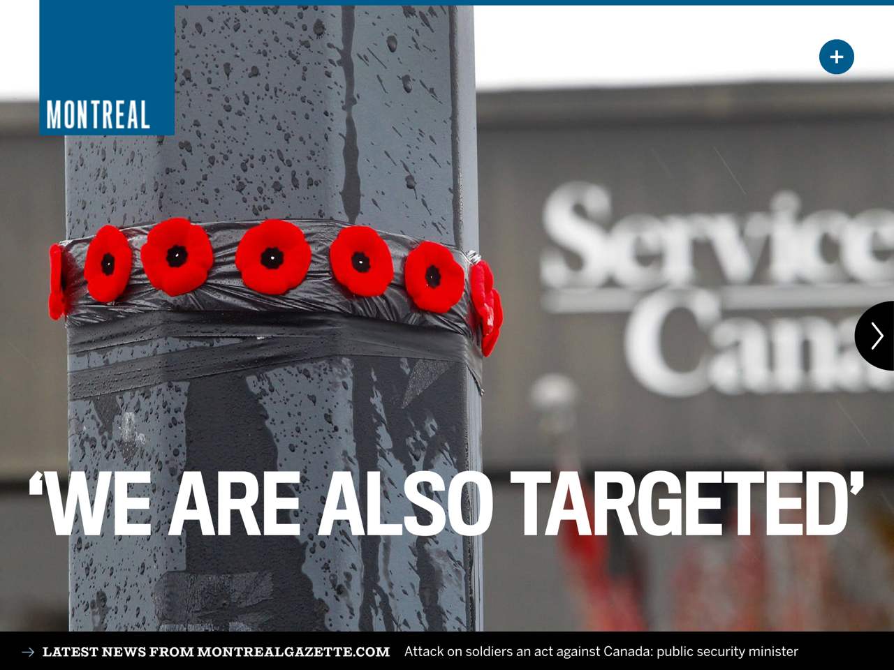
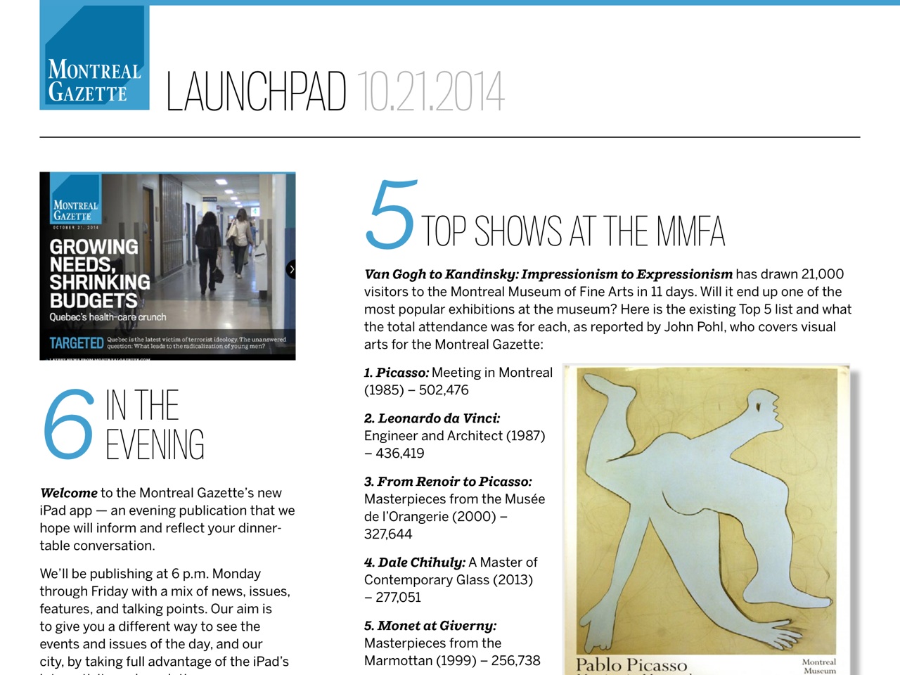
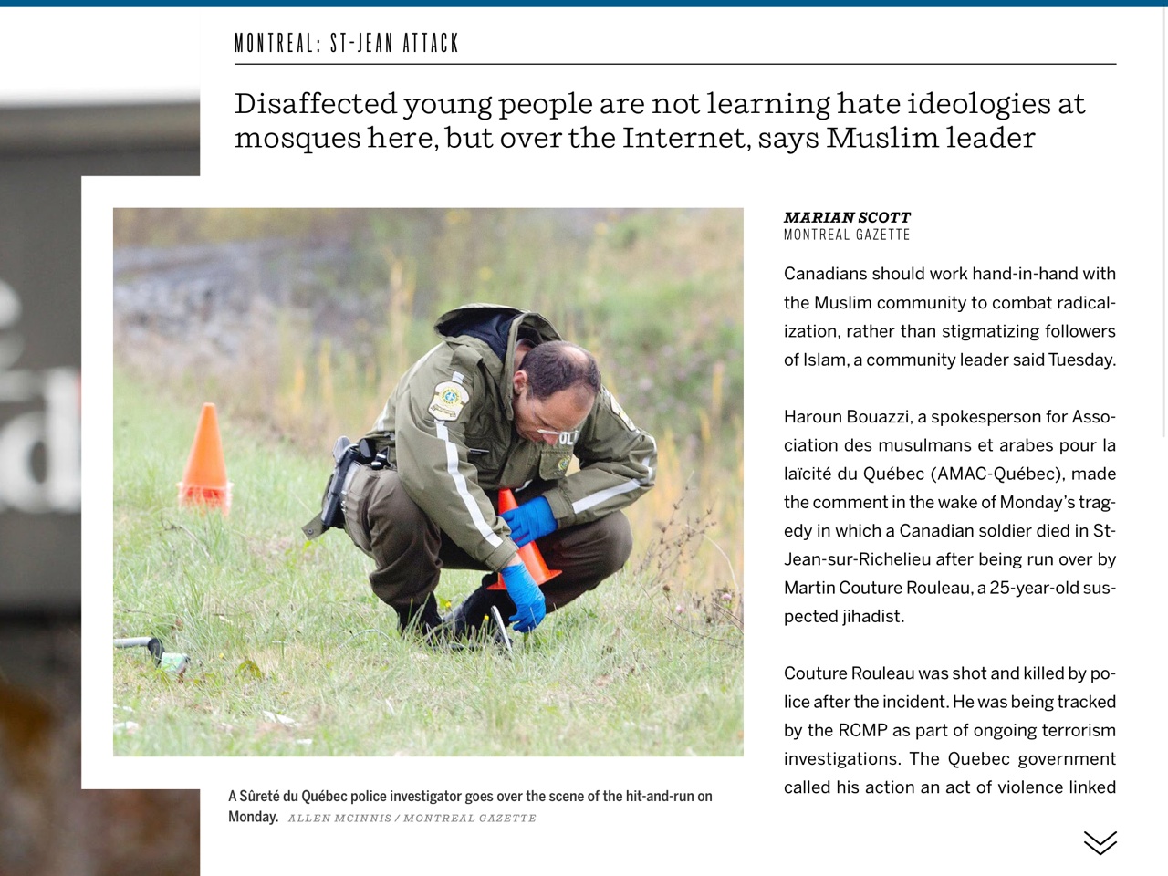
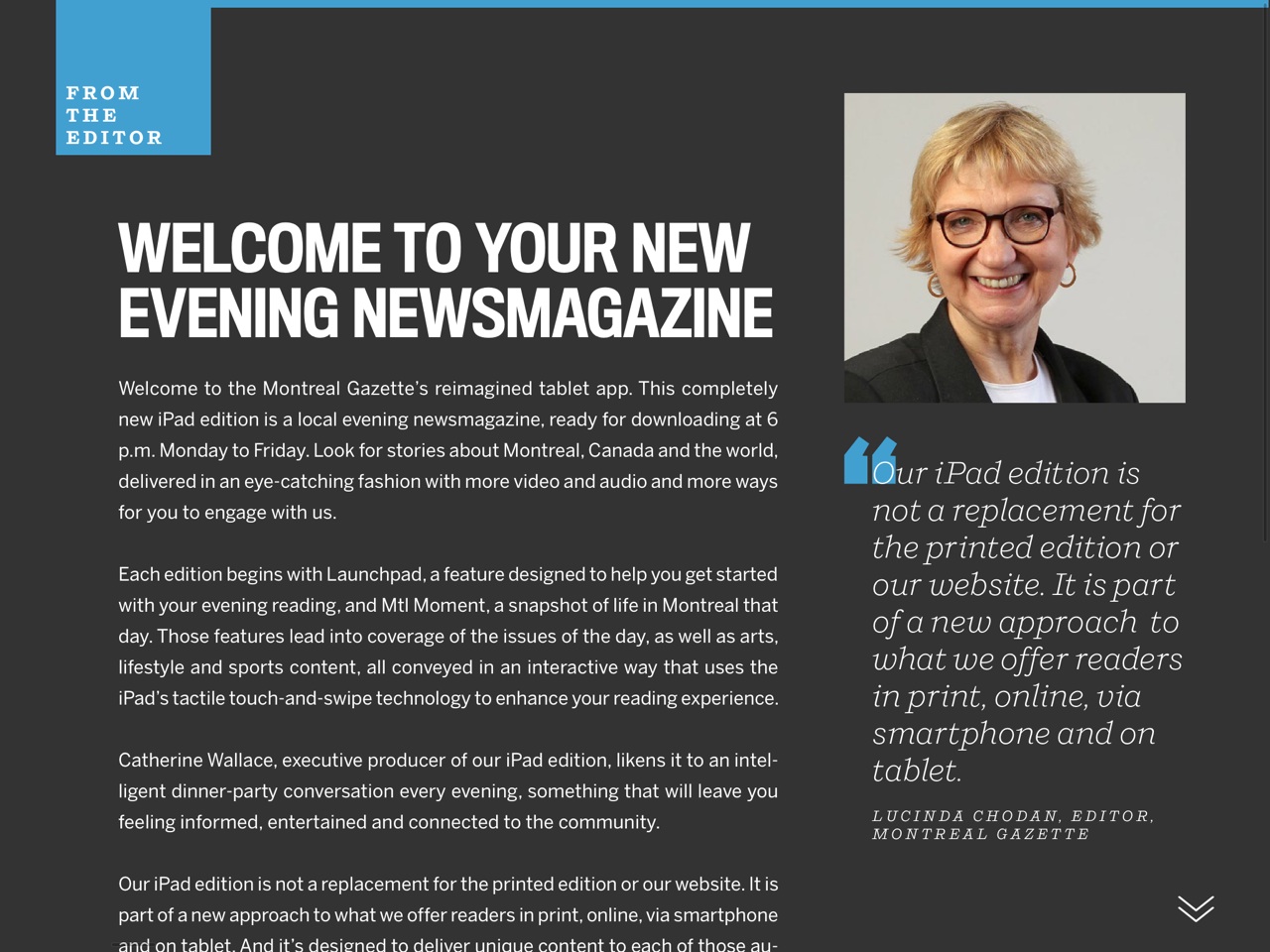
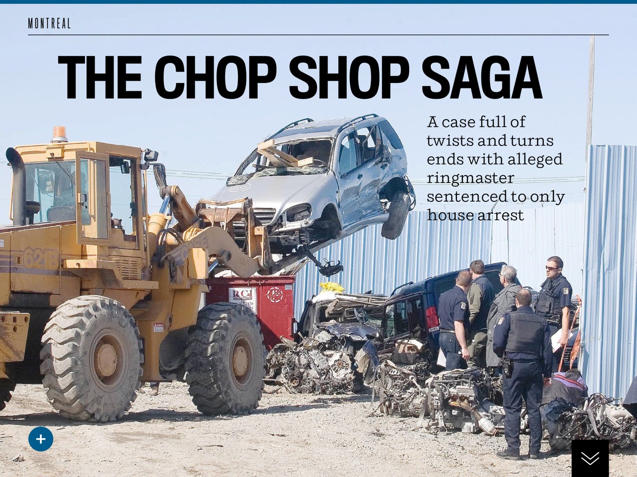
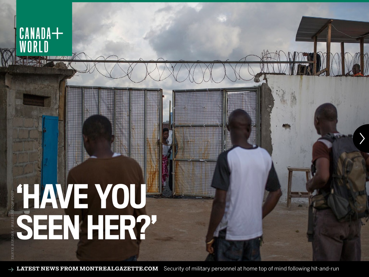

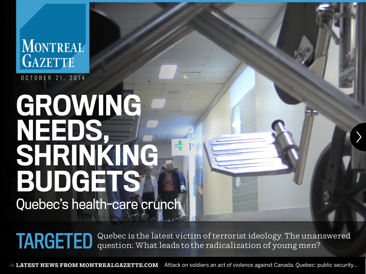
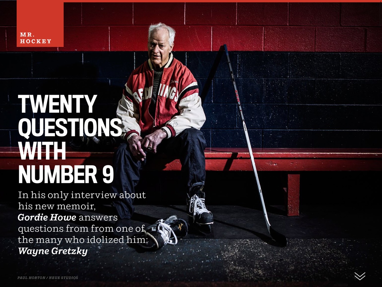
Perhaps the highlight of the new Gazette's launch is its tablet edition: it is fun, it is attractively designed and, like its sister newspaper, the Ottawa Citizen, it picks interesting and tablet-friendly content to develop in an evening edition.
For Catherine Wallace, tablet editor at The Gazette, it is storytelling in the new platform of the tablet that presents the biggest challenge and the most excitement:
The biggest learning curve has been just to learn the tools in a fairly short time. But the biggest lesson is how easy and fun it is to think of different ways to tell stories. I hope the tablet turns out to be an important player for newsrooms. But even if it doesn’t, it’s going to do more to change the way we tell stories on all platforms than anything else.
We had about four weeks after training to play around and experiment and practise — not long enough! — but it was really only in going live today that we could tell how much our thinking has already changed.
In addition to Catherine Wallace, executive editor, the team involved: Adam Martin, lead designer for tablet and mobile; Walter Buchignani, production editor; Dawn Lemieux, Andy Riga, Evangeline Sadler, Susan Ferguson and Jeanine Lee, designers.
Best News: The Montreal Gazette tablet edition is free for three months.
A chat with The Montreal Gazette’s Editor: Lucinda Chodan
Mario:
Lucinda, what was the biggest challenge for you and your team to get this project off the ground at the Gazette?
Lucinda:
Biggest challenge. I think there are two of them.
* Workflow. Reconfiguring how we think about, talk about and plan stories and visuals designed for different audiences on different platforms is a huge “re-set” for any newsroom. And the amount of planning, communication and collaboration is enormous. That has required a shift in our mindsets and our work processes, not to mention repeated practice.
We've had almost a full month of doing the latter, thanks to two weeks of “dry runs” (where we practiced different steps in the day working in our new Wordpress-driven content management system on our new Macs) and two weeks of “dress rehearsals,” during which we simulated producing the new Reimagined Montreal Gazette while colleagues from the rest of the Postmedia newspaper group helped us with the day-to-day production of the pre-existing version. That gave everyone a sense of confidence in our ability to successful launch this bold new strategy and a sense of excitement at seeing our new products before they are launched.
* Reimagination. The promise of the Postmedia Reimagination project is that we will rethink content on all platforms and deliver story-telling that is tailored to audiences using specific devices. It is easy when you are learning new tools and new work processes to lose sight of that core mission. That's why we started the Reimagination process for each of the platform executive producers and their teams with a reminder of the vision for their platform, a review of the research about the target audience for their work, and particularly in the case of the two brand-new apps, repeated feedback about how the content they were producing did or did not reflect the vision for their audiences.
Mario:
It is all about new strategies for storytelling, which, of course, require changes in how people in the newsroom work. How did you manage to effect those changes?
Lucinda:
Logistically, we are communicating more and earlier. Andrew Potter at the Ottawa Citizen, which launched its reimagined platforms in May, said, “We used to talk about 'digital first.' But this is really a 'tablet-first' workflow.” I think that's true, and because of the time involved in producing high-quality, media-rich tablet content, we are becoming accustomed to identifying and brainstorming tablet-destined stories early on.
One of the other key changes is the energy level in the newsroom. In the beginning, one of the first questions reporters would ask about this content-differentiation project was: “Does this mean I have to write four different stories for web, print, tablet and smartphone?”
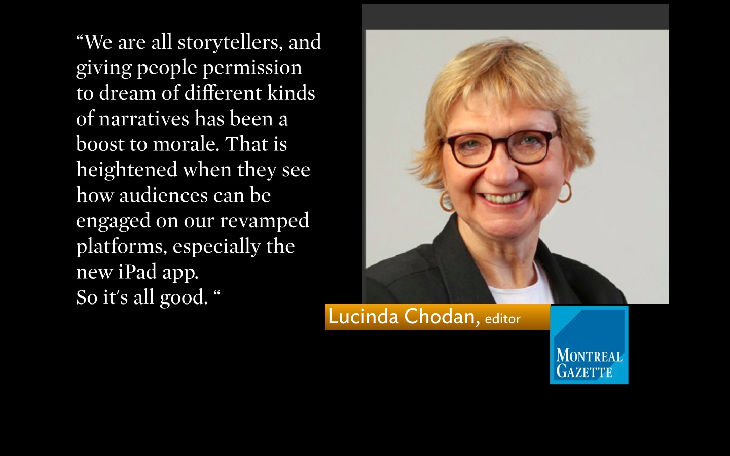
Now that they have seen the process in action, they have been excited by the possibilities for telling stories in different ways for the first time in their careers. We are all story-tellers, and giving people permission to dream of different kinds of narratives has been a boost to morale. That is heightened when they see how audiences can be engaged on our revamped platforms, especially the new iPad app.
So it's all good.
The new look
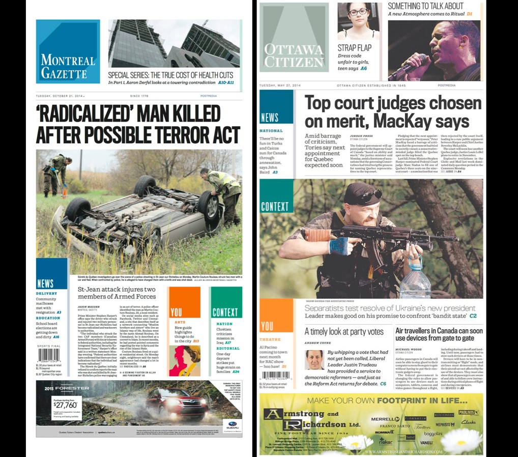
Visual continuity across all the Postmedia titles: front pages of Montreal Gazette and Ottawa Citizen, its sister newspaper. One look, one strategy.
Just as planned, the new look of the Gazette shares the same overall look & feel as the Ottawa Citizen—with a different color palette focusing on blue for the St. Lawrence River instead of mint green for Ottawa's Peace Tower—and which will remain for the other Postmedia titles.
I find that headlines, especially for the mobile edition, are catchy and inviting. Notice the generous use of white space between elements in those digital editions, allowing for an easier read.
The print edition looks modern and stylish. I am impressed with the front page of the first day: a bold, all caps headline for a truly newsy story with national implications. It has energy and power, but it does not overwhelm. Notice the use of squares as visual continuity elements for all titles in the Postmedia project.
Watch the video
Who was Who in the Gazette’s project
It takes a formidable team to launch a project of the Gazette's magnitude.
Here are some of the principal players:
Lucinda Chodan (editor) and Michelle Richardson (managing editor)
Rob McLaughlin holds the tablet vision for Postmedia.
Adam Martin , came to lend his digital design expertise for the launch and remains on board for a few days.
And, says tablet executive editor Catherine Wallace:
The Gazette newsroom is providing incredible support, from photos and videos to early story files and different ways of approaching stories.
Of related interest
Tablet editions: 4 years later, less finger-happy
https://www.garciamedia.com/blog/categories/postmedia
Postmedia unveils the reimagined Ottawa Citizen
http://www.postmedia.com/2014/05/20/postmedia-unveils-the-reimagined-ottawa-citizen/
Note to readers: a new Gazette coming
http://www.montrealgazette.com/news/local-news/Note+readers+Gazette+coming/10304103/story.html