Updated Tuesday, April 14, 1:39 pm EST
Mario Garcia Jr’s new blog post:

How ESPN Chicago sticks another nail in the newspaper coffin … and what to do about it
http://garciainteractive.com/blog/view/42/
Should a newspaper follow a totally modular design?
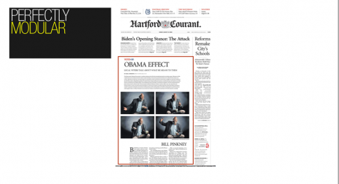
The perfectly modular Hartford Courant
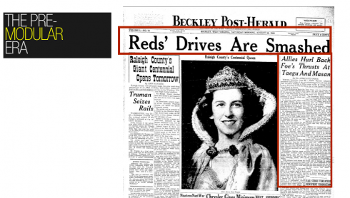
Before modular design: the many-directional front page
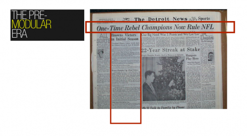
Detroit News from the 50s: banner headline that drops into one of the columns below it, but supports many other headlines under it as well
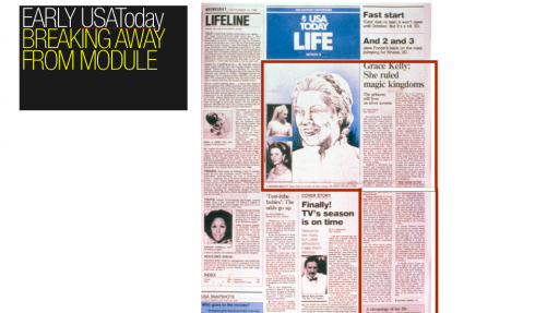
LIFE section front of USAToday its first day of publication: Notice how Grace Kelly lead piece does not follow a module
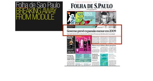
Brazilian newspapers, including Folha de Sao Paulo, disregard modules for a more imperfectly symmetrical style
Not that the answer to the question will in any way help financially strapped newspapers worldwide, but it is one of those perennially present topics when one gets down to the details of how a page is put together.
Last week, while working with the newspaper Sudkurier, in Konstanz, Germany, one of the editors reacted to my suggestion that a sports page be more dynamic by “breaking away” from the totally modular, perfectly square look.
“But, are you changing your mind about modules?,” he asked.
My answer is not at all.
“Your Contemporary Newspaper Design book specifically tells us about the virtues of modules,” he continued.
Indeed, but that was 1977, and I don’t wear the suits and ties that I wore then. We all evolve, and God knows newspapers have evolved a lot since the 1970s, when color was introduced, design became the “it” word in newsrooms, and advertising and classified were bringing in the cash, thank you.
Of course, I am in favor of modules. More importantly, I am in favor of using a GRID to design any page, or screen, for that matter. Grids help us get a sense of balance, proportion and visual organization on a page or screen. Grids are a network of uniformly placed horizontal and vertical lines for locating
points by means of coordinates.
However, one may follow a perfect grid on a page, and DEVIATE from it slightly to introduce a non-rectangular shape, which in the case of the sports page in question, would have allowed a dynamic, moving photo to go five columns across, while the headline and story under it would be only four.
Modules and newspaper design
Perhaps the modular design fever took off when Frank Ariss introduced a perfectly modulized design for the Minneapolis Tribune in the 1970s. Ariss also made Helvetica protagonist in his design, and adhered fully to a a Swiss grid. This was, indeed, revolutionary for newspapers everywhere, but, especially in the United States where most dailies still followed the 1950s model of “page make up”, which roughly translated into fill the page as you go, with stories and photos as interlocking pieces of a big text-driven puzzle.
With the Tribune’s new look, editors turned their attention to visual organization, perfect squares or “news units” on the page. Out went the so called dog legs of the past, or the awful armpits of another era, when a headline ran across the top of the page, with a thick black rule under it, to separate it from all the other non related stories and photos that hung from it like clothes on a line we may see at the top of a residential building in the teeming neighborhoods of Hong Kong.
The orchestrated non modular look
So I told the German editor: we can keep a perfectly modular page all the way, except for that one item where we break away from it, and the page gains in the process. More dynamic, more visual tension and a photo that is given its proper size treatment.
And there is nothing new here, it was that very visionary newsapper, USA Today, that brought back the dog leg and the armpit in 1985, right on the front page. Its design is full of energy, short items, small photos, and the only way to make all of that work was to deviate from the 100% modular look. USA Today continues to pull it off remarkably well everyday. But, for those of you studying USA Today pages, notice that the nonmodular effect is achieved with ONE element, not with many, which would result in visual chaos.
![]()
The following links from today’s IFRA Executive News Service appear to be of special interest
=========================================================
IFRA Conference: Managing Ink and Paper
26–27 May, Hamburg
More information: http://www.ifra.com/events
=========================================================
– Is The iPhone The New Newspaper?
http://recoveringjournalist.typepad.com/recovering_journalist/2009/04/is-the-iphone-your-replacement-newspaper.html
– USA: Marriott to discontinue paper delivery
http://uk.biz.yahoo.com/13042009/399/marriott-discontinue-paper-delivery.html
– USA: Honolulu Star-Bulletin unveils new compact format
http://www.visualeditors.com/apple/2009/04/honolulu-star-bulletin-unveils-new-compact-format/
– Germany: Bild publisher wants websites to pay for news
http://uk.biz.yahoo.com/12042009/399/bild-publisher-wants-websites-pay-news.html
– Print is still king: Only 3 percent of newspaper reading happens online
http://www.niemanlab.org/2009/04/print-is-still-king-only-3-percent-of-newspaper-reading-actually-happens-online/
– Amazon Plans Big-Screen Kindle
http://www.paidcontent.org/entry/419-amazon-plans-big-screen-kindle/
– How can newspapers help Google?
http://steveouting.com/2009/04/12/how-can-newspapers-help-google/
– Arianna Huffington and Tom Curley: Journalism biz models for future
http://www.robbmontgomery.com/2009/04/arianna-huffington-and-tom-curley-journalism-biz-models-for-future/
– An After-Life for Newspapers
http://www.pbs.org/mediashift/2009/04/an-after-life-for-newspapers099.html
– WSJ & the Kindle: Puzzling Relationship
http://www.contentious.com/2009/04/13/wsj-the-kindle-puzzling-relationship/
– Time to Reinvent Advertising, Not Sabotage It
http://www.poynter.org/column.asp?id=131&aid=161330
– Papers Try to Get Out of a Box
http://www.nytimes.com/2009/04/13/business/media/13carr.html
– Newspapers suffering in Europe, too
http://washingtontimes.com/news/2009/apr/13/dailies-suffering-in-europe-too/
– ‘Hyperlocal’ Web Sites Deliver News Without Newspapers
http://www.nytimes.com/2009/04/13/technology/start-ups/13hyperlocal.html?ref=media
:
To read TheRodrigoFino blog, in Spanish, go:
https://garciamedia.com/latinamerica/blog/
TheMarioBlog posting #238