TAKEAWAY: The tablet is one of the best things that has happened to storytelling because it allows for media rich experiences that are essential to fulfilling the user’s expectations. So why are some magazine publishers describing these experiences as mere “bells and whistles”?
UPDATE #1: Tampa, Fla., 1:01 p.m.—SPD conversation

Join the dialog on the SPD site as well: http://www.spd.org/2011/11/does-one-size-fit-all-lets-dis.php
Oh, no, tell me this isn’t true.
A recent report from adweek.com carries a headline that was enough to stop me for sure: Magazines Pull Back on Tablet Bells and Whistles: Why It’s Back to Basics for Some Publishers
The report quotes various magazine publishers saying things like rich-media features (I call them experiences) are “a secondary benefit,” or are “distracting, cause confusion, and occasionally irritate customers if the execution is not perfect.”
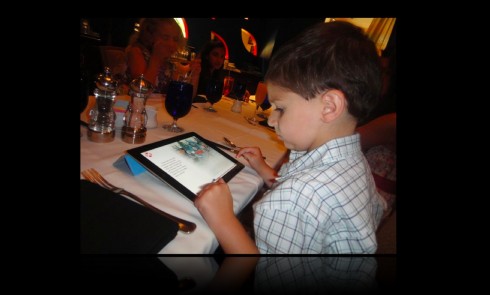
Funny that I would read this report on the same Tuesday that I have picked up my grandson Frankie from pre-school and brought him home with me for about three hours till my daughter picks him up in the afternoon. We follow our routine of fixing a quick lunch and then turning our attention to the ever popular iPad. Frankie is 4, but very iPad savvy, as are most of the kids in his class. We have several apps that we experience together, all related to children’s books. We have the more linear (less media rich) apps, and we have the ones that allow for greater interactivity—coloring the train cars in Thomas the Train, or doing puzzles, or doing things that keep the finger happy. There is no question about it: Frankie ASKS for the ones with the greater, more fun, enhanced experiences. I might as well delete the more linear ones.
Of course, Frankie is a young boy and these are not news/magazine apps. I am aware.
But the experience, the expectation, the total involvement between tablet and user is one where the richer and more substantial the role that the eye, the brain and the finger play, the happier the users are.
“It’s deja vu to web 1.0 all over again for magazines. Its startling that they see interactivity as a bell and whistle. When publishers truly embrace the tablet platform, they will see success,” says creative director, AOL Mobile, and president of the Society of Publication Designers Board of Directors Josh Klenert.
The research: more interactivity is the key

Courtesy: http://rww.readwriteweb.netdna-cdn.com/images/bbcstudy_3.jpg
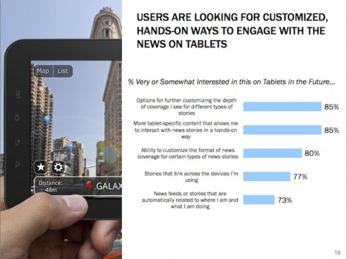
At any age. In whatever circumstance. Indeed, a recent BBC.com and Starcom MediaVest survey indicates that tablet users are eager for more interaction, not less. 85% of the 1,099 respondents were very or somewhat interested in “[m]ore tablet-specific content that allows [them] to interact with news stories in a hands-on way.”
This is why I cannot imagine that depriving apps from the richer, more interactive and fun experiences is the way to go.
Quite the contrary. We need to advance towards the 5.0 apps, rich in everything that extends the story, that provides the finger with tons to do, and which reminds us of all that a tablet can do that print or online can’t.
Bells and whistles? I would not use the phrase. I prefer to call them “pop ups”, and I include them among the essentials of what designing an app is all about—especially for magazines.
I would like to think that all of the smart people quoted in the Adweek.com piece are discussing a transitional or temporary situation.
No need for a pop up a minute: make smart choices about pop ups

Frankie enjoys interactivity with his iPad apps
I remind my newspaper clients that it is not necessary to have 25 pop ups in any one daily edition of their newspaper. BUT they have to sit down and identify the three or four stories each day where pop ups are needed and strive to create them.
The same should apply to a magazine app. We do not want the perhaps overwhelming experience of a pop up at every turn, but intelligent magazine apps will provide those moments when the story demands it and presents the opportunities. We do not need to gyrate type gratuitously simply because it can be done. But we need to look for those visual opportunities where the pop up contributes to more effective storytelling.
Finally, and the reason I refuse to use the phrase “bells and whistles,” the tablet is a multi-genre platform: one reads, one sees, one hears, one watches videos. It is the combination of these genres that make for a satisfied user.
A well-designed magazine app does not have to be Disney World, Las Vegas or Macy’s Thanksgiving Day Parade. Instead, it has multi-sensory appeal, enhances stories and provides for the type of fun and enjoyment that Frankies of all ages appreciate.
Of related interest:
-More bells and whistles, please!
http://joezeffdesign.com/more-bells-and-whistles-please/