This is the weekend edition of TheMarioBlog and will be updated as needed. The next blog post is Monday, September 8.

The great Ken Doctor, always insightful as a speaker and writer with his observations of newsroom behavior, has done it again. This time Ken takes up the ever sensitive topic of titles in the newsroom.
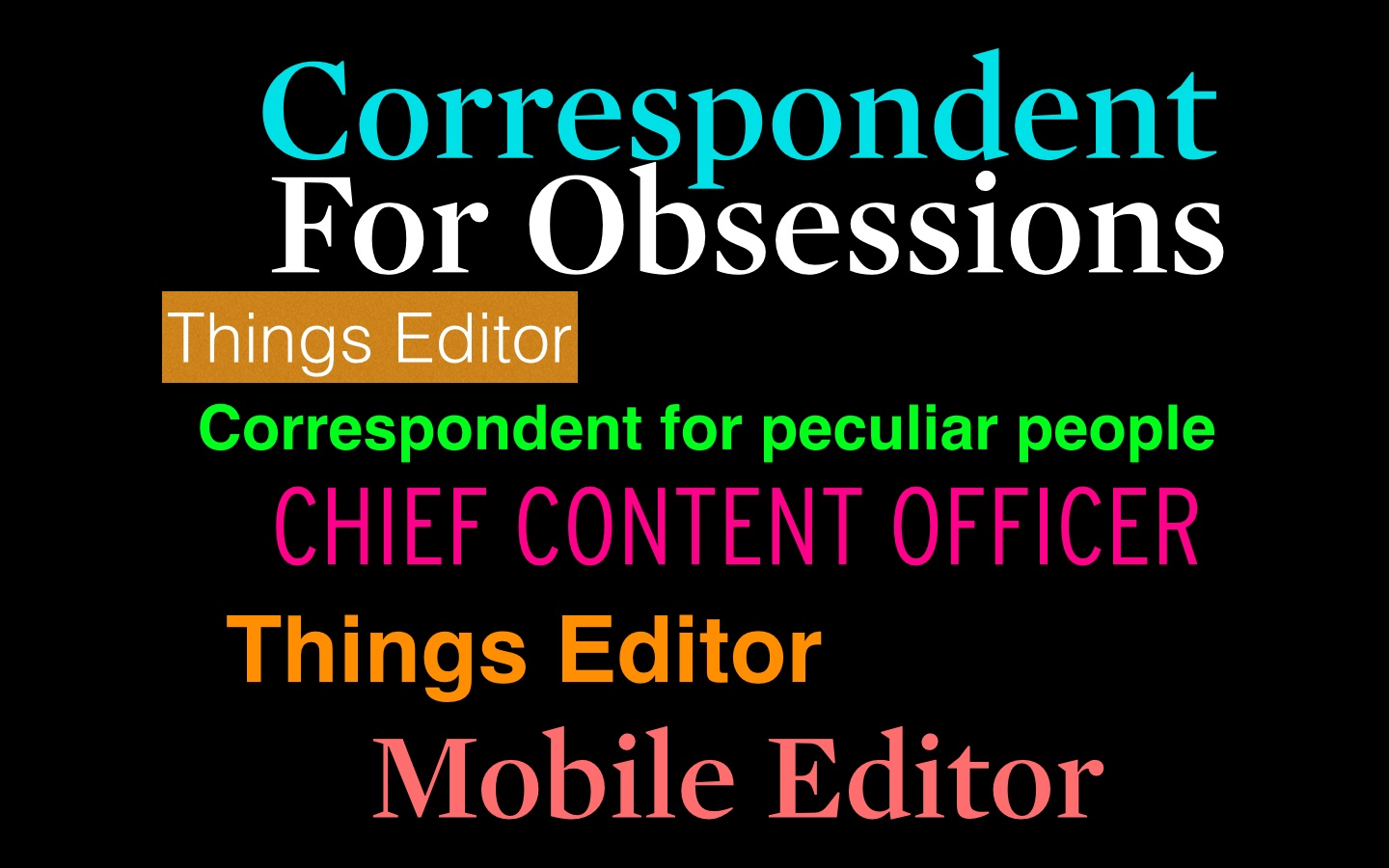
Indeed, it is a changing media world when such titles as “Things” editor, distribution editor, correspondent for progress or even correspondent for peculiar people (I want that job!) are now part of what we see as normal titles.
And how about if you worked for Quartz and handle its always surprising Obsessions section. I can see it on a card: Jonathan Smith, editor of Obsessions. That would make many sources open up to Jonathan, or perhaps not.
My favorite current newsroom title is that of Emory Thomas, Chief Content Officer for American City Business Journal. He wears the title well, and lives up to the substantive weight of it. Officer makes him a sort of sheriff for content, one who is vigilant that good content prevails, and who supervises those in charge of making sure it is so. Pistol in hand, Emory watches from his watchtower in Charlotte to see how editors in 40 titles of ACBJ do “content”. Not an easy job. But, heck, the title makes it exciting to come to work each day.
Emory describes his job:
Yes, it's a cool title. It also feels fresher and more accurate than traditional alternatives. My responsibilities extend well beyond the words and headlines. Editorial leadership today also has to be relentlessly focused on audience development. It has to encompass design, data, video, user experience, marketing, and more. So…chief content officer seems to work for that.
Title and the evolution of design in newspapers
Talk about tip toeing around the titles.
There was a time, before any of the millenials were born, when the word “design” was not welcome in newsrooms. There was layout or make up to refer to the function of aesthetics on the pages of a newspaper.
You could be called the “Make up Editor”, “The Production Editor,” anything BUT design director or, worse yet, art director.
I remember speaking at American Press Institute seminars, or conducting Poynter Institute workshops during the late 70s and 80s. A question circulating the room was always:
“We now have hired someone to handle layout. What is the best title to give this new person in our midst?”
(Another question usually was : Where do we sit this person?)
With the introduction of design in newspapers (and its somewhat acceptance) came the need to name the person carrying out the duties.
Titles that became a trademark of the era:
Assistant Managing Editor for Graphics, Graphics Editor, Associate Editor for Graphics.
Eventually, the biggest and most daring metropolitan dailies graduated to “Art Director” or “Design Director”.
At the start of the 2000s, with design acceptance conquering the hearts and souls of publishers and tough die hard editors, we began to see titles such as “Visual Presentation Editor” (nice but too soft) or even “Creative Director” (the current darling of those who supervise what the creative team does.
It's been a long haul for design to get here.
Now we see the same thing happening as digital and social media gain momentum in the newsroom.
I would like to be Correspondent for Obsessions for Quartz, if they would take me. So many obsessions to report about, starting with one of my current ones: how we relate to news and information on our phone in the era of the journalism of interruption and everywhereness.
When a spurned former First Lady speaks, the audience listens


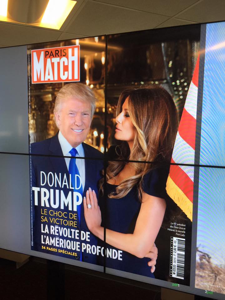
Paris Match has an exclusive this week: “It’s hot”

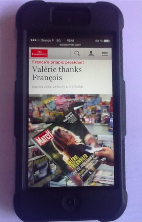
The Economist picks up the Paris Match “exclusive” story
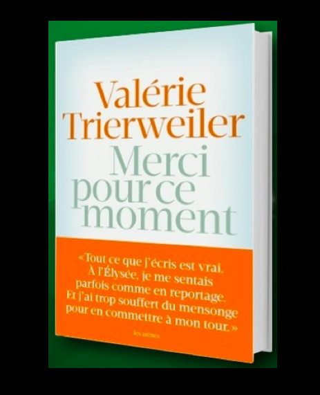
The legendary Paris Match magazine (and one that we are so proud to be collaborating with for the past six years) is enjoying an “exclusive” with its story this week: excerpts from a kiss and tell memoir by former French First Lady and Paris Match writer, Valérie Trierweiler. Her book is titled Merci Pour Ce Moment (Thanks for This Moment). Valerie is President François Hollande’s spurned ex-partner.
“It’s hot,” says Olivier Royant, editor in chief of Paris Match.
I am happy to be spending part of next week with the Olivier’s talented team.
And now, the IKEA book-book (a fun ad)
This will be your fun read of the weekend, I can guarantee you. A clever ad from IKEA which is also a parody of how Apple introduces a new product. Enough said. Just take a look here and enjoy the video.
IKEA Channels Apple in a Hilarious Ad for Its New Catalog ‘Bookbook’
http://time.com/3265308/ikea-catalog-2015/
Highlight:
To play on the fact that browsing an IKEA catalog is a sort of holistic sensory experience, the company has created this clever new ad, which skewers Apple’s notoriously over-the-top product commercials. The result is hilarious, and the jokes really just write themselves.