This is the weekend edition of TheMarioBlog and will be updated as needed. As I start my summer vacation now, the next blog post is scheduled for Monday, August 5. Till then, enjoy your summer!

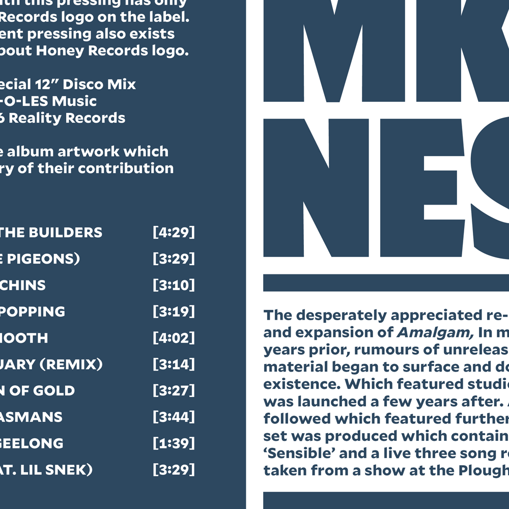
Great to hear from Tobias Frere-Jones, the type designer, with the good news that his font, Mallory, has been expanded from its original single width and 26 styles. Mallory now offers an even more eclectic range of voices.
Heritage is important; so is offering something new. Our transatlantic sans family includes five widths and 110 total styles to enhance its utility across editorial works, on any digital device, and within the most confined space restrictions. License Mallory for desktop, web, and mobile app use at frerejones.com.
We at Garcia Media have used Mallory and find it to be a legible, elegant and functional font for a variety of uses. It can enhance the look of a publication that reflects authority, but can also be played big for newspapers that still emphasize street sales. Our designers have used it well for feature pages too. We welcome these changes and hope to use Mallory again for future projects.
The new Mallory is adding four narrower widths. There’s also been a revision to the original set of Mallory styles. The whole expanded family is here:
https://frerejones.com/families/mallory
Mallory and digital
One important consideration when selecting a font in today’s multiplatform world is how that font adapts to its use on digital devices. I asked Tobias Frere-Jones about that:
An important part of the expansion is two new widths — Compact and Narrow — in the MicroPlus size as well as the Standard size. After Mallory’s first release, we heard requests for a version that was just a bit more economical, while still feeling like the “normal” state of the design. The Compact width fills that need, while Narrow goes a little further in increasing copyfit. Both MicroPlus sizes are well-suited to mobile screens, particularly in a portrait (vertical) orientation, where every pixel of width counts.
Take a look at Mallory’s versatility



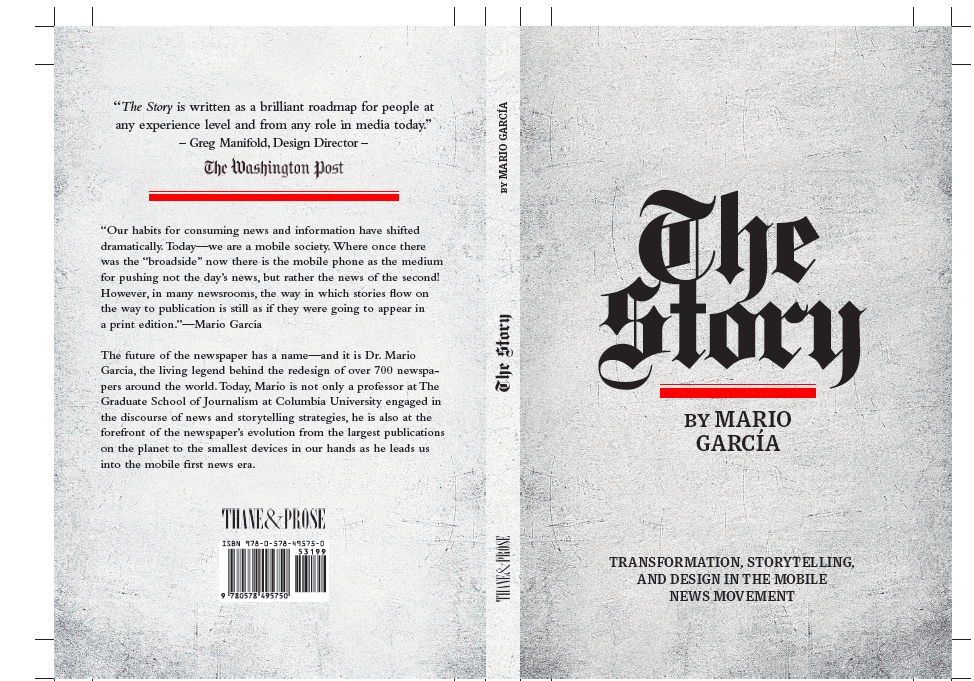
Now a print edition of The Story
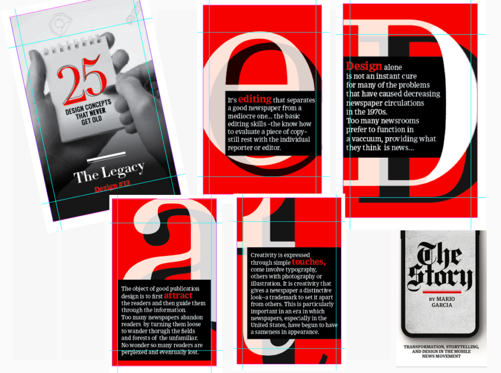
I am happy to announce that we will, indeed, have a print edition of my mobile storytelling book, The Story. I thank you for expressing your interest to our publisher, Thane Boulton, of Thane & Prose. Now the print edition will be a reality, and you can already see the cover and back cover here:
Order here:
https://thaneandprose.com/shop-the-bookstore?olsPage=products%2Fthe-story
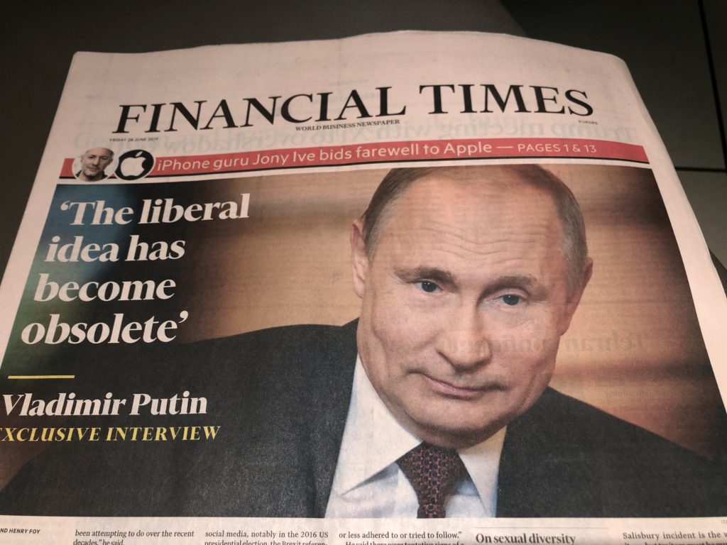
That’s a different FT front page
It is rare for the Financial Times to display a photo six columns across, occupying the entire upper half of its front page. But it is happening this Friday, as the FT promotes an exclusive interview with Russia’s Vladimir Putin. However, don’t miss the banner promo over that photo, informing us that iPhone design guru, Jony Ive, leaves Apple to start its own design firm.
Mario’s speaking engagements
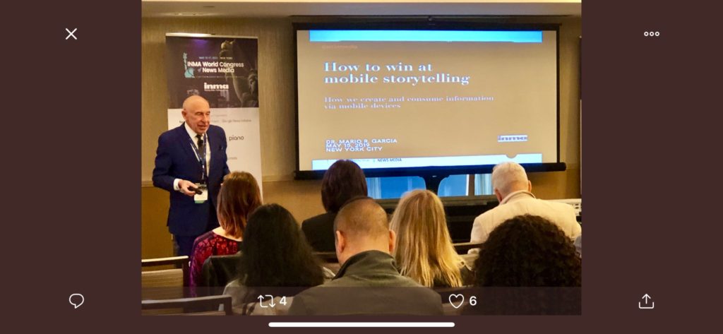
Here are places where I will be taking the message of mobile storytelling in the weeks ahead:
July 11, Florida Media Conference, St. Petersburg, FL, Keynote for editors: The mobile first newspaper strategy.
Mario’s weekend rituals…..
Monocle interviews me about what I do on a typical weekend (is there such a thing? Not for someone like me who is seldom in the same location twice. But I gave it my best shot, for what may come as a normal weekend, when I am home in New York! Enjoy.
https://monocle.com/minute/2019/04/27/
Pre-order The Story
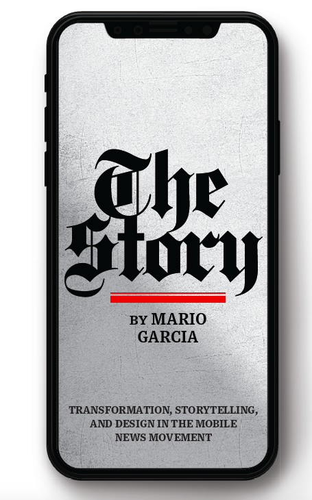
The newspaper remains the most powerful source of storytelling on the planet. But technology threatens its very existence. To survive, the Editor must transform, adapt, and manage the newsroom in a new way. Find out how, pre-orderThe Story by Mario Garcia, chief strategist for the redesign of over 700 newspapers around the world.
Order here:
https://thaneandprose.com/shop-the-bookstore?olsPage=products%2Fthe-story
An interview of interest
http://www.itertranslations.com/blog/2019/3/11/fd60ybflpvlqrgrpdp5ida5rq0c3sp
TheMarioBlog post #3083