Updated in Dusseldorf, Wednesday, July 22, 16:55
TAKEAWAY: Today Pure Design’s installment: case study of our work with the iconic German newspaper, Die Zeit. PLUS: Moonstruck: we continue to show you the best pages celebrating man’s landing on the moon 40 years ago AND: Dele Olojede writes about Next for the Financial Times
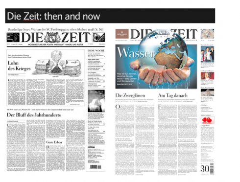
Pure Design: case study of Die Zeit, my most challenging project ever
When people asked which was my most difficult project, I usually don’t hesitate. After more than 570 projects now completed, Die Zeit still takes the coveted prize of “most demanding, most challenging” project ever. After all, it is not everyday that one gets to transform an iconic, legendary newspaper. To do it in Germany added to the challenge. Germans loved Die Zeit as it was: mostly text, except for a couple of black and white illustrations; long pieces written by the best writers. Professors assigned Die Zeit as required reading for their students, whether the topic was science or humanities.
So, to get in there, roll up your sleeves, and introduce color, photography, bigger illustrations—-and, yes, slightly shorter texts——was not the easiest task in the world.
But it happened. Die Zeit went on to win coveted design awards from SND (Society of News Design) , which picked it among the best five designed newspapers in the world; other organizations worldwide honored it as well. It also became one of the most commercially successful in Germany.
Today, Die Zeit remains a weekly thing of beauty. Art directors have come and gone, each adding interesting touches to the design, enhancing it, making it better.
Most importantly today: Die Zeit may represent the best existing example of the printed newspaper of the future—-appears weekly, is full of interesting, well written pieces which analyze, interpret and dissect topics in a variety of subjects. It is a gift to the eyes. It spells gravitas, seriousness and credibility.
Die Zeit did it first. Its editors were always convinced that they worked for a special publication. Design helped to make it better. And, yes, doing it was not easy at all.
Download entire first section of Pure Design: Words
Now that I have fully presented the first of six sections of Pure Design on TheMarioBlog, I am offering the entire initial section, “Words,” available for download—all 33 pages of it. This may be useful for those of you saving or printing out Pure Design and will be done following each of the remaining sections. At the end of our journey through words, type, layout, color, pictures, and process, I will publish the entirety of Pure Design in one file.
Dele Olojede writes about his pet project: Nigeria’s new newspaper NEXT
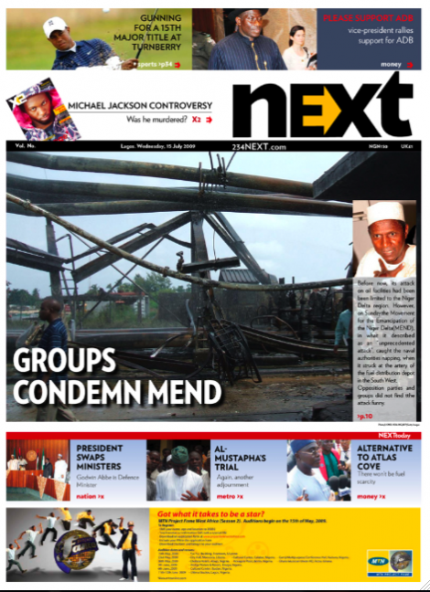
Here is prototype of how the daily Next of Lagos, Nigeria, which premieres in August, will look
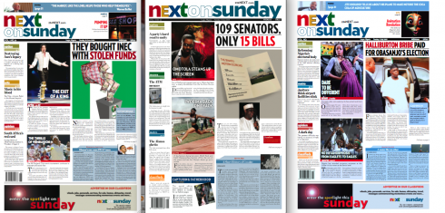
These are recent front pages of Next on Sunday
I am headed for Lagos, Nigeria in a few days, as we prepare to launch the daily edition of Nigeria’s new newspaper, Next. The Sunday edition, Next on Sunday, was already launched January 4, along with its website www.234next.com.
Dele Olojede, Next’s publisher, and a Pulitzer-prize winning journalist for international reporting, tells the story of this amazing newspaper launch in the Financial Times today:
http://www.ft.com/cms/s/0/13f3ba6a-74cf-11de-8ad5-00144feabdc0,dwp_uuid=9e5befe2-74d9-11de-8ad5-00144feabdc0.html
We posted a blog about Next on Sunday recently:
https://www.garciamedia.com/admin/index.php?S=7ea0dd83ee7f3f19b7f66d99e3d7060a727ab00f&C=edit&M=edit_entry&weblog_id=6&entry_id=671
Good news in the newspaper front
Happy to read that McClatchy, the company that publishes The Sacramento Bee as well as 29 other newspapers, including The Miami Herald, has
more than double its second-quarter earnings, even while its advertising revenue fell by 30 percent.
Could this signal the often mentioned green sprouts in the midst of what has been a very gray and somber economy?
For complete story:
– USA: McClatchy doubles Q2 earnings
http://www.bizjournals.com/sacramento/stories/2009/07/20/daily17.html?surround=lfn
Extra! Extra! All About Moon Landing
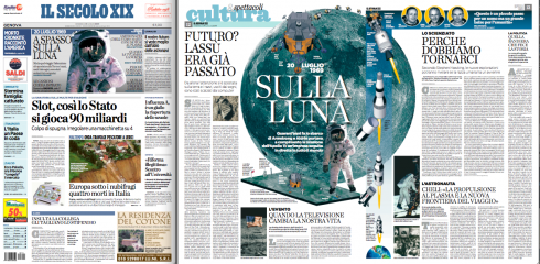
Il Secolo XIX of Genoa, Italy, went beyond the front page to include a double page treatment inside about the moon landing—courtesy of Design Director Massimo Gentile
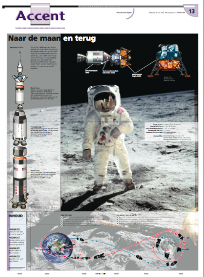
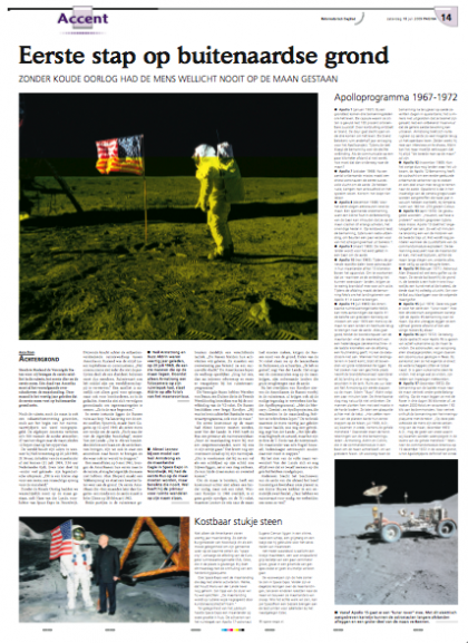
Moon pages from Reformatorisch Dagblad (The Netherlands). Sent by Henk de Boer
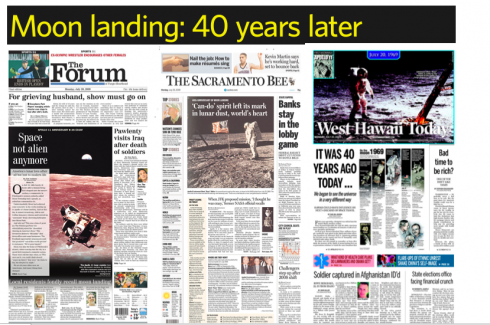
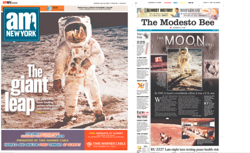
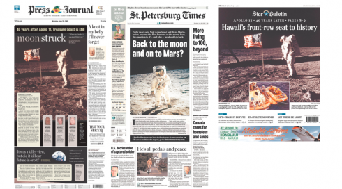
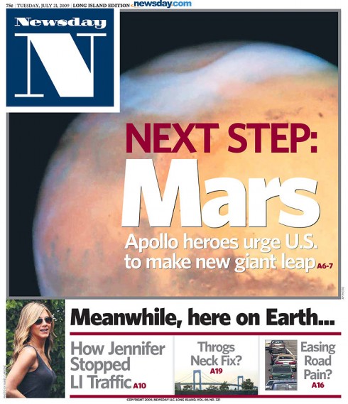
Newsday of Long Island, New York turns to the future with its headline
That lady up there has not lost her ability to seduce us. Forty years after man first landed on the moon, we are still moonstruck. I have been checking how many newspapers worldwide are playing up the 40th anniversary of man’s landing on the moon right on Page One. Some of these appear here.
Send me your “moon” page pdfs as I wish to celebrate the occasion in our blog as well.
Follow me at www.twitter.com/tweetsbydesign
Follow the Marios

Two Marios. Two Views.
Follow Mario Jr. and his blog about media analysis, web design and assorted topics related to the current state of our industry.
http://garciainteractive.com/
Visit Mario Sr. daily here, or through TweetsByDesign (www.twitter.com/tweetsbydesign)
In Spanish daily: The Rodrigo Fino blog
:
To read TheRodrigoFino blog, in Spanish, go:
https://garciamedia.com/latinamerica/blog/
TheMarioBlog posting #312