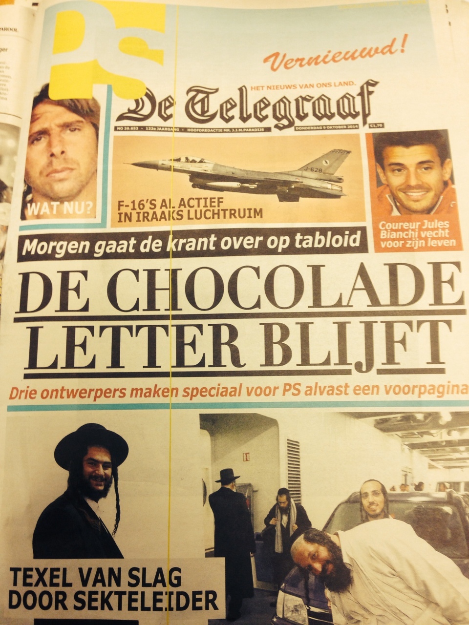
Take a look at these mock ups of front pages drawn by art directors offering their insights as to how they envision the tabloid De Telegraaf to be.
The sketches are accompanied by an interview that Het Parool media writer Vincent Smits conducted with me three days ago. Of course, nobody has seen the new front page concept for the tabloid Telegraaf yet, so all of these are mere speculations.
All are interesting and fun.
It's always a nice exercise to dream up how to do the front page of any newspaper without having to deal with the realities of legacies or with those big elephants in the room, or the portrait of the newspaper's greatgrandfather and founder pointing a cold stare and a finger straight at you.
Don't you remember that final project in newspaper design class, when you redesigned The New York Times and The Wall Street Journal as you thought they should be?

De Telegraaf: The Road to Tabloid Series
The Road to Tabloid, Part 1
https://www.garciamedia.com/blog/de_telegraaf_the_road_to_tabloid_part_1
The Road to Tabloid, Part 2
https://www.garciamedia.com/blog/de_telegraaf_the_road_to_tabloid_part_2
The Road to Tabloid, Part 3
http://https://www.garciamedia.com/blog/de_telegraaf_the_road_to_tabloid_part_3
ALL ABOUT THE NEW TABLOID EDITION OF DE TELEGRAAF
http://devernieuwdetelegraaf.nl