TAKEAWAY: T-shirts celebrate the power of print. PLUS: Mario Garcia Jr. discusses the challenges of working with the Moscovskiye Novosti team in the creation of the newspaper’s online edition. AND: Tributes to Elizabeth Taylor, the last of the movie stars.
Print is not Dead: Far from it
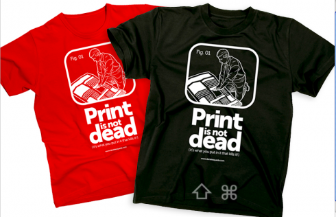
From Mexico: Print is not dead T-shirt
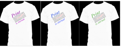
We had fun working on this Print is Eternal T-shirt
A few days back we had fun with our design of a T-shirt celebrating the Print is Eternal mantra. I did those shorts to send to William Powers, the bestselling author of Hamlet’s BlackBerry, the book that sends us a message of hope and highlights print’s ability to allow us a certain disconnectedness.
One of our blog readers, Daniel Esqueda Guadalajara, director general of Daniel Esqueda Consultores in Cuernavaca, Mexico, has sent us his rendition of a similar T-shirt. Thanks and we share it here today.
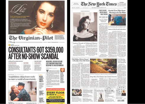
I will try to include as many pdfs of tributes to Elizabeth Taylor as my time permits today.
Creating the Moscovskiye Novosti online edition
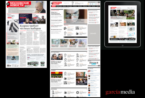
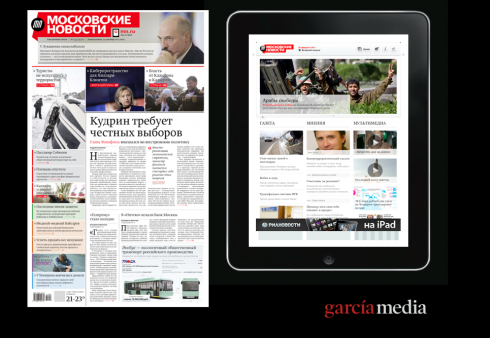
The new Moscovskiye Novosti: print, online, iPad app
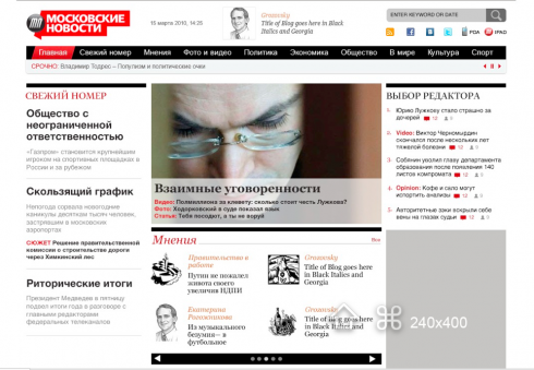
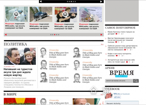
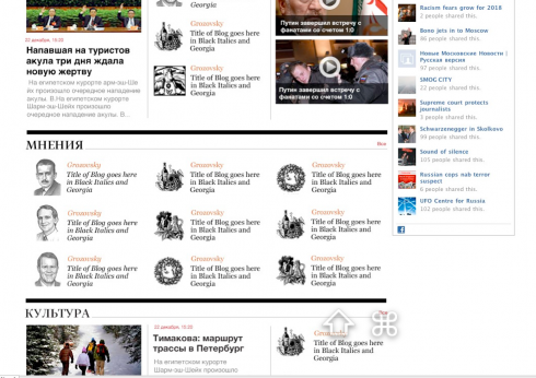
Follow the home page design for the new www.mn.ru online edition: the three images show the vertical scroll of the homepage
The online edition for the new Moscovskiye Novosti was created by Garcia Interactive, led by Mario Garcia Jr., working in close collaboaration with the newspaper’s own digital chief, Pavel Sukhov
Mario Garcia Jr, of Garcia Interactive, worked closely with the MN’s digital director, Pavel Sukhov. Here, Mario Jr describes the goals, process and challenges:
Thinking in terms of a multimedia brand
Re-launching as a multimedia brand, the challenge with the development of the MN website was to keep the brand consistent with the other mediums while differentiating how users would experience MN online. We didn’t want this to simply be the online home for the newspaper but more a website along with the newspaper, where users can get breaking news, follow the life of a story live, get more depth and perspective, interact, share and experience multimedia. In a sense we wanted to give every story layers which users could explore through any of those functionalities.
A different approach to navigation and content organization
This mean a different visual architecture for the homepage and article pages. We started by not segmenting the page into categories by functionality which was traditionally done on news sites. On the new homepage you will not find a multimedia or specific blog section. Instead, those features are dispersed throughout the entire page. The main story could be a traditional story with large photo, or can be a video or photo gallery. Section modules could be mostly columns and blogs about that topic, or just multimedia or a combination of story types. This flexibility gives users an opportunity to experience stories or subjects rather than just read them as they would in print.
Note: for more about the all-inclusive case study of the making of the multi platform Moscovskiye Novosti, scroll down to our earlier blog posts this week.
Goodbye to a true Hollywood legend
Germany’s Bild: “Goodbye to the most beautiful woman in the world”
Today’s The New York Times described it best: The last movie star died Wednesday.
Indeed, she was. For generation of moviegoers, Elizabeth Taylor was everything we associate with the golden years of Hollywood. I remember first seeing those violet eyes on the big screen one day as a child watching one of her films in Havana, a moment that has stayed with me.
Just like I will always remember that moment yesterday here in Helsinki, Finland, when I was conducting a seminar about iPad design for a group of magazine editors and suddenly my iPad, which I was holding up to show the new Oprah Magazine app, alerted me with a beep to a simple sentence: Actress Elizabeth Taylor has died.
I stopped, shared the news with my audience and admit that it took me about a minute to be able to continue. Not that this was not expected news, as she had been in the hospital since February, but, heck, this lady had fooled death many times before. This time it was for real.
Here, Germany’s Bild devotes its entire back page to Liz, with a headline that her fans will love: Goodbye to the most beautiful woman in the world.. In Finland, one of the newspapers devoted an entire 6-page pull out section to remember this talented actress, activist, and favorite of the tabloids.
Il Secolo XIX, Genoa, Italy
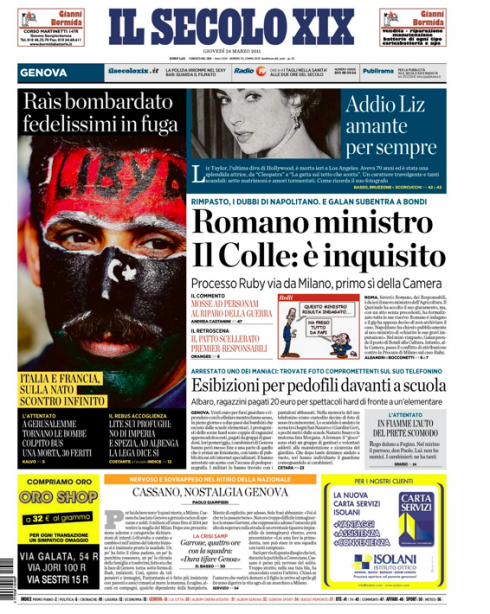
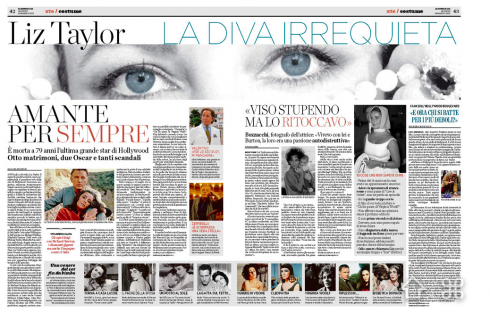
Our favorites from around the globe
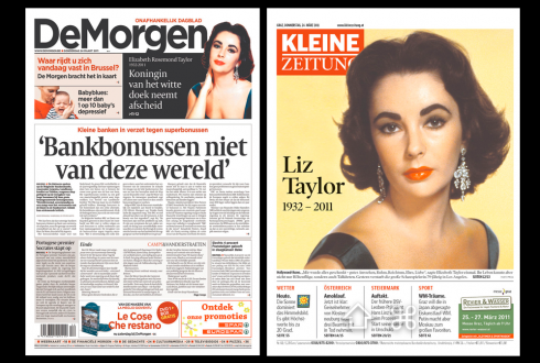
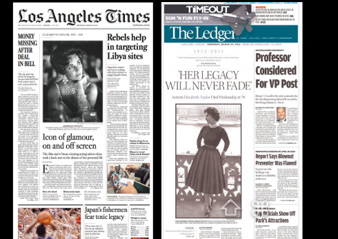
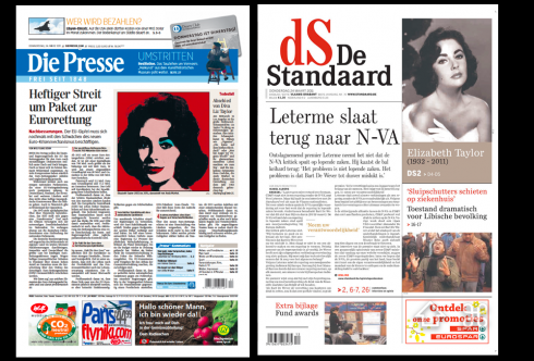

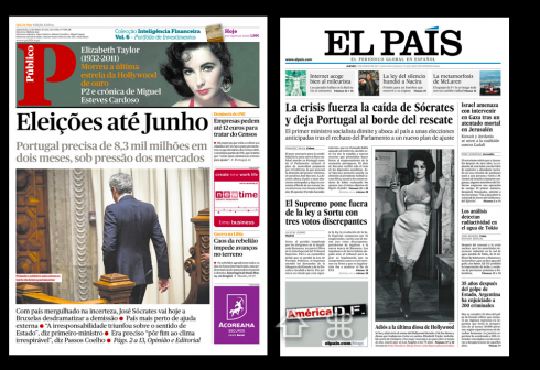
TheMarioBlog post #738
Moscovskiye Novosti marketing campaign creates controversy
TAKEAWAY: It is not out till Monday, March 28, but our Moscovskiye Novosti is getting publicity beyond that which was planned by the marketing department,or, perhaps, because of it: authorities have removed some of the banners promoting the new newspaper because they claim the campaign implies that there is a sense of decline and corruption in the government.

This is how the controversial billboard ad appeared (logo was intentionally covered, for an unconvering of it later in the campaign)—-courtesy of RIA Novosti
With only a few days before the roll out of the new Moscovskiye Novosti, the new Russian daily is attracting attention not because of its content or design——-not yet—-but because of a marketing campaign that the authorities consider disrespectful and which implies that the Russian government is in decline and awashed in corruption.
How did this happen?
The campaign to introduce the new newspaper uses a series of quotes from famous people, not just Russians. For example, Benjamin Franklin’s “A great empire, like a great cake, is most easily diminished at the edges”, but also Fyodor Tyutchev’s “Russian history before Peter the Great is one funeral service, and after Peter the Great – one criminal case.”
Another quote included in the campaign: ” Honesty is inseparable from freedom of corruption against despotism “(Anatole France)
The newspaper’s editor,Vladimir Gurevichblamed the removal of banners on bureaucrats trying to censor provocative messages.
“These quotes were chosen to recall the generic problems of Russian history. I think all we want, and this newspaper in particular, that these problems do not last forever,” Gurevich said.
P.T. Barnum said that “All publicity is good publicity”. Let’s see how true the circus master’s assertion is for the new Moscovskiye Novosti.
For the complete story from the RIA Novosti agency, go here:
http://translate.google.com/translate?u=http%3A%2F%2Frian.ru%2Fmoscow%2F20110321%2F356302012.html&sl=ru&tl=en&hl=&ie=UTF-8
Of interest today:
– USA: The Washington Times Expands, Restores and Prepares for a New Era in Multi-Media Journalism Coverage
http://www.worldofprint.com/us/meldung2.php?NID=10533621
– USA: The Washington Post Furthers Engagement, Conversation with New Website Design
http://www.worldofprint.com/us/meldung2.php?NID=10533587
– WSJ Launching Single-Issue Downloads For iPad
http://paidcontent.org/article/419-wsj-launching-single-issue-downloads-for-ipad/
– USA: New ranking combines print-digital reach of metro papers, reveals surprising winners
http://www.poynter.org/latest-news/business-news/the-biz-blog/123040/new-ranking-combines-print-digital-reach-of-metro-papers-revealing-surprising-winners/
TheMarioBlog post #737
Moscovskiye Novosti: a newspaper across three platforms
TAKEAWAY: Russians will wake up to a new daily newspaper March 28. But, although the product is brand new, the name, Moscovskiye Novosti, will be familiar to many. Today we begin a series of blog posts on our participation in the creation of this iconic Russian title as it makes a comeback. Today: the online edition, completing the trio of platforms—-print, online, iPad app.
Creating www.mn.ru

The new Moscovskiye Novosti: print, online, iPad app
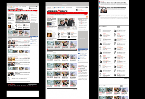
Early sketches in the creation of the online edition for Moscovskiye Novosti
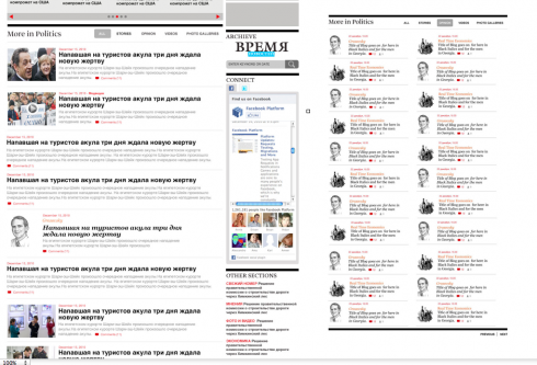
Close up of navigation areas
The online edition for the new Moscovskiye Novosti was created by Garcia Interactive, led by Mario Garcia Jr., working in close collaboaration with the newspaper’s own digital chief, Pavel Sukhov
Mario Jr and Pavel worked on several sketches, in an attempt to incorporate all the requirements of the new newspaper, with emphasis on a larger than usual number of blogs, features, in addition to breaking news.
What worked so well here, in my view, is that we had a briefing to create all the platforms simultaneously. Once we had the concept for print in terms of content and sectioning, it was easy for us to work on the online and iPad app platforms.
Normally this is not the way it is done in the case of newspapers that already exist. Many times the job is to redesign ONLY the online, or ONLY print, or, to create an IPad app. The fact that we were creating all the platforms simultaneously allowed us to truly incorporate storytelling techniques where each platform could do better in extending and enhancing the story.
For Pavel Sukhov, the challenges were many:
The fact that the project inherits almost nothing from the previous media. Certainly, the brand’s spirit was to be remembered. But we had neither a product range, nor existing visual decisions at our disposal.
Very tough terms in which the work should have been done, and the necessity to launch several platforms at once, to develop them simultaneously.
In addition, Pavel mentions that ” The corporate culture and inner mechanisms of work of the very big agency RIA Novosti, with dozens and dozens of people involved into different processes at different stages of the work over our media.”
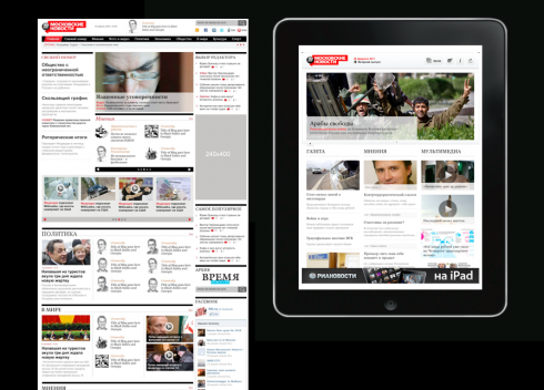
Online and iPad editions side by side: first cousins in look and feel
TheMarioBlog post #737
Designing a new newspaper across the platforms
TAKEAWAY: Russians will wake up to a new daily newspaper March 28. But, although the product is brand new, the name, Moscovskiye Novosti, will be familiar to many. Today we begin a series of blog posts on our participation in the creation of this iconic Russian title as it makes a comeback. Today: the new iPad app.
The Moscovskiye Novosti launch March 28 includes print, mobile, online and iPad editions.

The landing “door” screen of the new Moscovskiye Novosti iPad app: premieres in Moscow March 28

The new Moscovskiye Novosti: print, online, iPad app
Here is the landing page for iPad.
For the iPad app creation of this project, we worked closely with Pavel Sukhov, who is in charge of the digital side of the Moscovskiye Novosti operation; Mario Garcia Jr. worked with Pavel on creation of the new online edition.
From the start, our goal was to have a unique app with its own identity and content, while related as a first cousin of the print and online editions. Blogs, said Pavel, are an important part of the DNA of the MN, so the first sketch had the blogs prominently displayed.
We will continue to expand this case study throughout Monday.
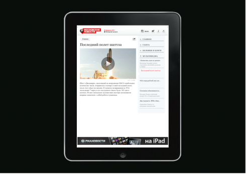
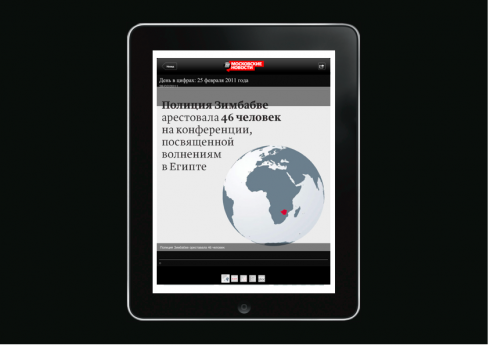
Trial and error screens for iPad app
As with print, one carries out many experiments in the creation of a news iPad app.
Because MN is a new product, we had to start from scratch. We were developing the concept across platforms, so you can see in the next series of images that we tried a variety of concepts——with different logos—-for the door screen. Should we reflect Moscow? Not really, said the editors. Should it be a simple, logo only door screen? More likely.
Then it came to movement: when do we move horizontally, when do we move vertically? And those important blogs? When do they appear?
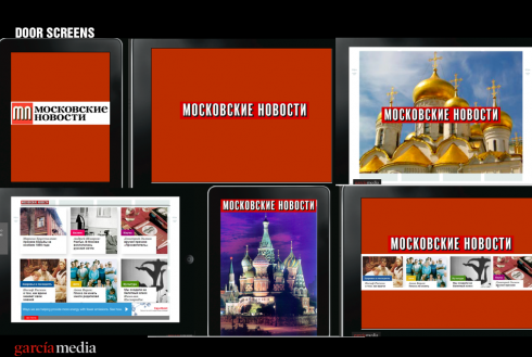
Doors with only logos; doors with ambience of the historical city
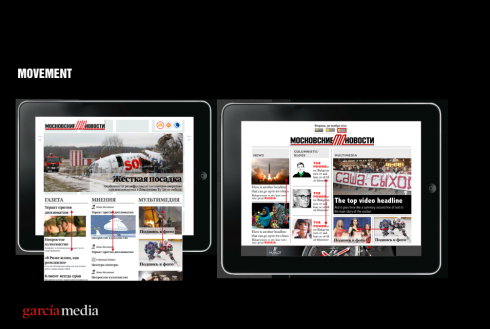
Areas of movement that we experimented with
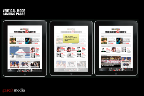
Vertical mode movement strategies
The iPad app was a collaboration involving me, digital managerPavel Sukhov and design director Fedor Korol.
More to come.
TheMarioBlog post #736
Moscovskiye Novosti: print case study follows
_thumb.gif)
Here is front page of practice run conducted today Friday
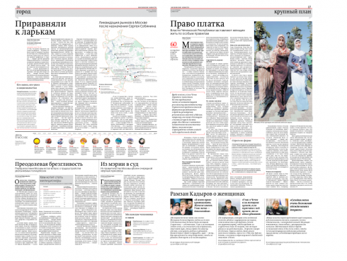
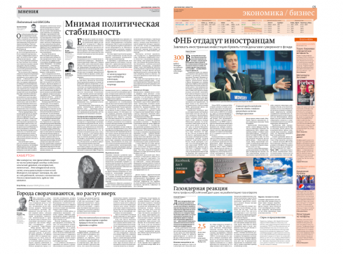
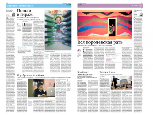
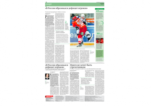
Inside pages from the same practice run of today Friday
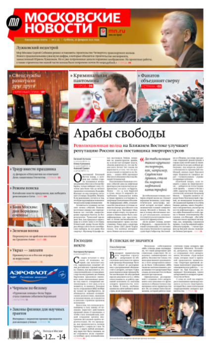
Here is one of the final front page prototypes (which is still work in progress) for the new daily Moscovskiye Novosti
It has been an unusually cold and wet winter in Moscow, but for the talented team of the new Moscovskiye Novosti, it has been mostly indoors, diligently working with the rebirth of an iconic Russian title, which was one a weekly, but now will appear as a daily, starting March 28.
For six months, we at Garcia Media have worked with the team in a project that involves three platforms: print, online and an iPad app, all of which will appear simultaneously.
The case study of how the new Moscovskiye Novosti has come to be is different from the usual project involving either a redesign of an existing publication, or the start of a new one that has not existed before.
In the case of MN, there is plenty of history, and a rich one too. For Russians of a certain age, the weekly MN, founded in 1980, came to signify the closest that existed to a free voice during the Perestroika period, when Moskovskiye Novosti gained huge popularity thanks to its liberal political stance, and for promoting itself as the newspaper to be “the bridge between the USSR and the Western world.”
Much has happened since then, and since 2008, when MN ceased publication.
Now, the MN will be published as the partnership between Vremya Publishing House (the publisher of Vremya Novostei until 2010) which will produce the journalistic content, and RIA Novosti (owner of the brand Moskovskiye Novosti) which will provide the technology and infrastructure.
It was RIA Novosti, the Russian news agency, that contacted us at Garcia Media to undertake the project. It began with a briefing meeting in London in late summer 2010. The key players from both editorial and management met with me and described their vision for the new newspaper. We conducted a lot of meetings on the phone, emails, and by the time I arrived in Moscow in the fall, I already had a good idea for the look and feel of the new MN.
Or so I thought.
As the day of the launch approaches, I would like to document the case in a series of blog posts starting this weekend.
More to come later in the day Friday, with updates throughout the weekend.
But, for now, here is a preview of the front page of the new Moscovskiye Novosti. In subsequent updates, I will relate and show our creative efforts to arrive here.

As usual, our process began with a good briefing from the editors and management team. From the start, we were aware that we were not dealing with a new newspaper without any history; in fact, the MN had a distinguished history, and some of its former editors were making a comeback for its revival; those editors were very serious about their wishes for the look of the newspaper: serious but contemporary, appealing to the young (in this case to the now adult children of the original MN readers of the 1980s); it must have the dynamics that we associate with the digital era (most of its readers are tech savvy and connected); it must be appealing to the advertisers.
We went to work, first with just my international team (it is my long time policy that we execute the first ideas within Garcia Media, before we engage the newsaper’s editors/designers): Jan Kny (Germany), Christian Fortanet (Spain), and a special guest appearance by Massimo Gentile (Italy). We conducted internal workshops, learned as much as we could about the history of the MN, and went to work. As usual, we had some firm ideas that were adhering to, especially in the area of front page navigation, use of photos and color. We were told we had a freehand with the conceptualization of the logo (don’t they always say that?)

Here are the models presented that first meeting in the fall of 2010:
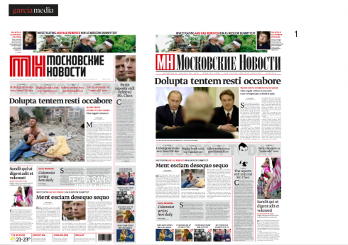
Obviously, we were not using the Russian characters here; this was a rough presentation to get an idea of look and feel; navigational devices, number of stories, photos, etc. We created a variety of logos ourselves
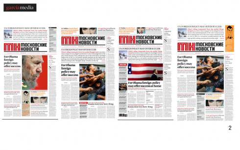
As you can see, these models all had one thing in common: the use of a narrative for an important story inside; large type; good writing highlighted for the best of the inside. This was a concept that I was ready to push for, remembering the words of the editor during the briefing: we are a text driven, serious newspaper
The reaction
Obviously, although the briefing had specified contemporary, fresh, lively and young, that was NOT necessarily the idea the editors in the room during this first presentation had.
It was more like: words, more words, smaller photos, less color, less of the “boulevard” look. What design consultant has not heard this before a zillion times? It all begins with “we are cool, hip and mega ready for change, big change.” Then reality comes in the way of real , tangible pages that can be seen and touched. Cold feet move under the table, and one courageous editor raises his voice to explain “how the rest of us feel”.
So, I had the message in a few minutes. It was back to the drawing board, to a more conservative, text driven concept, but, alas, there is always a little moment to savor a small victory: the narrative had tremendous appeal to this group. Of course: a six or seven line four-column type only, words only, visual element. They loved it. So did I, so the “narrative” lived. It survived it all. We came in there with 24 oranges in our hands, and a couple of apples. We had one of them in our hands still. In this business, it is that one orange that keeps the juices flowing.
We were now ready for Round 2 in Moscow, and by now the MN design director, Fedor Korol, had joined us in a collaboration. He is commander of the ship now and all the prototype pages you see here are Fedor’s hard work.

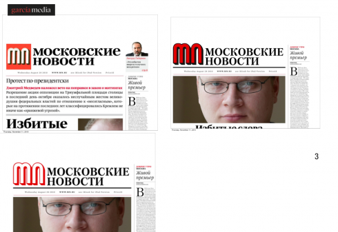
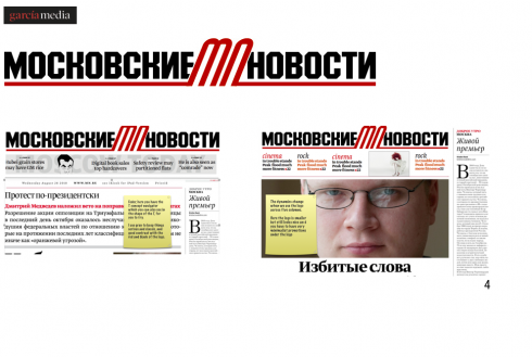
Notice that we kept trying different logos, but, at one point, it was decided to resurrect the last logo that appeared on the old Moscovskiye Novosti: there you see it in that second image.
Now the concept took a turn towards a more bookish approach, totally text driven with perhaps one large dominant photo. Text was the key word echoed by the top editors. We want longer stories and fewer items on Page One, the editor in chief repeated. His deputies echoed that feeling. Now we had the narrative as one surviving element from our initial concepts, and we kept producing pages that introduced more text.
From a return to the old logo, to more text, to almost a book environment on page one, we seemed to be going backwards, to another era, not moving forward.
However, the team and I and Fedor kept going at it, one page at a time. Nothing is built in one day, and few projects hit their stride with that first presentation, believe me.
Patience is paramount here.
The Fyodor Dostoyevsky model for page one
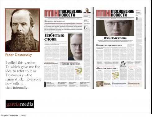
We retreated a few steps to create a front page that looked bookish, a bit imposing with a lot of text and, of course, the narrative, which did fit very well here. I kept calling the Fyodor Dostoyevsky model——the Russian author best known for his novels Crime and Punishment, The Idiot and The Brothers Karamazov.
Gone were the colorful top of the page navigators.
Gone was almost the use of any signifcant photography on the page.
You basically had several stories, and text ruled the day.
It seemed to hit the spot with editor in chief Vladimir Gurevich and his team, to proceeded to work on development of the Dostoyevsky concept, carrying it tothe inside pages as well.
I even began to grow closer to it, repeating to myself: it is their newspaper, they know what it means, they know what it should be, they know its history.
Meanwhile, while we settled on the texty Dostoyevsky model, another large Russian bear was showing up all along: the logo.
We were utilizing one of our logo creations that seemed to have the greatest acceptance with the editor of MN. But, suddenly, a call for us to provide more logo options.
Enter logo guru Jim Parkinson
, headquartered in San Francisco area, and thus about 11 hours time difference from us. Jim is, in my view, one of the most dynamic, conscientious and creative logo creators one can find, and we have worked with him now for over 25 years. Jim got a briefing and went to work, producing a variety of logos, a dozen of which were top choices, for the team as well.
The challenges continued, as did our work with design director Fedor Korol on inside page treatments to accommodate more and more text, fewer and fewer images.

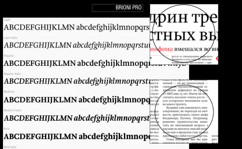
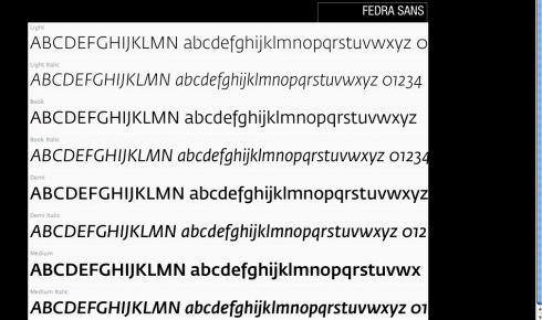
By now we had settled comfortably with our main typographic scheme consisting of Brioni Pro and Fedra Sans.
Brioni Pro is used for headlines and text; Fedra Sans for accessory items throughout the newspaper. Both come from Typotheque

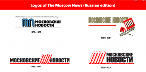
This graphic shows the various logos utilized by the Moscovskiye Novosti during its history
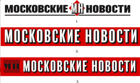
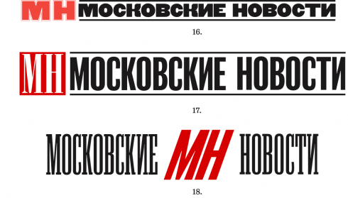
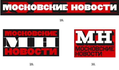
Parkinson went all out, creating a variety of choices, some bolder, several quite sophisticated, and all using the letter MN which was given to us as a necessary part of the logo, based on the newspaper’s history and the fact that
many readers referred to it as MN.
After more than 30 trials, none of the logos created by Parkinson seemed to have it, for the editors; time to reorganize, which meant using the last real logo that MN had before it closed in 2008. We continued to develop prototypes using that example. I was able to convince a now “out of gas” Parkinson to build something around the old logo, which he did with good humor.
But it was not meant to be.
By December, it was obvious that we did not have a logo that seemed to please everyone, and I was not about to ask Jim for another set of MN logos. There is a limit to everyone’s patience and creativity.
Fedor and I fiddled with concepts, abandoned the idea of the MN, and, by then, the Fyodor Dostoyevski model was buried under the January Moscow snows. The tide was changing: we want newer, fresher, more photographic.
Meanwhile, I asked Rodrigo Fino, in our Garcia Media Latinoamerica office, to help us with the logo concept, once Fedor and I had sketched the idea of an irregularly shaped, two-lined logo. He went to work with the Buenos Aires team as well.
Eventually, Russian typographer/designer Valery Golyzhenkov joined the project to take the logo concepts Rodrigo Fino had created and give them its final, polished look that you see today.
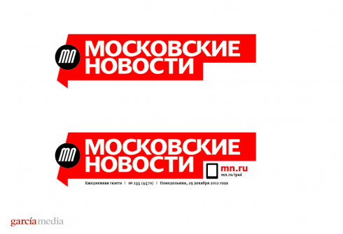
Here is the final version of the logo

Playing with the “pointed tip” of the logo through all inside page logos
Back to the drawing board.

Creating “the newspaper of tomorrow” one more time!
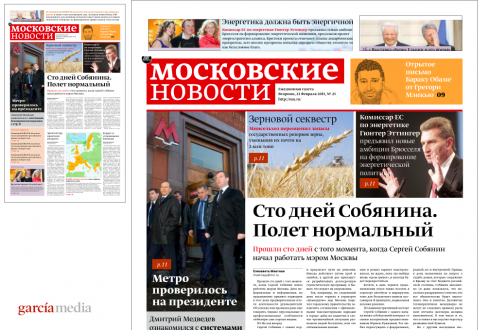
This was the first sketch I put together with Fedor after we got marching orders to
create a more graphic and youthful newspaper look. I called it “the three-tempo front page”
With January came orders to reverse course: the working prototype was not young enough, too full of text, old fashioned and not “the newspaper of tomorrow”—-whatever that is, and you all know how much I hate that phrase.
“Give us a newspaper that is more visual, for the people of today, but with the gravitas
of the serious newspaper that MN is,” was an echo in my ear.
Back to designing another front page, and I think this was attempt # 14, by my counts, but when it comes to these projects, nobody is counting and you simply keep plowing right along, which is what we did.
Now the work was between Fedor and me exclusively, and we made a good team.
The sketch above was the first that we produced after the new mandate. It was still rough and the logo, although close to the final, was not there yet, and we had to decide where to place digital icons to direct readers to mobile, online, iPad, but the concept was here.
The moment we showed it, it was a hit, in a big way.
I remember looking outside the window of our office this snowy January day to all those skaters skating in the ring located right in the courtyard of the RIA Novosti building. A light snow was falling, but it felt like a spring day, like when one sees the Finish Line sign with the huge inflated cans of Red Bull or Gatorade at the end of the marathon.
The Page One Gymnastics
Once the concept got applause for all the people on the upper floors, then Fedor and I engaged in the gymnastics of simulating various situations for page one, as you see here:
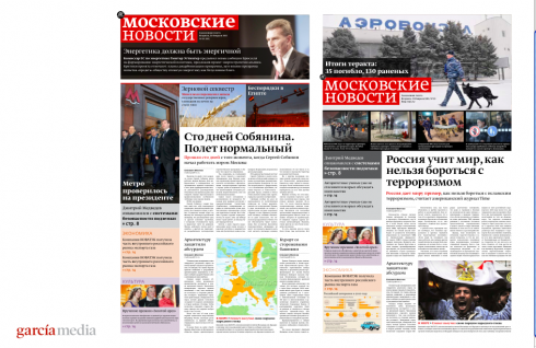
In this concept, the logo does not stand alone, but becomes part of the promo elements of the day.
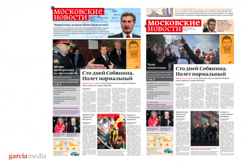
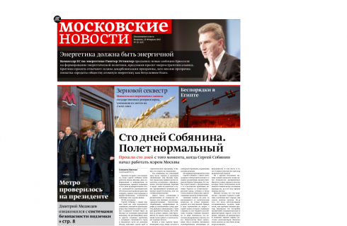
The narrative wrapped around the logo, or for a major news story, such as was the terrorist attack at the Moscow airport arrival hall, dominance of photo with logo, and a series of other photos related to the same incident.
The concept allows plenty of variety for promoting stories. Not two days have to appear the same, allowing the editors to let the content of the day dictate what wraps around the newspaper’s logo.
A three tempo front page
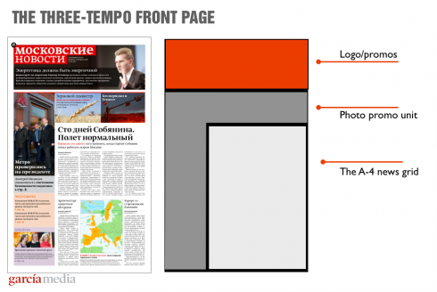
The three-tempo front page: Logo and top promos/narrative; general photos of the day and/or promos to inside in the shape of an inverted 7; a four-column A-4 format for the texty area of the page.
Incorporating an ad tempo into Page one: why not?
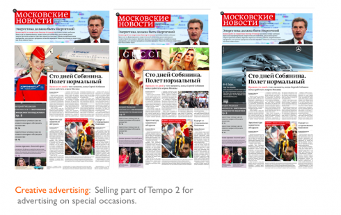
For special occasions: one of the tempos becomes an ad for an elite advertiser who pays a premium; newspapers already give their entire front page to ads, so here is a twist on the idea
And why not make one of the tempos, an ad tempo, for special occasions and for the advertiser who is willing to pay the price? I know that some will find this offensive, but this is 2011, and it is time we recognize that sophisticated media users see advertising as information too. I already see the emails coming from all corners of the world because of this pronouncement. But I stand by it: it is time to integrate advertising, marketing and storytelling. Why should they be separate islands in terms of management organization when they all affect the product in such major way?
By the way, for the record, although the advertising and marketing bosses at MN smiled when they saw those ads on Tempo #2 of the front page, the editors said nothing, and I have no indication that this will be done. However, I see my job as that of presenting all viable ideas, and, this, indeed, is one.
If there is a place in the globe where this type of ad experimentation can take place is in Russia, where “new” and “experimental” seem to be two popular words for everything.

A color palette for the MN
While we were putting together the first set of prototypes, and while I did extensive research looking at imagery associated with the Russia of the 1980s and the perestroika era, I pulled several pieces together and sent them to my friend and colleague, Dr. Pegie Stark Adam, up in Canada. Pegie is one of the top experts in color for media, and she quickly took my question of a little guidance and turned it into a rich color palette from which we borrowed many of the colors you see here today. Warm thanks to Pegie.
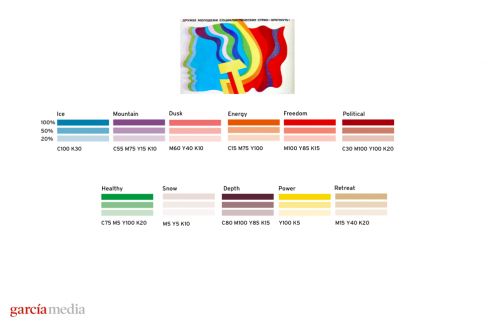
The initial color palette courtesy of Dr. Pegie Stark Adam, a media color expert
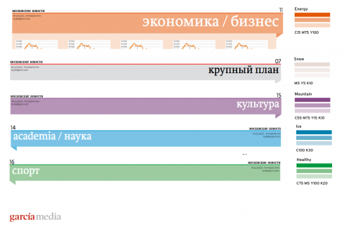
Here you see the selection of colors to identify specific sections of the 16-page daily newspaper.
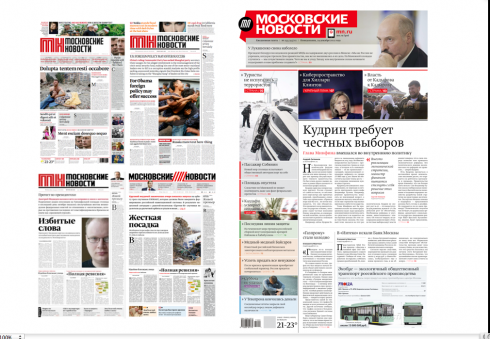
From first prototype to final concept—-a long road, full of interesting detours, but, eventually, a winning combination of the contemporary with the traditional
Next: Taking the concept to the digital editions
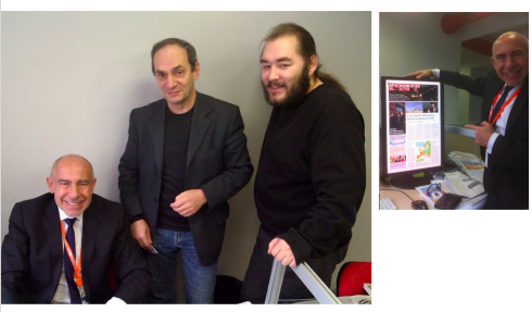
By the time this photo is taken, the final concept is approved. Here I am with editor in chief, Vladimir Gurevich (center) and design director Fedor Korol
Previous blog entries about the rebirth of Moscovskiye Novosti:
-In Russia: rebirth of a legendary, iconic newspaper: Moscovskiye Novosti
https://garciamedia.com/blog/articles/in_russia_rebirth_of_a_legendary_iconic_newspaper_moscovskiye_novosti
-Russia report #2: designing Moscovskiye Novosti across the platforms
https://garciamedia.com/blog/articles/russia_report_2_designing_moscovskiye_novosti_across_the_platforms
-In Moscow: making plans for the return of Moscovskiye Novosti, the iconic, influential newspaper
https://garciamedia.com/blog/articles/in_moscow_making_plans_for_the_return_of_moscovskiye_novosti_the_iconic_inf
Il Secolo XIX and Libya front for Sunday
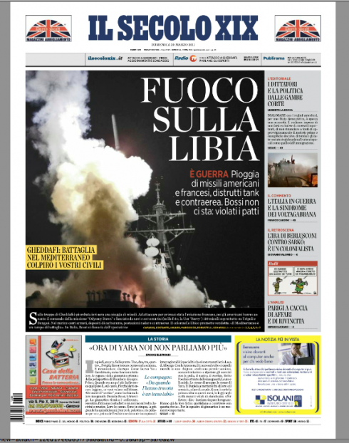
Massimo Gentile, design director, Il Secolo XIX (Genoa, Italy) proudly sends us his front page treatment for of one of the day’s hot stories——the Libya no-fly zone and the military intervention of several nations to help the rebels fighting Coronel Muammar Gaddafi , in what the US has called Operation Odyssey Dawn.
“I think we got the miniposter to work very well today,” writes Massimo. “This is one of those cases where to have that mini poster concept truly helps us in packaging an important event like this.”