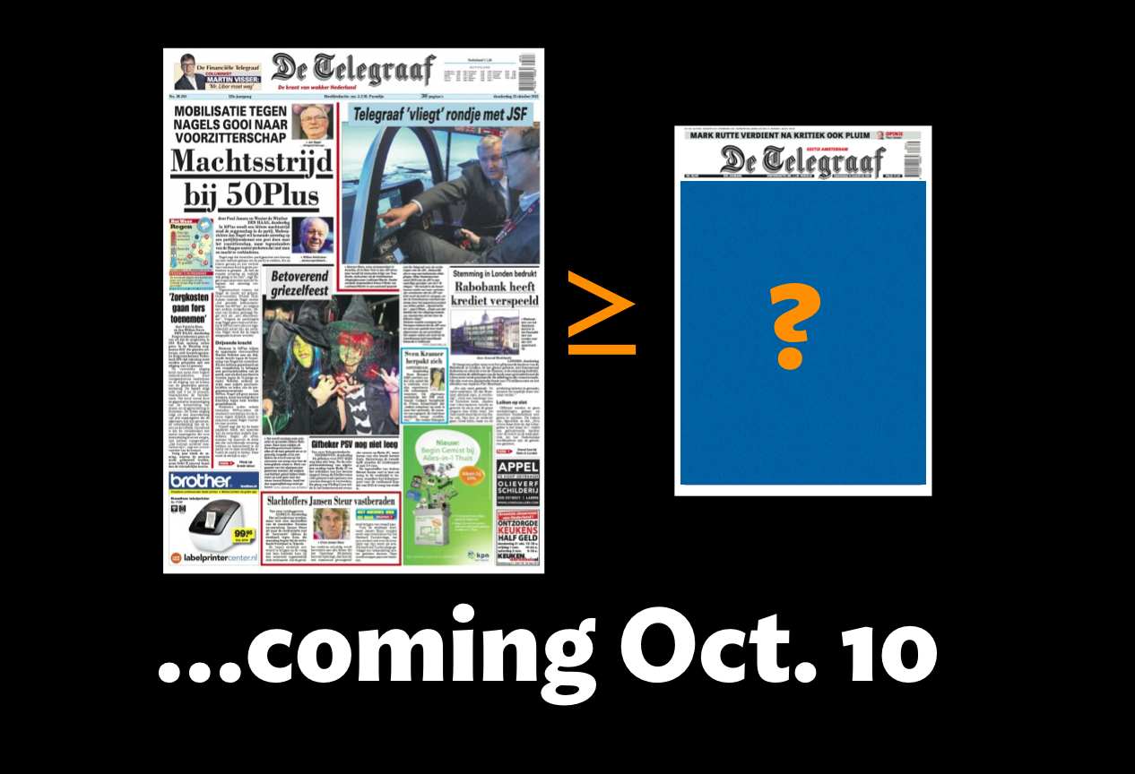
Dispensing tips for the type of work we do is always helpful, but never easy: not two projects are ever the same. This applies to broadsheet to tabloid conversions as well.
Some themes, however, run through all of these transformations:
1. First, it is important to realize that readers will be more ready for the change than editors, in my view. Today, readers do not equate a newspaper’s format with its credibility, but try telling that to editors of a certain vintage. The word tabloid does not have to mean sensational, as we know from seeing and reading a variety of the world’s best journalistic products. The “tabloid spirit” can very well appear in a full broadsheet publication. The size of a newspaper does not determine its credibility and gravitas. However, in any of the conversions in which I have been involved, this has been a topic of conversation that has taken more time that I would have granted it. It is the therapy part of the process. Editors need those reassuring teddy bears, no exception at De Telegraaf, of course.
2. Editors need to learn that they must think in terms of how photos are utilized (dominant photo is key on the smaller canvas). Starting with page one of a tabloid publication, photos are king. As we turn the pages, we like to come into the stories via photos, larger ones especially.
3. Think double pages and horizontal movement: the eyes moved top to bottom and diagonally when moving on a broadsheet page, but horizontally, left to right when on a tabloid double page, for example. Readers don’t fold tabloid newspapers generally. So the horizontal flow is natural and should be exploited by editors and designers. Let us dance into those double pages.
4. Do plenty of marketing about the new size, reminding readers that they are going to enjoy the smaller pages, but this does not mean there will be less content (which is often a comment from readers, especially if too much white space is dispensed throughout the design).
5. Let that front page include as little text as possible: use it as a map to the journey. The best tabloid front pages become an armoire full of goodies, as in “what am I going to wear today? Or, “what am I going to find inside today?”. I insist that this is not a battle that I always win: editors, especially when making this transformation to tabloid, which to reassert their conviction that text on the cover makes the tabloid more serious and authoritative. Readers don't seem to know that, but it is, again, one of those teddy bears one must dispense to calm the fears of editors, especially the night before the conversion.
Countdown to tabloid day
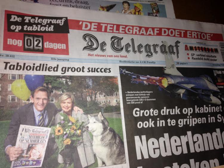
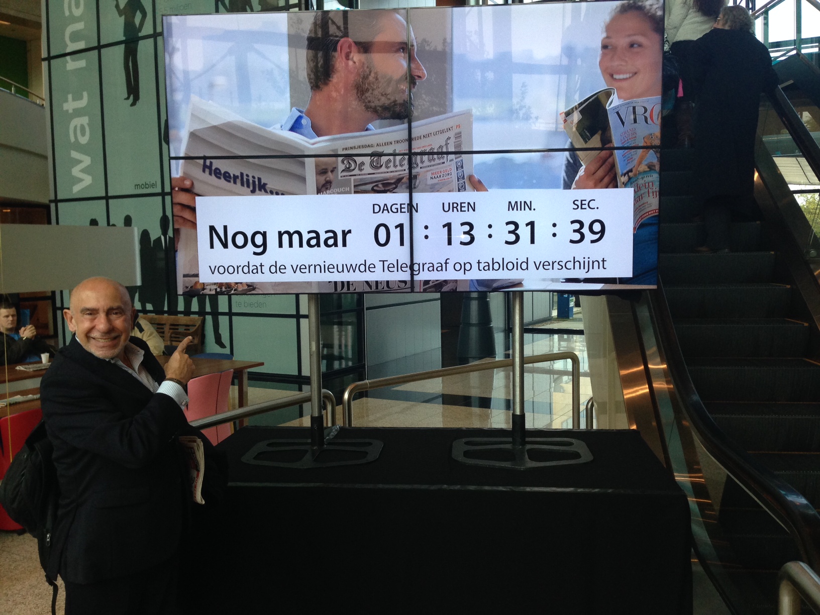
Recent Garcia Media conversions
Australia: Sydney Morning Herald and The Age
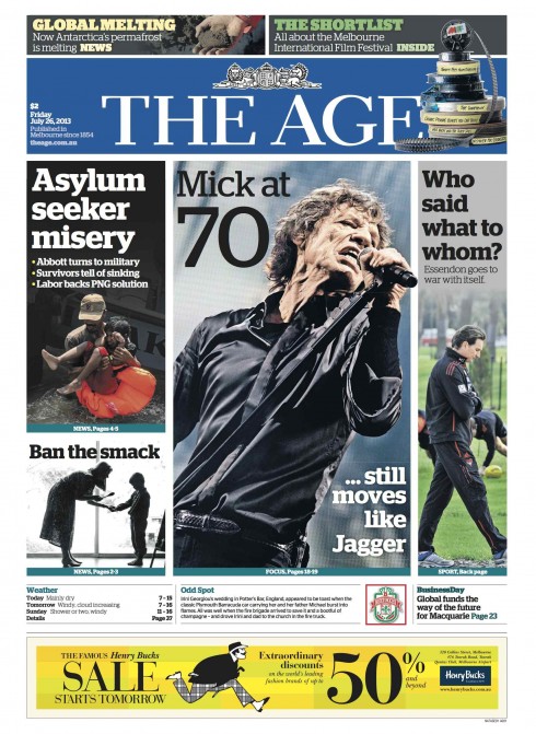
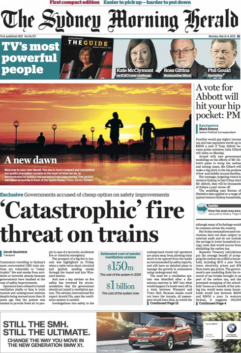
https://www.garciamedia.com/blog/pthe_age_evolution_of_a_front_page_design_p
Argentina: La Nueva Provincia
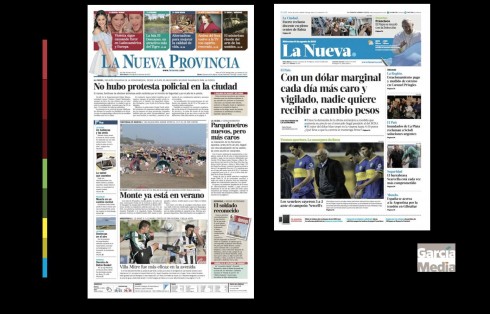
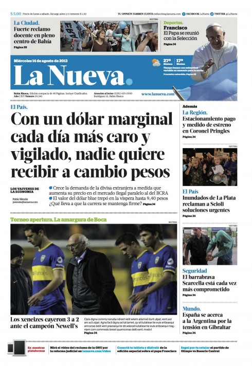
https://garciamedia.com/blog/pargentinas_la_nueva_provincia_its_a_new_look_across_platforms_p
More about tabloids here
Smaller formats for USA newspapers: win win situation
https://garciamedia.com/blog/smaller_formats_for_usa_newspapers_win_win_situation
Behold those multi personality tabloids
those_multi-personality_tabloids
De Telegraaf: The Road to Tabloid series
The Road to Tabloid, Part 1
https://www.garciamedia.com/blog/de_telegraaf_the_road_to_tabloid_part_1
Front Pages We Like
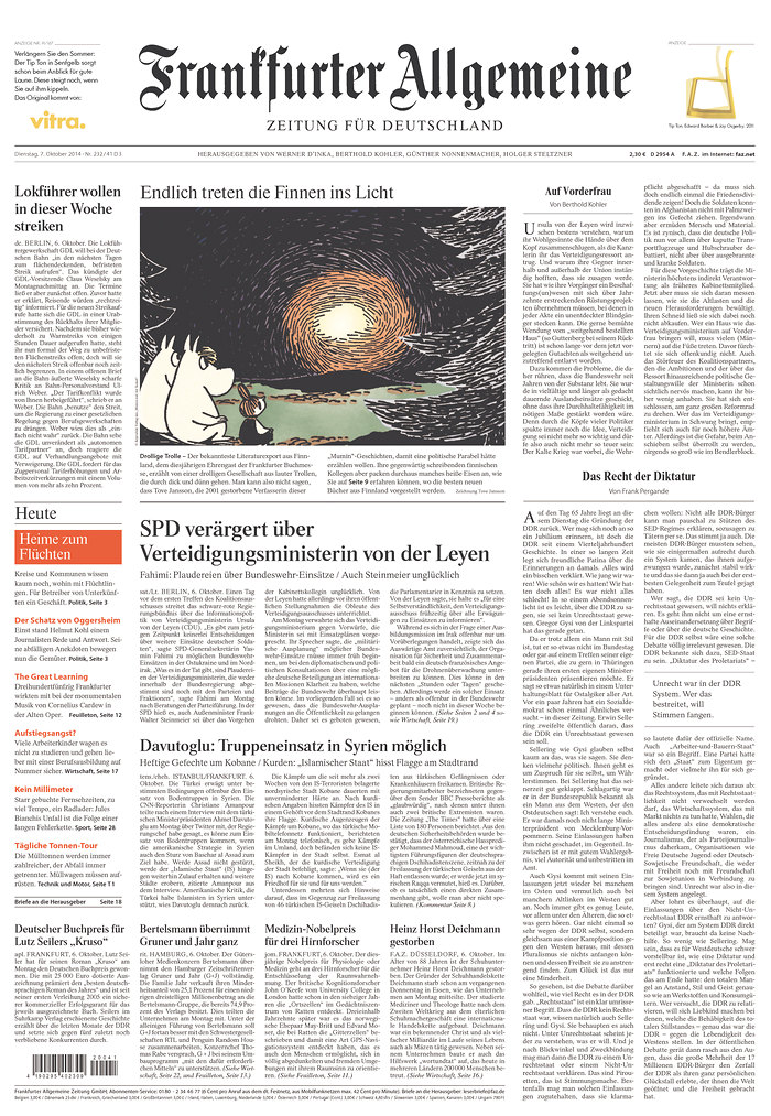
Front page of the Frankfurter Allegemeine Zeitung (FAZ) for Tuesday, October 7
While Germany's Frankfurter Allegemeine Zeitung (FAZ) usually displays a heavy text-driven front page, it also surprises often with its choice of imagery.
Tuesday's edition used an illustration, providing the visual element that one was not likely to find on the front page of any other newspaper.
Headlines We Like
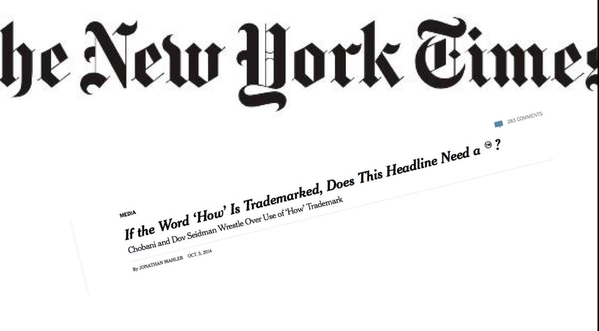
From time to time a headline comes along that intrigues, even if we may not be so interested in the topic of the story. The New York Times carried such a headline in its Monday, Oct. 6 editions.
The headline goes with a story about a bitter legal battle pitting a best-selling author and management guru against America’s largest Greek yogurt manufacturer, and all of it over the use of the word “now”.
Read the story here:
http://www.nytimes.com/2014/10/06/business/chobani-and-dov-seidman-wrestle-over-use-of-how-trademark.html?smid=tw-nytimes&_r=0