A BloombergBusinessweek report tells us that The Los Angeles Times, the fourth largest US newspaper by circulation, is seeking readers' reactions to a possible change to a smaller format.
That is great news, even though the LA Times folks are only treating this as a “test”, and not at all stating that the Times will reduce the size of its page. We have said it repeatedly: readers prefer smaller newspapers.
It is a matter of time before more US newspapers make the move, I continue to predict. All it would take will be for a major metropolitan US daily to make the switch and others may follow.
Meanwhile in the Netherlands
The Netherlands' largest circulation daily, De Telegraaf, has announced that it will reduce the size of its pages to the tabloid format starting October 10.
We at Garcia Media are delighted to be collaborating with editor in chief Sjuul Paradijs and his talented team to carry out the conversion.
We have been working closely with the team creating various prototypes that take the iconic Dutch daily to a tabloid format. The idea is to preserve the rich DNA of this colorful newspaper, with big headlines, colorful backgrounds and a retro 1950s look that has not evolved much through the years.
The new De Telegraaf tabloid will preserve some of its visual uniqueness, but incorporate new elements of navigation, more inside page organization, grater emphasis on hierarchy, and better brand extensions between print and digital editions.
I am in Amsterdam this week working with Sjuul and his team as we put finishing touches on the styles for the new tabloid.
Are broadsheets more effective when big news strikes?
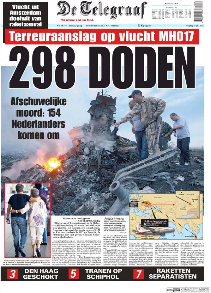
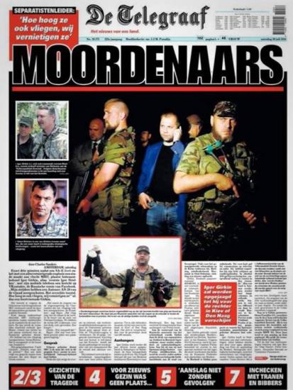
Here are two front pages of De Telegraaf covering the downing of Malaysia Airlines 017 over the Ukraine.
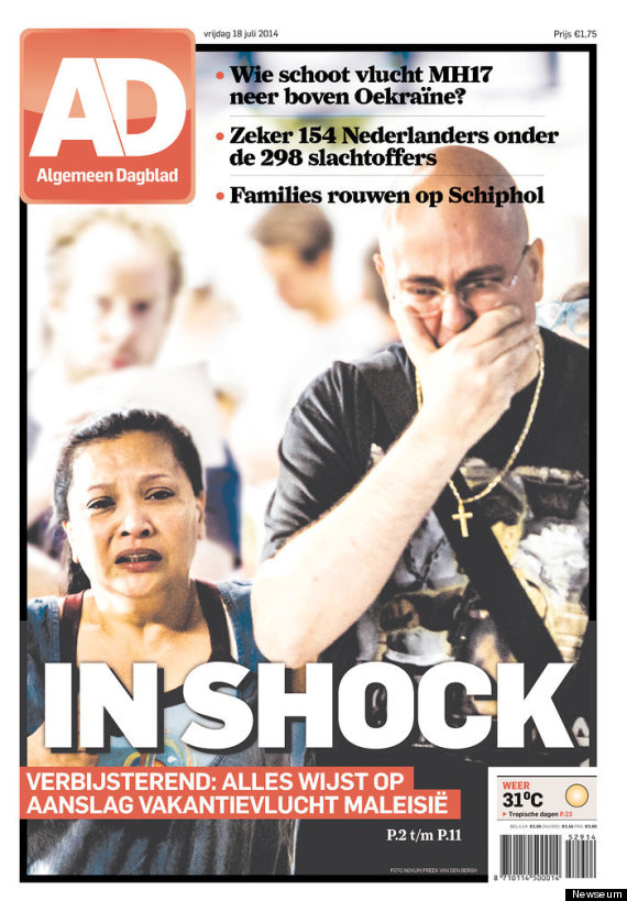
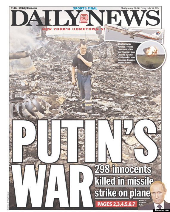
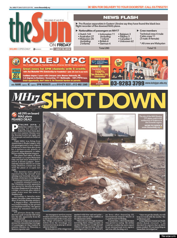
Here is front page of the Dutch newspaper AD, a tabloid. Also other international tabloids covering the same story of the downed passenger jet
This was a subject conversation today in the office of De Telegraaf’s editor Sjuul Paradijs. As De Telegraaf puts finishing touches on its conversion to tabloid, it is only natural that editors and designers would ask the question: could we have the same impact for big news in a smaller canvas than in the large broadsheet?
To make the point, Sjuul proudly showed me the front pages of De Telegraaf in late July with coverage of the shooting down of Malaysia Airlines flight 017 over the Ukraine, in which 298 died, including 154 Dutch nationals.
“Readers truly liked our coverage of this tragic story, a very Dutch human interest story, and part of that was the display that was possible with our broadsheet format,” Sjuul told me. “Our sales went up considerably. We covered the story thoroughly, but with a point of view. In fact, one of our front page headlines read: Killers.”
I don’t doubt for a moment the impact that these front pages have (some of which I have here), but I think a poster front page in a tabloid format can be as forceful. And, there is always the possibility to take the front and back of the tabloid sheet and treat it like a broadsheet poster.
Ultimately, however, it is always the story that determines success with readers. It's how headlines are written, how coverage is planned and photos displayed. In that sense, De Telegraaf's coverage of the Malaysia Airlines tragedy over the Ukraine was so good that it would have played well in any format.
Useful resources about tabloid formats
Download free The Impact of the Compact by Mario Garcia
An in-depth investigation about the renaissance of the tabloid format
http://issuu.com/mariogarcia/docs/the_impact_of_the_compact
More about tabloids in TheMarioBlog:
Behold those multi-personality tabloids
http://www.garciamedia.com/blog/behold_those_multi-personality_tabloidsNot all tabloids are created equal
Not all tabloids are created equal
https://garciamedia.com/blog/not_all_tabloids_are_created_equal
Of related (tabloid) interest:
Many dailies will convert to tabloids
http://www.editorandpublisher.com/PrintArticle/Garcia-Many-Dailies-Will-Convert-To-Tabloids
Of related interest:
Newspaper Front Pages Show Devastating Images Of Malaysian Plane Crash
http://www.huffingtonpost.com/2014/07/18/malaysia-plane-crash-front-pages_n_5598876.html?utm_hp_ref=media&ir=Media