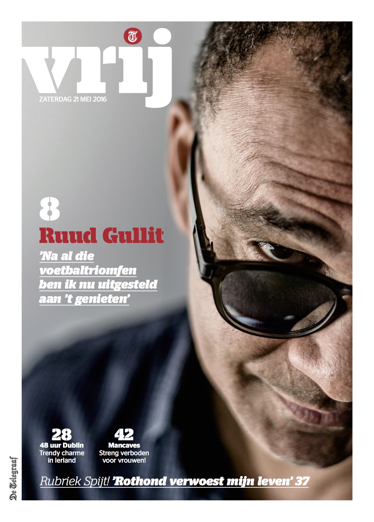
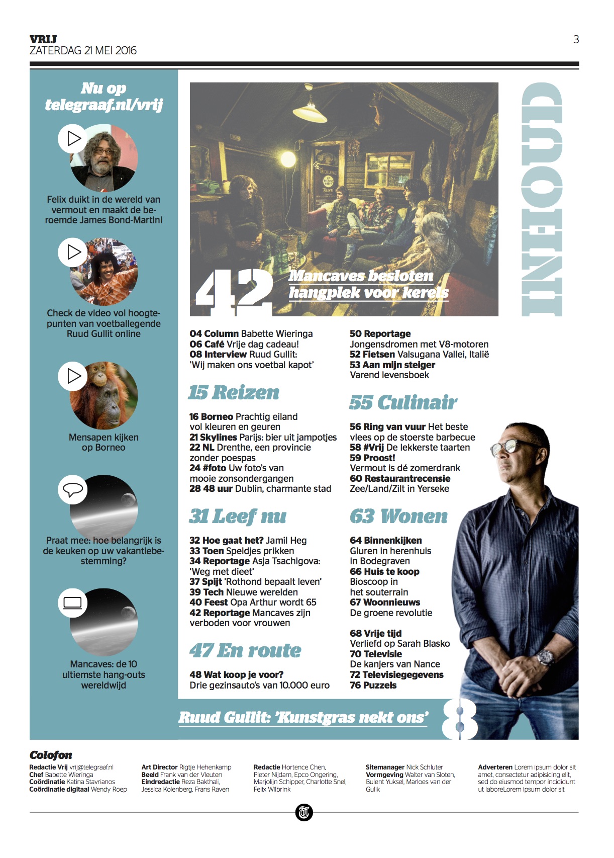
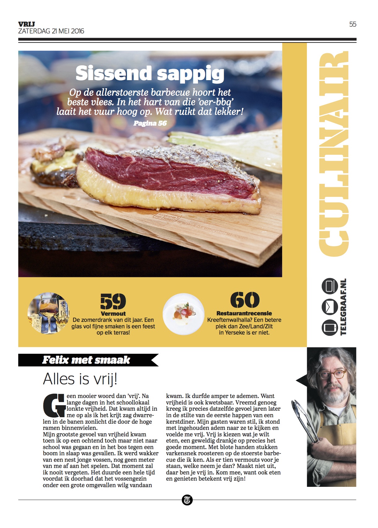
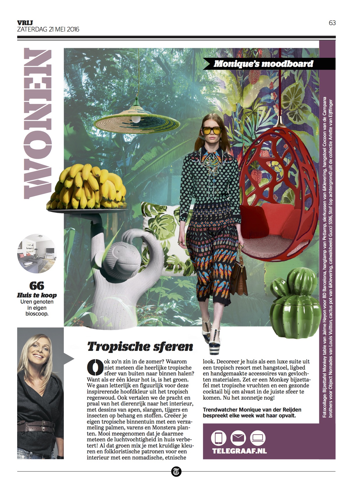
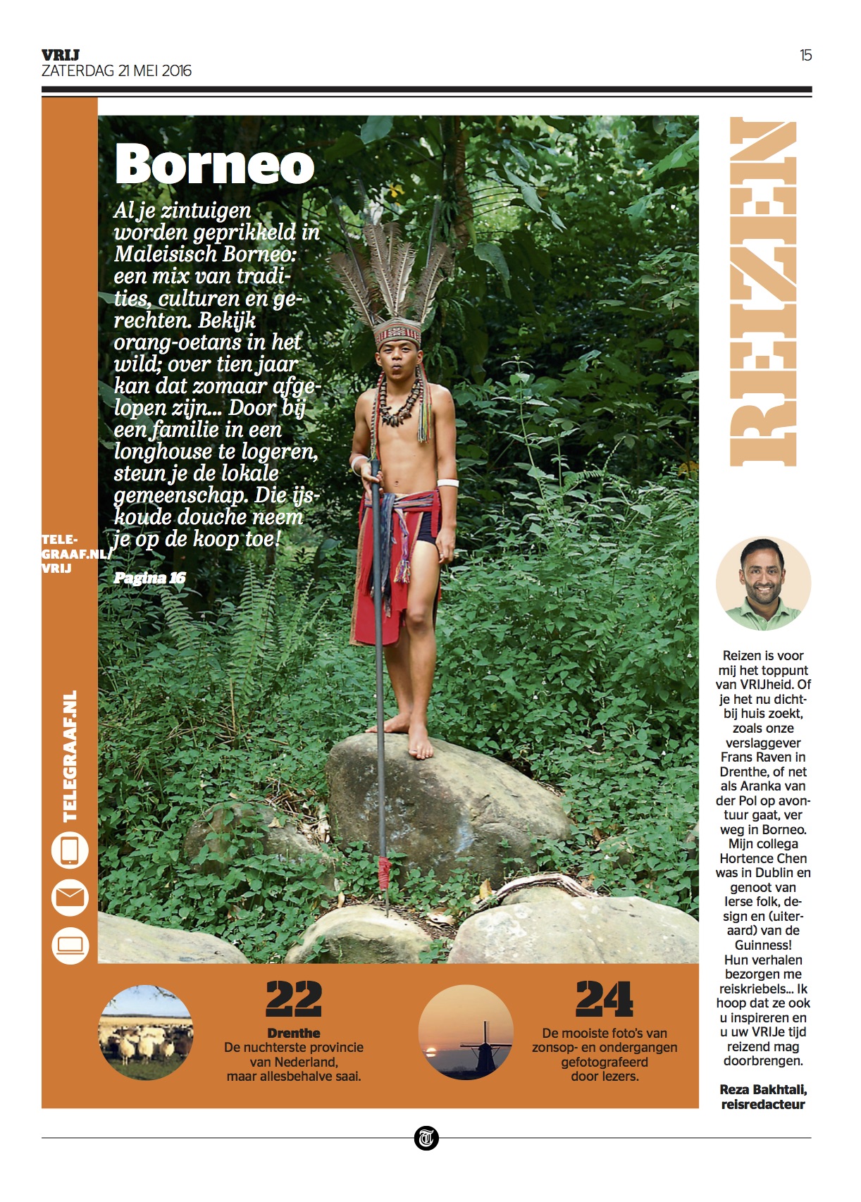
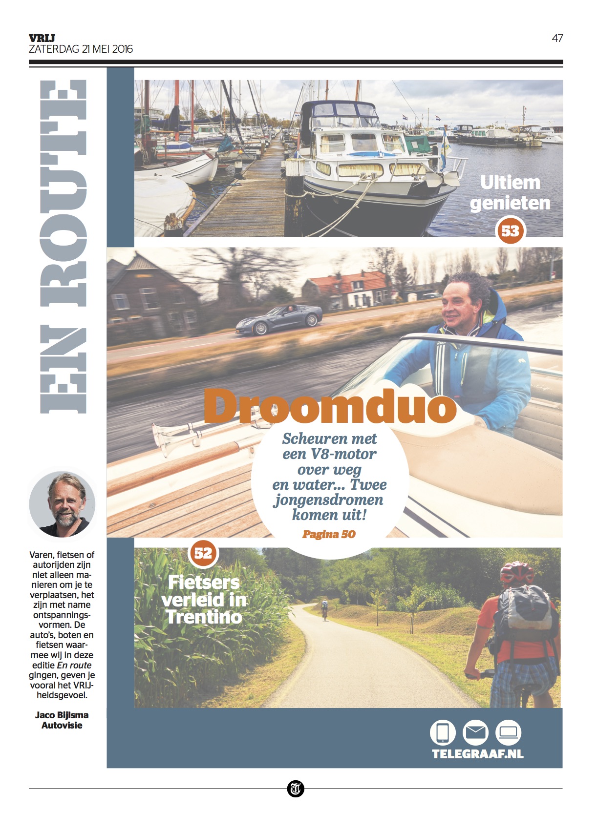
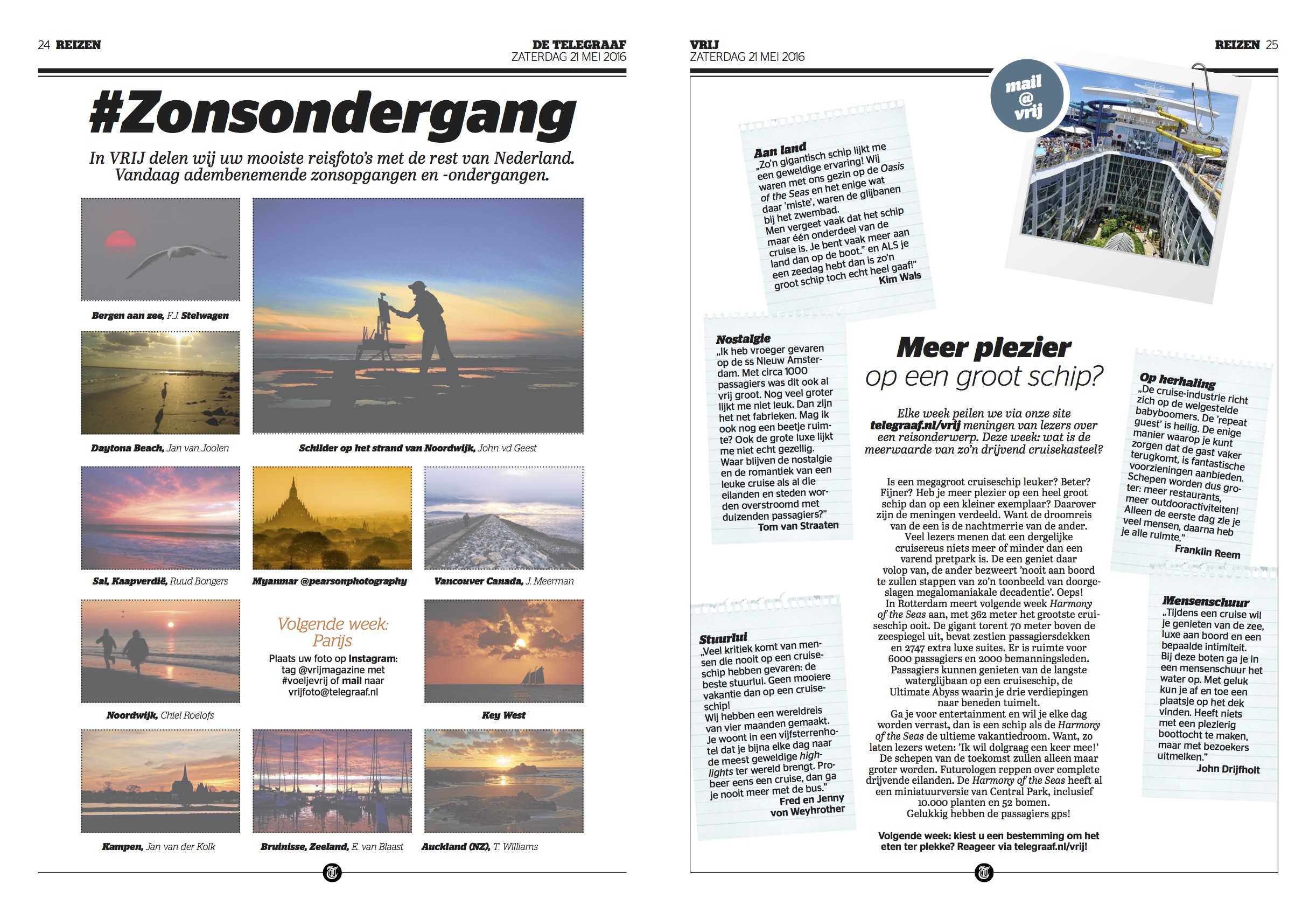
Reader of Holland's De Telegraaf are in for a new weekend product, a supplement that includes lifestyle, food, travel,homes, boats & cars, and a section titled “new life”. The supplement, in an A4 format, premiered May 21 to replace the old Weekend supplement that was printed in newsprint.
We at Garcia Media had the honor of working with the team of De Telegraaf, headed by Babette Wieringa, Vrij editor, and very closely with design director, Rig Hekenkamp, in the creation of the new product. Assisting was Walter van Sloten, art director, as well as Bulent Yūhsel, designer.
The idea for us designers was to create something new visually, but without abandoning the DNA of De Telegraaf, one of Holland's most traditional newspapers, with a distinct look that has made it unique for over a century.
But here we had a new product with appeal to a younger audience, so, from the start, Babette, the team and I set out to incorporate a bit of the more energetic elements that are a trademark of De Telegraaf, but also with some contemporary touches that, like the cover story (interview with Ruud Gullit, one of Holland's most legendary soccer players), offer a more upscale, sophisticated look.
Working with the talented Rig was a treat: Rig brings a fresh touch of elegance, a great feel for typography and experience as an art director. I previously worked with her and with the long time art director of De Telegraaf, Hans Haasnoot, on the previous redesign of De Telegraaf's conversion from broadsheet to tablet.
Vrij: The Type Palette
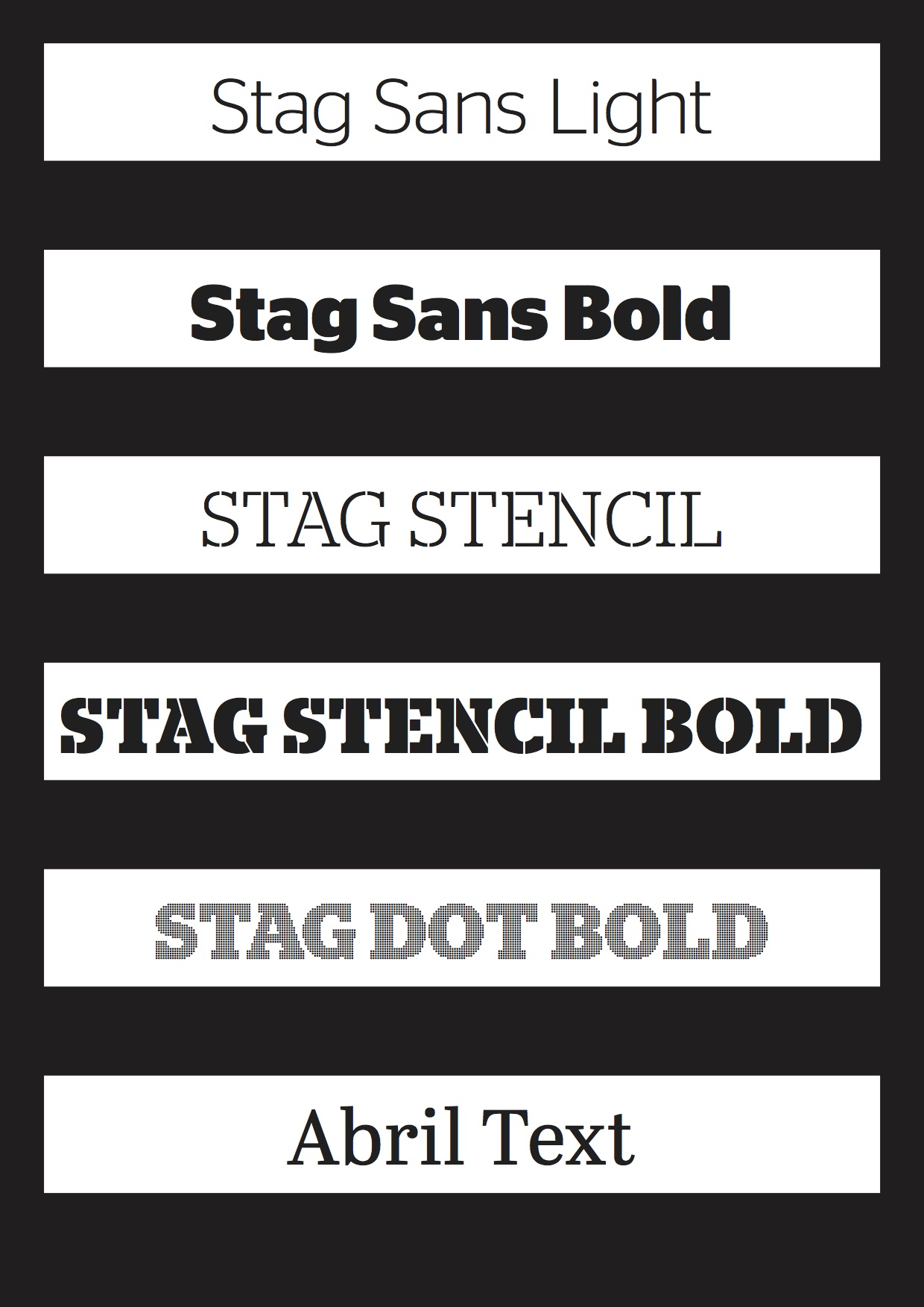
The type palette makes use of those wonderful Stag Sans variations. In our earlier prototype we had used the vigorous Stag Dots, but the editor did not like how it looked on the page, so, much to our chagrin, we had to abandon this part of the Stag Sans family. See images with Stag Dots below:
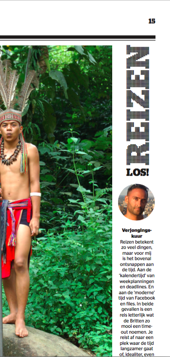
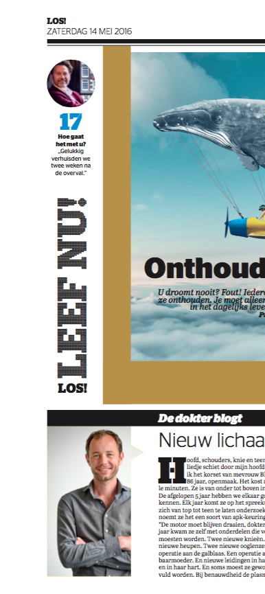
We used Stag Dots in the earlier prototypes, but this was abandoned for the final version. We still think it is a great choice!
Our previous blog posts about De Telegraaf
It’s a new De Telegraaf today
https://garciamedia.com/blog/its_a_new_de_telegraaf_today
De Telegraaf: it’s a new tabloid look where legacy meets the future
https://garciamedia.com/blog/de_telegraaf_launch_of_a_new_tabloid_format_today
De Telegraaf: The Road to Tabloid, Part 1
https://garciamedia.com/blog/de_telegraaf_the_road_to_tabloid_part_1
De Telegraaf: The ultimate design workout
https://garciamedia.com/blog/the_ultimate_newspaper_design_workout
The designer's role in the midst of order and chaos
https://www.garciamedia.com/blog/the_designers_role_in_the_midst_of_order_and_chaos