Amsterdam is one of those cities that never stops surprising, no matter how many times you arrive here. It is the canals, the narrow alleys full of personality and attitude. It is all those bicycles that seem to appear from everywhere.
Amsterdam, all visitors will tell you, is a city with plenty of character and attitude. All good.
It’s the same for Holland’s most uniquely different daily newspaper, De Telegraaf. It has plenty of personality and lots of its own attitudes about everything it covers. It has always been a closeted tabloid, in my view, regardless of its official format.
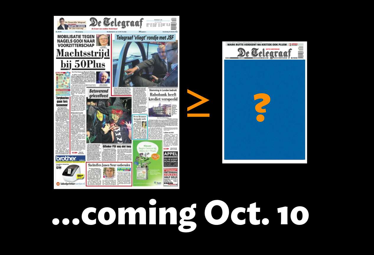
About personality: is there a more visually vintage and, yes, disorganized newspaper anywhere in the world? Well, Germany’s Bild comes to mind. But Bild, which is also a broadsheet with the character of a tabloid (it goes tab and more sophisticated for its Sunday edition), could be considered “contemporary design” by the standards of De Telegraaf.

Germany’s Bild is also a broadsheet with the spirit of a traditional down market tabloid.
The challenge
Newspapers, buildings and cities have personalities to preserve.
Those in charge of making changes to these institutions must beware of what the personality is, then work hard to preserve it.
The challenge for me and Garcia Media senior designer Christian Fortanet, working with the design team of De Telegraaf——Hans Haasnoot, art director, and Rig Hehenkamp, associate art director— was to travel that fine line that involves preservation of what is definitely the look of an iconic newspaper and at the same time the creation of a modern newspaper look, not just visually, but also functionally. (Telegraaf editor in chief is Sjuul Paradijs; project manager and managing editor, Babette Wieringa. A project of this magnitude could never take off without the enthusiasm and support of the editors. Sjuul, Babette and their team have provided plenty of that, for which we are grateful).
The new tabloid De Telegraaf is easier to navigate (we did review content flow and rhythm and readers will find that the paper flows more naturally, starting with the big story on double pages 2-3), slightly more organized (not totally modular, but with texts and photos more related to each other), and, we think, visually more appealing.
Yet, if you look at it and blink, you still see De Telegraaf that kings, queens, bakers and taxi drivers have read since 1893.
The lessons
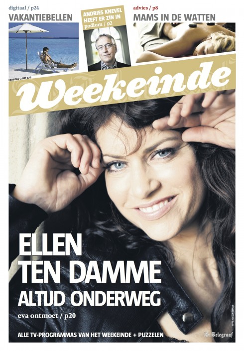
There is a lesson for me in every project. For me, the lessons of De Telegraaf began when Hans and I worked together on the remake of the weekend supplement, the first tabloid incursion for De Telegraaf. That was in 2012. It was our first encounter with the DNA of De Telegraaf. Read this as non modular, slightly chaotic, stories and photos coming out of everywhere letting readers make the associations in some cases.
When the weekend supplement appeared, it was extremely successful with readers, who are ultimately the best judges of whatever work we do.
Now, two years later, De Telegraaf moves to all tabloid, carrying with it a new size but the same old personality and attitude. I believe that the tabloid format will be the coming out of De Telegraaf, the moment of freedom to be what it always wanted to be.
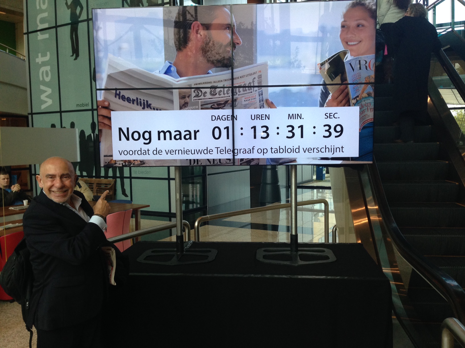
Stay tuned the rest of this week as I chronicle our experience during the countdown to Friday, October 10.
Hint: expect a slightly more sophisticated De Telegraaf, happier in its own (more compact) skin, and ready to shout out that headline that other newspapers may be too shy to use.
Countdown to tabloid

De Telegraaf's front page carries an “ear” next to logo daily with the number indicating the number of days till Friday, Oct. 10 and conversion to tabloid format.
Video: De Telegraaf’s transition to tabloid
This is a video that explains the process of change at
as it prepares to premiere its new look as a tabloid October 10.
The video includes interviews in both Dutch and English.
Previously about our work with De Telegraaf

The Weekend supplement of De Telegraaf converted to tabloid in 2012 with Garcia Media’s collaboration
De Telegraaf's weekend supplement launched as a tabloid
De Telegraaf: The ultimate design workout
https://garciamedia.com/blog/the_ultimate_newspaper_design_workout
The designer's role in the midst of order and chaos
https://www.garciamedia.com/blog/the_designers_role_in_the_midst_of_order_and_chaos