TAKEAWAY: Today we turn our attention to the specific elements of the design of Gulf News, which switched to a Berliner format June 1. Here is a review of the principles that guided our decisions for the look and feel of the newly rethought newspaper
It has been three days since the launch of the Gulf News in a Berliner format.
Early reactions are mostly positive, with the occasional reader who insists that he is getting less for his money, and, of course, the half dozen phone calls from irate readers who can’t find a specific content in a new package.
All of this very normal after the launch of a new product.
Miguel Gomez, design director, and I are in contact daily as he reports on production in the new format.
“So far, the newsroom team has taken to the new format in great style, with the usual hiccups here and there, but nothing major. There is a lot of pride in getting it right, and the journalists are happy with the reaction of the majority of the readers,” Miguel told me.
In a sense, the entire Gulf News team is aware that they are in a history making path: the first newspaper in the Arab world to adopt the Berliner format, and, not just that, but a change that has forced them to rethink how they work, and how print and digital platforms relate to each other.
That is the beauty of an organic change like the one we have done here: every aspect of the operation has been re-evaluated, just the way it should be.
The days when a change of format meant a simple “redesign” to accommodate the new canvas are over. We must take every opportunity to effect real change, the kind that both the journalists and the audience feels.
The basis of the new design
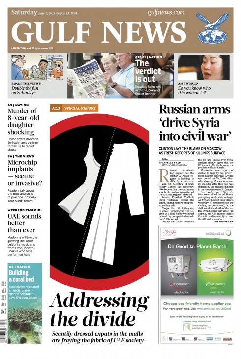
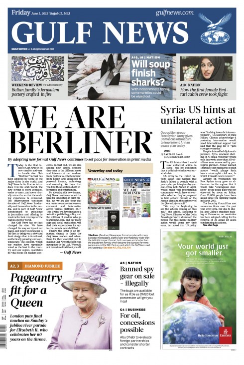
Many thanks to so many of you who have sent me emails and great comments about the new Gulf News design.
Miguel Gomez and I are proud of the results. This is a totally collaborative effort at every level. In terms of the design, Miguel and I spent close to one year creating, experimenting and eventually fine tuning the design that you see today.
The process was fascinating because to us this was not just a change to the Berliner format.
More than that, we asked the question:
How does one design the Berliner newspaper of the future? In the case of Gulf News, it is a newspaper that has already created the bases for a convergent newsroom, with the media quartet in place, and its own curated tablet edition.
The conversion to Berliner gave us an opportunity to conceptualize the design of a modern printed newspaper. What would that be like?
Here are some ideas that we discussed and used as the framework of the design:
The new Page One
_jpeg_thumb.jpg)
The color palette set for the Gulf News’ logo, which offers variety as opposed to a single color
Page One must be a fantastically functional navigator to the inside. The less text the better.
Page One must surprise at all times, and have the flexibility to accommodate the editors’ approach to the day’s news.
Page One is more likely to include surprises on page one, rather than a breaking news story, although we created the ability of the editors to convey urgency if necessary.
Page One would be less “text oriented” and more visual.
In terms of Page One logo colors, we created a palette that allows for the logo to go different, but all based on specific recurring hues. As you can imagine, this was not an easy concept to sell to editors who tend to be on the conservative side. I had already tried the multi color approach with the logo of the Sunday Style section at The Washington Post, which was done successfully, so that was the pre determining factor. Eventually, all the major deciding powers went along. The logo of the newspaper will assume the color that goes best with the lead visuals on the page, and that could include a black or white background, by the way.
The look and feel
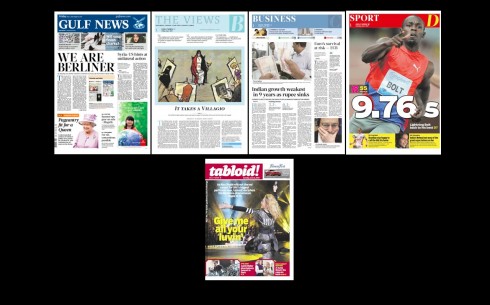
The new design for the Gulf News calls for each section to have its own personality
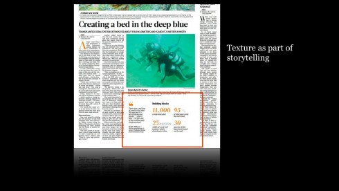
Providing texture within stories, secondary readings, is very important in the storytelling process
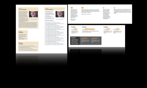
Adding texture: secondary quotes, numbers, fact boxes
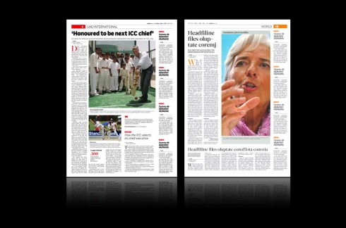
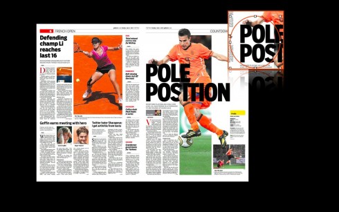
Our design for the Gulf News calls for major display of photos on each page: one photo dominates; the rest of the page includes various story structures from the longer lead pieces to compacts and snippets (briefs)
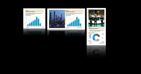
Here is the style for infographics in the new Gulf News
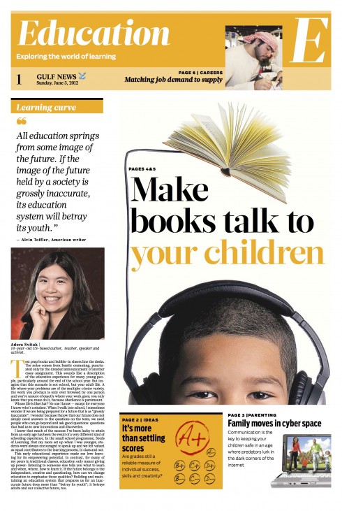
Cover of Education, one of several daily supplements that appear daily
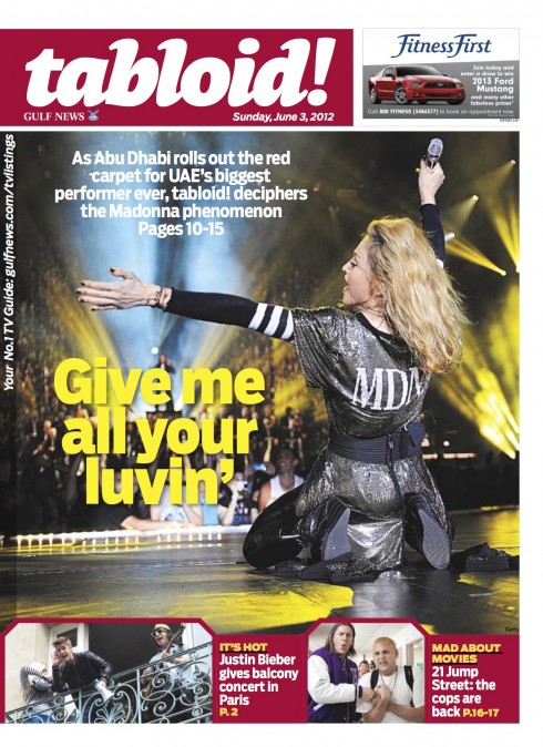
Tabloid, the entertainment supplement, appears in a quarter fold format (the folded Berliner)
One important decision for the designer is how the overall look and feel would work on a project.
From the start, I mentioned to Miguel that we would try to avoid the sameness that plagues so many newspaper designs that have not changed much since the 80s: the idea that every section must have the same personality. In reality, each section deals with content that is very different in scope.
Why should the Business Section have the same look as The View (which is all based on more text driven pieces, illustrations, and with a more dense type of texture)?
Inspired by that thought, we designed The View and Sports based on the “newspaper within the newspaper” concept. Typographically they are first cousins of the rest of the newspaper, but stylistically, they have their own personality.
The Berliner format is especially good for that, to offer visual variety while providing each section with its own personality.
In my way of thinking, if, for example, sports one day became its own daily newspaper, it could adopt this look; and, if The View was to be a weekly supplement published and sold separately, it could look exactly as it does now that it harmonizes with the rest of Gulf News.
The news sections all have their own, consistent look.
It is part of that visual symphony, with various tempos that indicate a variety in mood, content and texture.
We are likely to see more print newspapers following this direction, surprising with each section, and avoiding the monotony that has prevailed for so long, where “news inspired” design carries over and dominates sections which may not necessarily have a newsy angle.
The grid
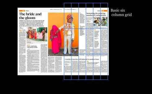
Bertliner pages look best when one adheres to the six column format. But there must be varieties, so we created those to give the pages texture and flexibility.
The typography
_jpeg_thumb.jpg)
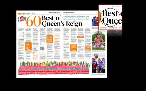
Glosa is the primary headline front for Gulf News
Salvo Sans is the secondary font, and used throughout the sports section exclusively
By selecting the combination of those two elegant fonts, Glosa and Salvo Sans, we managed to give the newspaper a fresh, sophisticated look that we consider to be timeless. Assuming that the Gulf News does not change its typography for many years to come, these two will satisfy the needs of any future design change.
The addition of Retina for the text of the Classified section—-what I call an all finger reading experience—-allows for ease of legibility. Plus, Retina is elegant and adds weight to those pages that are usually washed in small type.
Finally, we wanted a Gulf News that would inspire the “lean back” experience, not a newspaper that shouts. I believe that we accomplished what we set out to do.
As always, your comments are welcome.
Our previous blog posts on Gulf News’ switch to Berliner Format
Here is your new Gulf News Berliner format, new look
https://www.garciamedia.com/blog/articles/here_is_your_new_gulf_news_berliner_format_new_look
Report from Dubai 2: Gulf News prepares for Berliner, tablet progress
http://tinyurl.com/853rmnm
Report from Dubai: Gulf News prepares to switch to Berliner format
https://garciamedia.com/blog/articles/report_from_dubai_gulf_news_prepares_to_switch_to_berliner_format
The iPad Design Lab: Storytelling in the Age of the Tablet
Video walkthrough of the iPad prototype of iPad Design Lab
