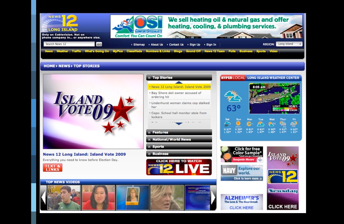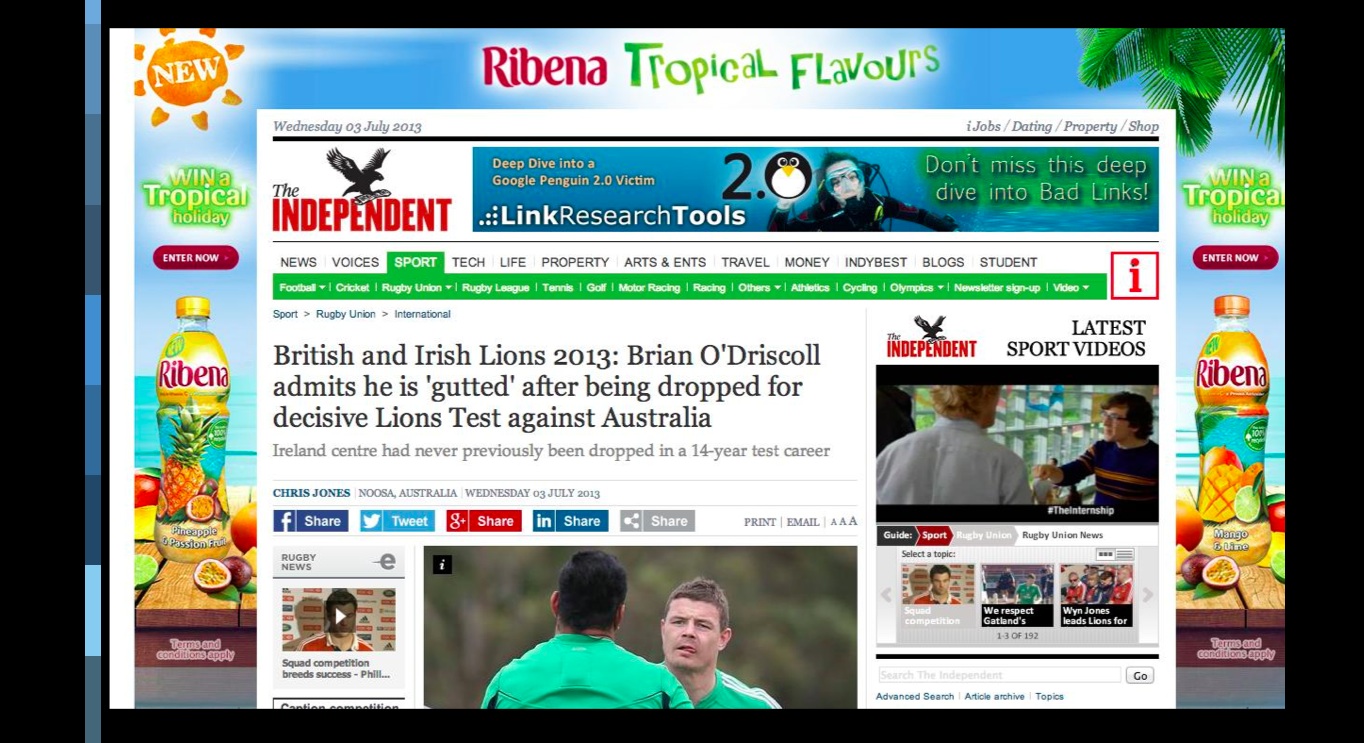

Ugly banner ads like the ones shown here are typical representations of the clunky and ugly ads that we see most often
I have finally found a banner ad that I truly like 20 years after the first one appeared. Why did it take so long? Are we seeing the end of banner ads?
To read the headline on a New York Times State of the Art column by Farhad Manjoo is to breath a sigh of relief: Fall of the Banner Ad: The Monster That Swallowed the Web.
Manjoo is eloquent in his dislike of those banner ads that try to grab us by the neck and into their often uncreative way of presenting advertising information. My favorite of his statements of rejection for banner ads: “clunky bits of sponsorship”.
“Twenty years ago last month, a team of well-meaning designers, coders and magazine publishers inadvertently unleashed on an unsuspecting world one of the most misguided and destructive technologies of the Internet age: the web banner ad.”
He proceeds to tell us that (alas!) these days “the banner ad is in decline”.
Decline, yes; extinction, doubtful. Like many other Internet creations of the 1990s Internet boom, those banners have become a part of the culture, something dangerous and likely to perpetuate their existence.
“Today we live in a mobile, social world, spending most of our time online using apps that load faster and are much prettier and more useful than websites,” Manjoo reminds us.
Manjoo believes that the possibilities of so-called native ads to finance journalism will likely put the final nail on the elongated coffin of those ugly banner ads. I hope so, too.
When the iPad first appeared, I thought it would be a great occasion to say adios to banner ads:
“We should think beyond those banners to which we have directed a blind eye, and move towards better storytelling that engages the audience with the product and the brand.”
Chobani has the taste for a nice banner ad


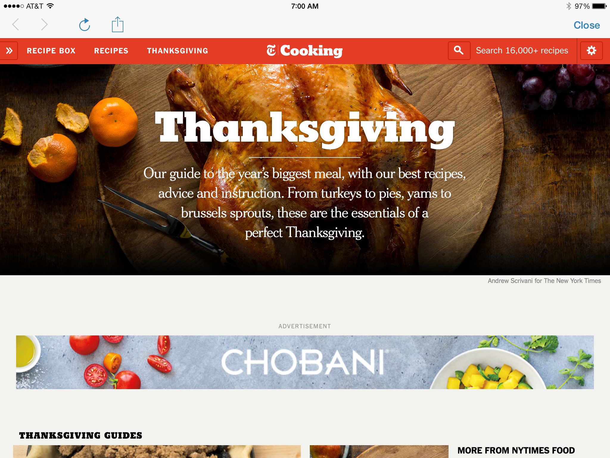
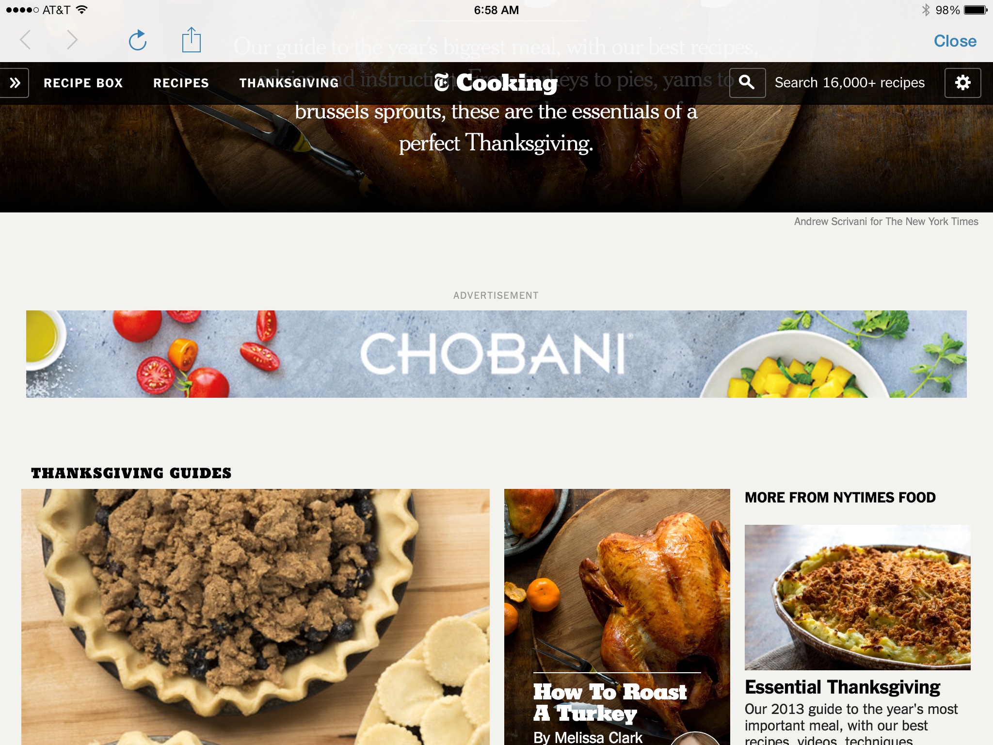
The Chobani banner ad in The New York Times’ Thanksgiving Cooking Guide: beautiful and fully integrated into content
But, while enjoying the Manjoo piece and the decline of banner ads, I ran into the most beautiful banner ad I have seen. It is for Chobani Greek yogurts and it appears in that very informative and beautifully designed New York Times Thanksgiving guide to cooking.
This Chobani banner ad is more like a silent ad: just the name of the brand Chobani, and nice images of fresh fruits used for Chobani yoghurts. It fits right in. It is inviting and, if you click on it, takes you to Chobani’s own turkey recipes. Well done, Chobani.
And a reminder that it is not the banner ads per se that are clunky reminders of an early Internet era, but it is what the “creatives” have done with those horizontal ad posters. Some are outright visual chambers of horrors.
The Chobani banner ads shows that it does not have to be.
More about banner ads in TheMarioBlog:
https://www.garciamedia.com/blog/the_ipad_ad_lab_1_wrap_that_ad_around_a_story
https://www.garciamedia.com/blog/the_ipad_ad_lab_2_kill_those_banners
https://garciamedia.com/blog/ponline_advertising_graduating_to_5.0_p
More about silent ads in TheMarioBlog:
https://garciamedia.com/blog/silent_ads_what_we_can_learn_from_online_advertising_strategies
https://www.garciamedia.com/blog/introducing_new_product_to_advertisers
Mario Garcia: teaching a Master Class at Poynter Institute

Innovation and Storytelling: Master Class with Mario Garcia
Here is where you can register to either attend the class in person, or via the archived replay shortly after the live session November 20.
Go here to register and more information:
https://www.newsu.org/masterclass-garcia