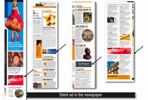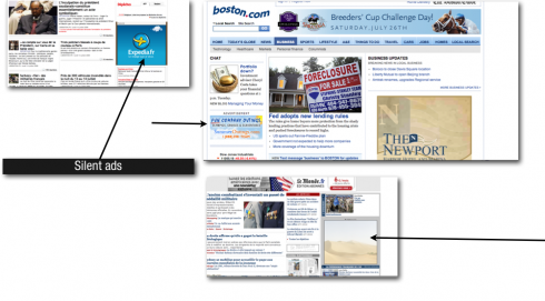

For years, newspapers have displayed advertising at the bottom of pages or in those awful staircases that rise from the corners of the pages, left and right. The world of editorial and that of advertising have been kept totally separate. When newspapers began publishing online editions, and because of the smaller canvas of the screen, advertising and editorial content were made to coexist.
Indeed, they have coexisted happily everafter. Users are smart and can tell the difference between and ad and editorial content. Of course, the word ADVERTISEMENT is placed in small type over the ad, just in case.
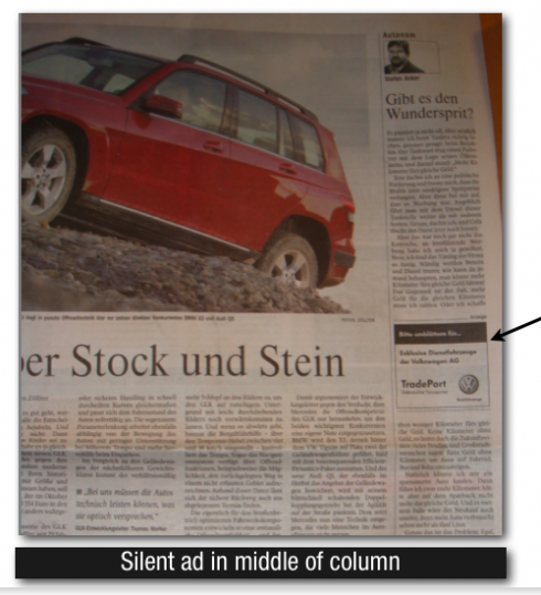
Now, printed publications take note of how online editions place ads, and begin to apply some of the same configurations to print. The result, what I call “silent ads” , advertisement specifically placed in the middle of summaries, navigational devices, and even columns of briefs, where the traffic is heaviest, and the ad noticed the most.
Advertisers pay a premium for a silent ad, which is usually only a “brand name” advertising. Readers see a brand name, that is all; no message, no text, only the logo of a company. Online, the website of the advertiser is one click away; in print, it is a matter of recognition.
Examples follow here. Silent ads are most popular with European and Asian newspapers, but have not taken off in the United States. It is a matter of time before this happens, I am sure.

TIPS: How to best use silent ads:
1. In vertical columns where “finger reading” prevails—such as in navigational units.
2. Also in the middle of a briefs columns.
3. Always place silent ads between elements, never at the top or very bottom of a column; their impact lies in their placement in the middle, allowing for more eyeballing effect.
4. Silent ads in vertical columns should not be deeper than 1.5 inches, so that they do not become an obstacle that the reader has to jump over to continue reading.
TOMORROW: A variety of ad configurations that break away from routine positioning.
WHERE IS MARIO? Home in Tampa, Florida!