
Because of the Thanksgiving Holiday in the United States we will not publish the next edition of TheMarioBlog until Monday, December 1. A Happy Thanksgiving to all.
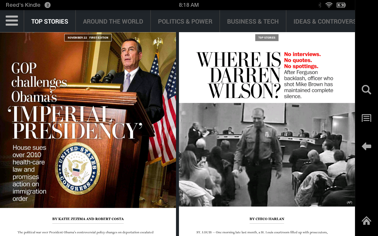

Editor's note: It's a development we were looking forward to: The Washington Post's new tablet edition for Kindle Fire. As I do not own one of these, I asked our art director & project manager Reed Reibstein to review it for us.
By Reed Reibstein, Art Director & Project Manager
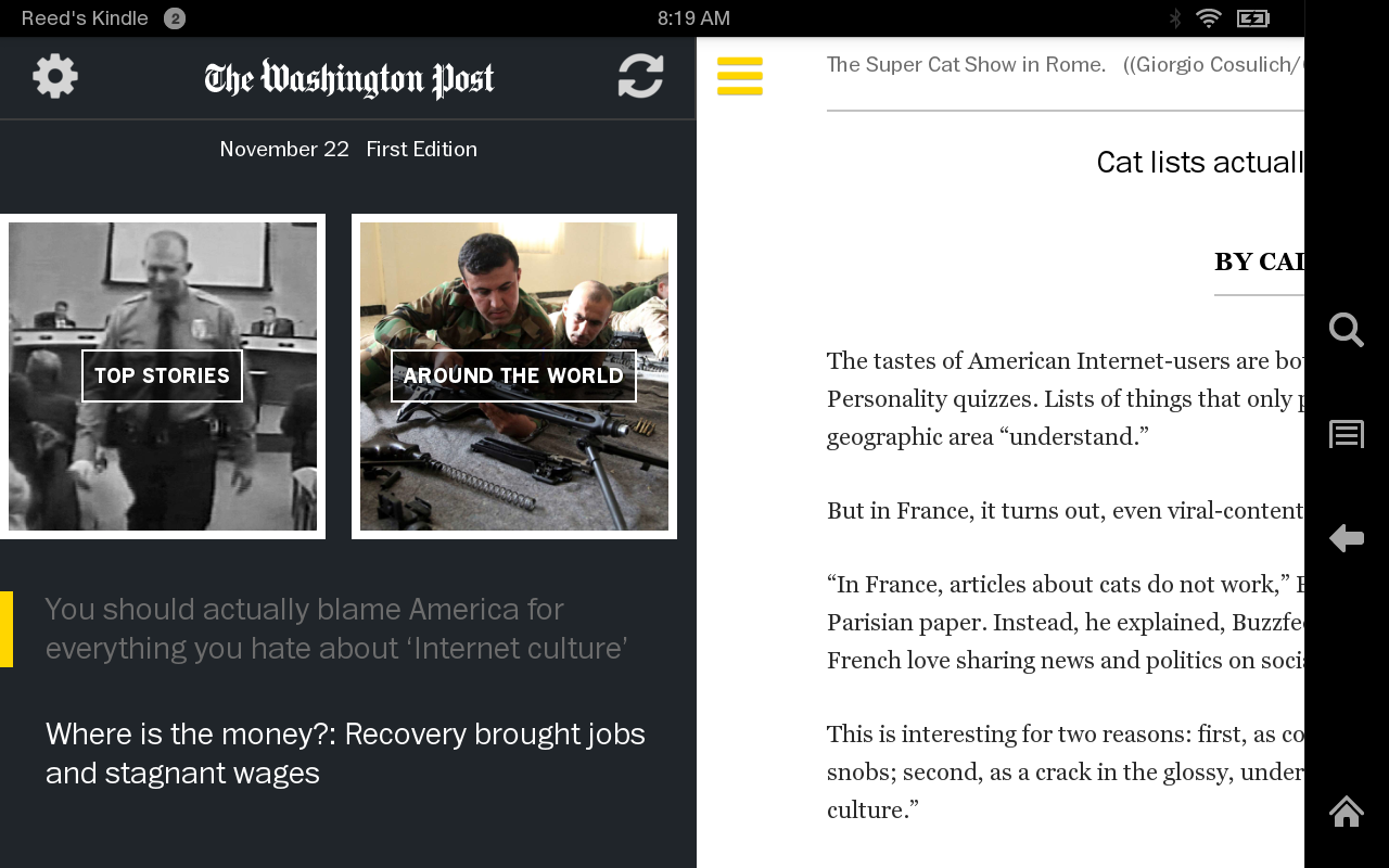
The Post's twice-daily edition features a multitude of lengthy stories—well over 100 across heterogeneous sections such as “Top Stories,” “Around the World” and “Ideas & Controversies.” Navigation is generally simple, with a swipe moving between vertically scrolling stories. Pinching the screen allows users to see and flip through two stories at one time, an intuitive way to scan each massive edition.
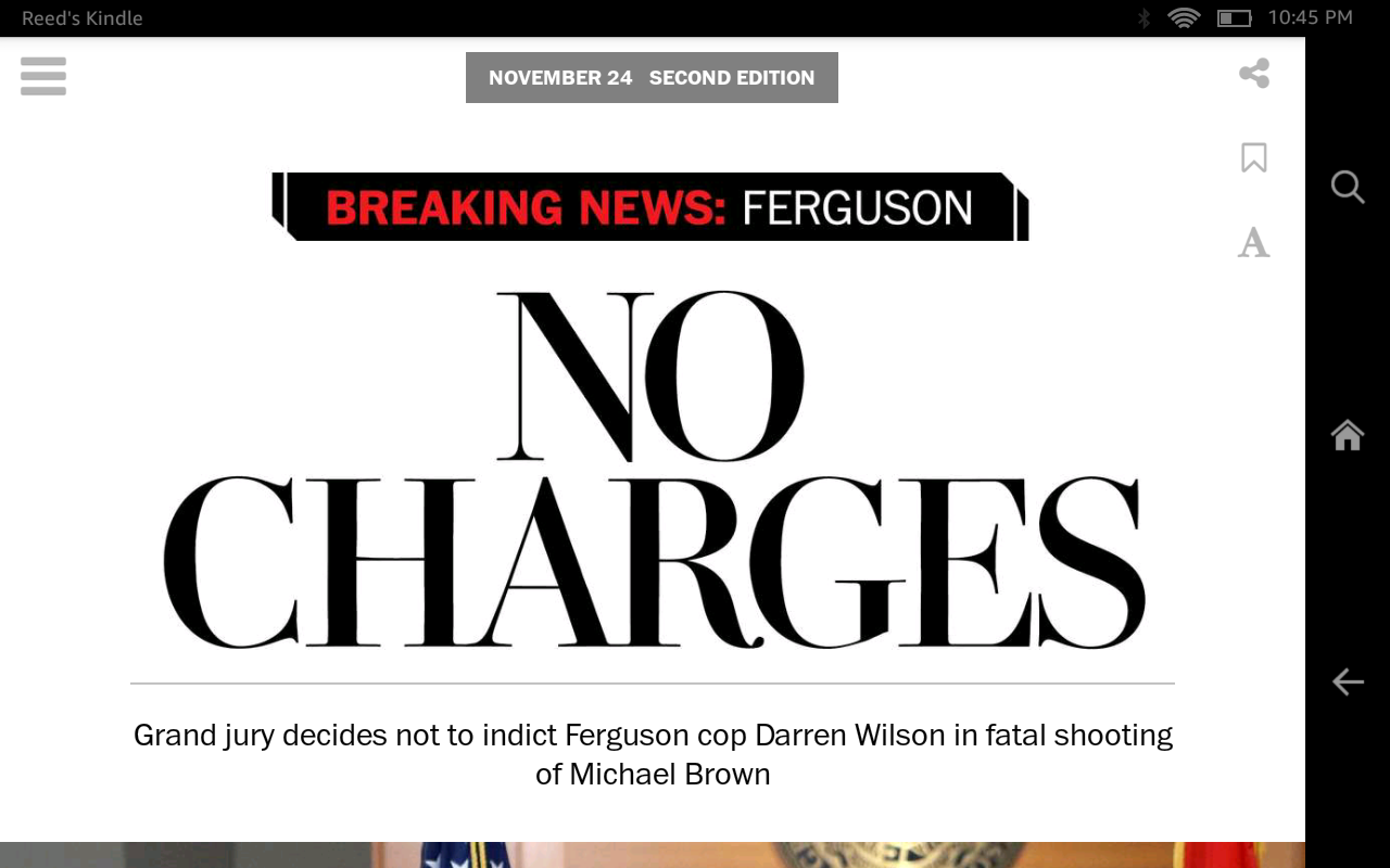
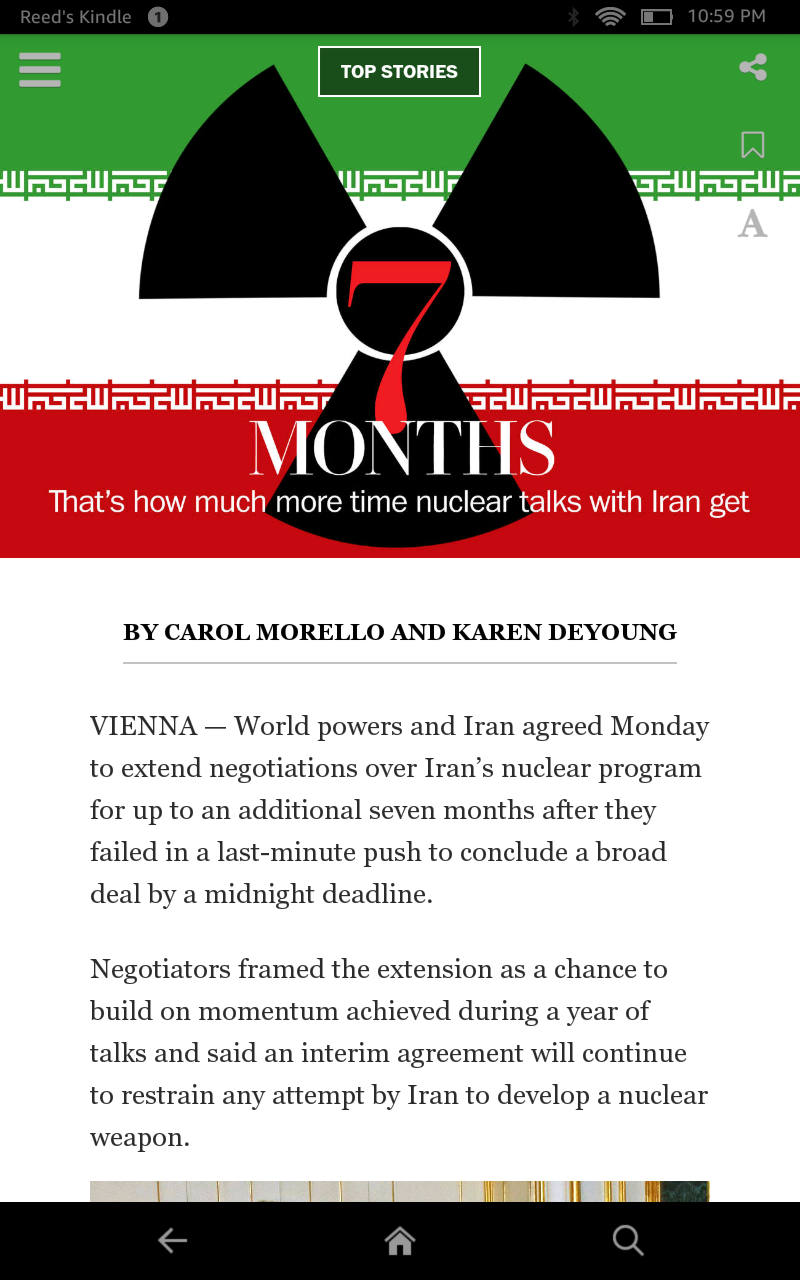
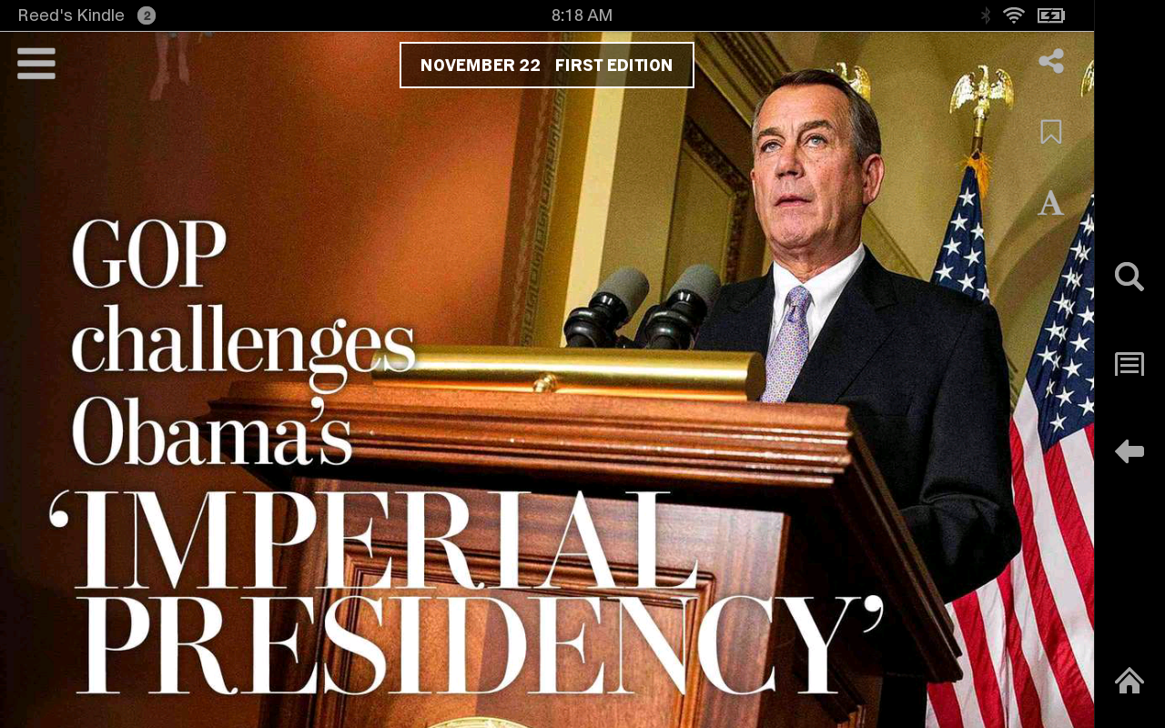
Many stories have richly designed typographic opening screens, the Post's designers clearly having fun illustrating the biggest news stories and features. The bodies of most articles contain few embellishments other than relevant photos and videos—few interactive “pop-up moments” are on display. It will be interesting to see whether certain stories gain a tablet-specific treatment beyond their openers as the edition develops and expands to other Android tablets and iPads.