Updated Saturday, March 28, 08:37 am EST
This blog will be updated serendipitously during the weekend as I make the transition from one month on the road to getting home and reacquainting myself with my family and surroundings!
Coming this Sunday: How Next on Sunday, Nigeria’s newest and most innovative newspaper, tackles an investigative story of consequence
St. Petersburg Times versus Tampa Tribune: the unofficial survey
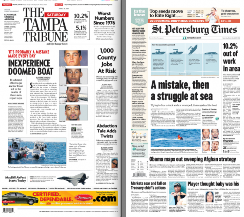
Front pages of today’s Tampa Trib and the St. Pete Times
I have completed my morning run, 45 minutes thru the beautiful grounds of my city Temple Terrace, a suburb of Tampa, known for its environmentally friendly ambience, tall oak trees, the Hillsborough River snaking around it, and allowing those of us who live right on it, spectacular views of the Florida flora and fauna—-including the occasional sleepy alligator, but also turtles, gazelles, and colorful birds.
I have lived in this neighborhood 24 years, and I have done morning runs around the Temple Terrace Golf Course, or by the River almost every day of those 24 years, when I am in town!
Today I noticed that one sees fewer wrapped newspapers waiting for their owners to claim them on the lawn of the big houses. But my most acute observation is that the St. Petersburg Times appears to be the newspaper of choice in the neighborhood, even though, of course, the Tampa Tribune has been here longer and is, after all, the Tampa newspaper. The Times has a Tampa edition—-and, in fact, I was involved with some of the early design for that edition when it was created. I counted 19 newspapers waiting for pick up between 7:50 and 8:30 am this lazy Saturday morning: 11 were the Times.
I, for one, respect both of my hometown newspapers and wish them many more years of their “friendly” rivalry in a city that has benefitted from the two papers and what they contribute to the community.
MINT of India: two years later, evolution of a new financial daily, and its design
Front page offers navigation, texts and even a silent ad to bring in the revenue
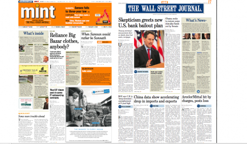
MINT”s front page left, and the inside front page of The Wall Street Journal, a daily offering from MINT with all WSJ content. Notice that we were able to put blue behind the WSJ logo here, and to illustrate the famous What’s Inside navigator, things not tried yet in original WSJ editions Notice also presence of “silent ad” in the What’s Inside navigator of MINT”s front page, left, in yellow.
Navigators: how the old Page 2 full nav gave way to better use of Page 2
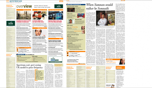
The original Page 2 was a full navigator to the inside and to online offerings. LIke at many other newspapers worldwide, at MINT, editors soon found out that many readers were skipping over this index, and would prefer a story there. So, the new Page 2 offers a meaty article that readers can tackle, with a minimized navigator. This has been my experience elsewhere: Navigators belong on Page One. It is a little too late to do this on Page 2, a lot of effort that is not properly compensated by readers.
Business of Life: daily features
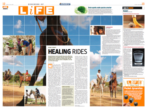
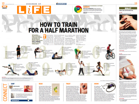
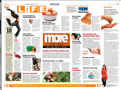
On weekends, it is Lounge section

India’s “new” financial daily turns 2
I remember it well, that first briefing in New York City, with Raju Narisetti, newly appointed editor with whom I had worked at The Wall Street Journal Europe, and now chosen to create India’s newest and most revolutionary financial daily, with the very approrpriate name MINT. Also present, HIndustantimes CEO, Rajiv Verma. We had a good workshop to kick off the planning of MINT. It was to be a Berliner format, the first in India; it was to be bright and energetic, but with gravitas, and, a big plus, it would be the only Indian newspaper to have access to The Wall Street Journal, several pages of which are included in MINT daily.
Raju has recently departed for The Washington Post, where he helps with the rethinking effort of that newspaper, and Anup Gupta, who was design director when we created MINT, is now working with me on the new design of the Hindustantimes. The rest of the staff remains pretty much like it was at the beginning.
The big surprise is that what we created two years ago has become better. Especially the feature sections, The Business of Life, and the weekend supplement, Lounge, have taken off as true design showcases, demonstrating that a financial daily with seriousness and credibility does not have to be visually dull. A lot of the credit for some of the vibrancy of the feature sections goes to feature designer, Manoj Madhavan, some of whose pages I display here.
The longevity of a design concept
It is the hope of every consultant that what we create at the start grows and evolves into something better than we ever dreamed. Sometimes it happens. When it does, it is because those inside take ownership of the project, and make it a point to build on what was created; when it doesn’t, it is usually because the foundations were not solidly planted, or a change of leadership—-could be the editor, or the design director—also brings a shift in direction. All of us in this business have seen examples of both in our work and projects. That is why, each morning during my visit to Delhi, as I picked up MINT, I had a great feeling of pride. Yes, 90% of what we started with is still there, but I see a lot that is new, fresh, and vital to the continued development of this newspaper, which started circulating only in Delhi, but now extends to four other Indian cities.
A question often asked: how often should a newspaper be redesigned?
The longevity of a design is only as good as those involved in its execution. While external factors such as audience changes, marketing strategies and competition can alter the course of a design, chances are that if good visual foundations were established, the design can enjoy a long life, with constant evolution based on the original creation.

Esquire magazine: a different and functional cover
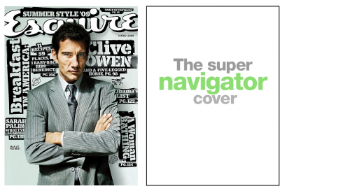
The designers of Esquire magazine always manage to offer surprises. For me, they have done so since as long as i can remember. The cover of the March 09 edition does it again: Clive Owen appears on the cover, arms folded and sporting a totally gray monochromatic look. The black and gray motif is developed through the rest of the cover, but what is interesting is that a type attack concept is applied for big headlines to the content inside. The headlines to inside content are positioned sort of like the graffiti we see on the walls of the subway.
And then there were two……
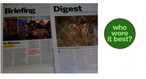
I picked up a copy of the Financial Times Thursday while passing through the Frankfurt Airport. It contains a special Health supplement with most valuable content, as expected. But what surprised me was to find a page titled Digest that seemed extremely familiar. Then, while on board my Lufthansa flight to Miami, I realized what I recognized about that Digest page from the FT: it was almost identical in typography, look and feel to what TIME does with its opening sections. Two peas in a pot.
Who wore it best? In my view, TIME, as the four-column architecture for the bottom of the page works much better.
He thinks it is the end of the printed book, but I don’t agree

Not sure I agree with Jacob Weisberg, editor in chief of the Slate Group, who in his The Big Idea column for Newsweek this week argues that:
The Kindle 2 signals that after a happy 550-year union, reading and printing are getting separated. It tells us that printed books, the most important artifacts of human civilization, are going to join newspapers and magazines on the road to obsolescence.
I don’t question Weisberg’s love affair with the Kindle 2 (yes, I am getting one, but perhaps waiting till the price drops a little!), but I do not for a moment believe that this little machine will totally eliminate our love for the printed book. Weisberg himself admits why printed books are special:
The Kindle is not better than a printed book in all situations. You wouldn’t want to read an art book on one, or a picture book to your children, or take one into the tub (please)…..
To me, those are reasons enough to admire the Kindle 2 and beyond, and give it a space in your life, but without abandoning those other printed artifacts that are not only wonderful to transport you with the writers to places they wish to take you, but which, to me, create a special environment when they surround you, as in the bookshelves of my home study, or on the coffee tables around my house (offering guests pleasant surprises as they flip thru the pages of that giant book of Havana Art Deco, between conversation and sips of champagne).
The printed book is more than just about reading the words and looking at the photos it contains. It becomes a personal possession. It becomes a companion. It is part of my landscape.By just looking at the cover of one of my books, I can immediately transport myself to when I bought it, when I read it, and sometimes that serves as an invitation to get it off the shelf and read it again. Did anyone mention Don Quijote?

iPhone apps to thrill, or to make life easier
Twice this week we devoted much space here to the iPhone. While Mr. Weisberg (above) may be hooked on his Kindle 2, I am forever intertwined with my iPhone. So I am delighted to read the WAlter S. Mossberg Personal Technology colum in The Wall Street Journal Europe. Mossberg is the guru of gadgets,and his recommendations are usually on target for me. He tells us that Apple offers a choice of 25000 widgets and offers us his favorites choices from the app store. And, by the way, Kindle, which can be downloaded free, is one of his choices.
For a link to the column cited above:
http://ptech.allthingsd.com/20090325/some-favorite-apps-that-make-iphone-worth-the-price/
Mossberg writes the Personal Technology column for The Wall Street Journal
His email: mossberg@wsj.com
UK: iPhone users lead way in Web, email use –survey
According to a Reuters story: over 90 percent of Apple Inc’s British iPhone users accessed mobile media in January including Web sites, e-mails, social networks and games, far higher than users of other mobile phones, research showed.
Market researcher comScore said on Thursday 79.7 percent of iPhone users accessed news and information in the three-month
period ending January, compared with 48 percent of other
smartphone users and 19.8 percent of all mobile users.
What is important to editors, and which corresponds with our postings about the iPhone and news of the past week is the following:
Almost 56 percent accessed news or information after
downloading an application.
Optimism from Al Neuharth
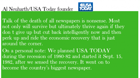
He is someone I admire, Al Neuharth, founder of USA Today, which is why I am happy to read his column in this weekend’s USA Today in which he urges newspaper people to simply perk up, work hard and not give up.
For text of the column, go here:
http://blogs.usatoday.com/oped/2009/03/tough-times-giv.html#more
The funny side
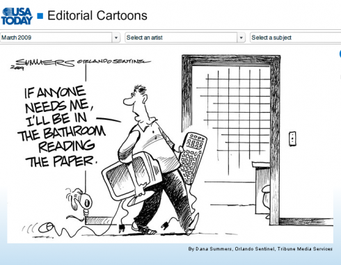
Cartoonist Dana Summers/Orlando Sentinel (Tribune Media Services) as published in USAToday, Friday, March 27, 2009
A smart discussion of the future, cautiously optimistic
This industry is definitely not lacking for its share of conferences, symposia, and all sorts of seminars dealing with “how can we save newspapers”.I read a lot of the information that emerges from these various events. However, there is a tone of repetition about what is discussed, and usually there is heavier concentration on “the way it was” rather than “the way it must be”. That is why I enjoyed reading the proceedings from the National Press Club’s forum Monday evening.
Some leading journalism executives, including my friend Alberto Ibarguen, with whom I had the honor of working at The Miami Herald when he was publisher, talked about reasonable ways out of the mess and all did so with a sense of cautious optimism. Not a bad thing, especially since each of the speakers offered convincing arguments and viable recommendations.
Some highlights
Tom Curley/president of the Associated Press, was perhaps the most optimistic, insisting that the demand for reliable news is growing, not shrinking
“Our profession is going to go through enormous growth after we get through this valley. But the next couple of years are going to be tough.”
Curley predicted newspapers would be around for decades. Yet, newspaper advertising is disappearing, he told host Marvin Kalb, so more revenue will have to be raised from readers.The demand for reliable news is growing, not shrinking, he said.
CNN President Jon Klein:
CNN has been able to capture a dominant position on the Internet as well as becoming a trusted source of news on television. Combining the two puts it in a strong position when the economy recovers
He agreed that private equity interests are seeing opportunities with news, and he advised students looking for their first jobs to seek start-up news organizations.
Alberto Ibarguen, president of the Knight Foundation:
Declining journalism revenues are leaving gaps in coverage. For the first time, the industry is not structuring news in a way that supports democracy. News operations are abandoning coverage of city halls, county commissions and state governments, undermining their role of “community bonding,”
Perhaps Alberto’s most valid point is that there is a “psychological shift” taken place in the public from being a news consumer to a news user.
“It used to be an I-write-and-you-read system. In the next generation, the consumer expects to participate in the discussion and to use it in some way. We should think about news as a utility. You pay the light bill, you pay the cable bill. Maybe you pay a news bill. I don’t know. But we ought to have all of these things on the table and stop trying to figure out how do we get back to 1970?
For more information:
http://www.press.org/wire/article.cfm?id=749
Mario’s video interview with Swedish magazine
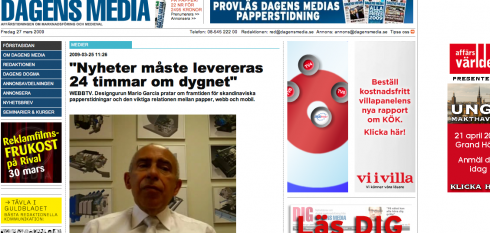
Those interested in a discussion about the future of newspapers, with emphasis on how Scandinavian newspapers, and particularly Swedish newspapers, face up to the economic crisis and the many changes in our industry, go here for video:
http://www.dagensmedia.se/mallar/dagensmedia_mall.asp?version=225919

English
– 10 Newspapers That Will Survive The Apocalypse
http://www.businessinsider.com/10-local-newspapers-investors-want-to-acquire-2009-3
– South Africa: Slump a factor in redesigns
http://www.journalism.co.za/index.php?option=com_content&task=view&id=2153&Itemid=37
.
– USA: ASNE Replaces Canceled Convention With Webinars
http://www.editorandpublisher.com/eandp/news/article_display.jsp?vnu_content_id=1003955912
– USA: How Sick is The New York Times?
http://recoveringjournalist.typepad.com/recovering_journalist/2009/03/how-sick-is-the-new-york-times.html
– USA: Newspaper sales slid record $7.5B in ’08
http://newsosaur.blogspot.com/2009/03/newspaper-sales-slid-record-75b-in-08.html
– USA: Washington Post Newspaper Facing Losses, Chairman Says
http://www.washingtonpost.com/wp-dyn/content/article/2009/03 …
– UK: BBC says it will share audio and video with newspapers
http://www.pressgazette.co.uk/story.asp?sectioncode=1&storyc …
– UK: Mobile media use on the rise
http://www.brandrepublic.com/Discipline/Media/News/893478/Mo …
– Canada’s Newspaper Readership High, But Not on the Web
http://www.editorandpublisher.com/eandp/news/article_display …
– The Canadian Press Mobile Launches Today
http://www.editorandpublisher.com/eandp/departments/online/a …
– Should readers be told about paid-for links on newspaper sites?
http://blogs.pressgazette.co.uk/wire/4893
– Can Media and The Web Coexist? [PDF]
http://www.mitchellmadison.com/articles/Can_Media_and_The_We …
– Heart is still set on media: Lachlan Murdoch
http://www.theaustralian.news.com.au/business/story/0,28124, …
– Newspapers look to digital as print faces challenges
http://www.dmnews.com/Newspapers-look-to-digital-as-print-fa …
– E-Book Market Heats Up—Barnes & Noble Pushes Free Reader for BlackBerry Users
http://online.wsj.com/article/SB123793101397630541.html
– News businesses must think about content, not just products, to ensure their survival
http://www.ojr.org/ojr/people/buttry/200903/1677/
Mario Garcia Jr. asks the question: How much should you listen to your audience after a redesign?
Here is his first paragraph for that posting:
One of my favorite stories that I repeat often to redesign clients is one my father told me after his redesign of the Des Moines Register newspaper. Four days after the paper launched the redesign, a frantic editor called him extremely concerned about the three hundred or so calls they received from readers who hated the redesign. My father instructed the editor to run out to the nearest liquor store and get a bottle of champagne. When the editor asked why my father told him that only getting three hundred “hate it” calls from a circulation of over 150,000 was cause to celebrate.
For complete post, go here:
http://garciainteractive.com/blog/view/40/
:
To read TheRodrigoFino blog, in Spanish, go:
https://garciamedia.com/latinamerica/blog/
Today Rodrigo takes us for a typographic tour around the world, as seen in this example, from Portugal
===
Portugal, Lisboa, Rúa O Século, Barrio Alto
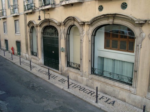
(courtesy of Francisco Gomez Nadal)
TheMarioBlog posting #226