This is the weekend edition of TheMarioBlog and will be updated as needed. The next blog post is Monday, Dec. 10
Update #2: Friday, Dec. 7, Frankfurt, Germany, 17:45
Final edition of Deutschland Financial Times
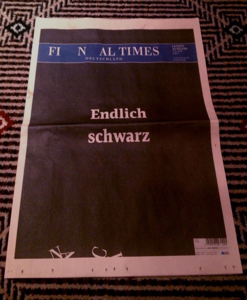
Today, Friday, Dec. 7, was the last day of publication for the German edition of the Financial Times. The newspaper, which printed on the traditional Financial Times peach colored paper, today wore black, with a headlined that read: Finally Black. Clever for a presentation for a newspaper that offered plenty of visual surprises, but perhaps not enough.
Must read this weekend:
In Defense of Tablet Publishing
http://www.joezeffdesign.com/jzdblog/in-defense-of-tablet-publishing
If you have a few minutes to lean back and read a valuable and focused piece on why tablets are the powerful communication tool that they are, then read Joe Zeff’s take.
Summary:
The death of The Daily has called into question the viability of iPad apps as a way to deliver magazine content. “Tablets in general, and the iPad in particular, are actually much less powerful and revolutionary than many of us had hoped,” writes Felix Salmon of Reuters. “Turds all around,” adds MG Siegler of TechCrunch.
Has digital publishing on iPad jumped the shark?
Not if done right.

TAKEAWAY: This is part four and the final segment of a series to discuss and to analyze the role of advertising in tablet editions of newspapers and magazines. Today: the ultimate tablet ads are cozy and comfy suites that welcome you in, tell you a story and keep you engaged. With this trio of mini stories from Cartier,they are also almost like honeymoon suites.
The ad that says: Let me tell you a story
First, I am quite aware that the ads shown here today are the ultimate: advanced in their creative execution, definitely expensive to produce and not at all well within the practical reach of a majority of the newspapers and magazines that carry tablet advertising.
I show them because they represent a goal that we should aim for. IF these ads are a 15—and they are!—-then let’s start by producing something that is NOT less than an 8, for example.
In the Thursday blog, we have discussed the rules of engagement. If we review them quickly: for a tablet ad to fully engage us, it has to do the following:
1. There is a story line. It is simple. It is direct. It invites further exploration.
2. Transports you to a place where story takes place.
3. Allows for interactivity
4. Keeps you within the app, not kicking you out to a mobile site, thus the concept of the advertising suite.
5. It avoids in your face promotion of the product, instead relating the brand to enjoyable content
Today, this is more about the advertising suite: that cozy place which in which, once you enter, everything is so enchanting that you do not want to leave, not even to link up to a product website to make a quick purchase. No, not yet. The advertising suite inspires you to think of the brand, the product, then remember the story in the ad sufficiently long to go for the purchase.
That is why, in a way, the advertising suite may be, to some, the anti-ad: the product is NOT in your face, the purchase deal is not closed in a second, but, oh, the message, the places it takes you, stay with you, making you want to acquire the product.
The ultimate advertising suites from Cartier
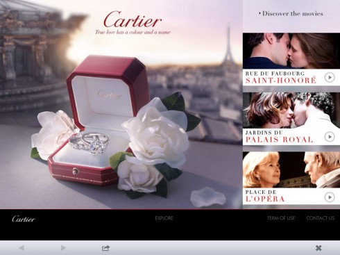
Here is the navigation to the ad: three videos to choose from as part of Winter Wonderland and L’Odyssee campaign for Cartier.
Here is what the user sees in the NY Times app to access the Cartier ad
The ads you will see below accomplish all of that and perhaps more: they appeal to our imagination, involving us in a little story that is even more ephemeral than those in a documentary or full length movie.
Cartier: Once upon a time in Paris, three love stores, three short movies. Cartier puts love in the spotlight with three short films inspired by proposals, brought to the screen by the Italian director Luca Guadagnino, 2011 Golden Globes
Cartier, Rue du Faubourg Saint-Honoré
True love has a color and a name
In a townhouse rue du Faubourg Saint-Honoré, a wealthy industrial family is celebrating the engagement of their only son. His fiancée seems lost in the middle of this splendor she has rarely experienced ….a moment, a doubt… But that’s overlooking the deep love the young man has for her.
Cartier, Place de l’Opéra
Love at any age
A mature couple is meeting at the Opéra Garnier where they once promised love to one another. An evening like any other after so many years spent together? Not with the affectionate playfulness they share. In this romantic mini story,
the exchange of a Cartier ring happens in the flashback. But, alas, the heroine wears very distinctively exquisite necklace and earrings, Cartier, of course.
Cartier – Jardins du Palais Royal
The proposal and two young playful lovers in the quaint streets of Paris
Two young lovers, the streets of Paris, their playfulness in close ups, and, at the end, the promise of love and, of course, a Cartier ring to seal the deal. They are not just selling all that new romance brings to mind, but, in addition, a retro look of those 1950s romantic films of the Italian variety.
?
Cartier – Behind the scenes of L’Odyssée
See how Cartier’s creative team developed the series of “mini cinema” ads for L’Odyssee.
Yes, that’s me in that Hitchcock movie poster!
While totally different, here is an example of the advertising suite that becomes a playground. We all like to see our names in lights. Why not? Our face on a movie poster, even better, so this advertising suite takes us there. In a few simple steps, I have gotten involved, I have played, and I see myself on the Hitchcock movie poster. This is real engagement. Will I go and see the film after that? Perhaps. What’s important is that I have become aware of its existence, I have recorded mentally what the main characters are, and now I am more likely to be receptive to the product and what it represents.
Getting there
So, how do we create and execute an ad that engages?
Let’s go through the steps:
First, you must know exactly what the product/brand wishes to sell. In the case of the Cartier ads shown here, jewelry is the object of desire, but luxury, as associated with Cartier, is also part of what must be conveyed.
Simply showing a beautiful diamond ring or necklace in a box would not do it for a legitimate tablet ad. That is where the mini story comes in. The item Cartier wants to sell becomes a secondary character in the story, where love, longing, passion, reminiscing are the main characters. At the end of each mini story, the Cartier brand and product move to the front of the camera. By then, we are totally immersed in the story, the moment….and the product for sale.
The Cartier advertising suite mini cinema moments sell a lifestyle, a concept, a moment, more so than a product. Our attention is never taken away from the story, and thus the product.
In the Hitchcock advertising suite, we are also fully engaged, keeping not just our mind, but also our finger, busy as we put ourselves in the movie poster.
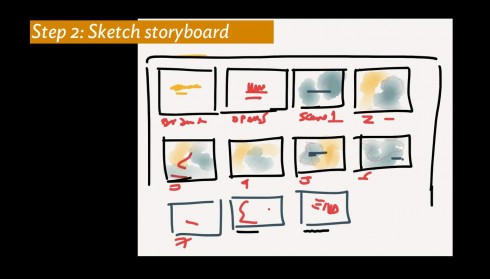
Second, you must create the storyboard for the ad, never forgetting that the brand’s identity must be present at the start and finish of the ad. If the advertising suite has an entrance and an exit door, then the brand must appear prominently on both. How does the message develop? Sketch the scenes to help the designers creating the visuals. This is where the creation of the tablet ad is like the plotting and planning of a documentary or full length film.
Once you grab the attention of the user, then plan your exit. Users are not going to spend too much time with you, so, as in the Aesop fables that we discussed Thursday, you must wrap the story up quickly, maybe in 50 seconds or less. Remind me of the product behind the ad.
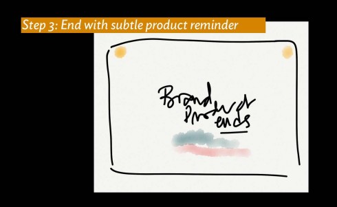
Third, provide me with the information I may need to act on whatever impulses the ad may have created for me. It could be instant shopping online, for example. Cartier does not necessarily go for the fast sale here, which is to be expected from one of the world’s most luxurious, top-of-the line brands.
The evolution of the advertising suite concept
The good news is that we are making good and fantastic progress even in the way we handle the advertising suites.
In their 1.0 versions, advertising suites, which I first discovered when the soon-to-disappear The Daily appeared, the advertising suites were more mini website than mini movie. They did close the door behind the user, to keep him/her within the app, but there was less of a storyline and more of a direct sale of the product.
An example of those was Virgin Atlantic, which you see here:
A different kind of talent required
It is not just that tablet ads require that we think away from the traditional advertising slogans, of the flat print-online inspired banner ads or the TV video ads. Indeed, the tablet is distinct from those platforms.
It is also that we need to think differently about the people who produce advertising. In most traditional media environments, the ad people may come together with print people once a week or once a month, but the synergy is NOT really there. It is us against them, or us and them, in the best of cases.
Tablet advertising says it must not be so.
I know extremely talented and creative people in advertising departments waiting to be tapped to create tablet ads. I also know extremely talented and creative storytellers in the editorial department that would be perfect to write that story that will become the next mini movie in the tablet ad.
These people are usually in the same building, but worlds apart. There is a new world waiting for them to be united.
Disregard the old lines of demarkation, the we versus them. We are emerging into a world where storytellers unite to tell stories, and the line between editorial and advertising may blur at times. Why not? In a world of constant rethinking of what we do, this, to me, is one of the most welcome aspects of saying yes to new ways of doing things.
It is the world of creative advertising for the tablet. Fusion of talent was never more important. Let’s blur those lines, bring down those walls, and let lights, camera and action start.
The advertising suite is now open and ready to welcome that talent. The year 2013 must be the year when we start publishing the 3.0 generation of tablet ads.
It all begins with a mini story—-could be yours, of course, and I will be curious to hear about the mini stories you may create for your tablet ads. Keep me posted.
Of related interest:
Flipboard seeks to elevate tablet ads
http://www.adweek.com/news/technology/flipboard-looks-elevate-tablet-ads-143439
Why journalists should explore the business side of news
http://www.poynter.org/how-tos/career-development/196857/why-journalists-should-explore-the-business-side-of-the-newsroom/
Highlight from article by Matt Thompson:
I’m saying journalists should become more engaged with the revenue-producing sides of their organizations. I’m not saying they should storm into their sales offices and say, “All right, we’ll take it from here.” While we do need more money-where-your-mouth-is entrepreneurial risk-taking, we also need journalists to recognize what they can contribute to the search for new ways of doing business, and what they can’t.
Previously in the iPad Ad Lab series:
The iPad Ad Lab #1: Wrap that Ad Around a Story
https://www.garciamedia.com/blog/articles/the_ipad_ad_lab_1_wrap_that_ad_around_a_st
The iPad Ad Lab #2: Kill Those Banners
https://www.garciamedia.com/blog/articles/the_ipad_ad_lab_2_kill_those_banners
The iPad Ad Lab #3: Rules of Engagement
https://www.garciamedia.com/blog/articles/ipad_ad_lab_3—rules_of_engagement
Brazilian newspapers pay tribute to architect Oscar Niemeyer
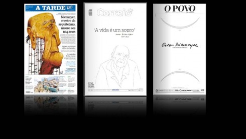
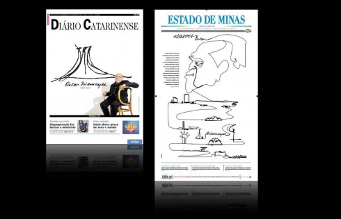
Here are some pages from Brazilian newspapers paying tribute to Oscar Niemeyer, the celebrated Brazilian architect whose designs can be admired around the world. He, died on Wednesday in Rio de Janeiro. He was 104.
Take advantage of our iPad Design/Ad Lab workshops
Do you want to take your brand to the next level by creating a tablet edition? Garcia Media can help. We now offer one- to two-day iPad Design Lab workshops on demand to jumpstart your presence on this exciting new platform. We also offer iPad Ad Lab workshops to develop engaging advertising models for your app. Contact us for more information.

Purchase the book on the iBookstore
The EPUB version of book is HERE:
Now available: The EPUB version of iPad Design Lab: Storytelling in the Age of the Tablet, ready for download via Amazon.com for Kindle:
http://tinyurl.com/8u99txw.
Take a video tour of iPad Design Lab
“iPad Design Lab” trailer on Vimeo.
Read the Society of Publication Designers’ review of The iPad Design Lab here:
http://www.spd.org/2012/10/must-read-ipad-design-lab.php

Keep up with Mario Garcia Jr. via Garcia Interactive: helping transform online news since 1995.
www.garciainteractive.com
Here’s a gift you don’t have to wrap!

It’s official. The Christmas/holiday shopping season is here.
Here is a suggestion for someone on your list, the digital book iPad Design Lab: Storytelling in the Age of the Tablet. No need to stand in line, no need to buy wrapping paper. Just send it to someone you think might enjoy a book about this magnificent new platform that is the tablet, and how to maximize its potential for storytelling.
Here is how you can get the book:
The original version of the book is the multitouch textbook version available on the iBookstore for iPad (iOS 5.0 and up):
https://itunes.apple.com/book/ipad-design-lab/id565672822. This version includes video walkthroughs, audio introductions to each chapter, swipeable slideshows, a glossary and a sophisticated look and feel.
Apple only sells multitouch textbooks in certain countries at this time, unfortunately. Copies are available in at least the following countries: Australia, Austria, Belgium, Canada, Finland, France, Germany, Great Britain, Greece, Italy, Latvia, Luxembourg, The Netherlands, Poland, Portugal, Romania, Slovakia, Spain, and the United States.
For those in other countries and without an iPad, we have made the book available in a basic edition for other platforms. This basic edition includes the full text of the original, along with the images and captions, but lacks the other features such as audio and video. It is available on the following platforms in many countries:
Amazon Kindle: http://amzn.to/SlPzjZ
Google Books: http://bit.ly/TYKcew
Scribd: http://bit.ly/PQTwla