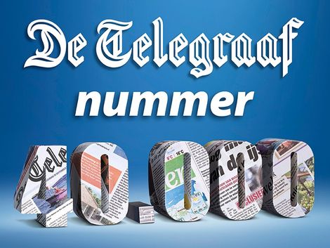
De Telegraaf today publishes its 40,000 edition!
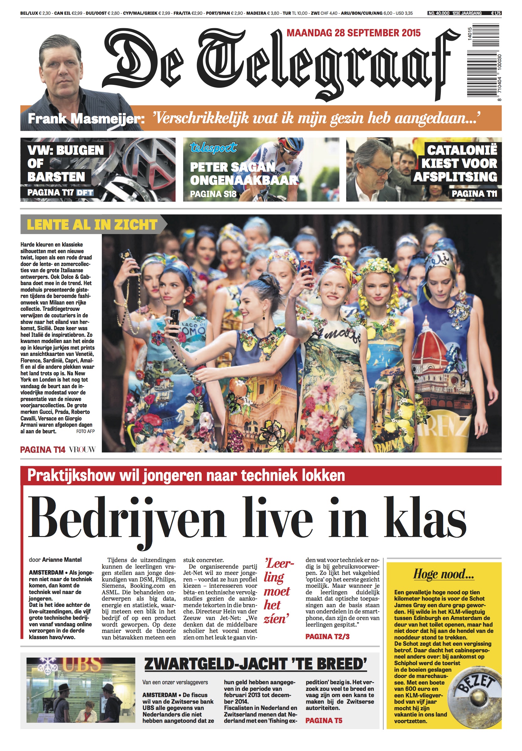
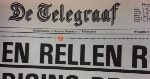
Front page of the first edition of the September 28 De Telegraaf
_JEPG.jpg)
The typographic palette: Stilson, Abril Tilting and Tablet Gothic
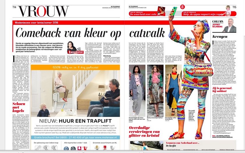
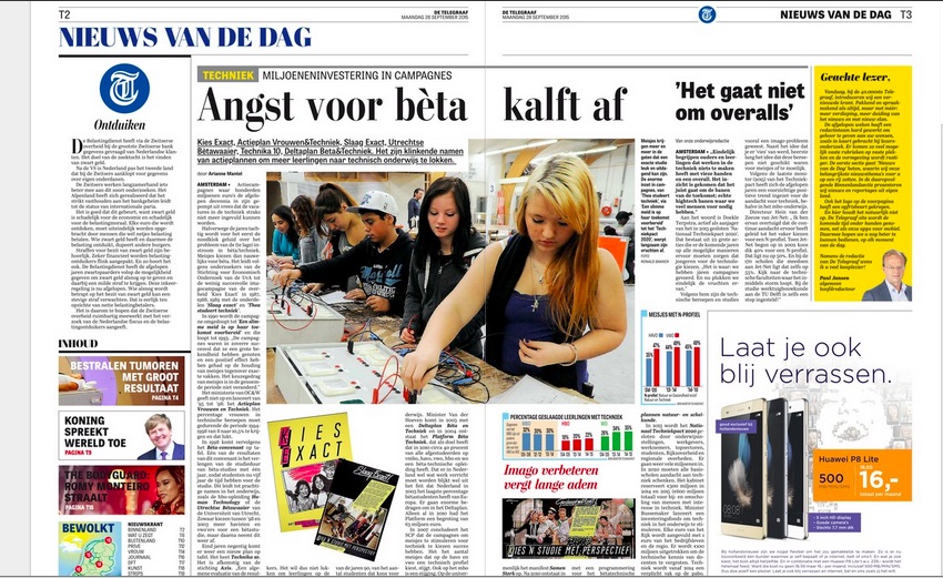
Various pages from today’s edition of De Telegraaf: a more modular and organized design throughout.
We at Garcia Media are no strangers to De Telegraaf. For the past 3 years we have worked with the various teams of Holland’s most iconic daily. We were involved in the creation of the new Weekend edition in 2012.
Then, in 2014 we collaborated with the team guiding De Telegraaf through the format switch from broadsheet to tabloid. That was almost a year ago in October. Readers liked the new format and told us so.
Today, however, with a new editor at the top, Paul Jansen, the idea is to retouch the design of the tabloid, make the newspaper better organized and its inside pages less congested. De Telegraaf you will see today is more modular, with fewer of the “dog legs” that are such a part of its visual DNA.
More importantly, Paul is incorporating a new concept for how the content flows in the print edition, starting with the double page spread of pages 2-3, which develop the main story of the day, complete with a commentary and the story in numbers when appropriate. The next few pages are a combination of the best news and features of the day, regardless of section. From that point on, the paper begins with the national section, etc.
In Paul's own words:
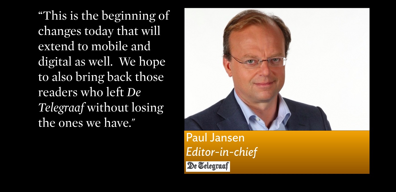
“We are trying to bring De Telegraaf to the next level—our intention to create a complete edition with the stories that are important today, not yesterday's news. The position of print has changed dramatically. Till now, De Telegraaf did not do that, so this is an effort to recognize that the role of print is different.
“We are trying to accomplish that without alienating our core readership—those smart, loyal and less connected newspapers that have followed De Telegraaf for year. This, of course, is a balancing act, but it is part of an evolutionary process. This is the beginning of changes today that will extend to mobile and digital as well. We hope to also bring back those readers who left De Telegraaf without losing the ones we have.”
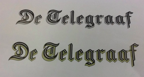
The logo
![]()
De Telegraaf’s new art director, Rig Hehenkamp, felt that the logo could utilize some retouching. I agreed that we should probably send the logo for a face wash, at least. It is great to have a great type designer in the neighborhood ,Erik van Blokbland, who accepted the assignment and cleaned up the letters, providing us with various versions of how the logo could be changed.
This is the version that was accepted and appears for the first time in today’s newspaper.
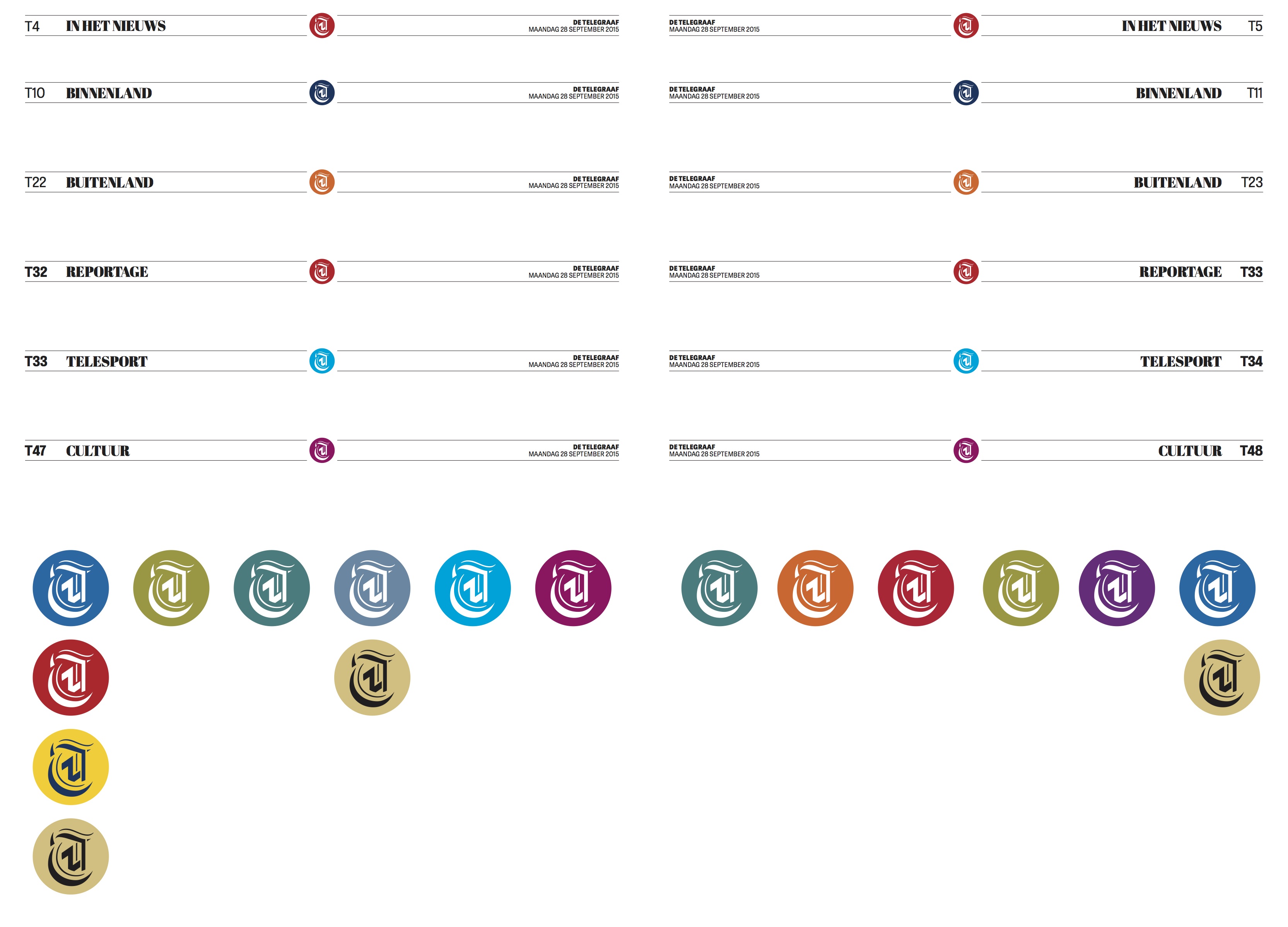
The new T

Part of the concept is to utilize the T in De Telegraaf more, and, particularly, with the digital/mobile editions
A little logo history
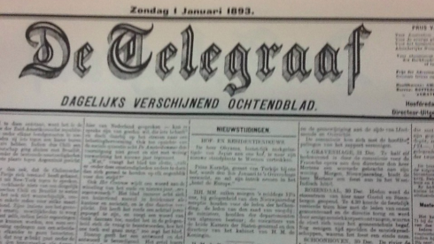
This is the original 1893 logo of De Telegraaf
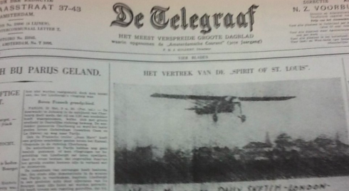
This is the logo during the 1920s
The logo during the 1980s
The 2012 revision of the logo by Jim Parkinson
Other details of the new look
Previously about De Telegraaf
Conversion from broadsheet to tabloid in 2014
https://garciamedia.com/blog/de_telegraaf_the_road_to_tabloid_part_1
https://www.garciamedia.com/blog/de_telegraaf_the_road_to_tabloid_part_2
https://www.garciamedia.com/blog/de_telegraaf_the_road_to_tabloid_part_3
Telegraaf’s weekend supplement launched as a tabloid
De Telegraaf: The ultimate design workout
https://garciamedia.com/blog/the_ultimate_newspaper_design_workout
The designer’s role in the midst of order and chaos
https://www.garciamedia.com/blog/the_designers_role_in_the_midst_of_order_and_chaos