As of Sunday, April 2, the Las Vegas Review Journal introduced a new look, as well as a new version of its logo.
This is the work of my friend and colleague J Ford Huffman, formerly of USA Today. J Ford was the consultant in charge of directing the redesign of the for the Las Vegas Review Journal. He and I exchanged notes this weekend since I redesigned the Review Journal exactly 17 years ago, at which time we changed the logo, too, to introduce the one below which has now been retired.
Designs come, designs go as publications make changes, adapt to new realities, and simply want to get rid of wrinkles and aches. Here is the logo that we introduced in the earlier redesign, which has now been eliminated.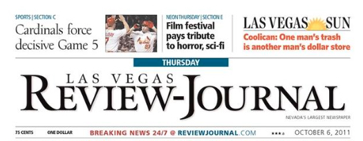
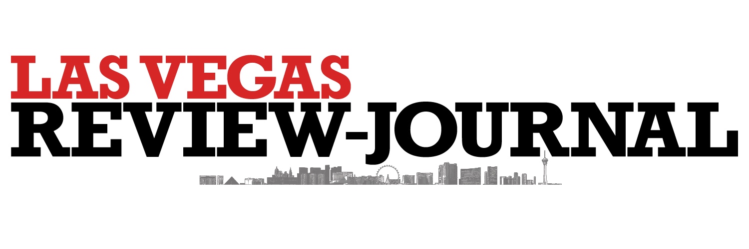
Here is the new logo of the Review Journal.
I have asked J Ford to give me his comments and explanations for the changes introduced Sunday:
About the logo
The logo even includes the skyline of Vegas
In thinking about the possibility of an image, we considered the mountain range or the Strip.
The Strip won. The East perspective, south-to-north rendering of the Strip is by former staff artist and helps establish the Review-Journal as a voice and a part of a local community that’s a big city that attracts global visitors. Not all local readers visit the Strip on a daily basis but the area remains the cultural, economic, geographic and visually iconic center the city.
The Review-Journal will consider revising the rendering when new structures change the skyline considerably.
The typography of the new logo:
The logotype, in a bold face of the font called Rockwell, dominates the nameplate on Page One in print.
Typography fans will note that the logotype adjusts the depth of the font’s capital “J” so that the letter requires less depth.
The logotype emphasizes “Las Vegas” prominently in red – inspired by the colors of Clark County, from neon signs to Red Rock mountain. We call it Red Rock Red.
Rockwell letters have square serifs and evoke 19th Century fonts used in show bills and signage often associated with the old West. The nod to typographic history also has a contemporary boldness that offers a no-nonsense image that reinforces solid, impactful journalism.
The red is nod to the mountains and to the colors of the Strip.
About the new typography and why it was selected
BODY TYPE is Utopia 10.8 — up from the previous Olympian 10. Unjustified, or, hyphenated ragged right, which avoids wide word spacing.
HEADLINES are in Minion bold, with drop headlines in Minion regular.
LABELS and sans-serif display type is Griffith Gothic.
The style? Every element is flush left: From the logotype to headlines to bylines.
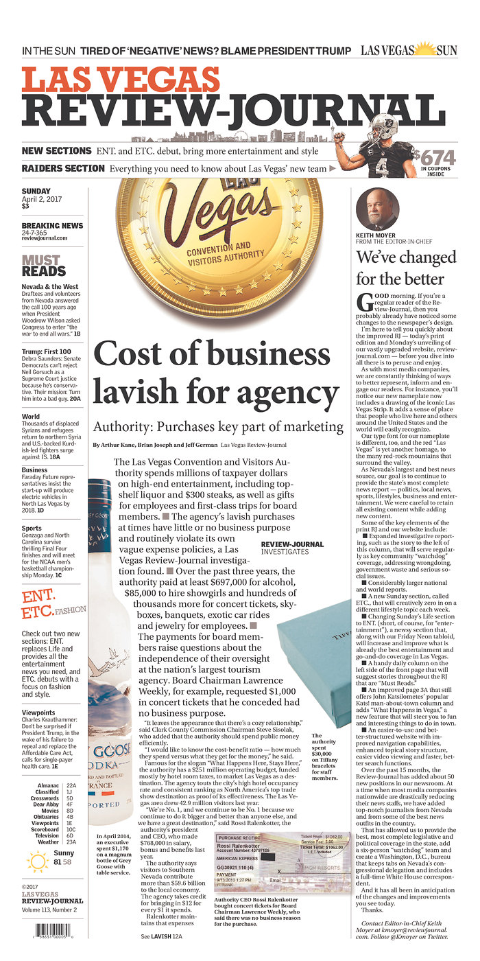
The front page of the new design
Good design requires good content, and vice versa.
Today‘s Page One centerpiece, about the spending habits of staffers at the Las Vegas Convention and Visitors Authority, funded by taxpayers, is a report by the Review-Journal’s new investigative-reporting team.
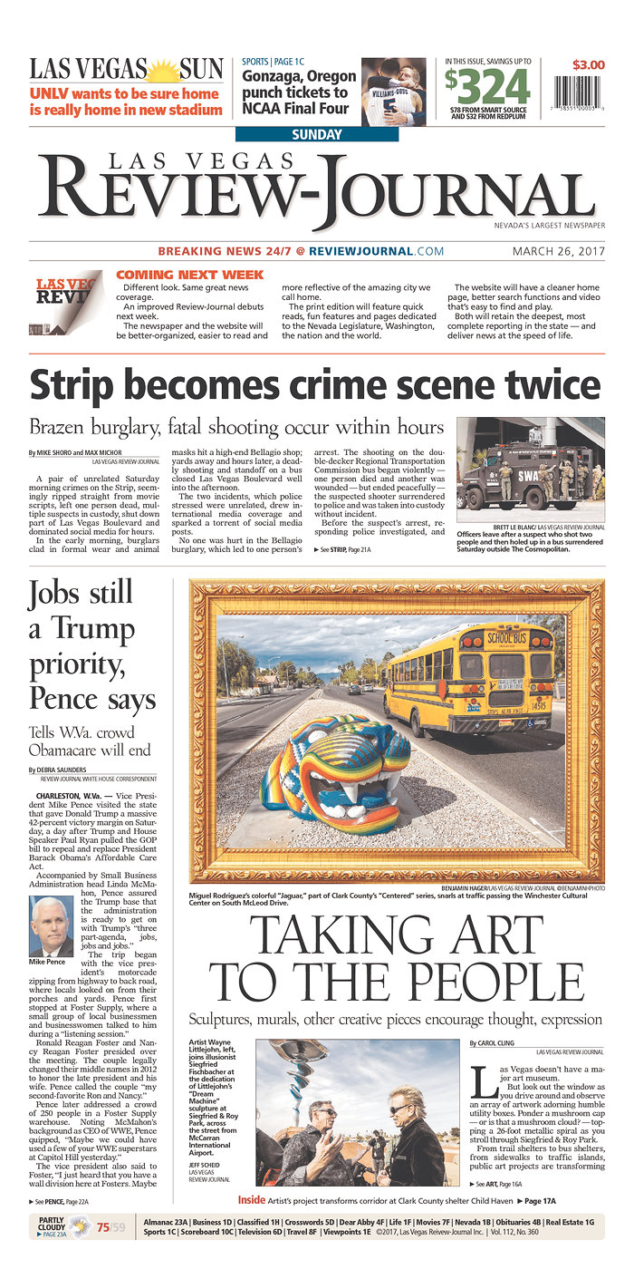
And, for comparison, the last Sunday front page in the old design.
The new entertainment supplement.
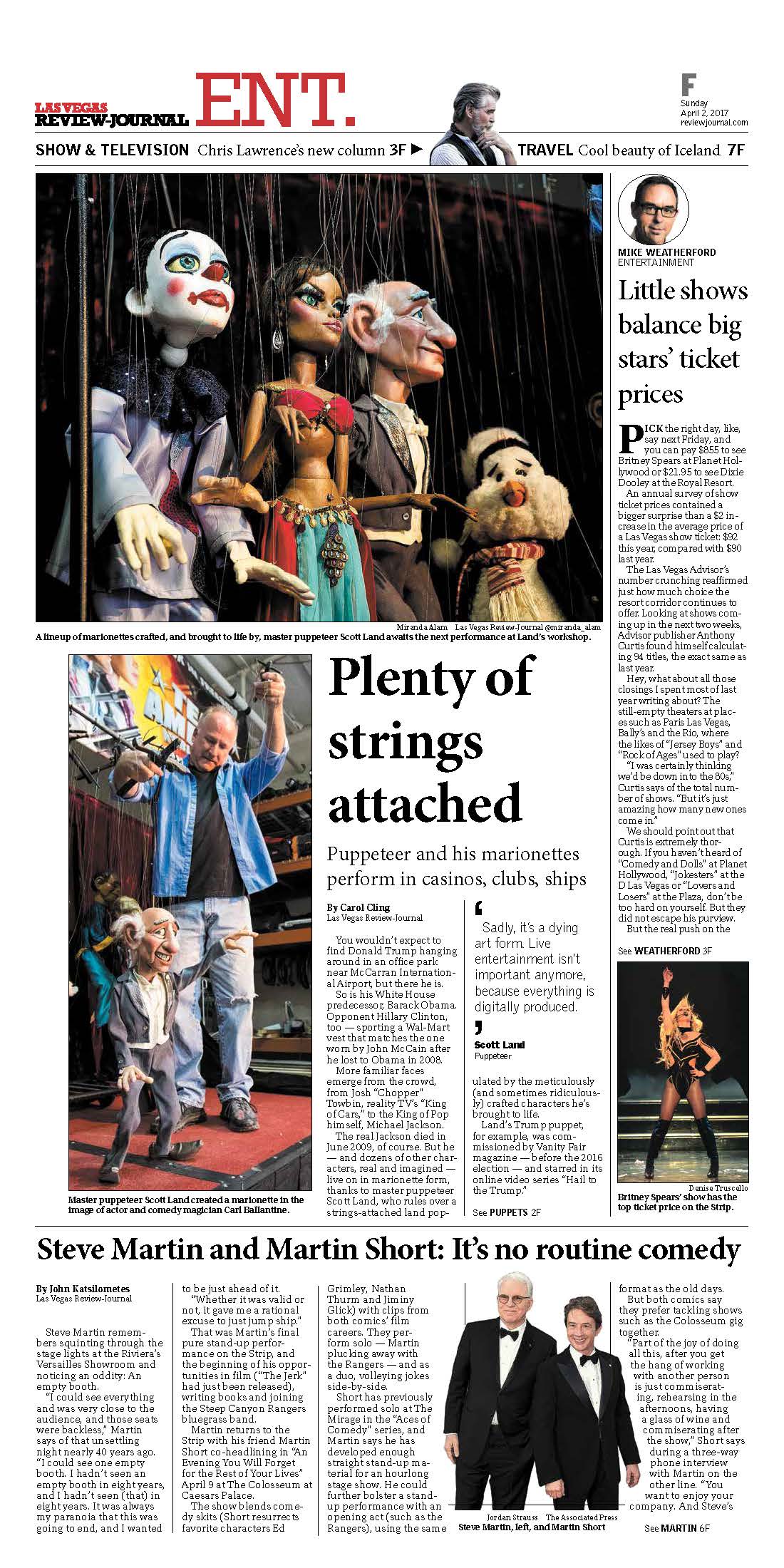
Friday guide to events in the “entertainment capital of the world.”
Avoids the need to put a lot of display type on the art, which is typographically risky. The nameplate can run horizontally or vertically (on the left side), depending on the shape of the art.
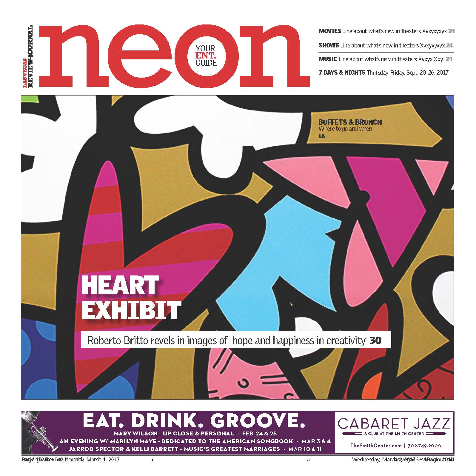
The old Neon.
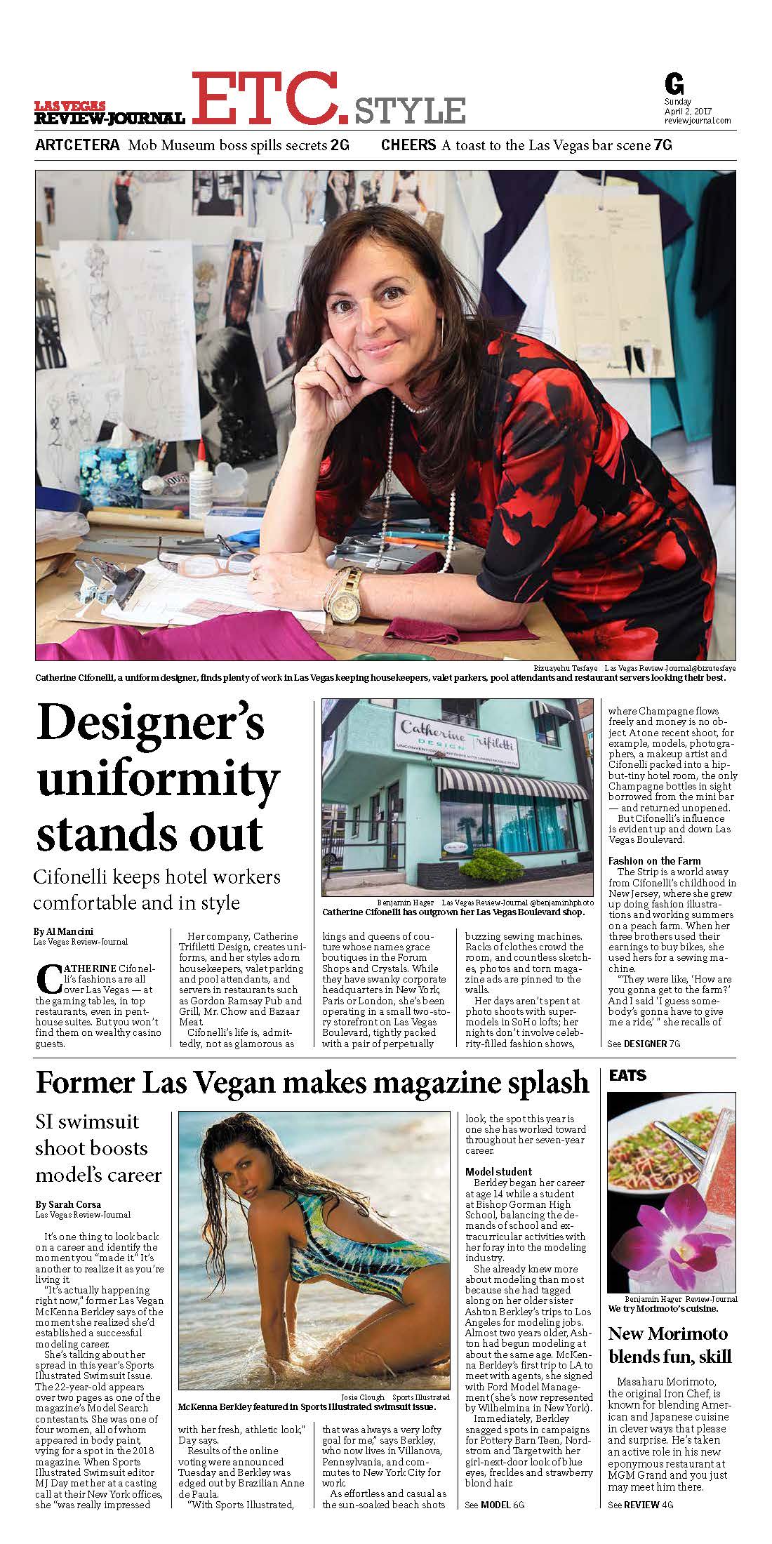
The new ETC. Sunday section.
ETC. is the new Sunday section that is themed weekly. Opening day is Style. Other topics will be Habitat, Men’s Style, etc. The arts page inside is called ARTCETERA.
The message from the editor
Las Vegas Review Journal Editor-in-Chief Keith Moyer wrote a Page One column to describe the changes in the design of his newspaper. Here are highlights:
“As with most media companies, we are constantly thinking of ways to better represent, inform and engage our readers. For instance, you’ll notice our new nameplate now includes a drawing of the iconic Las Vegas Strip. It adds a sense of place that people who live here and others around the United States and the world will easily recognize.
“Over the past 15 months, the Review-Journal has added about 50 new positions in our newsroom. At a time when most media companies nationwide are drastically reducing their news staffs, we have added top-notch journalists from Nevada and from some of the best news outfits in the country.”
Making it happen
Design editor Paul Doyle, IT chief Carl Nobel and freelance designer Bambi Nicklen worked to get InDesign and NewsEngin and the LVRJ IT programs to speak the same language.
Speaking Engagements Coming Up
VOZ Media Conference
April 6
Vienna, Austria
I will be the keynote speaker for this event, my presentation titled The important role of print in the digital age. This presentation presents a state of the media today, with emphasis on how we tell stories visually on mobile devices, the role of print and the importance of email newsletters and sponsored content to find new ways of promoting content and monetizing your operation.
For more information: http://www.voez.at/b2039m10