TAKEAWAY: Want to warm up to a sans serif that has the warmth of the tropics, the aroma of a good “cafecito cubano” and the scent of a very special Cuban cigar while you design your next page? Now there is Habana, the type font. And, as if the tropics offer typographic inspiration, there is also Governor, a take off on the Art Deco district of Miami Beach.
Taking the heat of the tropics to type
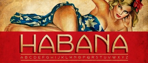
Habana was created by Bonnie Clas
Governor designed by Riley Cran
From time to time I wonder what it would be like to design a newspaper in Cuba—-the place of my birth! After all, as someone who was born in this small Caribbean island, left as a child, and got to work with media outlets in over 95 countries in six continents, it is only normal that I would think what it would be like to apply my craft there.
If, as Mark Twain has suggested, life is about completing full circles, then I am destined to complete the circle by doing something in the land of my birth——-although I have no idea when that would be, and it would probably require changes, as in a free Cuba (but that is another story).
Well, if that happens, now I could arrive there armed with a couple of typographic fonts that are just especially designed for the tropical heat of Cuba: Habana and Governor.
Habana was created by Bonnie Clas, a designer and illustrator from New York City. It is a font that would go well for logos, headers, posters, but not necessarily as a headline font, in my view. Take a look here. By the way, the T-shirt with Carmen Miranda and the word Rio, could be recreated to fit more into a Cuban theme, as with Celia Cruz, the late queen of salsa, and the word Salsa or Azucar, famous with Celia. Although Carmen is a character that I like very much, she was born in Portugal and became famous in Brazil.
What I like about Habana is that, indeed, it evokes memories of the Havana I remember as a child, a vibrant, effervescent city that only took short cat naps and where the music from windows and balconies seemed to be a permanent part of the landscape.
The dot inside the O is mysterious, and lends itself to all sorts of explanations: but to the Cuban child in me, that little dot is reminiscent of “bolita” (or little ball), the favorite illegal lottery game of the Cubans in Cuba, and still today in Miami.
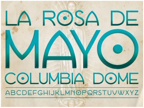
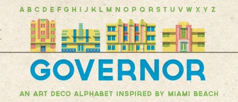
The second font, Governor, is inspired by Miami Beach and the signage on its now world famous Art Deco buildings. Designed by Riley Cran, a designer, typograher and illustrator, it is a clean, appealing font that, like Habana, is more suitable for logos and headers than for actual headline/text use.
Both fonts are available through Lost Type.
Now it is a matter of waiting for the moment when that project in Havana appears.
h4>FAZ and the US debt story
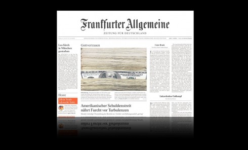
Headline over the promo photo on page one reads: In God we Trust
Interest in the current Washington debate about the US debt and how to tackle it is not limited to American media, of course.
I found today’s visual treatment of the story in Germany’s Frankfurter Allgemeine to be of interest, a series of$100 bills with one popping out and a caption that wonders how Benjamin Franklin would feel about the discussions taking place. The photo is used as a lead element on page one, and leads to coverage of the story over pages 8 & 9. Simple, direct, tells the story and probably not too difficult to accomplish.