TAKEAWAY: Here is what happens when the design of the newsroom invites interaction, provides for functional, spacious areas and, eventually, leads to innovation. Check out the new newsroom of Austria’s WirtschaftsBlatt
Friday in TheMarioBlog:
At The Washington Post: effective storytelling through good packaging of end of the year stories.
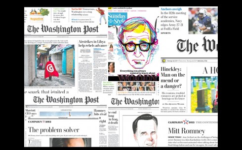
Wouldn’t you like to work in this newsroom?
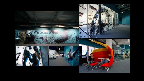
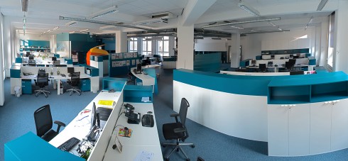
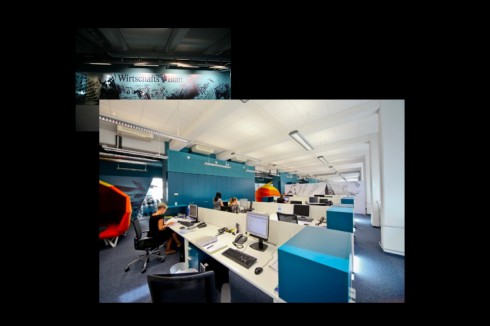
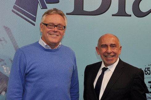
Dr. Hans Gasser and I in front of one of the entrance panels in the WirtschaftsBlatt’s newsroom during the Mobilista 2 workshop in early December/photo by Roland Seper
Much is discussed about how a modern newspaper newsroom should look like?
And while the usual discussion is about furniture and space configurations that contribute to bring the print and digital teams closer together, to foster better communication and to achieve convergence, not much is said about the aesthetics of accomplishing it.
Enter the new, functional, convergent and VERY attractive new newsroom of Austria’s financial daily——and a Garcia Media client——WirtschaftsBlatt.
I knew that the move to the newsroom will involve an attractive newsroom setting the moment Dr. Hans Gasser told me that he had engaged the same architects who had previously designed the young and hip newsroom of a newspaper in which we both worked in Croatia, a very successful daily called 24 Sata.
The team of idfl (Innovative Design for Living) gave 24 Sata, a newspaper that we helped create in 2004, a spacious, attractive, colorful and inviting look. That design was most appropriate, since 24 Sata was conceived to be a newspaper for a very young audience. Each room was designed to have its own charm, glass dividers were not merely wall separators . Instead, they were designed with graphics, and with messages. As a result, people wanted to work at 24 Sata, or sit down and give the reporters an interview , just to relax in its comfy sofas, red chairs and airy environs.
Now they have done it again, this time in Vienna, giving the WirtschaftsBlatt newsroom its chic and elegant look, very colorful and full of graphic details, with every wall becoming a canvas, plus small meeting areas that resemble beach umbrellas in a tropical island. Overall , the designers, have created an ambience that is inviting, cozy and makes us forget we are, indeed in an office. Not necessarily what you would expect when stepping into the working habitat of a group of financial journalists.An office with the visuals to seduce you upon entering.
I have already conducted three workshops with the digital team here, and, if you ask me I will tell you that the spirit, motivation and excitement of these workshops had a lot to do with the environment in which they were conducted.
And, by the way, this is not just a beautiful for the eye newsroom: here the integration of print and digital journalists is also part of what the new newsroom has accommodated.
For the architects’ view of how they approached the WB project, go here:
http://www.idfl.si/interier/interier%20projects/interier_wb.html
Additional related blog posts:
24 Sata and color
https://www.garciamedia.com/blog/articles/what_research_tells_us_about_color_use/
WirtschaftsBlatt
https://garciamedia.com/blog/articles/in_austria_the_wirtschafts_blatt_uses_cross_media_to_attract_subscribers
https://garciamedia.com/blog/articles/creating_the_next_generation_website_mobilista_2_workshop/