TAKEAWAY: It is the perennial question during print design seminars. However, with most text on online editions set ragged right, I wonder if we will hear the question five years from now. Pure Design installment deals with ragged right versus justified type. ALSO: Where the blog readers are—did you say China?
Pure Design: Ragged right vs. justified text
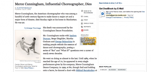
As seen on this www.nytimes.com screen, most text online is set ragged right.
It is one of those questions that has always appeared sometime during the course of a layout/design seminar. You see a hand up in the air and the question: Is it better to justify type or to run it ragged right?
I imagine that the days of this question’s relevancy are counted, however.
It is not a question of better or worse. Sometimes, ragged right gives the text a different feel that offers contrast, indicates a more feature approach, or an opinion, while the justified text is usually associated with news. Not that it was probably meant to be that way. However, the closest I have come to any “scientific” answers about the subject, has been during focus groups. Usually, you ask the question of a group of readers. They first ask for you to restate the question. You do, then they look at the text in question, and you can tell that there is NO CLEAR difference to the reader. So you press them for more information, and then they will say: usually I see type like that in the features section, not in the news section.
However, if one set an entire newspaper in ragged right—-which could be a possibilitiy—-chances are the readers will not mistake news for features.
And, online, everything is ragged right. Nobody has complained yet!
Soon there will be a generation of readers/online users for whom ragged right type will be the norm. Of course, in print one can always orchestrate contrast by alternating between ragged right and justified settings. However, the question will become one more of aesthetics than legibility, in my view.
As states “The Elements of Typographic Style Applied to the Web,” “Effective justification of text can only be achieved if long words are hyphenated. HTML and CSS 2 do not have any provision for automatic hyphenation and current Web browser support, even for manual hyphenation, is poor. So don’t justify text on the web.”
For more, go here:
http://webtypography.net/Rhythm_and_Proportion/Horizontal_Motion/2.1.3/
Purely surprising: where the readers are
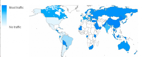
The map shows that large numbers of you in China, Russia, Saudi Arabia, are following Pure Design with great interest, and downloading more often than, let’s say, your counterparts in North America.
Perhaps you will find it as interesting as I have. Our intern, Reed Reibstein (Yale University ‘11), who has a good eye for statistics, has shared the following numbers with me about those of you downloading segments of Pure Design.
Here is how Reed describes his findings to me:
The final metric of particular interest is the geographic distribution of your readership. The first entry, interestingly, was read much more by the Chinese, Russians, Saudis, South Africans, Australians, and Bolivians than Americans and Brits. More recent entries still have quite a global readership, with North and South America being particularly heavily represented, Europe making up a bigger proportion, and Asia remaining a significant segment .”
I would appreciate hearing from those of you reading the blog in all these locations.

Reports from Nigeria
Starting tomorrow, I will be blogging daily about our experiences as Garcia Media team helps the Next newsroom to prepare for launch of the new daily, August 4. We will be conducting training, finalizing styles, and doing all those things that are part of the “opening night” when a new newspaper is launched. Stay tuned.
For more information about Next, go here:
The official website:
www.234next.com
Previous blogs dealing with Next:
https://www.garciamedia.com/blog/articles/nigerias_next_on_sunday_changing_journalism_one_sunday_at_a_time/
https://garciamedia.com/blog/articles/next_on_sunday_the_new_newspaper_that_raises_journalistic_bar_in_nigeria/
Download entire first section of Pure Design: Words
Now that I have fully presented the first of six sections of Pure Design on TheMarioBlog, I am offering the entire initial section, “Words,” available for download—all 33 pages of it. This may be useful for those of you saving or printing out Pure Design and will be done following each of the remaining sections. At the end of our journey through words, type, layout, color, pictures, and process, I will publish the entirety of Pure Design in one file.
Follow me at www.twitter.com/tweetsbydesign
Follow the Marios
Two Marios. Two Views.
Follow Mario Jr. and his blog about media analysis, web design and assorted topics related to the current state of our industry.
http://garciainteractive.com/
Visit Mario Sr. daily here, or through TweetsByDesign (www.twitter.com/tweetsbydesign)
In Spanish daily: The Rodrigo Fino blog
:
To read TheRodrigoFino blog, in Spanish, go:
https://garciamedia.com/latinamerica/blog/
TheMarioBlog posting #317