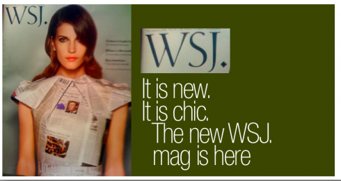
Ten seconds into this premiere edition of WSJ, and you know that this product is very targeted to an audience which may not be feeling the cold winds of inflation, and for whom foreclosure news is just that, something you read about in, well, The Wall Street Journal.
It is significant to note that WSJ becomes the first brand extension launched since Rupert Murdoch and News Corp acquired Dow Jones for $5.6 billion last August. Circulation is projected about 960000, with about 800000 circulated in the U.S., and the rest in the WSJ’s Europe and Asia editions
Editor Tina Gaudoin writes in her letter to readers that “at WSJ, we believe luxury is not about how you spend—-it’s the way you live that counts.”
Hunters and Gatherers
The table of contents offers an original division of content into two categories:
Hunter and Gatherer.
Hunter topics: The way we wear (trench coats), Second chapter (a high profile lawyer finds happiness in making chocolate),
Gatherer topics: How much is it worth? (why American folk is a buy for native collectors), Luster (Tupac’s ring stands out among Hip-Hop hottest rocks)
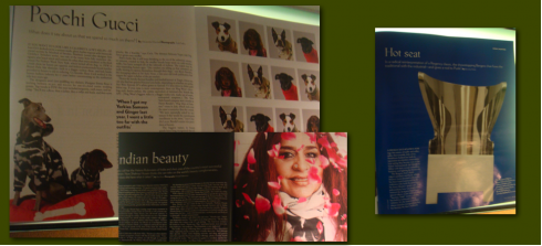
Headlines like “Poochie Gucci” , with a subhead that reads “What does it say about us that we spend so much on them?”, accompany stories about “one of a kind” wedding gowns for your doggie in love (prices ranging from $2500 to $10000).
Not quite minimalist design
Designed by Creative Director Tomaso Capuano—-who, coincidentally also designed WSJ’s main competitor in the luxury magazine race, the Financial Times’ How to Spend It —-WSJ does not disappoint visually. White space waltz in and out of the pages. The font selection sets it apart from many of its competitors.
I was thinking that the design was minimalist, but perhaps that is not the best way to describe it: minimalist design tends to be more skeletal than what Tomaso has carried out in his design for WSJ. Some of the photos bleed off the page, something minimalist designs usually avoid, as the emphasis would be on framing with white space around the page.
A diamond salute to the past
Good touch to pick up that traditional diamond that The Wall Street Journal uses here and there since its beginnings. Tomaso has placed the diamond right after the WSJ in the logo. Just like the logo of the newspaper carries a dot (and nobody knows why, but it remains there), there is a diamond here.
That is where the similarities with the parent newspaper end, in my view.
One good thing: texts are short, photos are big, and many of these “luxury” readers will be satisfied to get through the magazine pretty quickly.
Their pockets may be full, but I bet they are short on time like the rest of us.
And, indeed, there is an online edition for those who wish to see videos and daily updates:
www.wsj.com/magazine
*I tried to visit the website several times Friday, but without success. To be continued.

The WSJ magazine fonts
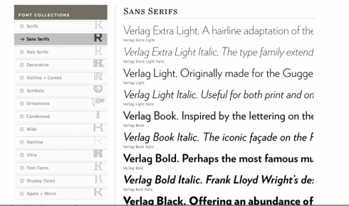
Intrigued by the serif font used for the design of WSJ magazine, I contacted my friend David Pybas, associate art director at The Wall Street Journal, who reports that the fonts utlized are: Phaistos (serif) and Verlag (sans serif).
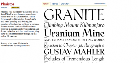
Phaistos: (www.fontbureau.com)--Recommended for magazines,this is how The Font Bureau describes the font:
Phaistos was inspired by the vibrant life in Rudolf Koch’s 1922 Locarno, sometimes called “Eve” in the United States. David Berlow explored the design through 1989 and 1990, proofing and revising the structure of the tapering verticals to enhance their movement. Italic and bold variants followed in the spring of 1991; designed and drawn by Berlow and Just van Rossum, they carry the life of the roman throughout the series.
Verlag: (www.typography.com) -One of the most modern sans serifs, Verlag lends itself well for occasions when the design calls for elegance and classic style, but with the strength of a sans font. Hoefler & Frere-Jones describe it as “the affable Modernist” and include this as part of the description:
From out of the six typefaces originally created for the Guggenheim Museum comes Verlag, a family of 30 sans serifs that brings a welcome eloquence to the can-do sensibility of pre-war Modernism. Originally envisioned as a riff on the Guggenheim’s iconic Art Deco lettering, Verlag developed into its own family of versatile typefaces in order to suit the needs of a modern identity program….From the rationalist geometric designs of the Bauhaus school, such as Futura (1927) and Erbar (1929), Verlag gets its crispness and its meticulous planning. Verlag’s “fairminded” quality is rooted in the newsier sans serifs designed for linecasting machines, such as Ludlow Tempo and Intertype Vogue (both 1930), both staples of the Midwestern newsroom for much of the century. But unlike any of its forbears, Verlag includes a comprehensive and complete range of styles: five weights, each in three different widths, each including the often-neglected companion italic.
Innovative advertising on Page One: The Asian Wall Street Journal goes for it
.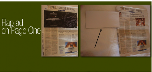
While on the subject of The Wall Street Journal: I arrived at Singapore’s Changi Airport today and was surprised to find an edition of the Asian edition of the WSJ with a “glued” flap ad on the front page. Indeed, the easily-removable ad is for a special commemorative Royal Oak Offshore Chronograph watch by luxury brand Audemars Piguet.
As I have said repeatedly in this blog and in conferences worldwide, newspapers need to be more experimental with advertising presentation. This is an example of how it can be done. I found the ad to be non-intrusive for readers. Bravo to the Asian WSJ. Now, will the U.S. Wall Street Journal try something like this? I say, go for it. Why not?

![]()
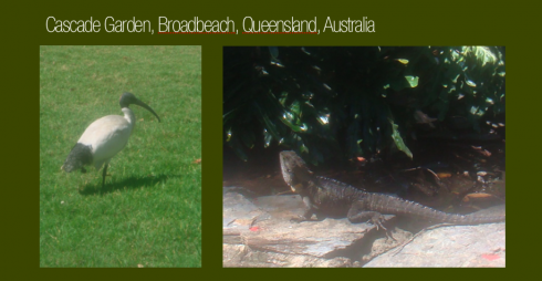
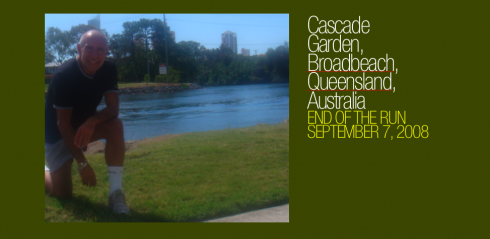
Today, Sunday, I took a 45-minute run around Cascade Gardens, here in Queensland, Australia, a tropical lush environment, with exotic birds, iguanas that surprise you as you run through the trails, while markers offer information on a variety of plants and trees. It is springtime in Australia, with sunny and cool weather, perfect for running.
TheMarioBlog posting #86