This blog post will be updated throughout the day, Monday, Nov 2, with new developments about the launch of the business format Handelsblatt
Updated, Monday, Nov. 2, at 10:54 German time
TAKEAWAY: Handelsblatt introduces its new business format today, becoming the first quality German newspaper to switch completely from the broadsheet to the compact size. ALSO: Typographic details of Handelsblatt’s new look AND: Production night photos
Historic day for German media: Handelsblatt goes compact
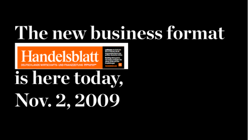
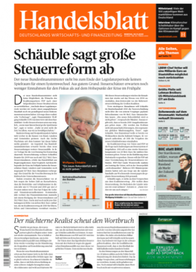
First front page of the Handelsblatt in its new format: Nov. 2, 2009
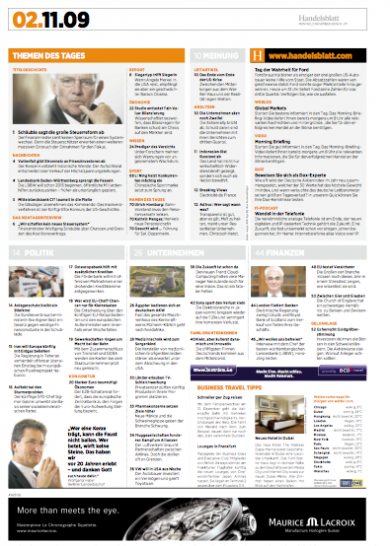
This is the last page of today’s edition: a complete summary of what is the newspaper today.

This inside page from today’s edition shows the Mondrian visual concept at work: several images come together in a rectangle to tell the story visually. In this case, a story about Google and other companies coming together to experiment with the way we will connect to the Internet in the future
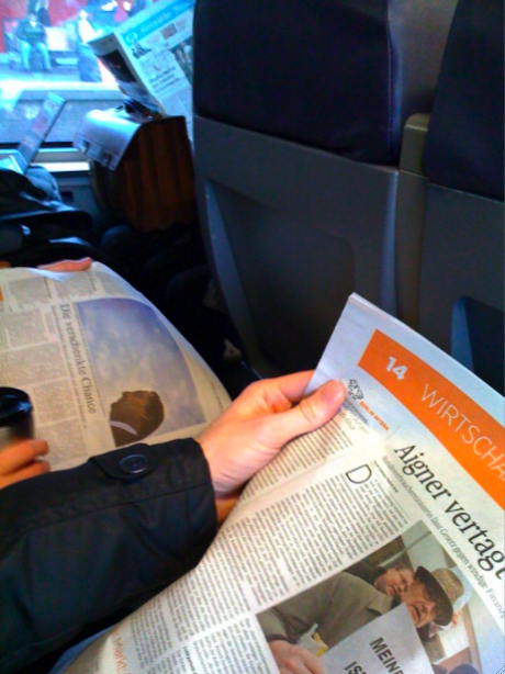
Philipp Busse, of the Handelsblatt online staff, who commutes from Cologne to Dusseldorf on the morning train daily, tell us: “the new Handelsblatt passes the train test”
After more than six months of preparation, D-day is finally here.
Today, Nov. 2, the first edition of Handelsblatt in its new business format (compact) hits the kiosks, trains, buses, airplanes and, of course, offices of readers everywhere in Germany.
At the same time, a brand new and totally rethought online edition:
http://www.handelsblatt.com also premieres, as well as the mobile phone application.
It was a busy but productive time as editors, designers, subeditors and production people gathered Sunday afternoon to put finishing touches on the many details that become part of the tapestry that is incorporating a new design (and new format) to a newspaper and an online edition. Things went well. Deadline was met, and now we prepare for the reaction of readers and online users. That should come soon!
Typographic details of the new Handelsblatt
Many of you have sent me emails and notes inquiring about the typographic scheme of the new Handelsblatt.
For that I turn to Katja Hoesli, of Media Design, in Zurich, Switzerland, who assisted Nils Werner, Handelsblatt art director, with overall details of the redesign of Handelsblatt.
Nils and Katja had worked on a first dummy version of the business format when I joined the team in late May 2009. I took one look at the work they had put together, and I was very pleased with the typographic components.
Publico and Gotham
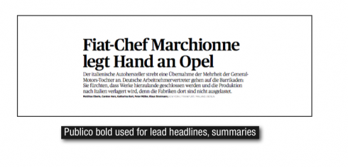
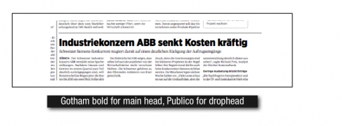
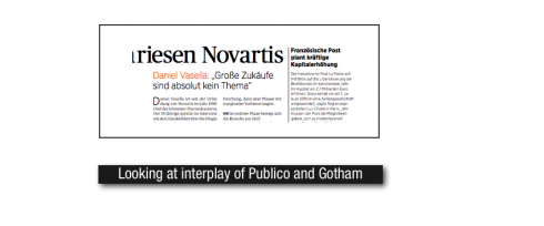
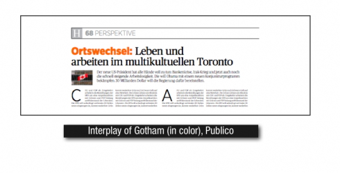
Two primary fonts are used throughout this design: Publico and Gotham.
I asked Katja, who with Nils, made those choices, about the selection:
Our initial briefing asked for us to create a newspaper that was classic, elegant, not trendy. We also did not want to utilize more than two fonts in this newspapers, so the moment we put the refined Publico, a serif, with the strong but appealing, Gotham, a sans serif, together, we knew that they worked well together. It was a sort of organic match.
With Publico, we felt that it had a familiar feeling about it; readers would look at it and think that this is a newspaper font they had seen before.
Using the type
In the original set of pages that I examined, there was a more protagonistic role for Gotham which, although one of my favorite sans serif fonts, gave the front page of Handelsblatt, a little too robust of a feeling. Nils and Katja had used Publico for opinion pieces, features, etc., where it looked fantastically well.
I thought that Gotham, however, was too bold and severe for the type of business stories that we would carry on Page One daily. A serif like Publico would do so much better there.
By then, we were discussing that philosophically, the front page would be analytical—-remember the book concept idea—-and so we started testing with Publico for the lead story on Page One.
That led us to take a look throughout the entire newspaper: again, the same feeling. The Gotham everywhere overwhelmed the page. My suggestion: why not use Publico for the lead story on each page, but leave Gotham everyplace else.
Nils and Katja decided to test. Everyone liked it. It was the one element that was missing from those beautifully crafted inside pages.
The new Handelsblatt seemed to be coming typographically alive—-organically so.
When the first group of editors entered the room for a “gallery walk” one afternoon, they loved what they saw. One of those decisive moments in the life of a redesign.
We smiled. We hope the readers today will do the same.
Those of you who would like to get more information on the typography of the newstrong Handelsbaltt, feel free to write an email directly to Katja Hoesli:
khoesli@mediadesign.ch
Publico
http://christianschwartz.com/publico.shtml
Gotham
http://typography.com/fonts/font_overview.php?productLineID=100008
Mini moments that mean a lot
A Handelsblatt “mini moment”: creating that small story structure that is a sort of interesting, surprising encounter for the reader on the page; for the editor, another storytelling technique
In every design, there is one seemingly insignificant detail that can be the readers’ favorite. For me, in this new look of Handelsblatt, that detail is what I would call a “mini moment”, a short little outburst of text and image that is either a very brief profile of someone, or some company. Short and to the point, ephemeral perhaps, but nonetheless, notable. It is not a brief, it is not a compact story——it is a pleasant encounter for the reader along the way.
These mini moments can appear in any section of Handelsblatt. Here is one of them!
Handelsblatt explained: Mario talks to Tyler Brulé on Monocle Radio
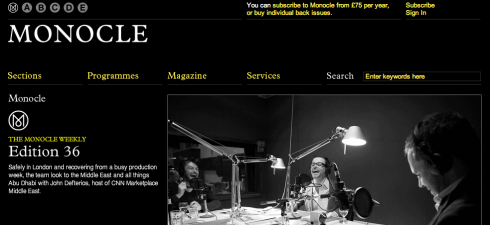
Go here to listen to the 36th edition of Monocle Weekly:
http://www.monocle.com/The-Monocle-Weekly/
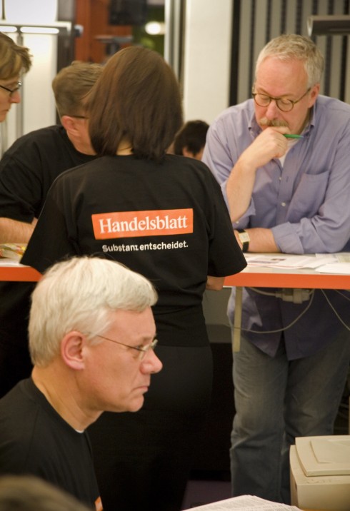
Opening night: behind the scenes
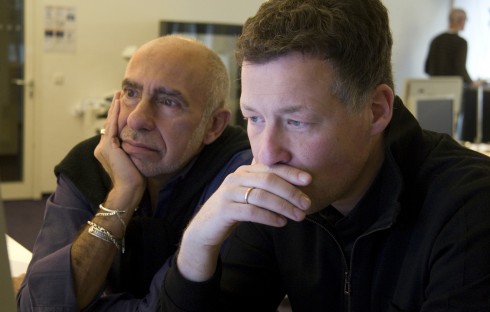
Handelsblatt editor in chief, Bernd Ziesemer, (right in blue shirt) reads over a final page proof of today’s edition
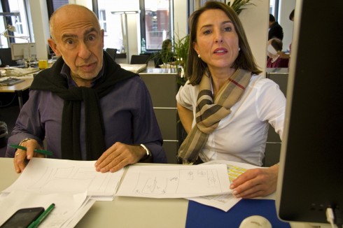
Here I go over inside page layouts with Media Design art director Katja Hoesli
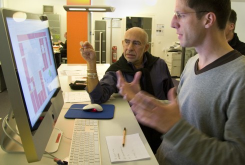
Nils Werner, Handelsblatt art director, and I, review final double page inside spread for today’s edition
Isn’t that story too long? Editor Peter Brors and I ponder the question as we snake up and down columns of text
Photos by Hendrik Rauch/Handelsblatt Photo Editor
It is the night before the first day of publication: yes, a little bit of nerves; everyone paying close attention to style, asking questions, taking a second look (which is why I always say that the real dangerous moments for any redesign begin two weeks from the day, when people begin to feel comfortable with the style, and errors creep into the pages!)
While a cold drizzle covered the city of Dusseldorf (where Handelsblatt is edited ) Sunday night, inside it was peeping hot: editors coming and going, fingers on computer screens, eyes on page proofs, finished pages on the wall for everyone to see. Most staffers wearing the souvenir black and orange Handelsblatt T-shirt, especially designed for the occasion.
Handelsblatt photo editor, Hendrik Rauch, captured the moments. Here are some of his images! Thanks, Hendrik, for making them available to us at TheMarioBlog
All previous posts about Handelsblatt relaunch
https://www.garciamedia.com/blog/articles/presenting_readers_users_with_preview_of_new_handelsblatt
https://www.garciamedia.com/blog/articles/handelsblatt_relaunch_to_be_on_monocle_radio
https://www.garciamedia.com/blog/articles/and_in_the_battle_of_the_h_versus_the_h_the_winner_is
https://www.garciamedia.com/blog/articles/do_we_associate_the_internet_with_everything_lower_case
https://www.garciamedia.com/blog/articles/getting_ready_for_relaunch_of_handelsblatt_coming_nov._2
TheMarioBlog post #411