TAKEAWAY: Lean back in your easy chair, grab a cold drink of your choice, and sample these items: the New Yorker iPad app is meant for reading (no surprise here); Lucky Peach is the print fan’s equivalent of a sweet summer lemonade, while Editions celebrates the print world on the iPad. What can be better than this for weekend readings? And, sample some interesting type-related links plus a video you must see. It is all here!
Something for everyone
It is August and what Americans have a tendency to refer to as the dog days of summer, when the heat makes any type of activity hard to accomplish. For most of the USA it has been an unusually hot and sticky summer with record breaking temperatures in the three figures. However, for many of my European friends, in cities from Amsterdam to Berlin, and in between, the summer has been disappointingly cool and wet.
But, if you ask me what the temperature is for that fascinating world of iPad news app development I would say that it is sizzling hot in terms of the energy but extremely cool when it comes to what is happening as we begin to see news apps developing their own personalities.
I often say that not two news apps should be the same. Each app souuld bring forth the publication’s DNA and its app potential, while catering to the needs and expectations of its audience.
It is in this spirit that I am happy to compile here, for this weekend edition of TheMarioBlog, a series of fascinating stories that not only highlight the role of personality and uniqueness in iPad app creation, but that also emphasize that sometimes print can hold the surprises, too.
My able and always connected co-pilot, Reed Reibstein, and I have found these items of tremendous interest. We hope you do, too. Read on:
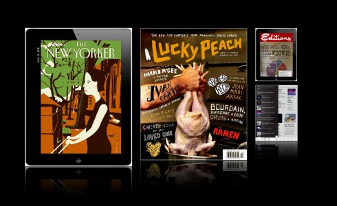
The New Yorker’s iPad: lean back and read, read, read
“For New Yorker on iPad, Words Are the Thing”:
http://www.nytimes.com/2011/08/01/business/media/new-yorker-on-ipad-shows-viewers-want-to-read.html
The following excerpts, taking from the article, highlight why The New Yorker’s app has been successful:
“The New Yorker, a magazine that has always been heavy on text, took a different tack from its peers. Instead of loading its iPad app with interactive features, the magazine focused on presenting its articles in a clean, readable format.
” ‘That was really important to us: to create an app all about reading,’ said Pamela Maffei McCarthy, the magazine’s deputy editor. ‘There are some bells and whistles, but we’re very careful about that. We think about whether or not they add any value. And if they don’t, out the window they go.’
“It is surprising that Condé Nast’s biggest success has been The New Yorker and not, say, a magazine that has a more technologically stimulating app and a younger, more Web-oriented readership like Wired.
[…]
“One apparent reason for The New Yorker’s success with the iPad is that the magazine has the right demographics. IPad users tend to inhabit households with annual income of more than $100,000, much like readers of The New Yorker. Research from comScore shows that all iPad users read news on the device more than they seek out entertainment like videos and games.
“But The New Yorker’s popularity with iPad users could also say something about the experience people desire on the devices. Whether the glossy magazines that are Condé Nast’s specialty — those full of highly stylized photo shoots and sleekly designed page layouts — are something people prefer to view in print remains to be seen.
“ ‘I do think there is a really large dynamic of people who are interested in reading, actually reading, on an iPad,’ Mr. Lipsman said.
“In that sense, said Mr. Remnick, The New Yorker’s editor, his magazine and the iPad were a good fit.
“ ‘What do people read The New Yorker for? To read,’ he said.”
In my view: As expected, the wonderful New Yorker content is available for a price; it is $4.99 to download an edition. The DNA of the legendary magazine is ever present. The magazine is making a major push to gain subscribers, and reminds us that we can save 74’% off the single-issue price by subscribing. If you are already a print magazine subscriber, you tap into the screen to access the tablet edition; if there is such thing as “word pop ups” you will find them here, but, of course, nothing new in this department. For word (and caricature) lovers, the New Yorker always offered a feast; the tablet edition is not going to disappoint you; in fact, for app designers ready to take big bites of how type and storytelling should be presented in an app, take notice here—the almost perfect textbook has arrived.
And for those lucky print fans, Lucky Peach
“Bringing Comfort to Print Fans”:
http://www.nytimes.com/2011/08/01/business/media/lucky-peach-magazine-a-comfort-to-those-preferring-print.html?ref=media
“And yet in June we got the first issue of Lucky Peach, named for the English translation of momofuku, a quarterly magazine that weighs in at 174 pages with nary an ad in sight and a price of $10.
“It breaks many of the conventions not only of food journalism, but of magazine journalism in general. The glamorous star on the cover? It’s a chicken being lowered into a pot with its wrinkly backside depicted squirting out graphic eggs. The so-called front of the book — which in most magazines is filled with infographics and breezy snippets — is filled with a trippy, 9,000-word, rambling eat-a-logue through Japan by Mr. Meehan and Mr. Chang.
“And while most food magazines use tiny recipes and glossy photos to expose readers to as many cuisines as possible, Lucky Peach is planning single-themed issues. Some of the graphics look as if they were conjured in a tattoo parlor — rugged, expressive and streetwise, with a gallery of the pantheon of ramen heroes rendered in black-and-white woodcut.
“The magazine is printed on thick matte paper, not glossy, and mixes the divine — an essay on authenticity by Todd Kliman — with the profane — an alcohol-infused verbal fist-fight among Mr. Chang, Anthony Bourdain of ‘No Reservations’ television fame and Wylie Dufresne, chef of WD-50, on the subject of mediocrity, each piece pivoting around food and cooking.
“In between are page after page of material about ramen — the central theme of the issue — in the form of recipes, regional Japanese maps of different varieties and a taste test of noodles by, do tell, Ms. Reichl.
“All of this would be too cute by half, a fetish object for foodies, if not for the larger lesson it provides for publishers.
“Reading magazines — and newspapers for that matter — is becoming a niche activity, and it behooves the industry to reward its true fans with palpable, physical quality.
“In the last few years, when the ads began disappearing and the page counts began shrinking, many magazines began to look like brochures. The industry responded by cutting costs on every front, including by printing on thin, gauzy paper that made them feel like brochures as well.
“That makes sense: Mr. Chang is a freak about the covenant of quality between the consumer and the cook, and McSweeney’s, the small publishing concern put together by the writer Dave Eggers, is similarly concerned with handcrafted excellence in the form of McSweeney’s Quarterly and Believer magazine.
“If magazines are to survive, they’ll have to become something special, offering heft and a kind of “thing-ness” that gives them value over other ways of consuming text. The writing in Lucky Peach is bright and unexpected, the graphics are remarkable, and the knitting of images and prose is done with élan.
“ ‘The solution to problems in publishing is probably not less, but more,’ said Mr. Ying of McSweeney’s, who is the editor of Lucky Peach. ‘Writers and designers don’t deserve to have their work squeezed onto pages that look and feel like tissue paper. We wanted to put the effort in to give the reader something they’d value having in their hands.’
“Lucky Peach delivers. It is a glorious, improbable artifact that sold out its first printing of 40,000 and second of 12,000. It is a pint-size hit among the food-obsessed.”
A must see: Editions
“AOL Makes an iPad Reader”:
http://bits.blogs.nytimes.com/2011/08/02/aol-makes-an-ipad-reader/?scp=1&sq=aol%20editions&st=cse
“The retro feel starts with the Editions logo, which recalls a Sunset magazine, replete with faux mailing label on the front page. It continues with the leisurely pace at which new articles are added — daily — rather than the second-by-second stream that has come to define the Internet era.
“The concept for Editions is a daily briefing that lets people get up to speed on what they need to know, said David Temkin, who leads AOL’s mobile team. Algorithms help tailor the articles that appear to individual tastes.
“Updating Editions daily with new articles instead of around the clock is done deliberately, Mr. Temkin said. Otherwise, the quantity would be too overwhelming for most people to follow.
“ ‘For a lot of people, it becomes oppressive,’ Mr. Temkin said. ‘This is not tapping you on the shoulder all the time.’ “
In my view: This one captures the essence of how busy people like to receive information in a tablet. I like the idea of editioning for Editions; one daily edition as opposed to constant updates; this is lean back territory and one that many users of the iPad, especially those using it in the evenings, will appreciate. Works only in the vertical mode; allows me to pick the color palette that I want the screen to greet me with each time; links to my social networking sites; offers me local Tampa Bay news (a plus). It feels so absolutely customized that I get the feeling it was done just for me, something I don’t get from Editions’ competitors, Pulse and Zite (which I also like, by the way). Highly recommended. Editions is off to a great start, and I can see me getting hooked on this one. And if anyone doubts the “lean back” approach Editions takes, this welcome message received via my email, will make it quite clear: “To begin, put your feet up, grab a cup of coffee and start reading. Editions will automatically start learning which topics you gravitate toward. The more you read, the better it’ll get at delivering the latest news and info it knows you’ll like.”
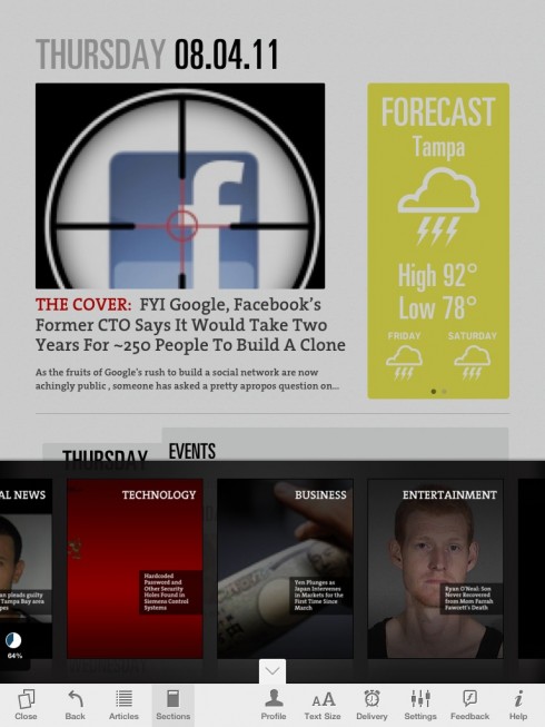
Here is the page customized for me, with Tampa weather top right, and then a carrousel navigator, bottom of vertical screen, with the topics I selected of interest
Some wonderful type-related weekend links if it gets too hot outside
The secret life of the @-symbol, part 1 of 2:
http://www.shadycharacters.co.uk/2011/07/the-symbol-part-1-of-2/
What Makes Letters Legible?:
http://opentype.info/blog/2011/08/01/what-makes-letters-legible/
A close look at Omnes:
http://blog.typekit.com/2011/08/01/about-face-omnes/
Three newly-released typefaces of interest to publication designers:
FF Tundra (https://www.fontfont.com/fonts/tundra),
FF Sero (https://www.fontfont.com/fonts/sero), and
Doko (http://www.vllg.com/Urtd/Doko).
Don’t miss this video
Type: The (Seven-Minute) Movie
This is Reed Reibstein’s pick of the one type-related video everyone should see:
Watch a terrific short documentary on type, with contributions by those who make and use it. Highlights include Jonathan Hoefler and Tobias Frere-Jones on the two kinds of type designers, Paula Scher on a visual language for the Public Theater, and Eddie Opara demonstrating “stealth” typography. Stick around at the end for a quick primer on “how to talk about type like you know what you’re talking about.”
The Apple Tree grows
Interesting “family tree” for Apple products. If you are like me, you will have fun taking a look back and reminiscing about that first Mac you owned, and how, even then, the appearance of the Macintosh computer and all that it could do revolutionized the graphics departments of newspapers and magazines worldwide.
I have especially fond memories of how the appearance of that first Mac prompted us at The Poynter Institute for Media Studies to put into motion immediately the so called MacTracks, two-day (often weekend) seminars to train a generation of info graphic artists and designers on how to use the new computer.


Bild has sent President Obama a birthday card on the occasion of his 50th birthday, but, no pop up! We were thinking someone will pop out of the birthday cake. Perhaps Bild editors realized that the situation in the White House and the consequent stress that probably greets the President on his birthday did not call for anyone popping out of a cake——not this year.
For a view of the Garcia Media printed projects’ retrospective
https://www.garciamedia.com/blog/articles/garcia_medias_print_projects_a_retrospective