Update #2: Saturday, Nov. 5, 07:22, Tampa. This is the weekend edition of TheMarioBlog and will be updated as needed. Next new blog post is Monday, Nov.7—reporting from Kuala Lumpur, Malaysia
TAKEAWAY: It took several months to complete the total rethinking of Working Mother magazine, but the efforts have paid off, both with the readers who like the changes, as well as with those tough jurors at Folio, which have awarded Working Mother the 2011 Folio Ozzie Gold Award for Best Redesign, Consumer! ALSO: At the New Straits Times of Malaysia, the final push as the day, 11-11-11, approaches for relaunch across platforms
Deadly floods in Genoa, Italy: Il Secolo XIX reports
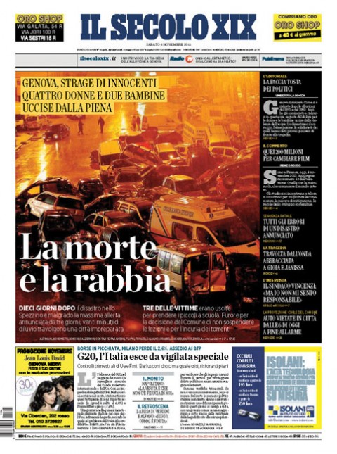
Massimo Gentile, design director of Il Secolo XIX, sends us the front page of his newspaper today: the headline reads “Death and Anger”. Here is Massimo’s report to accompany his front page:
“Yesterday was a horrible day here in Genoa. The heavy rains made the rivers swell, and as they overflowed, the city was flooded. Suddenly, a big wave of water escaped from the Bisagno River around the football stadium, dragging dozens of cars and flooding all around it. A woman died between the cars, another woman and her children were pushed by the force of the water and they, too, died. Six people have been killed so far. The anger is directed towards the city leaders. The people are angry that, knowing that Genoa lies in an area prompt to flooding, measures were not taken, the schools were not closed, deaths could have been prevented.”
New Straits Times prepares for big relaunch

It is an 11-11-11 launch for the New Straits Times of Kuala Lumpur, Malaysia, and the Garcia Media team prepares to accompany the team next week as the rethinking of the past six months launches across all platforms: mobile, online, print and tablet. Check with TheMarioBlog all of next week for daily updates of the process.
Here is a teaser promotional video as the marketing campaign kicks off for the relaunch of the New Straits Times. Marketing director Zuraida Mohammad sends us this first clip that is now appearing in the local media, emphasizing the theme of “Staying Sharp”, the emphasis of the new rethinking.
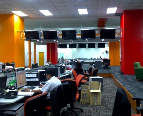
The newsroom of the New Straits Times is also going through a rethinking; the old glass enclosed “fish tank” conference room is now a thing of the past; down came the walls, to allow for a more open environment in which storytelling is made easier thru the interaction of print and digital journalists.
Working Mother magazine: high honor
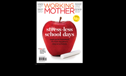


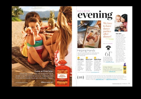
The new content flow for Working Mother magazine emphasizes the cycles in the day of the working mom, from starting the day, to the workday and to the evening.
Notice the yellow circle on cover of Working Mom: it tells readers how many minutes will be saved by following the tips in this issue of the magazine
Working Mother magazine has won the the 2011 Folio Ozzie Gold Award for Best Redesign, Consumer!
We at Garcia Media take pride in this very special achievement, representative of the great team effort of a very talented group, which included art director Ebby Antigua, as well as Mario Garcia, Jr. and John Miller.
The award is the ultimate vote of confidence for the team that worked on a total rethink of the magazine.
“When I first got involved in the project, I knew that part of what we had to do was to develop a content strategy that was in direct response to the lives of working mothers,” says Mario Jr. “To that effect, content strategy and information architecture became our first priority, before even the design. The idea then was to present the content within the context of the three main portions of a working mom’s day: morning, workday, evening. Everything fell into place after that. It also facilitated the design.”

Illustration: http://www.trendir.com
-Content design for tablets: swipe versus scroll
Content design for tablets: swipe versus scroll
First paragraph: A while ago, Mario Garcia, renowned newspaper and magazine design consultant, asked me to comment on tablet design for an article he was writing for the Austrian marketing and media magazine Horizont. His question came through Twitter: “What is your take on swipe vs. scrolling?”
– Fifth of FT.com traffic coming from mobile devices
http://www.journalism.co.uk/news/fifth-of-ft-com-traffic-coming-from-mobile-devices/s2/a546603/
First paragraph: A fifth of the traffic to the FT’s website is now coming from mobile devices, publisher Pearson announced today.
The financial title had 790,000 users of its new web-based iPad app registered by the end of September, with more than 15 per cent of new digital subscriptions for mobile devices.
My take: More evidence of the impact of mobiles and tablets. No surprises here. But everyone pushing the digital side of his operations, and still needing ammunition to convince management, here is one more factual report to add to the ever growing list.
– UK: Another broadsheet switches format
http://www.guardian.co.uk/media/greenslade/2011/nov/03/local-newspapers-newspaper-formats?utm_source=feedburner&utm_medium=feed&utm_campaign=Feed%3A+theguardian%2Fmedia%2Frss+%28Media%29
First paragraph: Today’s issue of the Dunfermline Press is its first in a compact format after 152 years as a broadsheet. According to the paper’s website, this is because readers in their thousands said that size matters.
My take: What took them so long?
– Twitter quietly debuts new ‘Top News’ and ‘Top People’ search features
Twitter quietly debuts new ‘Top News’ and ‘Top People’ search features
First paragraph: Twitter’s web interface got a couple of nice new additions Wednesday, seemingly aimed at making it easier to find relevant content when conducting a search within the site.
My take: Everyone wants to make sure the Top News button is never too far out of view/touch. Indeed, social media and news in a long and sweet honeymoon it seems; however, it is up to the established media—-and journalists—-to develop the story beyond the 5Ws and the H.
– Your digital paper, sir – The struggle to make money out of news on tablets
http://www.economist.com/node/21536614?fsrc=rss|bus
First paragraph: A CUSTOMISED, constantly-updating newspaper used to be the stuff of science fiction. Now, thanks to tablet devices like the iPad, there are several. Livestand, a news app launched this week by Yahoo!, joins a field that already includes Zite, bought recently by CNN; Editions, created by AOL; and Flipboard, which Google tried to buy last year. Rebuffed, Google is expected at some point to launch its own news app, code-named Propeller.
– “WSJ Live” Interactive Video Service Adds New Distribution
http://www.marketwatch.com/story/wsj-live-interactive-video-service-adds-new-distribution-2011-11-01
First paragraph: The Wall Street Journal today announced several new distribution channels for WSJ Live, the interactive video service for iPad, Internet-connected televisions and set-top boxes that launched in September.
– Friendly Fire: Facebook a danger to publishers
http://panpa.org.au/2011/11/04/friendly-fire-facebook-a-danger-to-publishers/
First paragraph: Facebook apps play straight into Mark Zuckerberg’s hands, by lending their brand to the goal of keeping users within the Facebook universe. Publishers must re-think the sustainability of an in-Facebook strategy. ANY good friendship is a two-way street – and publishers would do well to remember this when it comes to Facebook.