TAKEAWAY: The process of publishing your newspaper or magazine as part of an iPad tablet gets better and easier everyday, as demonstrated by the presentations at the WoodWing’s World Tour stop in London Friday.
Easy does it
Now leaving sunny London (indeed, not bad for mid September in the foggy city!) and preparing for the long flight to Hong Kong, but satisfied with the audience and good reception at WoodWing’s World Tour day Friday.
I learned much, and found the group of participants to be deeply interested in all things tablet——should I say, all things mentioning iPad? I was curious to see that more than one third of those in the audience did not come from the traditional media outlets,a s we would expect. They came from the corporate world——medical and pharmaceutical firms,insurance, travel, etc., an indication that tablet apps are going to satisfy the information needs of many, and not necessarily just through newspapers, magazines and books. The annual report in app format is not far behind, or so I have learned.
Perhaps the biggest learning was to see how much we have advanced technologically to make publishing processes more flowless. WoodWing’s own Enterprise 7 seems to be an ideal and easy to use software that becomes a publishing platform across media. It is story centric, allowing for a single user interface. It also allows for integration to expand content to Twitter, Facebook, YouTube. And one interesting feature, and quite valuable, is Google Analytics , which allows editors to get rich insights into their website traffic, thus offering great storytelling follow ups, not to mention marketing effectiveness.
Next WoodWing World Tour stops: Buenos Aires, Sydney

The Times iPad app now available
While I was in London, The Times announced the launch of its iPad edition. In today’s printed edition, The Times urges readers to subscribe to The Times iPad edition through the Apple Store.
Here is the text from the announcement:
“This electronic newspaper combines the accessibility, graphics, sharpness and cleanliness of a digital product with the traditional look of the world’s most respected newspaper. All for only 9.99 pounds for 30 days’ access. Available Monday-Saturday.”
Best fashion apps?
Meanwhile, in the weekend edition of the Financial Times, Sarah Hay offers her selection of the best fashion apps. Her list includes:
-Shop Style—customers can browse 100 or more brands.
-Gilt: shop for luxury brands like Prada at discount prices
–Yoox: Like John Galliano? This app offers deals on designers like him or Viktor & Rolf.
-Gucci: reportedly the “first luxury brand to embrace the iPad”. With not ONE but two apps.
-Tod’s: all about bagging it through your app
-MaxMara: customize your own outfit here
Of related interest
-Apple said to be negotiating digital newsstand
http://www.sfgate.com/cgi-bin/article.cgi?f=/c/a/2010/09/18/BUPQ1FFJD4.DTL
The new look of the Yale Daily News Magazine
TAKEAWAY: Two years after we revamped the newspaper, another Yale University publication gets a new look. Garcia Media intern Reed Reibstein describes relaunching the Yale Daily News Magazine.
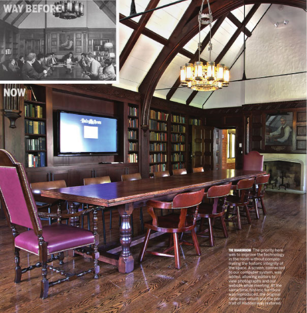
Above, the renovated board room of the Briton Hadden Memorial Building.
Six months ago, Mario and I sat in the wood-covered board room of the Yale Daily News’ Briton Hadden Memorial Building. The room served its purpose for the twice-daily budget meetings but showed its age: dusty archives spilled from open cabinets, the thick door could not open when closed, and plaster was falling onto the portrait at one end.
The Yale Daily News Magazine was in a similar state: functional, but in poor condition. There were some strong pieces of writing among the reportage, fiction, and poetry that made up each issue. The design, though elegant in places, was unexciting, with many pages being overly text-heavy. After browsing through several issues, Mario memorably remarked that the Magazine looked like it was from the year he was born—1947!
Today, after the summer’s renovation, the archives have been moved to a safer location, the door closes as it should, and the portrait of Briton Hadden has been professionally restored. Likewise, the Magazine’s visual presentation has been revived, a process I was lucky enough to guide over the last months. The new design is only an issue old, but I have already received a number of comments, encouraging in their enthusiasm, at the prospect of augmenting great stories with great visuals. Flip through the full issue below, and read on for how it came to be.
Starting Out
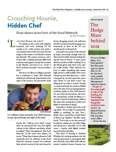
Above, early prototype of a short feature. Below, early prototype of a section contents page. The explicit sectioning was abandoned in the final design.
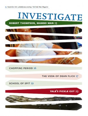
After Mario gave his thoughts on where the Magazine should go at that first meeting, I worked largely independently—my first time in the driver’s seat for a redesign. The first prototype pages I designed weren’t bad, but between the angled shapes, tinted boxes, and dotted rules there were far too many elements jockeying for attention. It became clear that the chaos emerged from my confusion over the Magazine’s identity. Was it about hard-nosed investigative reporting? An even balance between non-fiction and fiction? Was there a pervasive sense of humor, or irony, or seriousness?
As I spoke with the staff, in particular editors Zara Kessler and Naina Saligram, and Yale Daily News editor in chief Paul Needham, I found out that there wasn’t a single, consistent tone in the Magazine. In fact, the staffers were proud that they could employ many different voices, picking an appropriate attitude for their pieces short or long.
What unified the Magazine in the end was simply superb writing. With this as my focus, I tossed out everything in the earlier pages except for the type palette and started again. The emphasis on words suggested a literary approach, and I turned to traditional book design for inspiration. I began with sedate and clean typographic pages with a minimum of color, and while the final issue featured larger, more exciting visuals, the DNA of the design is in the work of figures like Bruce Rogers and William Addison Dwiggins.
“Imagery must communicate in a nanosecond …”
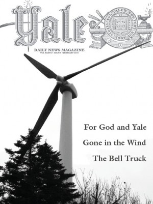
The February 2010 cover of the Magazine, before the redesign.
While the inside spoke softly at times, I wanted the cover to shout at the top of its lungs. The Magazine’s biggest problem in recent years has been a lack of awareness among potential readers. The editors described the previous cover design process as often being an attempt to find the best photo of those taken for that issue. While some covers were engaging, too many were still lives—a windmill, a hut with palm trees—that just didn’t push you to look inside.
I sought inspiration here, too, and found it in the legendary Esquire covers of George Lois. I could go on about their directness, or how they act as stunning visual editorials, but Lois sums up his approach perfectly in a quotation from a recent interview:
“Imagery must communicate in a nanosecond — the idea must be immediate and forever memorable. The idea must be understood: simple but certainly not simplistic … Hopefully an idea that enters your head and instantly enters popular culture.”
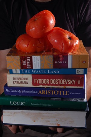
Above, a photo from the cover shoot, trying out three smashed tomatoes instead of one. I Photoshopped out my arms for the final image, but the tomato juice needed soap and water to disappear!
We’re certainly not dealing with material as weighty as the Vietnam War or Watergate, but the power of Lois’ covers is a worthy goal. This first cover is of a tomato on top of a stack of books labeled as “Your new course books” (tying in with the cover story’s argument that farming is a worthy part of a liberal arts education). We shot it standing outside the Hadden building, drawing an amused crowd as I was photographed holding a stack of books covered in tomato bits. (My clothes were fine, but the books will never be the same.) I hope the image grabs viewers, even for a moment, and gets them to pick up a copy.
Architecture and Typography
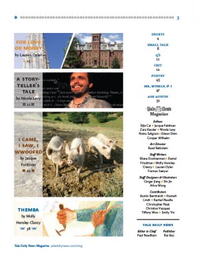
The new design’s table of contents, with cover story and three big features.
The design was not the only aspect we revamped. Instead of presenting several long features of equal importance, we now emphasize a single, longer cover story. There are three longer features (an investigative feature, a profile, and a short story) that get secondary billing, with shorter pieces at the beginning and end for variety.
As for the grid, at magazine designer Robert Newman‘s excellent suggestion, I switched from the awkward nine-column grid of the early prototypes to a twelve-column, with a six-point baseline grid.
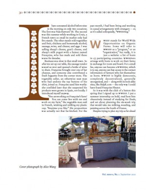
Above, the first page of the cover story.
To give the diverse content some cohesion, I decided to base the design in a type suite, with serif and sans designed to match each other. I selected Xavier Dupre’s FF Yoga and FF Yoga Sans. Both faces work well for both body text and display—useful in keeping the pages from feeling cacophonous. The serif has an interesting chunkiness but is highly readable at ten points. The sans is the calmer of the two, with nods to Gill Sans that make it appear somewhat familiar within a literary context.
The four fonts of the Yoga suite were the workhorses, but I needed an accent face to flavor the design. A long search for a high-contrast garalde yielded Magneta by Neil Summerour. The best part of Magneta turned out to be the ornaments. I had decided earlier to use ornaments in the Magazine to add a bookish quality, and I was thrilled to find a type family with a coordinated set. We use Magneta’s ornaments for the “headpieces” at the top of every page, with each of the four major features receiving a unique scheme. They appear occasionally elsewhere, most prominently in the drop caps for the cover story.
Update
Alexandre Giesbrecht, in the comments below, reminds me that I didn’t write about the Magazine’s new nameplate (thanks, Alexandre!). We’re using type designer Tal Leming‘s terrific redrawing of the 119-year-old Yale Daily News nameplate, enlarged to several times its size in the newspaper. At first I was afraid that using the word “Yale” as the nameplate downplayed the actual name of the publication too much. But running the title through the center of the word allows “Yale Daily News Magazine” to take center stage. I’m quite happy with how the alternating blue and black lines in the nameplate turned out as well.