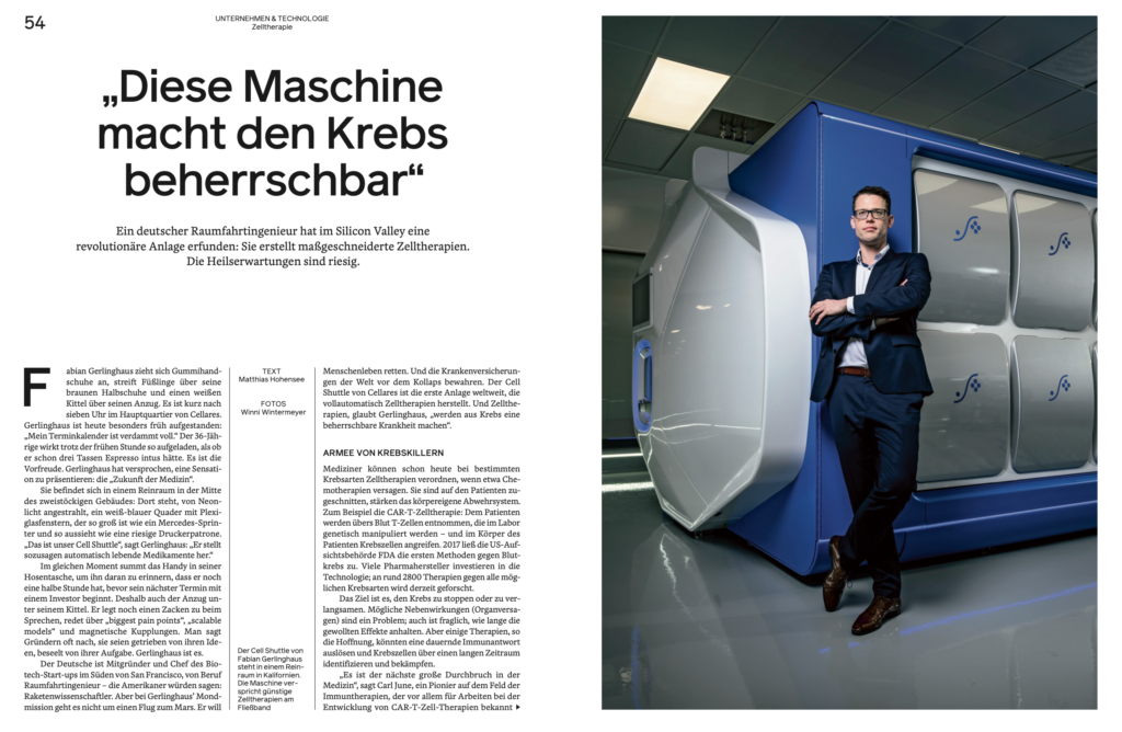
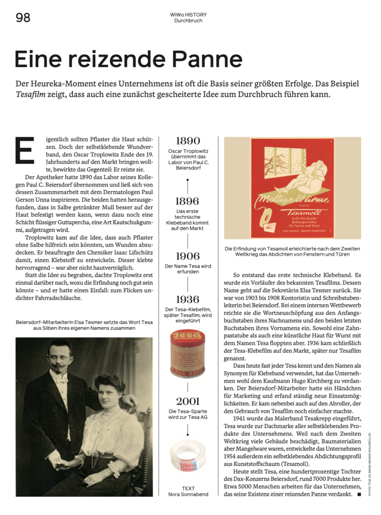
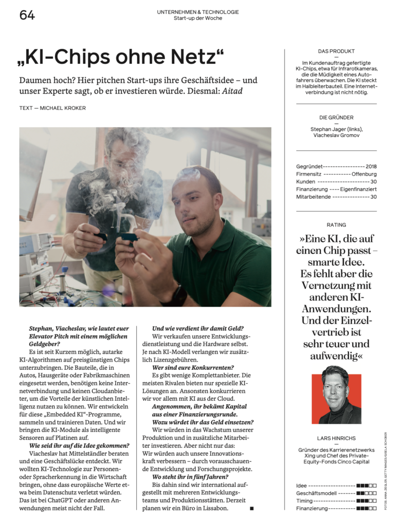
Readers of WirtschaftsWoche have plenty to celebrate this week. Their magazine, often referred to as WiWo, is out with a new look that is only one of the several changes readers will see. Under the leadership of editor in chief, Horst V. Buttlar, the WiWo out this week with a cover story about New Beginnings, is also embarking in a new journey that includes new fonts, an easier to navigate distribution of content, greater hierarchy for various type of content, new color palette, and a monthly section about Lifestyle.
At 97, WiWo looks young, contemporary and it becomes perhaps the ultimate example of how a legacy weekly newsmagazine can adapt and perhaps even thrive in the mobile-first era of content consumption.
Here is the cover for the first edition of WiWo with new design: The cover story headline–The Art of New Beginnings:
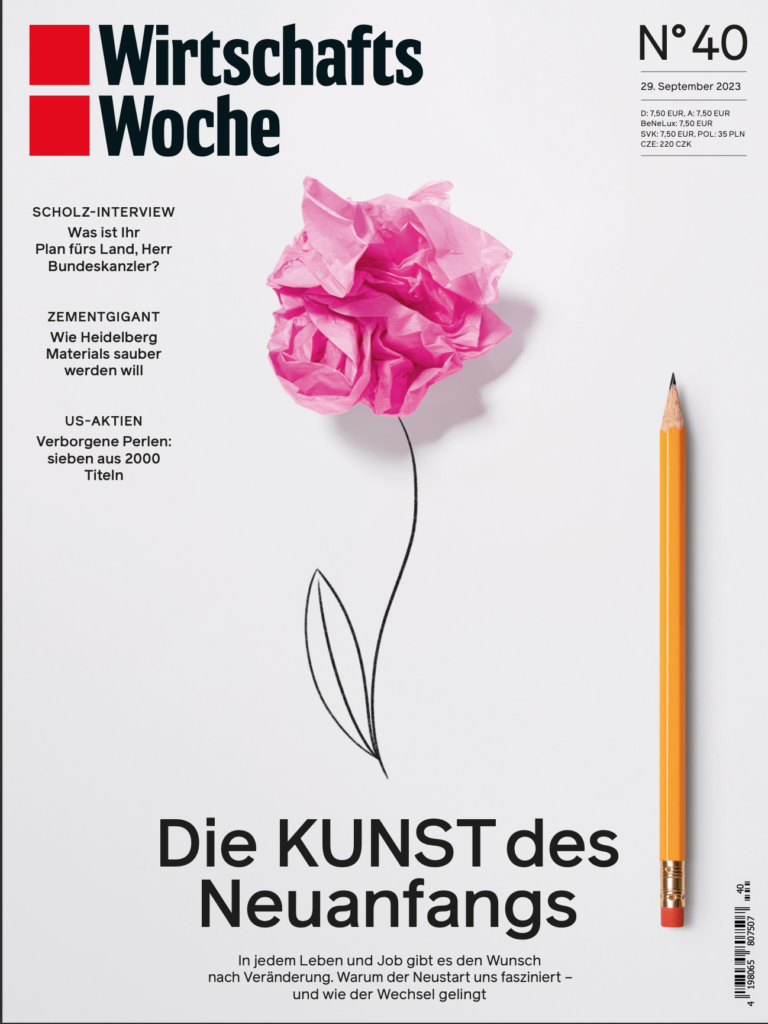
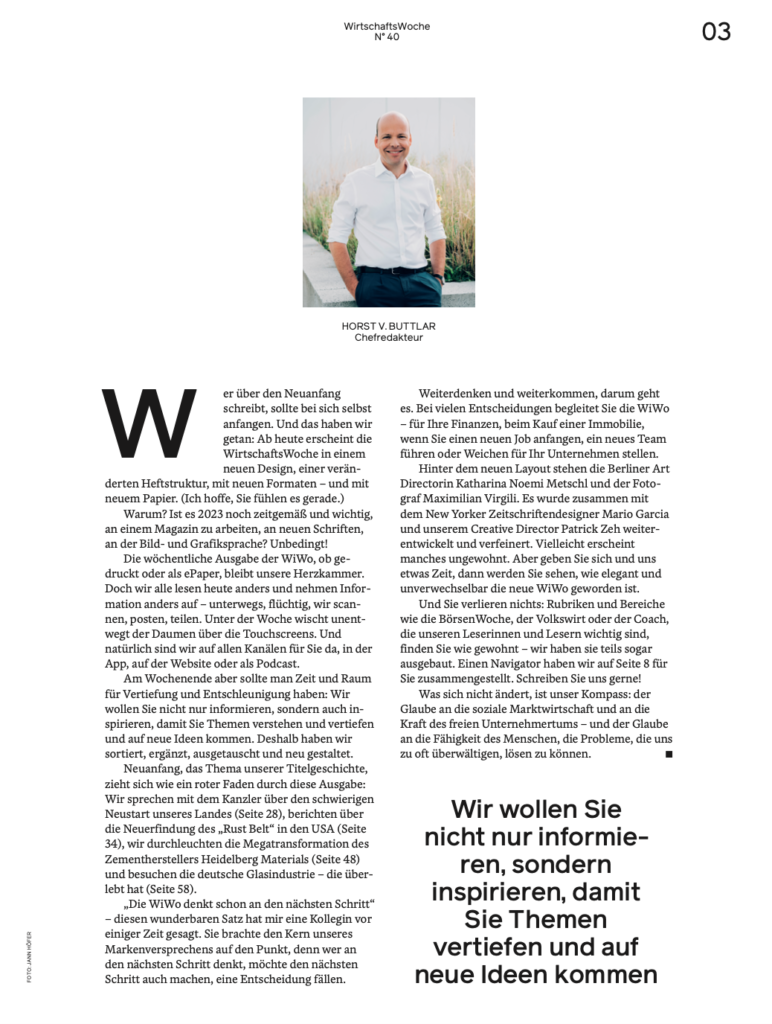
This is how Editor Buttlar introduced the relaunch to the readers September 28:
“The weekly edition of WiWo, whether printed or as an ePaper, remains our heart. But we all read differently today and absorb information differently – on the go, fleetingly, we scan, post, share. During the week, your thumb is constantly swiping across the touchscreens. And of course we are there for you on all channels, in the app, on the website or as a podcast.
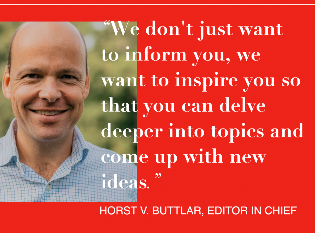
At the weekend, however, you should have time and space for deepening and slowing down: We not only want to inform you, but also inspire you so that you understand and deepen topics and come up with new ideas. That’s why we sorted, added, exchanged and redesigned.”
Buttlar has defined the rhythm with which readers consume information today, leaning forward several times a day to read on their mobile devices, but also leaning back to enjoy longer pieces when time allows, but especially on weekends.
Here is the page where Buttlar introduced the new WiWo concept:
The process
We at Garcia Media, and me personally, have enjoyed our collaboration with the WiWo team, a process that began in August 2022 with first sketches, working with our GM Latinamerica team of Rodrigo Fino and Paula Ripoll, senior art directors, with additional work from Thomas Weyres of Tagesspiegel, Berlin. At the time, the idea was to give WiWo a fresh new “rethink”, not just for its look, but for how its content is presented.
This is how WiWo covers looked, usually with an illustration as the main visual element. We started by suggesting more cover variety, sometimes photos, or type treatments, or photo illustrations, but not be married to the same type of illustrations week after week. Take a look at how WiWo looked before the transformation:
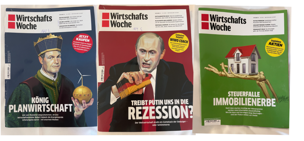
Side by side, the old and new cover concepts:

From the start, we knew that the print edition of a magazine for readers in the mobile first era had to offer a cleaner, more minimalist design concept.
Working closely with WiWo art director, Patrick Zeh, and two extremely talented Berlin-based designer Katharina Noemi Metschl and the photographer Maximilian Virgili , we embarked on a series of creative workshops, coming up with ideas that we would pin on the wall for further discussion.
Key to our thinking for a new, less cluttered and more appealing, easier to read WiWo:
Simple grid
The essential grid is three columns on the page, but we also used a narrow column “track” that can be used for secondary readings and marginalia elements, such as numbers or facts:

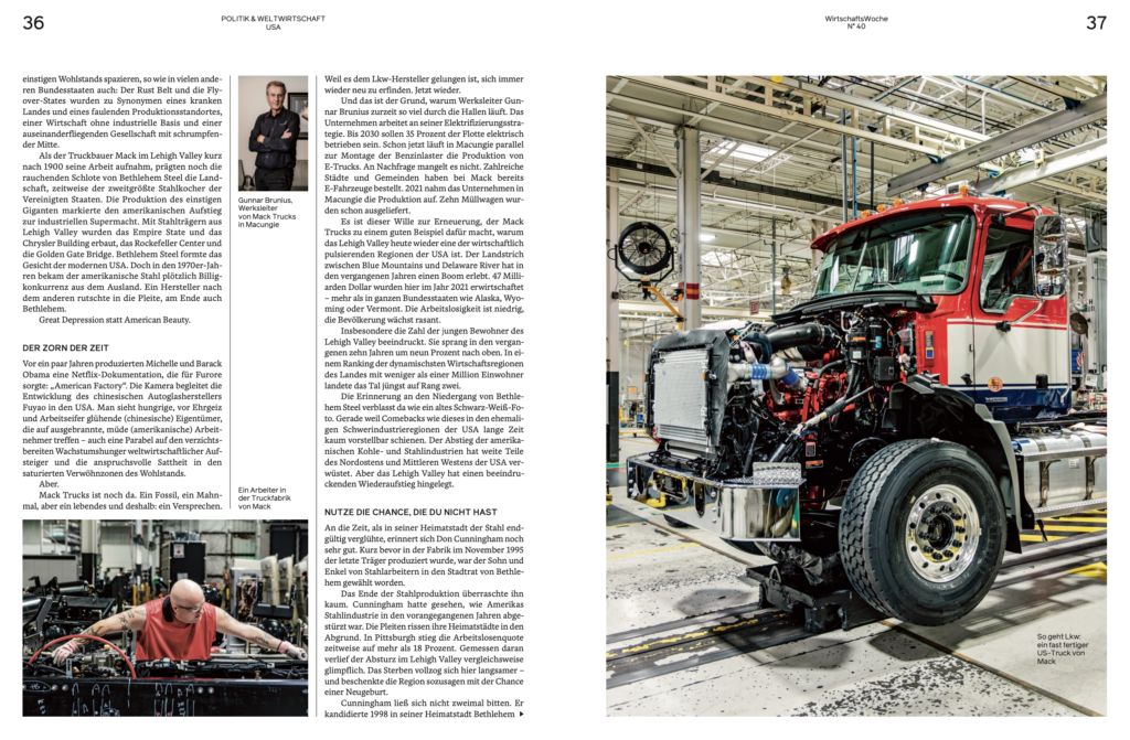
Other grid configurations:

Double page spreads
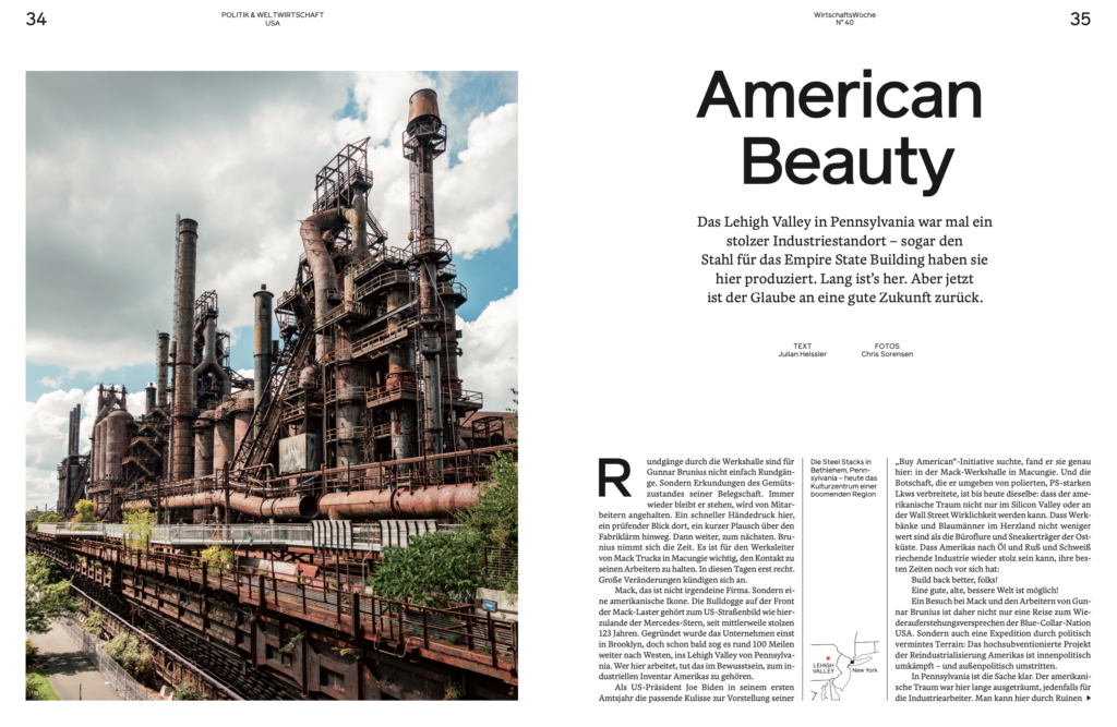
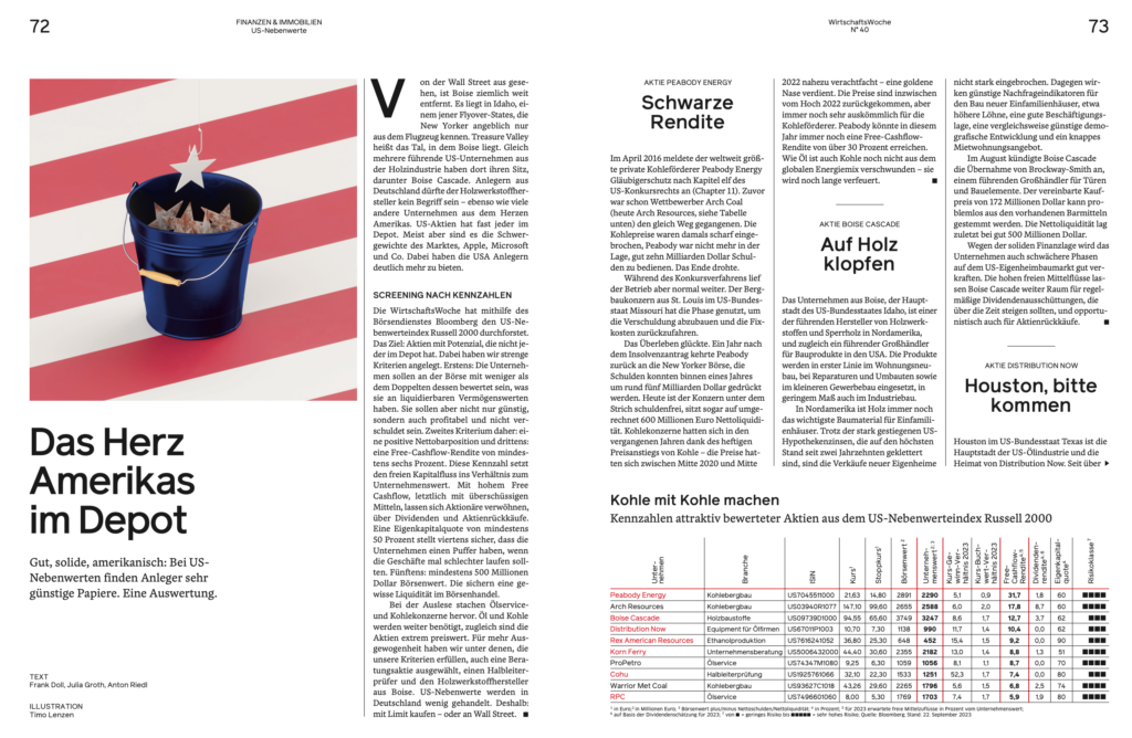

Big openers
I worked closely with the designers reminding them of a concept I embrace: the design of a magazine is like a symphony, so there must be adagios (violins) and staccatos (drums and trombones). These pages show what happens when the designer plays the trombone to change the rhythm in the middle of a print magazine:
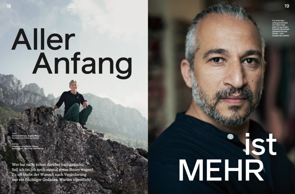
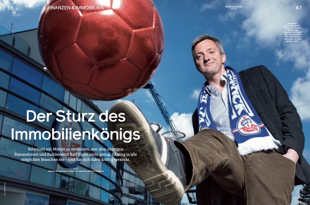
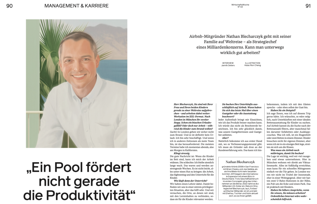
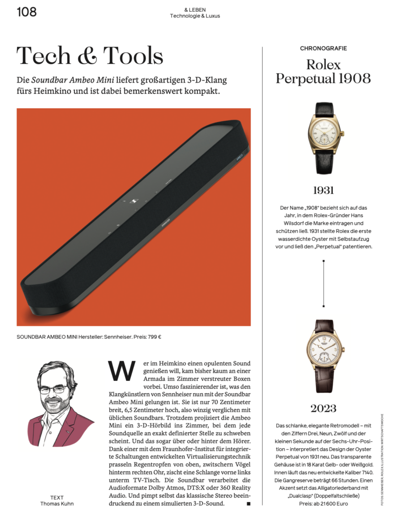
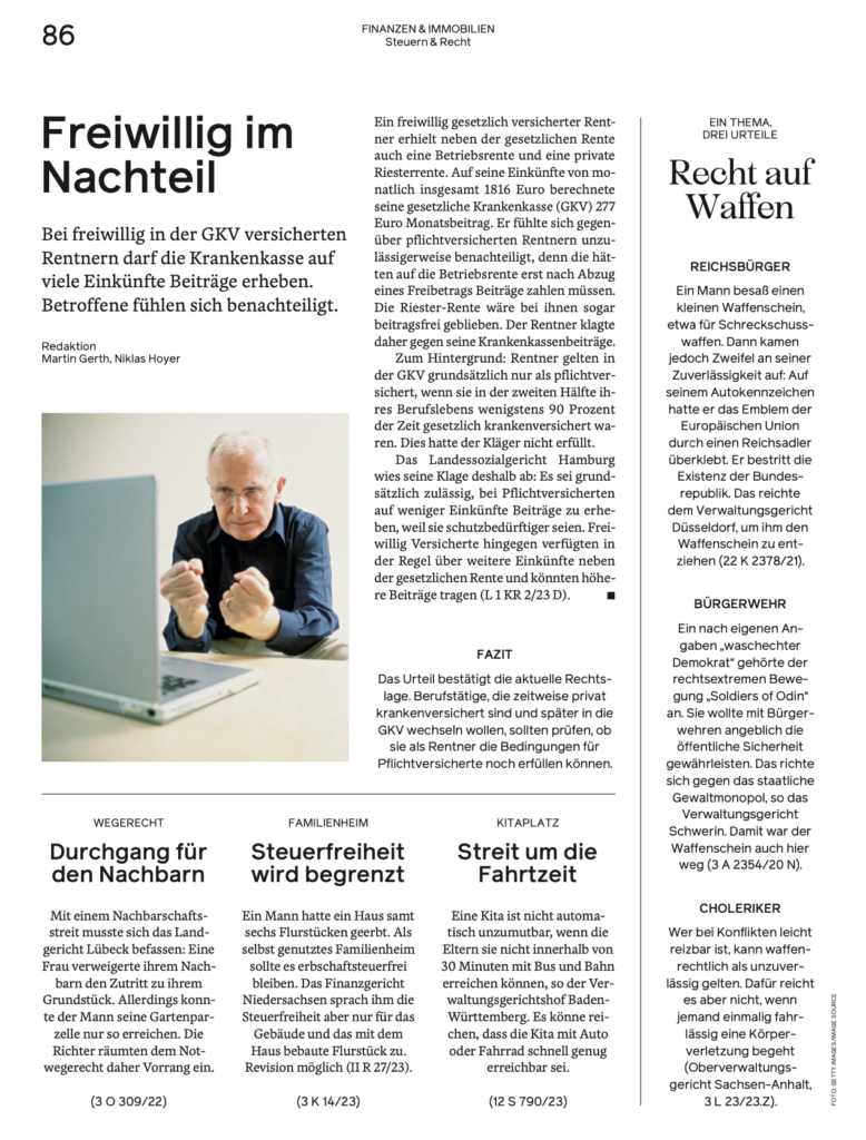
Single pages are important too
A key element of the new WiWo design is how various single pages add context and what I describe as “finger reading”–short snippets on a variety of topics. See below:

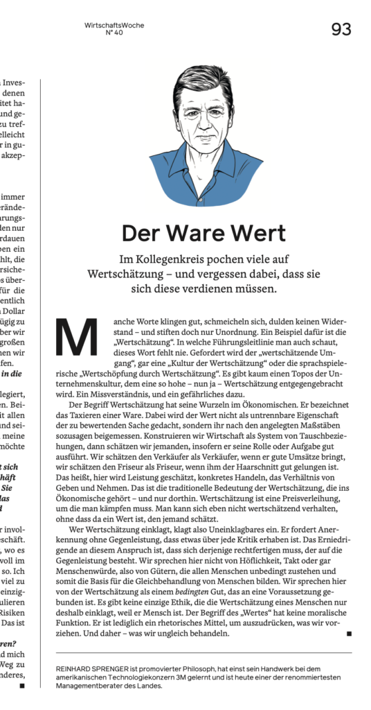
Special treatment for commentaries
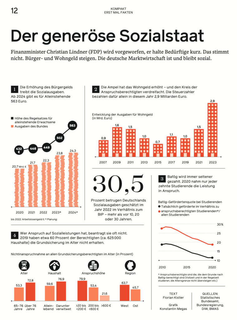
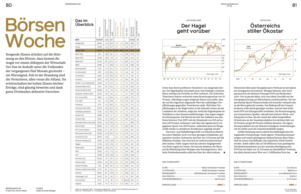
The treatment of infographics
In a financial magazine, graphics and tables play a key role. Our design team, working closely with editor Buttlar, opted for the most functional and minimal approach for these elements:
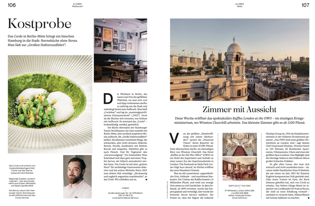
The new Leben (Lifestyle) section
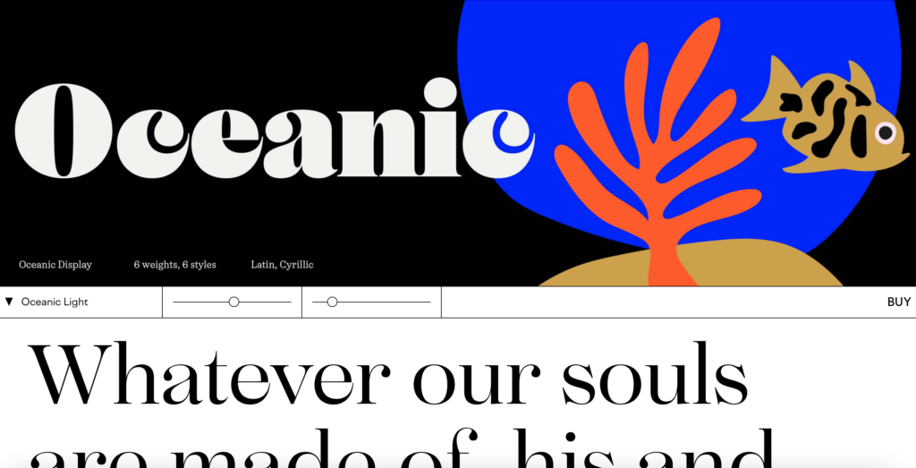
It is not all hard business and financial news in the new WiWo. Once a month, a section devoted to lifestyle, art, homes, food, and the finer things in life, appear. We opted for a change of font here, with an elegant serif , Oceanic, leading the way:


The typography palette
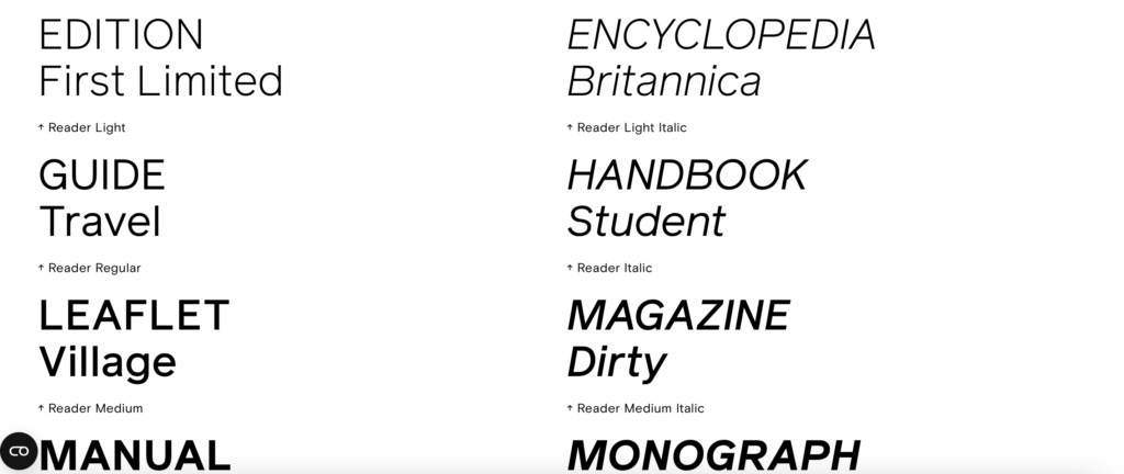
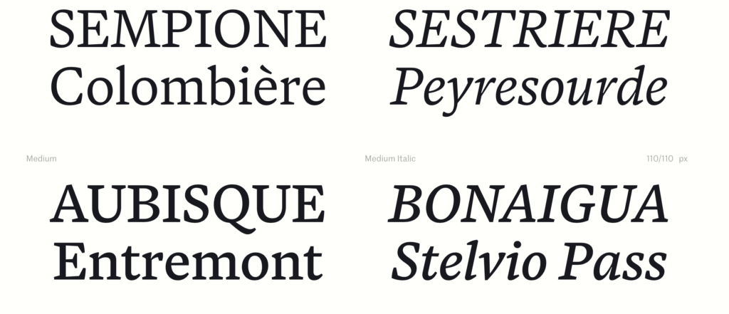
Here the fonts utilized through the new design of WiWo:
- For headlines of news section we use the font Reader from Colophon Foundry
- For Headlines of Leben section we use the font Oceanic from interval Type
- For Texts we use Blanco from Foster Type
Of related interest
In German:
Scroll through entire magazine:
Pre-order my new AI book here
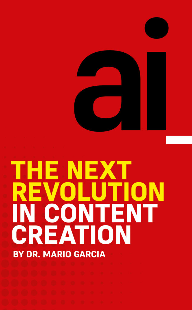
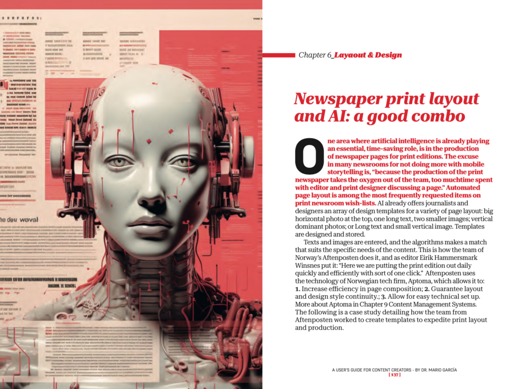

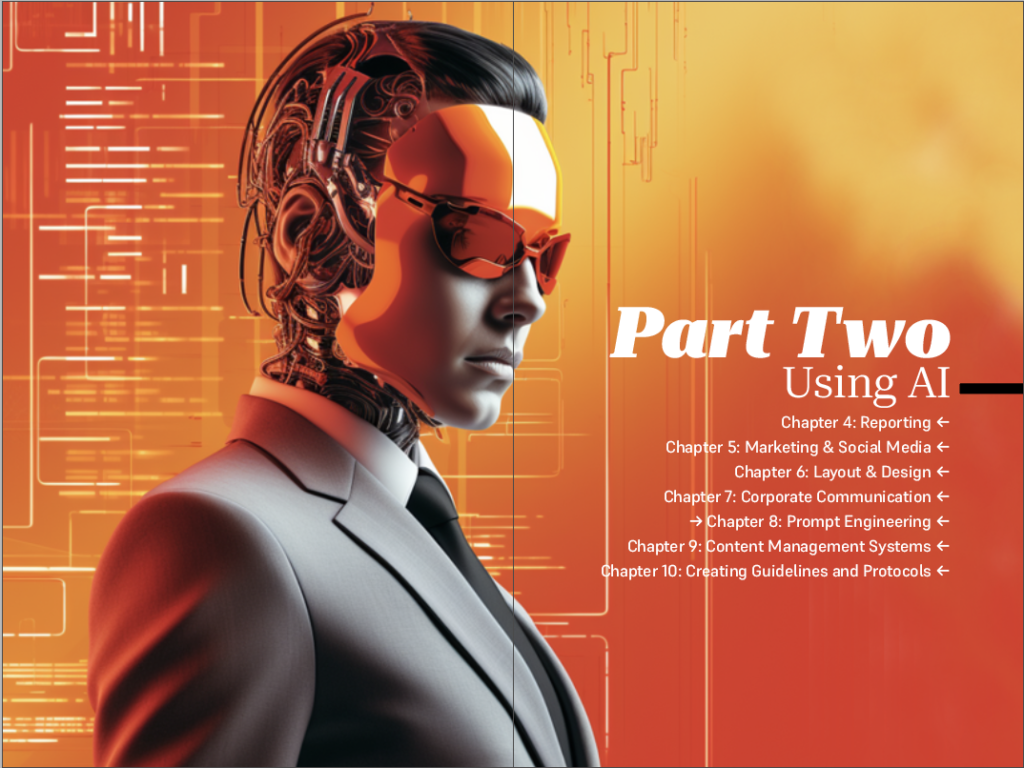
Here is a chance to pre-order my new book about Artificial Intelligence and content creation. The first 25 copies sold will be signed! Order here:
https://thaneandprose.com/…/preorder-ai-what-to-expect…
Pre-publication reviews here!
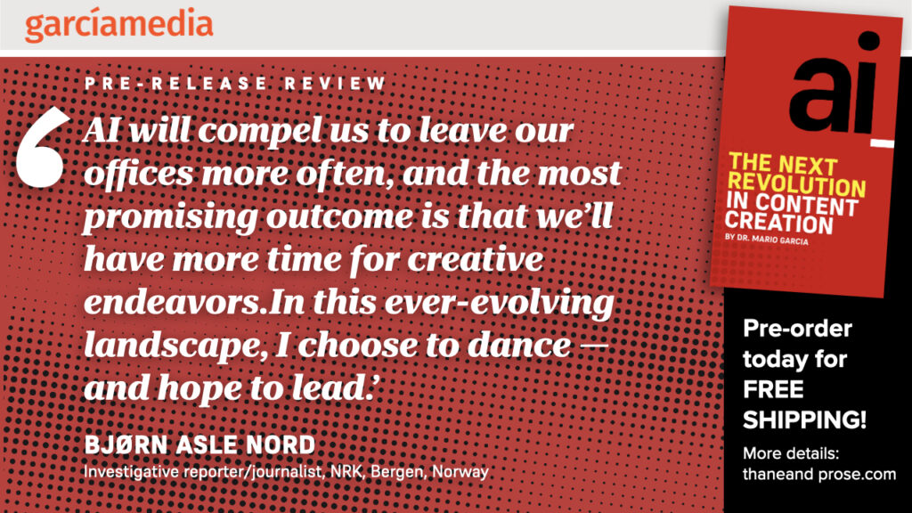
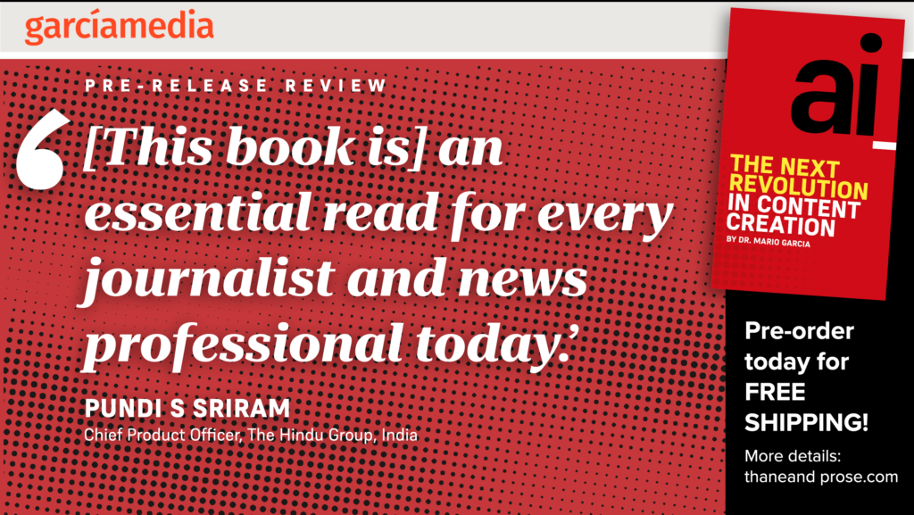

AI front and center
As I put finishing touches on the manuscript of my new book, AI: The Next Revolution for Content Creation, I am aware that the number of AI-related headlines that appear in my mailbox daily is on the increase, frustrating the author of a book that must have a date of completion, and realizing that in today’s fast paced technological advance environment, books must have websites created for updates.
For more about my new AI book, go here:
Other AI-related blog posts
ChatGPT gets competition–say hello to Claude 2
https://garciamedia.com/wp-admin/post.php?post=21948&action=edit
Of related interest
https://newspaperdesign.in/ai-is-the-next-big-media-revolutionmario-garcia/
Newsrooms around the planet have gone mobile-first after a Garcia Media workshop!
Our Garcia Media Mobile Storytelling workshops are proven to introduce your editorial team to the way we write, edit and design for mobile platforms. It is a one-day program that involves a presentation (where I summarize my Columbia University class content), and follow it with a hands on workshop.
Did you read The Story yet?
I urge you to consult my latest book, The Story, a trilogy full of tips and explanations about mobile storytelling, which represents the latest genre for journalists to explore. See information below:
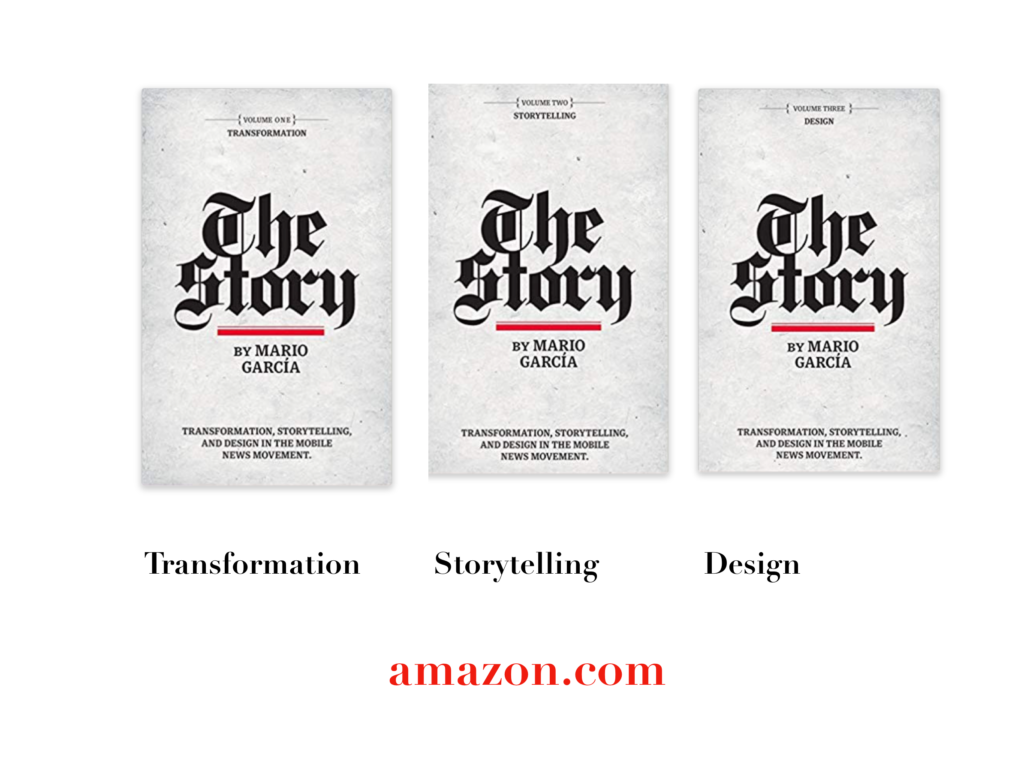
The full trilogy of The Story now available–3 books to guide you through a mobile first strategy. Whether you’re a reporter, editor, designer, publisher, corporate communicator, The Story is for you! https://amazon
Volume 1: Transformation
https://books.apple.com/us/book/the-story-volume-i/id1480169411
Volume Two: Storytelling
https://books.apple.com/us/book/the-story-volume-ii/id1484581220
Volume Three: Design
https://books.apple.com/us/book/the-story-volume-iii/id1497049918
Order the print edition of The Story, from Amazon, here:
The Story, en español:
TheMarioBlog post # 3376

