TAKEAWAY: Typographic contrast is a must to ensure that the overall design of a publication shines. Bold, medium, light weights combine to play a symphony on the page. The Tampa Tribune needs to add a few violins to its own symphony—-quickly. PLUS: One guy’s redesign of those boring and hard to follow airline boarding passes.
When excessive boldness drags down a newspaper’s design——and brand
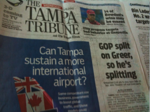
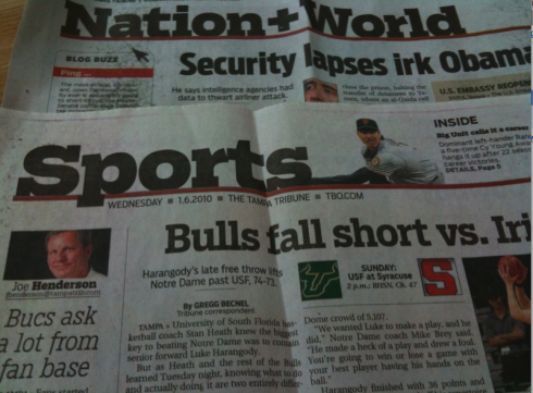
Bold headlines, bold section headers: no typographic contrast at The Tampa Tribune
I have been three weeks at home in Tampa.
That means reading the local newspaper, The Tampa Tribune. The Trib is always very local, informative and it covers the small neighborhoods—-such as mine, Temple Terrace—-well.
But, God, I think it must be the boldest newspaper, typographically speaking, in the entire United States. Tell me it isn’t so. For days I have looked at it each morning and pondered my questions as I eat my yoghurt and drink my coffee:
—What font is the Tribune using for headlines?
—Why is there nothing but bold, bolder and boldest type used. It is the equivalent of taking a hammer and pounding on the readers’ heads at each step of the way. From page headers to lead heads, to secondary heads, to briefs: bold is the word.
—Did anyone consider contrast when arranging the typographic scheme?
If this was a a symphony, it would be 76 trombones playing. A couple of violins are needed pronto.
Type over layout
What disappoints me is that the pages are generally well laid out. In some cases, the front page and the front of sports, the design tends to be good and inviting. But along come these bold headlines and everything disintegrates quickly.
The January 6 edition of the Tribune also had its over the top boldness compounded with poor printing—-bold headlines, smudgy, inky pages. This is certainly an invitation to abandon print and read online, or, in my case, on my iPhone. I never thought such idea would cross my mind, but I admit it did.
I wonder how readers of the Tribune feel about the way their newspaper looks. Not that many readers will call to complain about boldness in their newspapers, but I admit I was quite close to making such a call, out of curiosity. This excessive boldness cannot be good for the brand of a serious newspaper that has served our Tampa Bay community for over 110 years.
The Tampa Tribune’s content is local and smells like a good Tampa-made cigar. The look of the newspaper, however, does not match anything that has to do with Tampa. Indeed, the boldness of its pages would fit much better as a down market newspaper sold in the streets of a Central American country.
Typography constitutes about 85% of what one sees on the pages of a newspaper. Type makes up the strongest fabric of the page. When the type selection is not good, everything else falls victim to that choice. If, in addition to a bad font, only ONE BOLD weight is used for everything, then the problems increase.
The good thing for the Tribune: this problem is easy to solve. If they DO like that font used for headlines, all they have to do is a little design rehab to start incorporating other lighter weights into the mix. Design rehab is a place where good things happen to pages with bad addictions.
Tribune readers deserve better—-so do the reporters who produce those local stories that end up housed under black umbrellas.
Sometimes “bold” is what we seek….
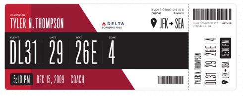
I want to have a boarding pass like this as soon as possible: are the airlines listening?
While on the subject of type. And to make the point that boldness is NOT necessarily undesirable, but one must know when to apply it.
Reed Reibstein(Yale University ‘11) sends me a fascinating link about the “redesign” of airline boarding passes. True, not many of us pay attention to the typographic choices of boarding passes. We are usually too busy trying to decypher boarding times and gate numbers.
This is why I could truly identify with Tyler Thompson’s, who, upon looking at a boarding pass during a recent flight, decided that it was one of those things that had no design and could be rethought. This is how Tyler described the process he thinks went through as boarding passes were first designed:
It was like someone put on a blindfold, drank a fifth of whiskey, spun around 100 times, got kicked in the face by a mule (the person who designed this definitely has a mule living with them inside their house) and then just started puking numbers and letters onto the boarding pass at random (yes, I realize that a human didn’t lay this out, if a human had, judging by the train-wreck of design, they would have surely used papyrus). There was nothing given size or color importance over anything else, it was a mess.
The results, one of which I show here: an attractive, easy to follow boarding pass, complete with large type, boldness (where needed), and a distinctive, modern way to facilitate the ever complicated process of travel.
Visit the Rodrigo Fino’s blog in garcia-media.com.ar/blog (in english) click here
TheMarioBlog post #445