Let me put my disclaimer out here first: I am a fan of white space as an essential element of design. I have said so in my books. I continue to reinforce that notion in my workshops. I think white space is like punctuation on a page: it allows us to take a deep breath, and to separate one item from another.
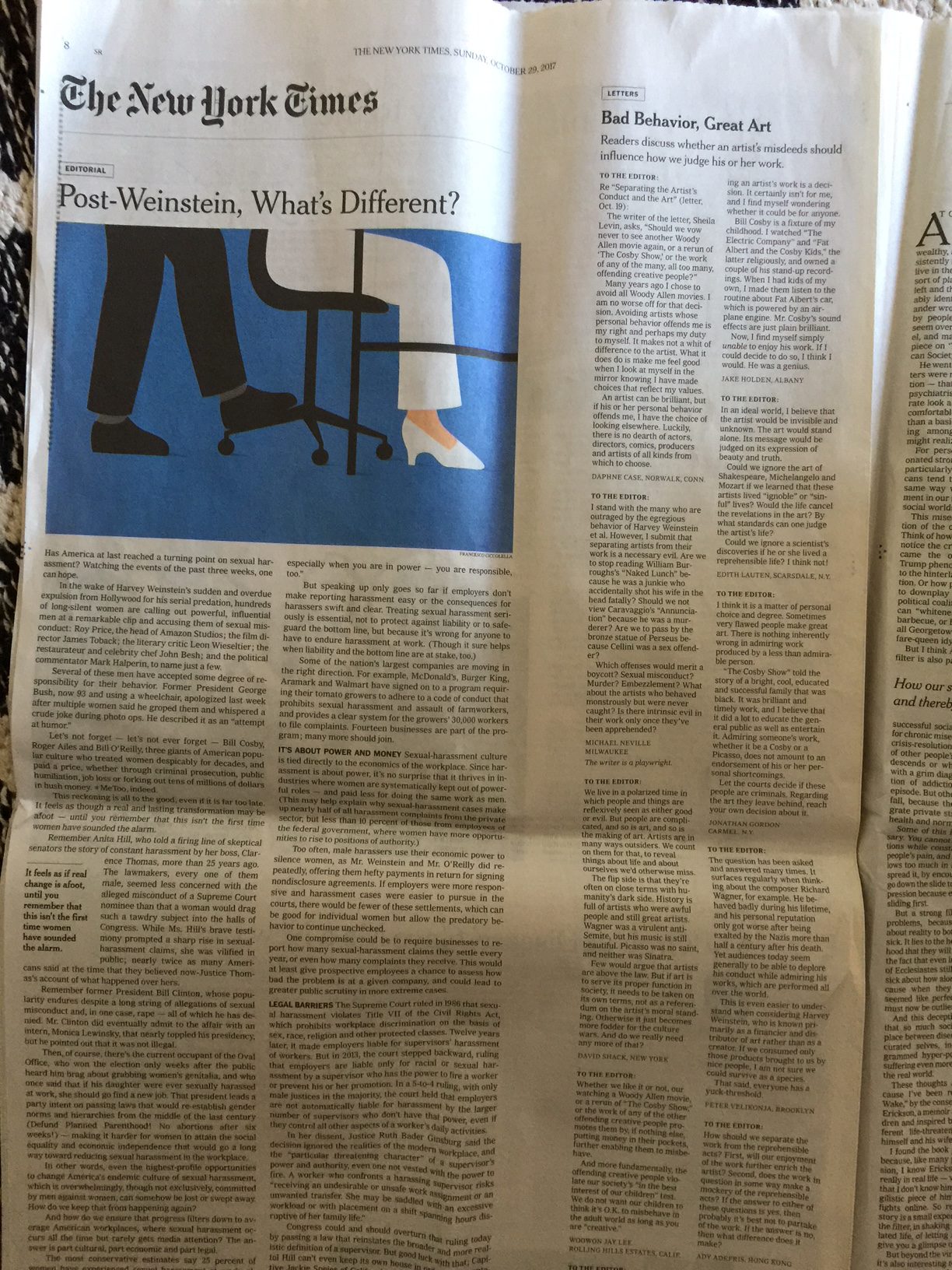
And I am happy to see that, for example, the opinion pages of The New York Times are now building white space as part of the grid. I like also, as we see below, on the Times’ editorial page, that the alley of white space separates the newspaper’s editorial from the letters to the editor on the right. The grid allows for the editorial to be set in wider column than the narrow set for the letters. All of this is good.
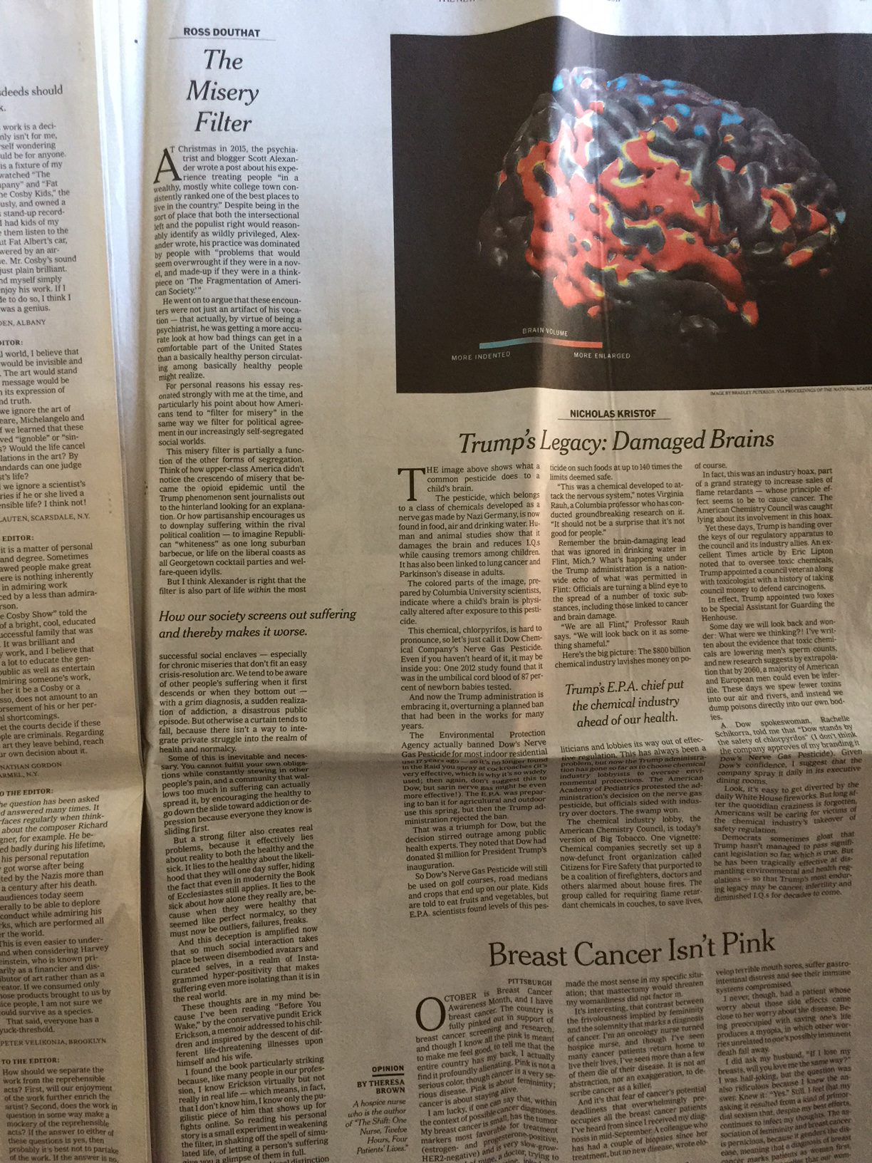
The same grid concept is used on all of the opinion pages, as we see below. Sometimes that “alley” of white space can be used to incorporate small texts.
Meanwhile, at USA Today
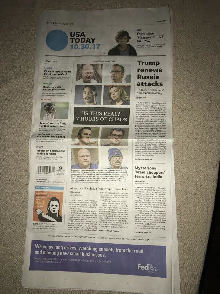
Just as I was putting together this blog post about “white space” on the opinion pages of The New York Times, an Atlanta friend, Jim Okula, sent me a note asking if USA Today had undergone a redesign lately. His text read:
Morning. Is it my imagination or has USAToday undergone a redesign/touchup? Columns are wider; more white space; maybe less content?
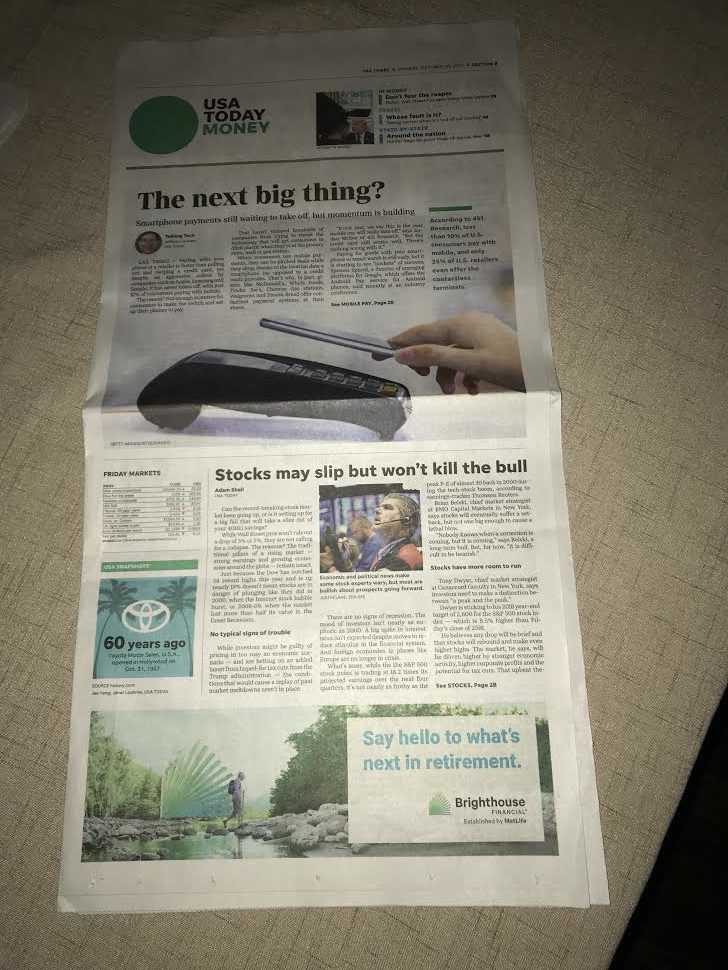
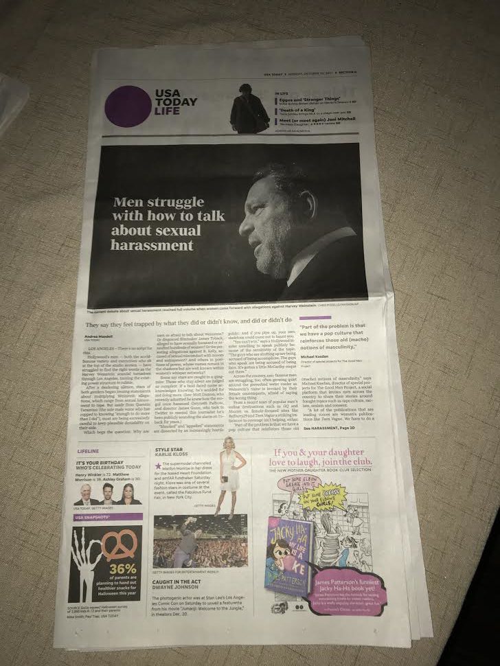
I answered that I was not aware of a recent print redesign for USA Today. So, he sent me pages to show me what he meant. In these pages we see two things of interest: more white space above headlines, for example. Also, use of wider columns across these section fronts.
Okula did study the pages carefully and got back to me with this:
Checked it against an issue from last week. I was right. I would bet changes to accommodate fewer reporters and few stories. Columns wider. More white space. Less content. Not a happy camper. Questionable value.
Jim Okula, who is now retired after decades working as a communications creative, is quick to point out that he, too, likes white space:
I love white space also. While USA Today did “news lite or news brief” sometimes called the McNewspaper, I loved it for what it is. Now it all seems like sections from the Sunday NYT, which I also love. To me it has gone from a NEWSpaper to a features paper.
Today each section was only 6 pages. Is this the last iteration before there is no more print edition? If this is not accepted, is the death kneel playing?
Two different uses of white space
We see above two distinct uses of white space. The Times’ has used white space wisely, incorporating it as part of a grid that allows for white space to be functional, separating content and creating air on a page that tends to be text heavy due to the nature of the content. The Times’ basic grid is six columns, so the designers turn that into a 12 column grid, to allow for that skinny rail to be a systematic part of the look of the page.
I am not so sure that the excessive white space we see above the headline (top) of USA Today is systematic. The danger here is that, as my friend Jim related, the reader sees the excessive use of white space as reducing the value of the content. “We get less,” say the readers when white space is not part of a grid, but appears to be there because there is nothing else to put in its place.
Good thoughts for designers of print newspapers at a time when value offered is key, especially for print readers.
Of related interest: about USA Today and format
Mario’s Speaking Engagements
Nov. 16-19, WAN IFRA Latin America, Buenos Aires, Argentina

April 18-19, 2018-–Newscamp ,Augsburg, Germany.

June 3-6, 2018—The Seminar, San Antonio, Texas.

Our digital transformation workshops
If you would like to find out more about our workshops for digital transformation, email me: mario@garciamedia.com
I will be happy to answer your questions and provide more information. Our workshops are offered in both English and Spanish.
TheMarioBlog post #2726