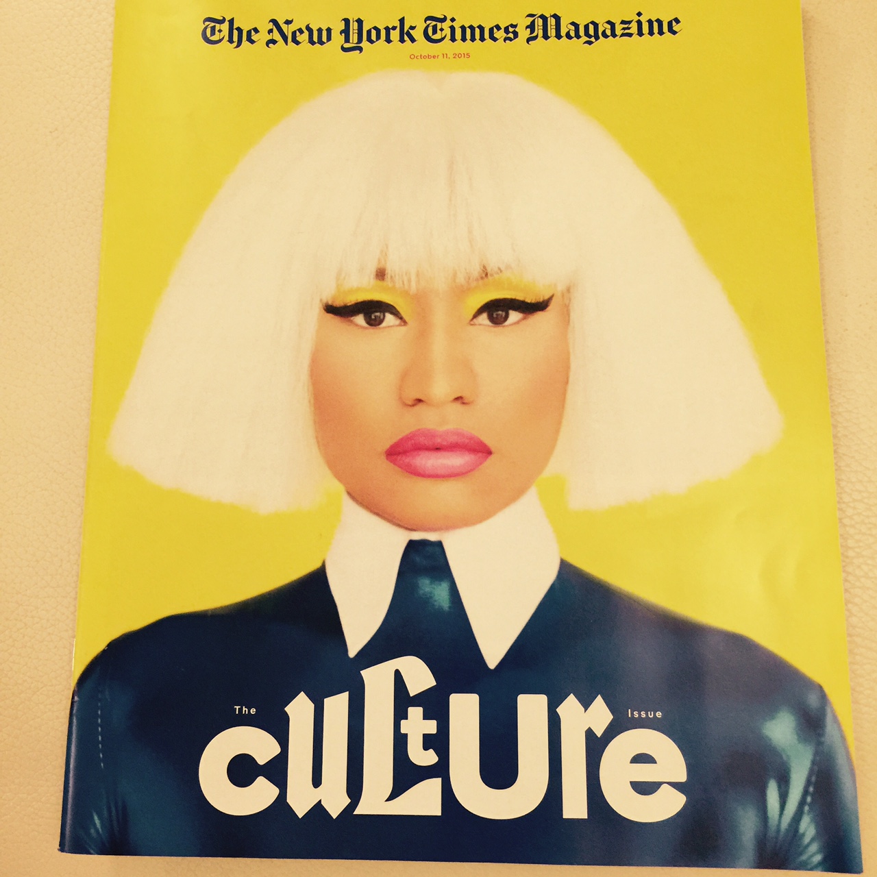
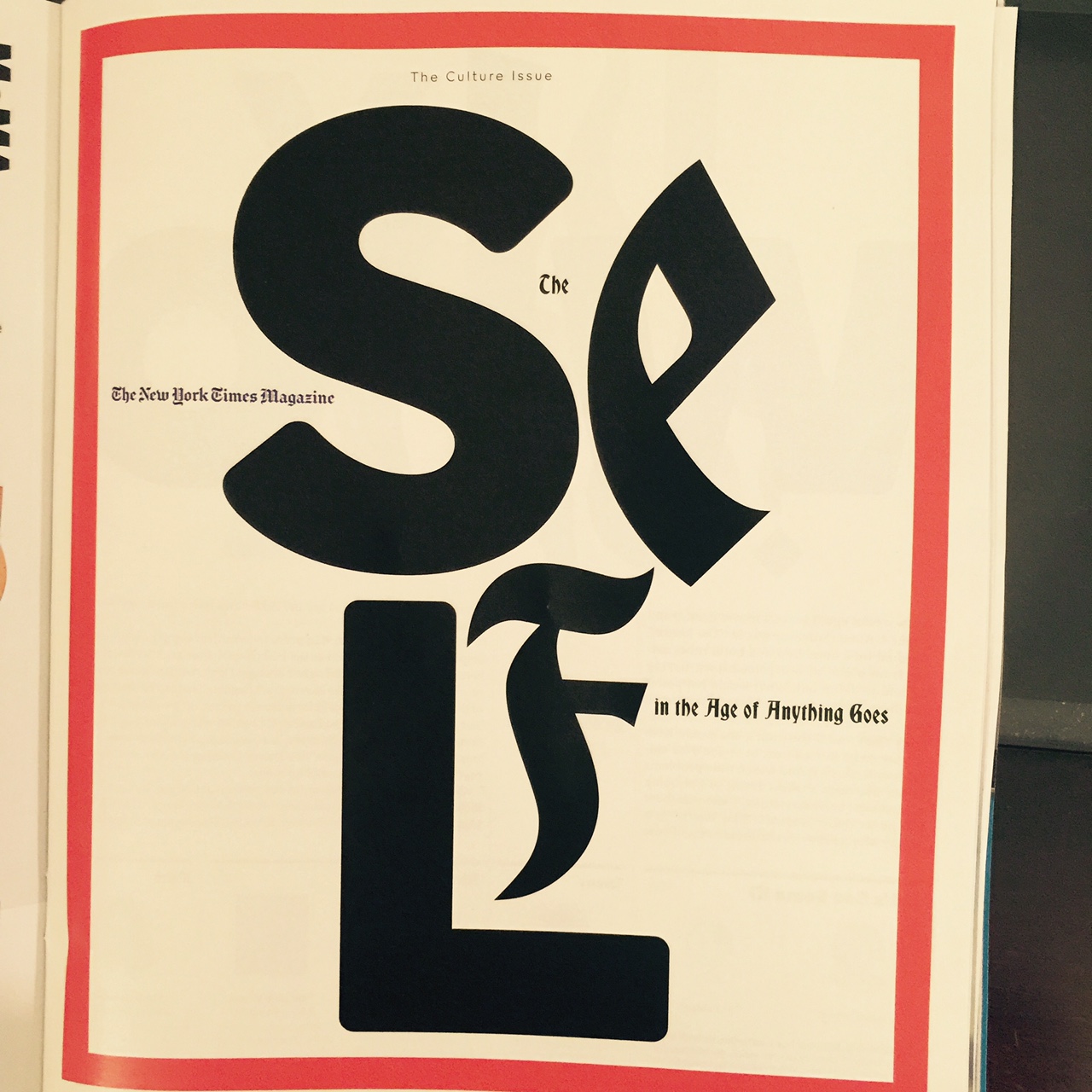
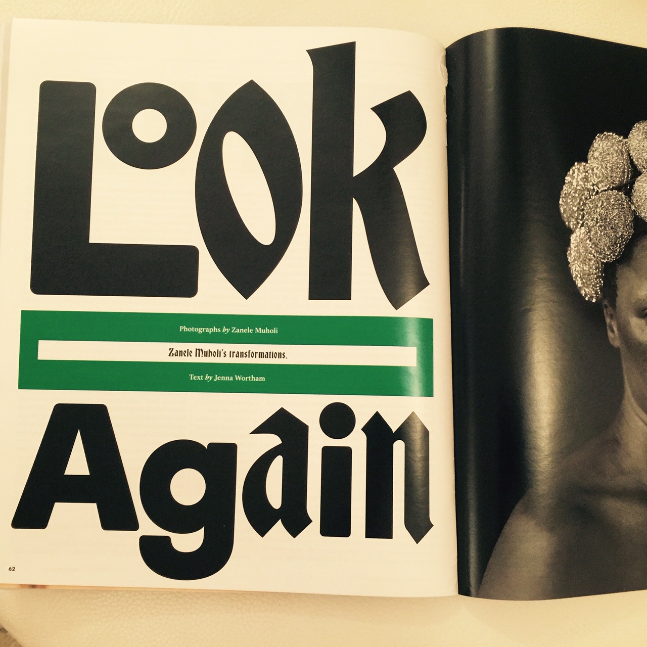
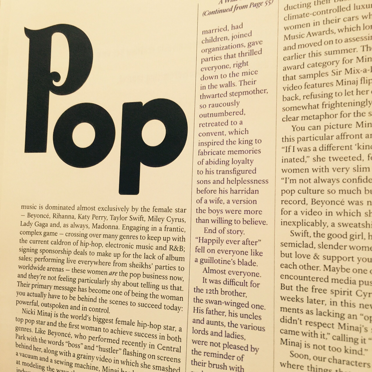
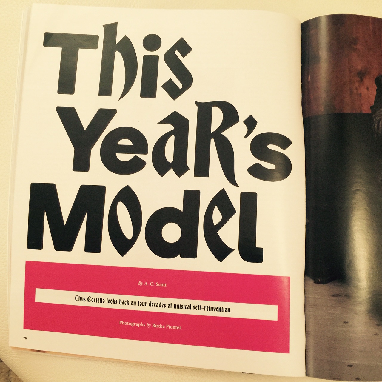
Bravo for those art directors (and editors) at The New York Times Magazine for how they let type carried the day for their cover story.
Readers of TheMarioBlog know how much we like “type attacks”—those moments when a designer decides to let the letters do it. Not that the photos and the text don't play a key role here, but it is type as protagonist, without a doubt.
I an only imagine the deliberations between editors and designers before they decided to go with this type attack. In this case, however, it is a story with attitude (an opening spread carries a headline that reads: Who Do You Think You Are?), so why not let the design also show a bit of an attitude?
We like what we see here.
TheMarioBlog post #2025
The Mario Blog
02.27.2026—1am
Looking back 50 years, some things stay the same
02.10.2026—2am
When Rothko Meets the Robot: Why Your AI Needs a ‘Human Scent’ to Truly See.
02.09.2026—2am
The Artist’s New Scenographer: Why the Next Great Life Drawing Isn’t Born on the Canvas, but in the ‘Scent’ of the Prompt
02.05.2026—11pm
The Architect’s Scent: Giving AI a Nervous System for Buildings and Bridges
02.03.2026—9pm
The Educated Zombie: Why AI’s Next Great Leap Isn’t About Words, But Weight
—8am
What 1917 Can Teach the 2026 Newsroom
Sign up and we will keep you updated