Update #2, Wednesday, 7 am, Dubai time
TAKEAWAY: I will be reporting from Dubai all of this week, with emphasis on how the region has embraced visual journalism. Today:the importance of “protocol” and how it impacts what we designers can and cannot do on Page One.

Dubai Report #3, Wednesday
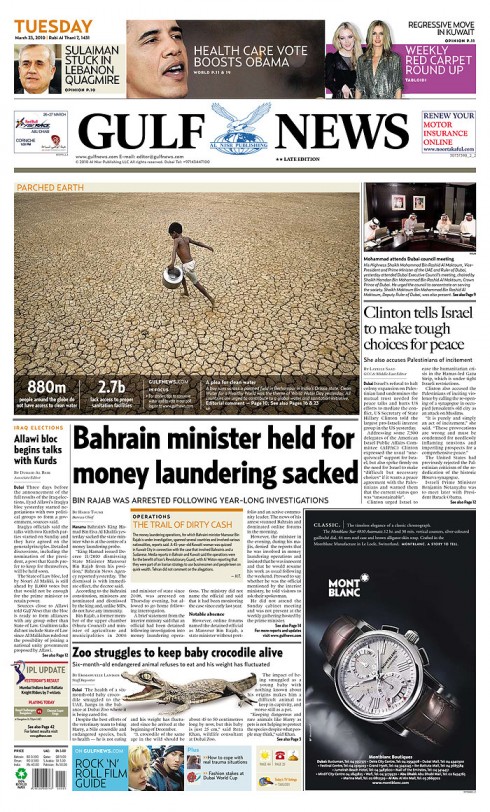
Front page of Tuesday’s Giul;f News: protocol photo at right
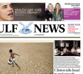
Notice small protocol photo at right of Page One: must be there, above fold.
In my blog yesterday (see below), I showed some of Lucie Lacava’s work for the Arab-language daily, Al Ittihad, the oldest such newspaper in the United Arab Emirates. As I know the challenges that designing newspapers in the Arabic language present, I asked Lucie to share with us what she faced when designing Al Ittijad. I am not surprised that she mentions the ever present “protocol” as one of her challenges.
For those who may not be familiar with it, “protocol” dictates that the newspaper must have a photograph on Page One of any news about the ruler of the Emirate. The item must lead at the top of the page and no other person’s photo can be positioned above his.This is something Lucie did not apparently have to worry about when doing the English language The National, which, today for example, was the only newspaper in the UAE that did not have the protocol photo above the fold. For whatever reason, this newspaper does not do it. I am told, unofficially, that the first editor of the newspaper negotiated a deal NOT to have protocol at the top for the first five years of the newspaper’s life. Good deal for the designers.
We were not so lucky at the Gulf News. Today, if you look at the page here, the small photo is there on Page One, usually not a very pretty photo, if you ask me, as the protocol photo usually is but a group of men around a table, with a floral bouquet between them, and nothing else. No action. No excitement. As the term implies, just plain protocol. Designing around it is not easy, but one gets used to it. And, in our Gulf News page shown here, President Obama made it to one of the teasers “above” the protocol photo, and so far no problem. For the past 7 years working here, I have often wondered how art directors and editors elsewhere in the world would react to this protocol mandate.
As Lucie put it:
The first challenge was redesigning the Front page around protocol. For those unfamiliar with this middle eastern tradition, protocol dictates that any news about the ruler of the Emirate must lead at the top of the page and no other person’s photo can be positioned be above his. This of course was limiting the way we designed the Front but especially the refers, which ended up as typographic only below the nameplate. We had proposed some interesting solutions, but these were considered unconventional.
Lucie’s other challenges:
In addition, Lucie cites this as a challenge we all know well: “Being the oldest established newspaper in the Emirates, most of the staff has been there for a long time. Set in their ways, it was not easy to change the mentality. The entire newsroom had to be retrained to use InDesign just weeks prior to adopting the new design. I was very pleased that Zaki Qurban, AME Design, was hired just months prior to the launch, as well as an infographics artist. Zaki was instrumental in ensuring that the redesign was properly implemented, and continues to do a great job in maintaining the guidelines.”
Then comes the most interesting and satisfying part of designing a newspaper in Arabic language—-getting to study and to know more about the beautiful Arabic typography, and to discover so many nuances that are rich with meaning.
“The final challenge was to study and familiarize myself with Arabic typography. I developed an appreciation for the different calligraphic traditions, before proposing a contemporary sans type style that would lead the paper into the future. All fonts were custom designed, from text to display, and the entire process took almost a year from proposal to approval. It is important to mention that there are virtually no Arabic fonts on the market appropriate for a newspaper,” Lucie wrote me.
Mario’s note: In the days ahead, as I travel in the region from Dubai to Muscat, Oman, where I am after Friday, I will expand on the topic of working with Arab calligraphy, the challenges it presents, and how we have learned so much to be able to create a new logo for the Oman newspaper, Al Shabiba.
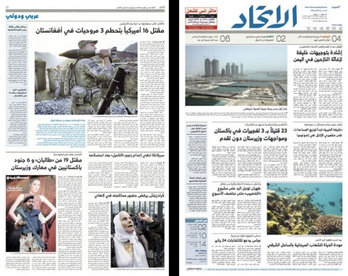
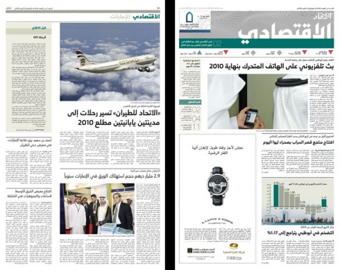
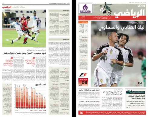
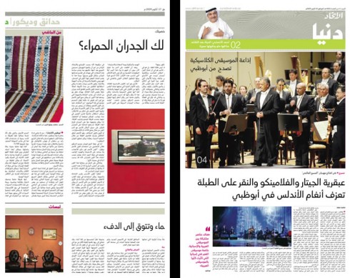
Lucie Lacava, whose name is synonymous with refined, classic design, writes us that she also was engaged to redesign the region’s oldest Arab-language daily, Al Ittihad, Not an easy task redesigning a publication in Arab. We at Garcia Media are presently engaged in redesigning Oman’s Al Shabiba, and everything from the way reading takes place from right to left, to the Arabic letters and symbols, it all presents challenges at every step of the way.
We have reviewed today’s Al Ittihad, and like the fact that Lucie has maintained the classic elements here: headlines tend to be small, and light (as opposed to big and bold as in other Arab language dailies). Section fronts are distinctive, and in the case of lifetsyle, the page resembles those of The National, with the big poster look, the large dominant image, and smaller photos for navigators.
The inside pages are well organized, following a six column grid, and the color palette is very much like that of The National: the colors of the desert, with emphasis on muted tans and violets. The logo is blue.
Design evolution in the UAE since 2003
When I first came to the UAE with a Garcia Media team, I encountered an environment at the Gulf News where visual journalism was not a top priority and design was not a term that people in the newsroom used often. That was in 2003, and i am honored to have been retained by Editor in Chief Abdul Hamid to offer continuous consulting services and help his publications move along. With the arrival of Art Director Miguel Gomez, visual journalism has seen a tremendous boost,as he has shaped a graphics/design department that would be the envy of any newspaper anywhere in the world. Under the leadership of Miguel, the Gulf News has become a constant winner for design/illustration and infographics awards.
But something else happened: right after 2003, and the redesign of the Gulf News, other publications took notice. A blogger described the scene for design in the Gulf region as “effervescent”. Indeed, it is a drastic, favorable change, and the judges of the SND Awards have taken notice.
The Gulf News took home 43 awards in the recent SND contest; The National, the new arrival (designed by Lucie Lacava), and published in Abu Dhabi, 49 awards;Emirates Business 24/7 , 8 awards. Emarat Al Youm, a new product designed by the firm Innovation , 1
Of course, it is not about winning these coveted awards: the importance I attach to them is that readers in this area, who come from around the globe, are the real beneficiaries, profiting from the high level visual journalism presented to them daily.
“The Gulf News created an appetite for visual journalism in this region, which had not been there before. That, together with the high level competition of the media in the UAE, contributed to boost the quality of design across the titles. We now have a newsroom at the Gulf News, where designer/editor dialog is part of the routine, and not the exception,” says Miguel Gomez.
Case in point: recently the Gulf News carried a story about the process of putting together the graphic that won an SND Silver Award, which was a recap of the year of the economic meltdown, prepared for the Business section. In this case, says Miguel, the designer, Dwynn Trazo, drove the process, working closely with Gulf News DME Paul A. Stober
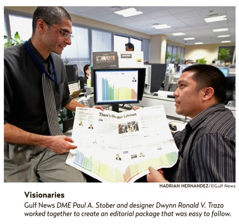
Designer Dwynn Trazo working closely with Gulf News DME Paul A. Stober
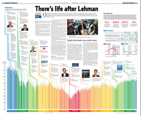
This is the Gulf News graphic about the Lehman Brothers year of the meltdown by Dwynn Trazo, awarded Silver by SND for 2009
According to Douglas Okasaki– regional director for the Society for News Design – Middle East and Africa
It is very important that newspapers in our region pay attention to design as a powerful tool to attract readers and make news more exciting. This is an investment and not an expenditure!
SND competition is a great opportunity to show the result of our creative work in design and I recommend other newspapers in our region to participle in it and showcase the talent of their staff. This can be a very healthy and productive exercise. There are many other newspapers in the region doing a great job in design and the world would want to see those!
Lucie Lacava on The National’s success
Lucie Lacava, design consultant to The National, has this to say about the newspaper’s success and awards:
It is very exciting to see this impressive performance by The National.
In less than two years The National has established itself among the leaders in the industry not only for the quality of its design which defines the paper, but also for the quality of its content. It has built a strong upmarket brand. Its editors, journalists and designers believe in the craft and trade of journalism, and the readers love it. It now has the 3rd highest readership in the UAE.
Lucie mentions that Laura Koot, managing editor and art director, ” is doing a superb job of leading and inspiring the team, producing fresh and visually stunning pages on a daily basis while solidly maintaining the design standards according to our style guide.”
I asked Lucie about the explosion of design and visual journalism in the Gulf region:
Design is alive and well among the papers in the UAE because there is commitment from up above to deliver quality at all levels. This will obviously attract the best in the field. Luckily, in the UAE, resources have not dried up as in other parts of the world.
Newspapers and the iPad
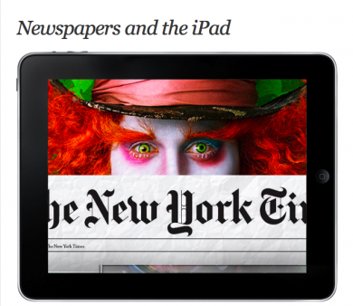
Wonder why you don’t see any YouTube videos of newspapers anticipating how their editions will look in the new iPad come April 3?
Well, Joe Zeff takes a look at it in his blog today. We recommend it.
Go here:
http://joezeffdesign.com/blog/