Time to make changes perhaps?
When writing this “fable” for Pure Design, I used the word “wrinkles” often to describe elements of the design that perhaps age more rapidly than others. I stand by the use of “wrinkles” today, but what has changed is our ability to look at the design of a newspaper or magazine in an organic manner daily,and make changes quicker to repair, to take preventive measures, than the way it was in 2002.
It is no secret that users of a newspaper website enjoy change, especially as many of them refer to their newspaper’s website several times a day. A day of web use may represent seven days of newspaper reading, if we look at it in terms of frequency of visitation. With this mentality comes a more open mind to change.
I no longer tell my clients to look at the design of their newspaper every five years. That could be a long haul. Instead, look at how your design evolves from day to day, make changes on the go.
I think the days of the splashy, big leap redesign are over, giving way to the constant rethinking, both journalistically and visually, where changes are made as needed, perhaps without fanfare, but definitely with a sure idea of how change will make reading and storytelling more effective.
A note of interest about today’s Pure Design download:
Please note that this and fable #15 (tomorrow) are both single page fables, so you will find that we have added a blank page to each of the PDFs for the Issuu viewer to work correctly. Thanks.
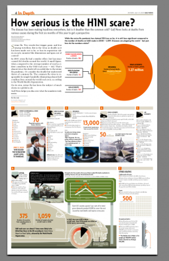
Pages we like: Gulf News of UAE

When Gulf News (Dubai) info graphics artist Guillermo Munro discovered that the common cold was causing approximately 13000 deaths a year worldwide, he suggested to his editors doing a one-page graphic revealing those facts, as compared to the more media-covered H1N1 as well as other epidemics, and other causes of death generally, from road accident to air crashes. Guillermo tells us that this was a collaborative effort with the newsroom. In this case, the first dialog was between Guillermo and Gulf News design director, Miguel Angel Gomez, then journalist Sanya Nayeem. and reader’s editor Anupa Kurian.
Guillermo adds: “We kept working on this page for a few days, and, ironically, plane crashes that occurred during this period kept us alert and making changes to the numbers till the last minute.”
Interview about Hindustantimes redesign

For those who read in Spanish, turn to the Rodrigo Fino blog. Rodrigo asked me five questions about the remake of India’s Hindustantimes.
To read TheRodrigoFino blog, in Spanish, go:
https://garciamedia.com/latinamerica/blog/
Minimalist marketing campaign
Simple, to the point, one word, indeed. Business Journal, of Baltimore, Maryland, handles its in-house marketing campaign following its own slogan: Stay focused. The campaign follows the same look and feel through its print and digital versions.


Download entire first section of Pure Design: Words
Now that I have fully presented the first of six sections of Pure Design on TheMarioBlog, I am offering the entire initial section, “Words,” available for download—all 33 pages of it. This may be useful for those of you saving or printing out Pure Design and will be done following each of the remaining sections. At the end of our journey through words, type, layout, color, pictures, and process, I will publish the entirety of Pure Design in one file.

Follow me at www.twitter.com/tweetsbydesign
Follow the Marios

Two Marios. Two Views.
Follow Mario Jr. and his blog about media analysis, web design and assorted topics related to the current state of our industry.
http://garciainteractive.com/
Visit Mario Sr. daily here, or through TweetsByDesign (www.twitter.com/tweetsbydesign)
In Spanish daily: The Rodrigo Fino blog
:
To read TheRodrigoFino blog, in Spanish, go:
https://garciamedia.com/latinamerica/blog/
TheMarioBlog posting #316