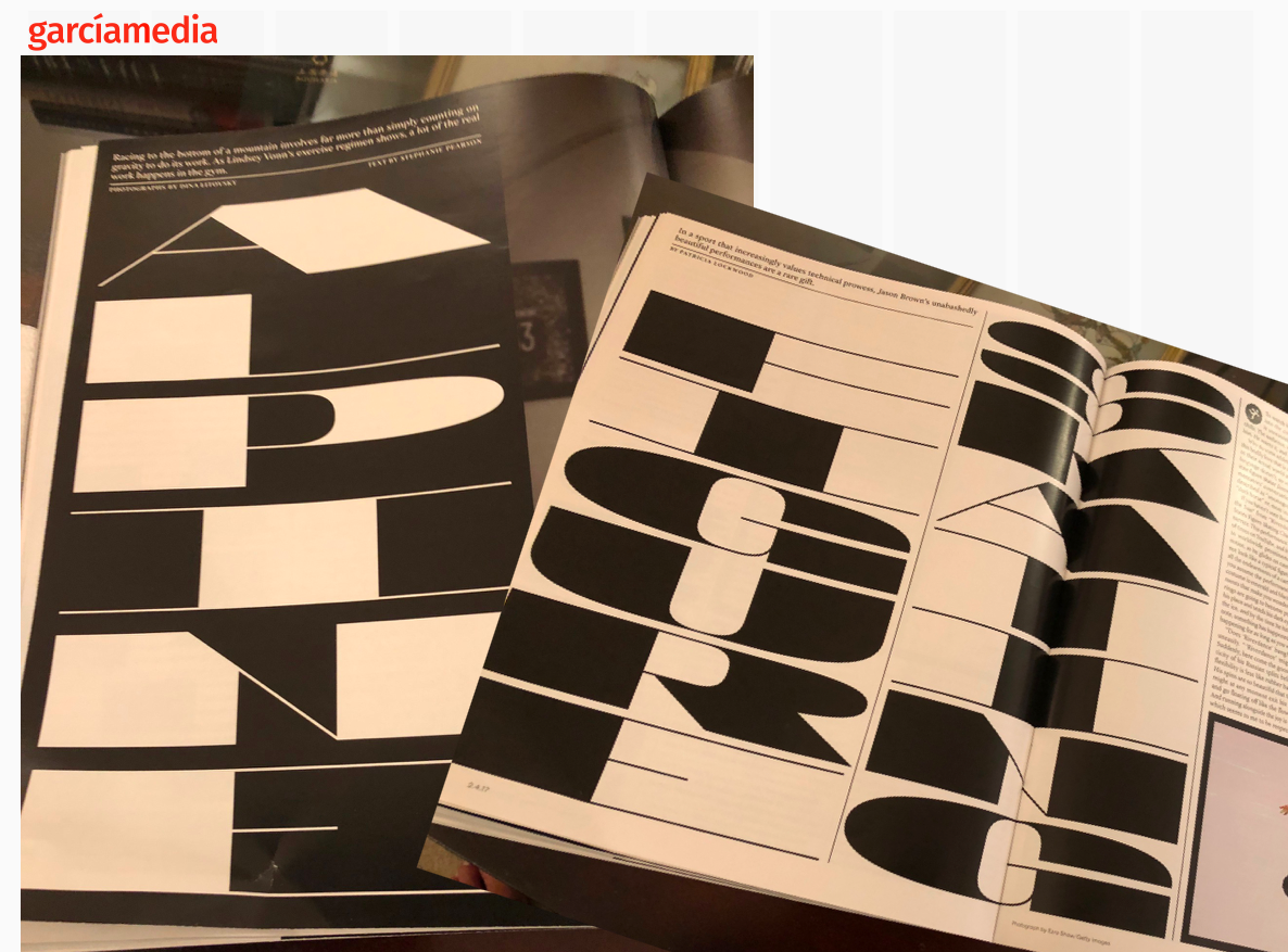
As readers of TheMarioBlog know, Monday we discussed the “bad choice” of type for the Guide to the Winter Olympics, as used by the Sunday New York Times Magazine.
It happened to be the day we were discussing typography with my Columbia class and I used the Times’ hard to read type as an example of an alphabet that was just plain difficult to read, and not very attractive either.
Many in the design community wrote me emails to say they agreed, some adding that the overall package was not very visually pleasing. I appreciate those opinions.
Others wrote to remind me of the good work that the Times’ Magazine does on a weekly basis.
And, of course, I know that. It was during the same Monday lecture that I showed all of these marvelous examples to the class.
The point was made:
-Selecting type is the most difficult choice for the designer.
-We all can be totally in love with a font that may not be the best choice, as probably happened in the bad example here.
-Discussing the issue is what makes us all grow and become better.
I also know that it is easier to play Monday morning quarterback (even the morning after the Super Super Bowl) than to be the one making the choice.
All is well with the Times.
All is well with the state of typography.
Now I see how much my Columbia students captured from the discussion when they turn in their next assignment!
When the Times gets it right (here is a showcase):
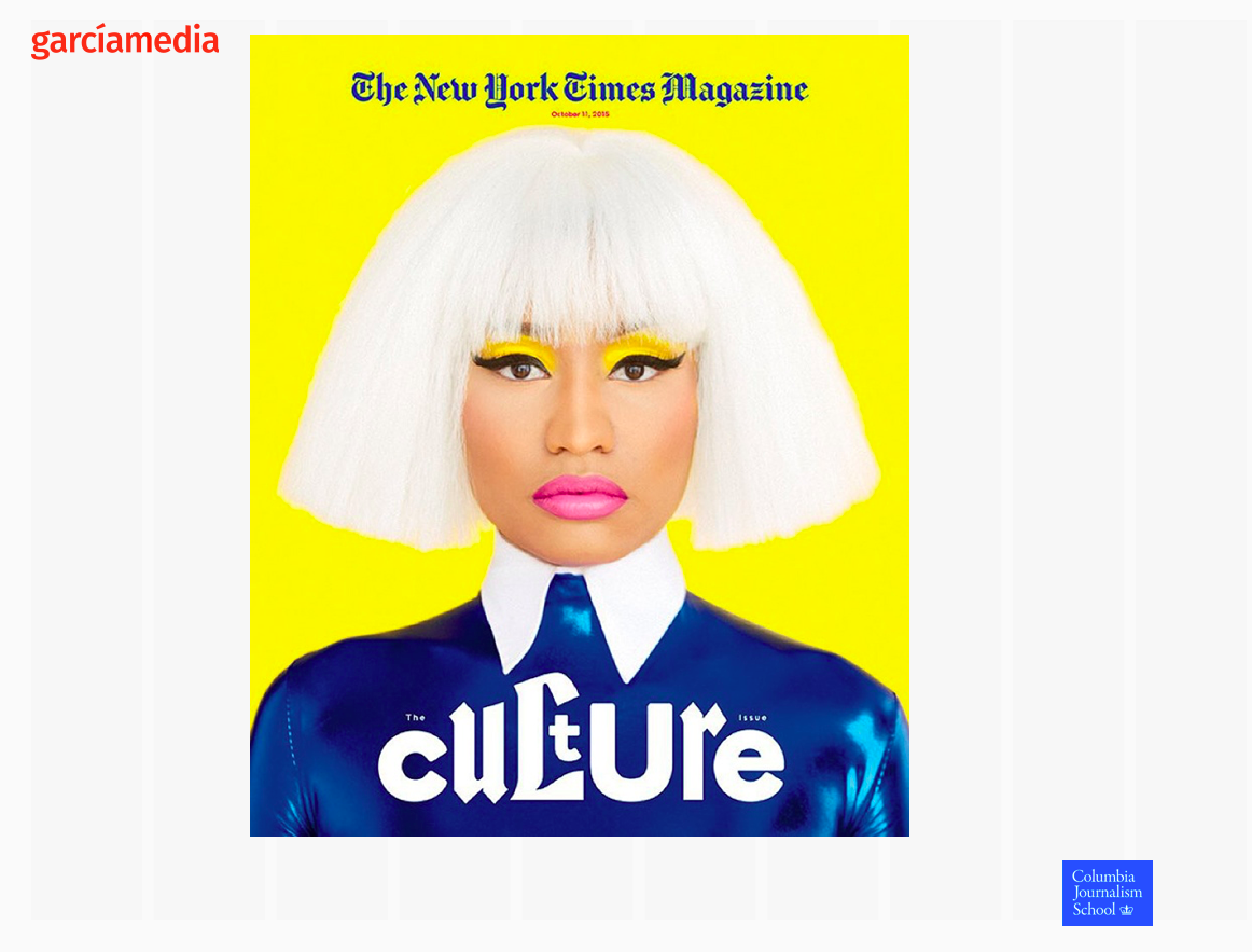
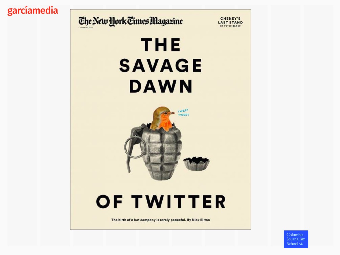
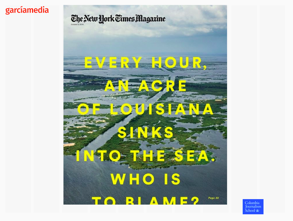
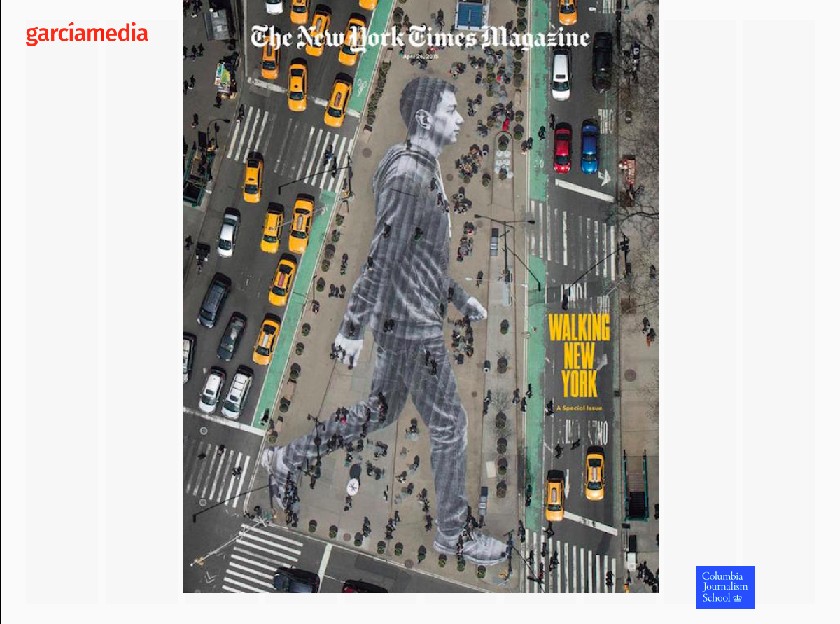
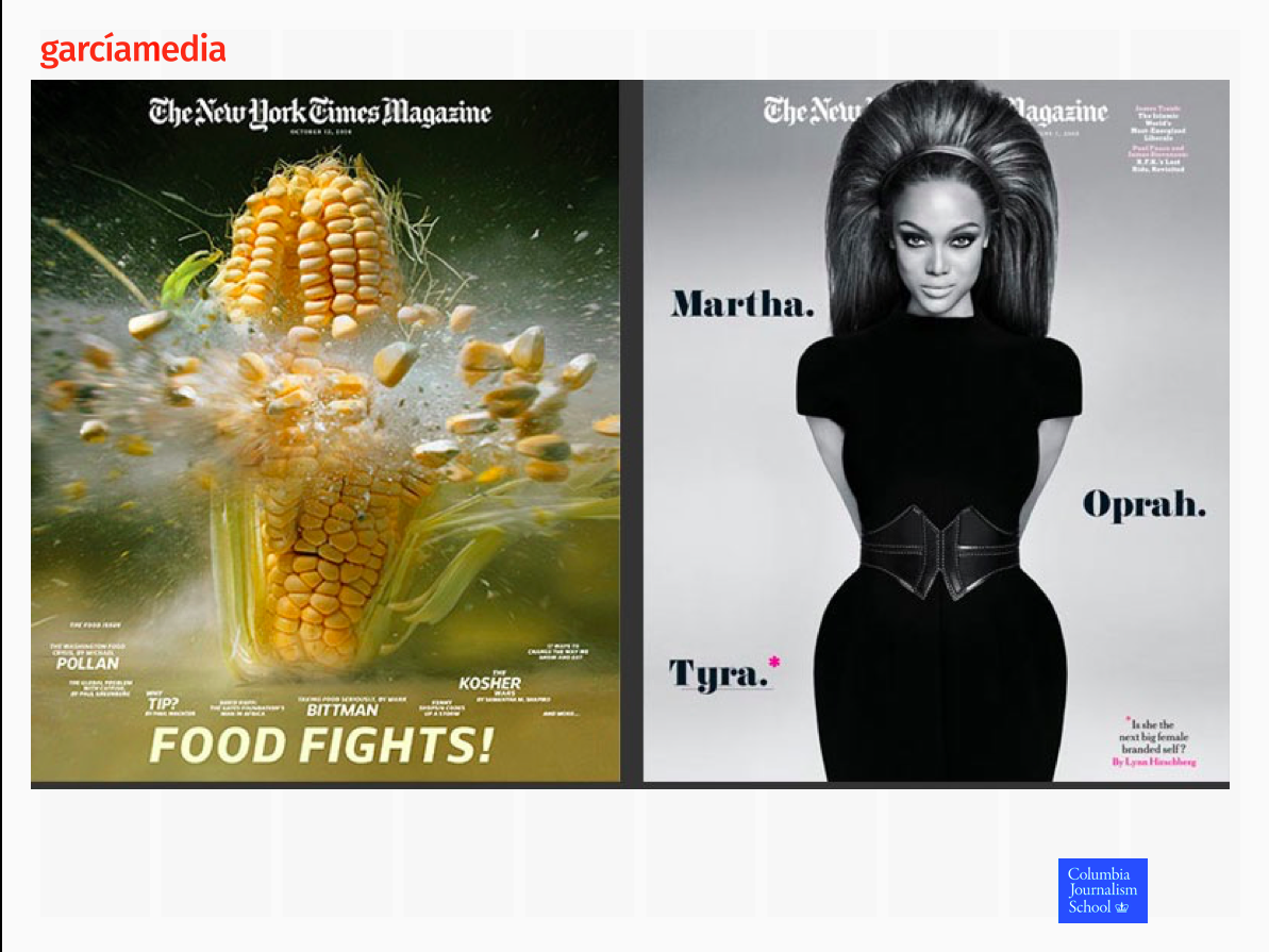
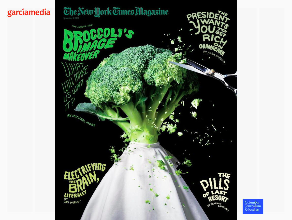
But, I make my point again, here the Times did not make the right choice:
Mario’s Speaking Engagements
April 18-19, 2018-–Newscamp ,Augsburg, Germany.

May 26, 2018 —Associacion Riograndense de Imprensa, Univesidad de Santa Cruz (Unisc), Brazil

June 3-6, 2018—The Seminar, San Antonio, Texas.

Garcia Media: Over 25 years at your service
TheMarioBlog post #2773