Rate day and one for the record books for those of us for whom newspaper design is an object of fascination. It is not everyday that those venerable titles The New York Times and The Wall Street Journal decide to go BIG with a front page photo. It is even more rare that the big photo is about the same subject, in this case, the line of cars and trucks stranded by a winter storm on busy Interstate I-95 in Virginia. Thankfully, that Interstate has now reopened. For news design peeps and aficionados: Who played the photo best?
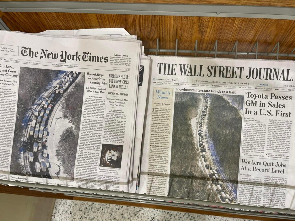
My take: I remember when I redesigned The Wall Street Journal in the 1990s, and we never imagined the presence of a large photograph on Page One. However, I am happy to see this front page today, as I am sure are most readers. Nothing beats a photo to tell the story at a glance.
And The New York Times is a long way from its former description as “the gray old lady” of newspapers, as shown on this front page.
I applaud page designers at these newspapers who are willing to bank on large images for the front pages. I also take my hat off to those editors who give their approval. Both The Times and The Journal are authoritative, well respected newspapers for their journalism, and the presence of large visuals will never diminish that fact.
If you analyze these front pages using the traditional norms of page design, you see that both place their lead stories on the right hand side. Ironically, The Journal, which has normally appeared more conservative in terms of design than the Times, is now sporting a bolder, larger head for its lead story, as compared to The Times.
What works here and should be a lesson for all print newspaper designers: you can’t replicate the impact of large photo images on the screen of an iPhone. By designing newspaper pages with large photos and illustrations, designers give printed newspapers an edge, showing what print can do best.
And, who played the photo best? Well, I think The Times gave us a closer look at the line of cars stranded. However, The Journal’s crop gives readers a sense of how long that line of stranded cars was. Applause for both. Also, I do like those “eyebrow” headlines over photos that enhance storytelling so effectively, as seen in The Journal’s example.
These two pages show what doing print happily is about.
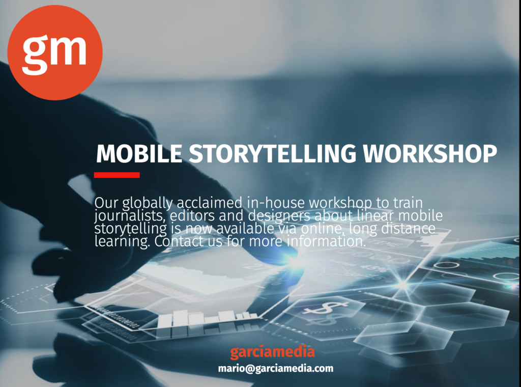
Our mobile storytelling workshops now available remotely
Professors: get your review version of The Story on time for fall classes
As an academic, I know the importance of having the right tools to advance our students, especially on the important subject of mobile storytelling. Please drop me an email if you would like to sample The Story in its digital edition: mario@garciamedia.com
Start writing or type / to choose a block
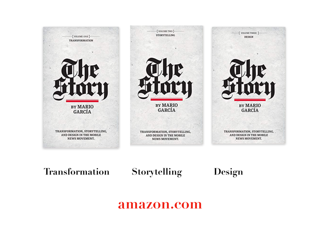
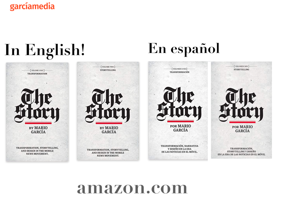
The full trilogy of The Story now available–3 books to guide you through a mobile first strategy. Whether you’re a reporter, editor, designer, publisher, corporate communicator, The Story is for you! https://amazon
TheMarioBlog post # 3341