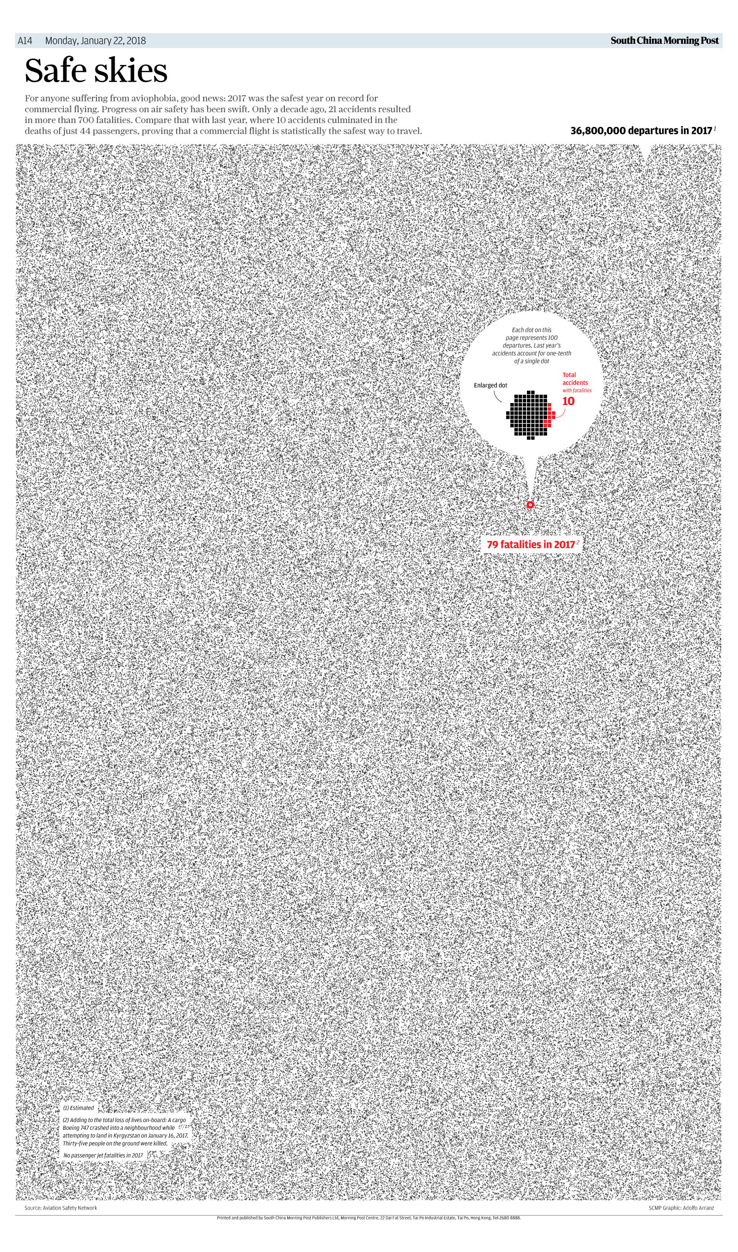
Every dot contributes to tell the story here. As a frequent flyer, I have truly benefitted from the story behind this graphic. As a visual journalist, I am in awe of the amount of work, preparation and craftmanship that took for Adolfo Arranz and his infographic artist, Pablo Robles, to complete such masterful work.
In Adolfo’s own words about the making of this unusual graphic:
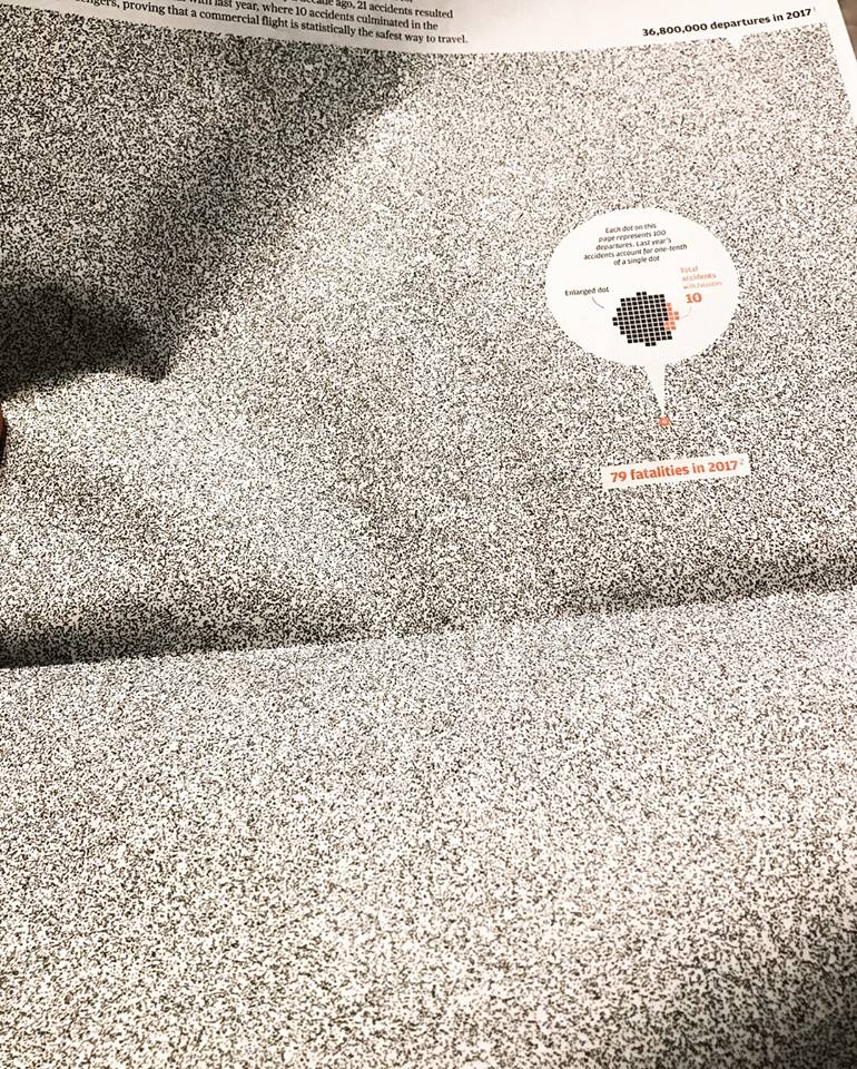
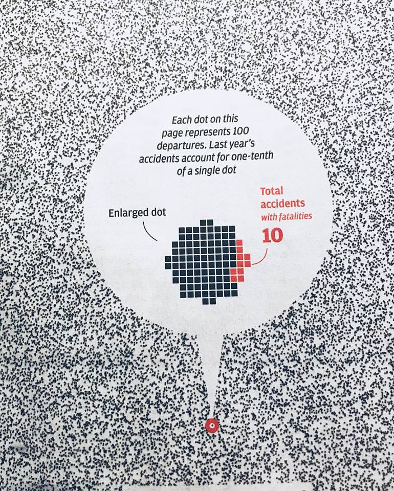
The data released annually by the Aviation Safety Network website with the annual aviation statistics are always a good example to understand the current aviation situation. I have always used them to draw several graphics. But this year especially, the data is very different from other years. On other occasions I had taken out the most typical, bar graphs, maps… But this time I tried something different, because the news were the few accidents that occurred in 2017, actually, there was no passenger jet accidents with fatalities.When you have here, at South China Morning Post, the immense luck of having a complete broadsheet to do an infographic, it is normal to want to use this much space to include as much information as possible. Why not just use a couple of figures in a whole page? Something that draws attention and demonstrates at a glance air safety, as we usually say, put it in perspective … So we did, at first the idea was to try to place the 37 million points, but the page went black, so it was divided into 100 to be able to appreciate them. I think it’s an effective and fun way to show air safety.
Admire it here:
http://multimedia.scmp.com/news/world/article/safety-aviation-2017/index.html
Take a look at how the graphic played in the printed edition of the South China Morning Post, a newspaper with which I have had the honor of working on at least two of its last redesigns.


Great work, guys.
Mario’s Speaking Engagements
April 18-19, 2018-–Newscamp ,Augsburg, Germany.

May 26, 2018 —Associacion Riograndense de Imprensa, Univesidad de Santa Cruz (Unisc), Brazil

June 3-6, 2018—The Seminar, San Antonio, Texas.

Garcia Media: Over 25 years at your service

TheMarioBlog post #2768