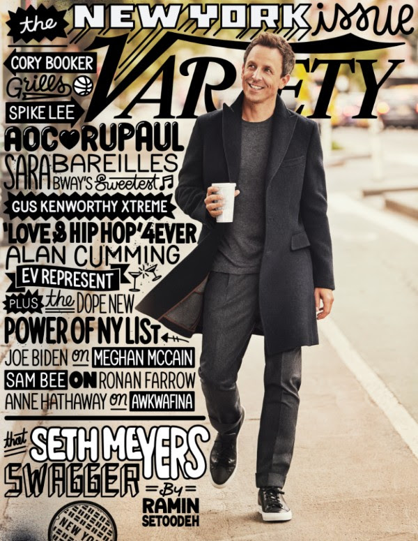
I like how this cover of Variety uses type to navigate the reader to inside stories.
I know that purists of typography may consider this treatment to be too messy and informal, and even hard to read.
I found it delightful, playful, fun.
This is not something you do everyday. But, honestly, I stopped and looked at the cover of Variety and I had no trouble at all reading through the type.
It’s a sad day when we stop having fun doing what we do. Knowing that it is not possible to please everyone all the time is a compelling reason to be adventurous when art directing. Bravo for Variety.
I wrote that perhaps some type purists might consider this treatment a bad mojito.
My friend and colleague, and type guru, Roger Black, wrote back:
“I think it is a good mojito.”
Amen.
Robert Festino is the creative director

TheMarioBlog post # 2923