Updated Sunday, Nov. 22, 10:52 Paris, France, time
TAKEAWAY: After a busy and intense week in the UAE, mow it is back to Europe and colder climes! We look at the newly designed Wall Street Journal Europe “in person” ALSO: SND Society for News Design opens its contest to magazines

Who is Jacky?
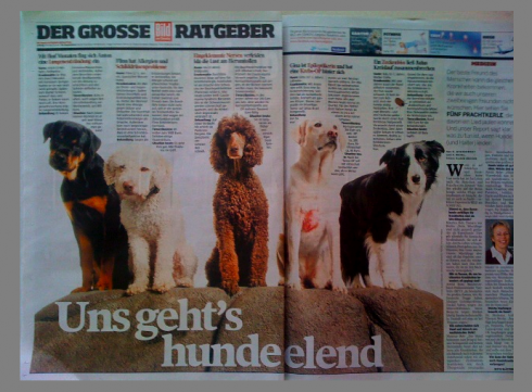
Jacky loved the story about “we all feel like a dog” with so many different illnesses, the swine flu, etc.
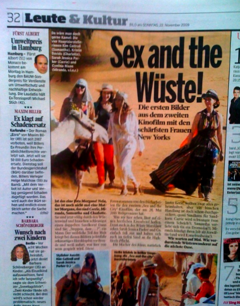
First pictures ever on the set of the new Sex and the City movie, with headline Sex and the Desert
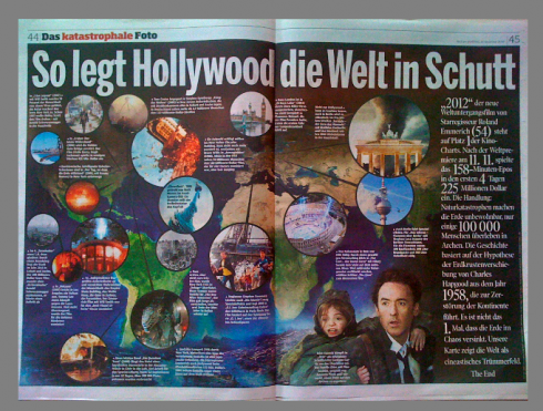
The movie 2012 forecasts the end of the world: this graphic shows how major world monuments would collapse with headline that reads “this is how Hollywood sees the world destroyed”
strong>Jacky belongs to Frank Deville. The Luxembourg-based pooch is an “avid reader” of the German newspaper, Bild Am Sonntag. Every Sunday Jacky picks stories and interesting graphics in Bild Am Sonntag , the German newspaper.
WSJ Europe: minor change, bigger photos


Weekend edition’s front page and an inside page: big photos lead the redesign here

Here is one change that is visible: new style for columnists
We had only seen pdf versions of The Wall Street Journal Europe, which introduced a new design and a series of new features Nov. 17. We discussed the redesign here , but wrote that we would have to see an actual printed edition to comment further.
It is Saturday and I landed at the Frankfurt airport and found a copy of the WSJ Europe, weekend edition, at the Lufthansa lounge there.
First impressions:
If you blink, you don’t see a change at all, which, I assume, will make many editors and traditional readers extremely happy. However, as I flipped through the pages of the WSJ Europe, I was disappointed that so much of the same stayed. In fact, as I write this, I am still wondering if this weekend edition has, indeed, been part of the transformation, or was it only the daily that went thru a redesign?
What’s new?
1. Photos are big: the big four column photo of Herman Van Rompuy, new prime minister of the European Union, dominates (this new prime minister needs to pay attention to his hair style, especially if more four-column photos of him will appear on front pages of newspapers around the world, as it is likely to occur).
Inside, a three-column photo per page seems to be what the style calls for. In some cases, in this edition, the photos are of faces, big faces, nothing that could not run smaller. In the case of the interview of the week, a six column photo of the interviewee could have been one column. Just a passport photo blown up. And the same is true for a feature appropriately called The Big Head, where a giant, six column photo of the chief of the Citadel Investment Group stares at us.
2. The legendary What’s News navigator has moved to page two. I still think it belongs on Page One, but maybe it is a matter of getting used to.
3. Column treatments: The newest of the visual elements: the new treatment for columnists, with a gray bar and brackets, the freshest element of this redesign.
4. Thick black bold page headers: each page is crowned by a bold black border with white letters to tell us what the content of the page is.
One never knows what is behind a redesign. Perhaps the prototypes created pushed design and the WSJ Europe much further than this.
To me, this is more of the face wash category, not even a full shower.
Having worked in the environment of the WSJ, however, I know that it was not probably easy to even make these changes.
SND now calling for magazine entries
Our friend Marshall Matlock, who heads the SND (Society for News Design) contest yearly, informs us of a big change for the upcoming contest.
The Society for News Design 31st annual Creative Competition, the world¹s largest program for recognizing excellence in visual journalism, has
expanded its categories to include all magazines, not just those published with newspapers.
The competition¹s name has been changed to “The Best of News Design “Creative Competition to reflect design excellence in both newspapers and
magazines for the 2009 publishing year.
Here is how Marshall, who has directed the contest for 30 years from his post as professor at the S.I. School Newhouse of Public Communications at Syracuse University, describes what is new:
“Magazines may now enter a competition that has been well established for
newspapers. We hope to honor magazines and staffs the same way we¹ve
recognized newspapers for more than 30 years Winning an award for newspaper work
has always been recognized as a top news design honor for the newspapers
industry. Now we¹d like to do the same for non-newspaper magazines.”
For more information in English: http://www.snd.org/pdf/SNDCFE31.pdf. The Call
will be posted in several additional languages in early December.
TheMarioBlog post #424