TAKEAWAY: Time to check out the best magazine apps out there. We plan to do so.
Why am I so happy to see a list of the best magazine apps out there in table land?
Well, it is good to see these lists shaping up, and I also like that some of my own favorites are there: Newsweek,Bloomberg Businessweek, Martha Stewart Living, among others.
The list, released by McPheters & Company as the iMonitor™ List of Best Magazine Apps for iPad.
Says CEO Rebecca McPheters:
“These apps are each doing an outstanding job of fully-leveraging the iPad’s capabilities to enhance the user experience and expand upon the services traditionally offered to readers by printed publications.”
It is worth taking a look at this list. As for the ones I have sampled and like:
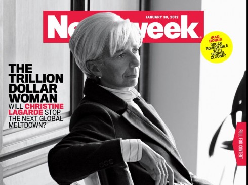
Newsweek: Very clean, airy, displaying good typography that maintains the printed newsmagazine’s DNA, and a good balance of linear and interactive elements.

Bloomberg Businessweek-—Like their color palette very much, which helps with the navigation; features are well presented, and, while one gets a reall good feel of the printed edition, there is plenty of interactivity and updates for those following business stories.
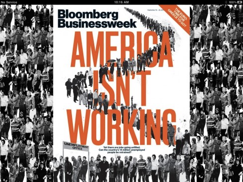
Bloomberg Businessweek: a magazine app carried out with sophistication, and almost perfection
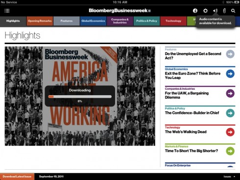
Simple sophistication does it: a horizontal navigator that is color coded, easy swipes (no scrolling here)
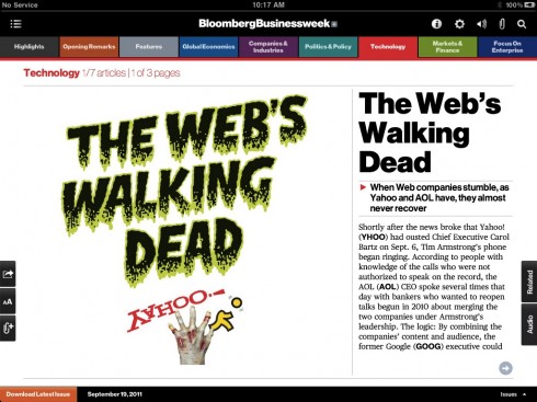
Opening of the Technology section; functionality prevails, a reminder that this is 1/7 articles, 1/3 pages
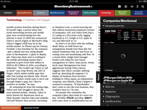
Utility: hit the related pop up window to right of screen; get a listing and info on all companies listed in an article
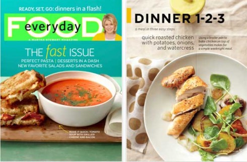
Martha Stewart—Great indexing, good archiving which allows those interested in searching for recipes to find them according to categories; good use of mini stories to accompany photos.
I am looking forward to taking a look at the rest of those mag apps on the list that I have not seen yet. If you have a favorite there, let me know.
Related blog posts:
We take a look at Newsweek’s new iPad app
https://garciamedia.com/blog/articles/we_take_a_look_at_newsweeks_new_ipad_app/
Mentions Bloomberg Businessweek
https://garciamedia.com/blog/articles/the_acrob/
What’s cooking in the iPad: Try the new Martha Stewart food mag
https://garciamedia.com/blog/articles/whats_cooking_in_the_ipad_try_the_new_martha_stewart_food_mag/
Of related interest: Magazines in the iPad
Cosmopolitan Says It Has 100,000 Paid Digital Subscriptions
http://adage.com/article/mediaworks/cosmopolitan-100-000-paid-digital-subscriptions/233142/
Highlight: The Hearst Magazines title seems to have beaten other brands to the mark, reinforcing the idea that digital will be a big platform for Cosmopolitan. But it’s also a good sign for magazines’ digital ambitions in general.
Goteborgs-Posten refresh: follow up
From time to time, Jim McManus and I establish email dialogs about the state of media design. Jim, who now devotes most of his time to painting, has worked as a designer, art director, creative director and consultant for several of the world’s leading publications and corporations, including The New York Times, Newsweek and Fortune magazines.
When we posted our Wednesday blog about the new look for the Gotebogs-Posten of Sweden, Jim immediately sent me this note, which I think is worth sharing with you:
Just a quick note to say that I really liked the look of the redesigned Goteborgs Posten. You and I had a conversation a while back about what Modern newspaper design would look like… and I said something to the effect of my not seeing any newspaper designs that really looked modern (even though many might look sharp, elegant, smart, inviting or other positive design attributes). But my first reaction when looking at the examples you posted the other day was “Wow, How fresh and modern looking this is”. Something about the use of the section numbers, the color and the display typography really look very 2012. And that’s a very good thing.
We agree, Jim, and so do the editors at GP. In fact, associate editor Ninni Jonzon has asked approval to run your quote in her weekly column published in the GP. Also a very good thing!
It’s World Women’s Day


And, as Frank Deville, our European blog correspondent tells us, Bild of Germany gave the day off to all women in the staff today, so only men in the newsroom. It is Bild’s way of celebrating International Women’s Day today.
Wonder if it will make a difference in how the news is covered? Something to think about.
To read the Bild piece in German:
http://www.bild.de/news/weltfrauentag/weltfrauentag/bildde-am-weltfrauentag-23028556.bild.html