I am aware that I am probably one of a very small number of people who do this exercise: taking a look at a story published in one platform and then comparing how it appeared on another.
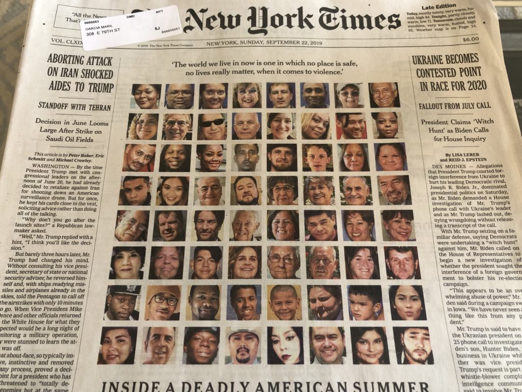
No, it is not my hobby (yet!). However, ever since doing the research for my mobile storytelling book, The Story, I am aware of how tuned in I am to the presentation of stories. So, when I picked up my Sunday edition of the print New York Times this past Sunday and saw how the front page carried a lead story headlined, Inside A Deadly American Summer, with 64 small head shots of the victims, the first thing that popped into my head was: Ummmm, those are very small, stamp sized images. Wonder how they played them on their digital editions.
A quick review yielded the following:
- While the small images also appear in the digital version, the design of the digital version allows for a bit of animation, so that we see certain images but not all of them.
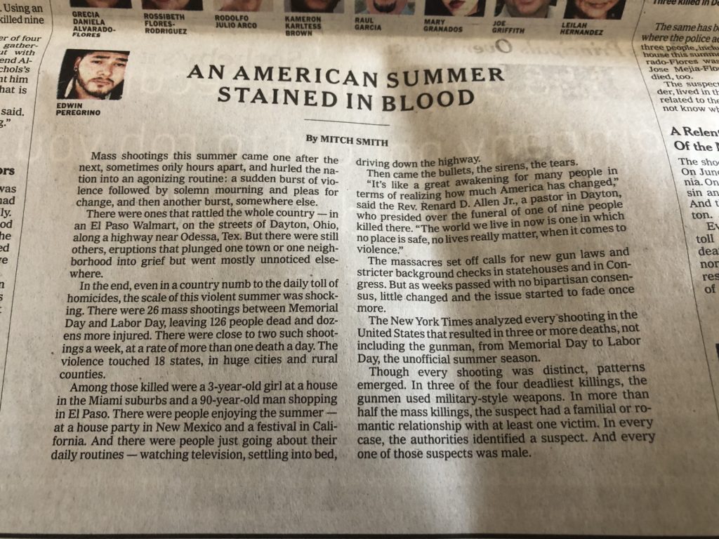
- The introductory text is different in print and digital, while the byline is that of the same writer. This is how the print story opens:
Most shootings this summer came one after the next, sometimes only hours apart, and hurled the nation into an agonizing routine: a sudden burst of violence followed by solemn mourning and pleas for change , and then another burst, somewhere else.
And here is how the digital text reads:
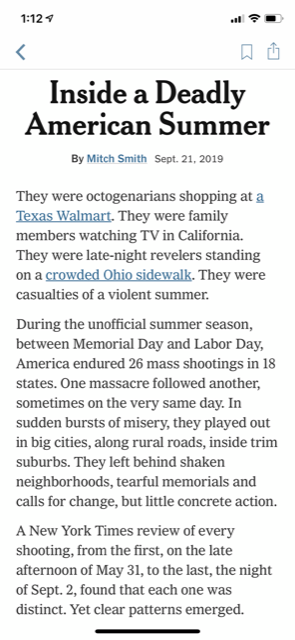
They were octogenarians shopping at a Texas Walmart. They were family members watching TV in California. They were late-night revelers standing on a crowded Ohio sidewalk. They were casualties of a violent summer.
Somehow, I prefer the digital opening as more personal and one that draws the reader into the story quicker and in a more engaging manner. I do wonder why the text was changed, since the print version could have worked.
Take a look at the digital version here:
https://www.nytimes.com/interactive/2019/09/21/us/summer-mass-shootings.html?smid=nytcore-ios-share
Digital influencing print?
I don’t know this for sure, but it appears to me that the print version, which includes an introductory short essay, followed by several short vignettes of the various shootings described in the story, is how the story was designed for digital, but the strategy transferred to print. Take a look at how the inside page of the print edition appeared:

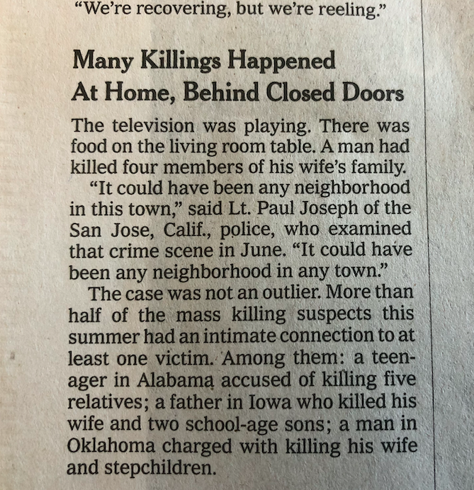
Then notice how the various short takes are displayed for the digital edition:


It’s all in the planning stages
While I was not present when coverage of this story took place at the Times (how I wish I had such an opportunity!), I imagine that there was a discussion of how each platform would handle it. This is what I call mobile first strategy, when it becomes second nature to undertand that when it comes to storytelling, one size does not fit all.
This is a good example to dissect step by step, with each platform doing what it can do best.
It is also obvious by the presence of the short snippets of information in the print edition, that we see how mobile storytelling begins to affect how we do it for print. A good idea, and one that we will probably see more of in the future.
Ironically, it is already happening: instead of preparing the text for print and dumping it on the phone, we are now seen the ideas of digital filter into print.
One thing is for sure, whatever we do with transfer from one platform to another, the key is to recognize the specific characteristics of each platform. For example, print is best for the display of large photos, especially horizontal ones. Keep that up!
It’s happening already!
In Book 2 of the trilogy that is my mobile storytelling book, The Story (out October 15)I write this:
Print continues to match digital strategies in so many ways that I anticipate the day we begin to see some type of linear storytelling finding its way on the pages of a newspaper.
The story we have dissected here from The New York Times is an example that this may already be taking place.
From Monocle Weekend
https://monocle.com/minute/2019/09/21/
THE INTERROGATOR / EDITION 30
Mario García
Editorial consultant Mario García has advised the most important newsrooms in the world on design – and how best adapt to a digital transition. More than 700 publications, from The Wall Street Journal to the South China Morning Post, have received his strategic steer. Other than being an adjunct professor at Columbia University’s School of Journalism, he also runs his own consultancy firm: García Media. Nowadays his speciality is how digital devices influence narrative structure and consumption; his latest book, The Story, was written specifically to be read on a phone. Here, though, he confesses to a few analogue pleasures.
What they are saying about The Story!
The Story is here!
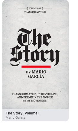
You can now download my new mobile storytelling book, The Story, from Apple Books at $6.99
This is Book 1 of a Trilogy! The other two books coming soon.
https://books.apple.com/us/book/the-story-volume-i/id1480169411
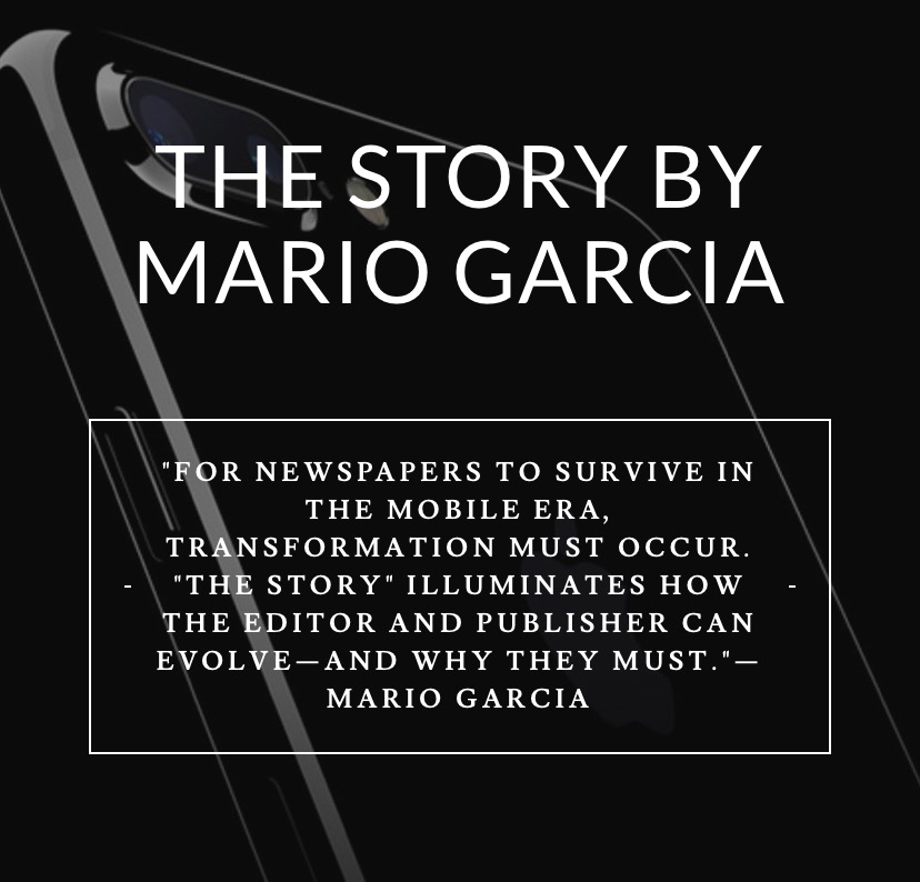
The newspaper remains the most powerful source of storytelling on the planet. But technology threatens its very existence. To survive, the Editor must transform, adapt, and manage the newsroom in a new way. Order The Story by Mario Garcia, chief strategist for the redesign of over 700 newspapers around the world.
My chat with in Monocle Radio
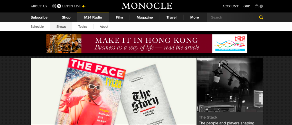
Listen to my chat in Monocle Radio’s The Stack: Latest episode‘The Face’ and ‘The Story’:We welcome the return of the print version of ‘The Face’ and talk to legendary newspaper designer Mario Garcia about his latest book, ‘The Story’.
https://monocle.com/radio/shows/the-stack/368/play/
My interview with CNN en Español
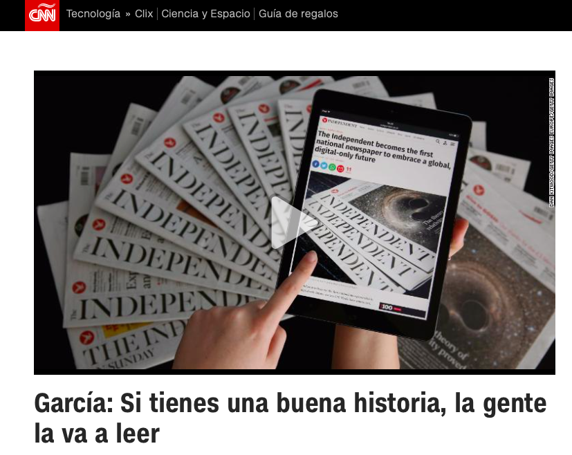
I was a guest in the program Encuentro, hosted by Guillermo Arduino daily at CNN en Español. The interview was about how we read on mobile devices and my introduction of my new mobile storytelling book, The Story, to a Spanish-language audience.
Mario’s speaking engagements
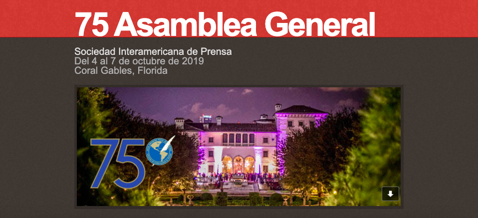
Presentation of The Story at the Sociedad Interamericana de Prensa (SIP) in Miami, as the organization celebrates its 75th anniversary serving the Latin American Press, Miami.
October 4, 2019

Keynote Luncheon Speech: Ad Club of Toronto, Newspaper Day
October 25, 2019

Keynote presentation: Business Information & Media Summit (BIMS).
November 12, 2019
Order print edition of The Story
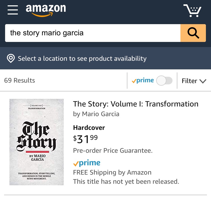
You can order the print edition of my new mobile storytelling book, The Story, from Amazon already here:
An interview of interest
http://www.itertranslations.com/blog/2019/3/11/fd60ybflpvlqrgrpdp5ida5rq0c3sp
TheMarioBlog post # 3119
