This is the weekend edition of TheMarioBlog and will be updated as needed. The next blog post is Monday, January 12.


It was the 1980s and at The Poynter Institute for Media Studies, editors and designers would gather at graphics seminars to sharpen their visual skills. A frequent assignment was all about telling stories visually whenever possible. For example, why write a 3-paragraph story about the weather forecast for the weekend, when it would be easier for the reader to grasp the meaning of that story via weather icons: Sunny on Friday; Windy on Saturday; Rain on Sunday. Presto.
Sounds easy, right? But it wasn't. Editors accustomed to expressing it all through words had trouble coming up with more visual solutions. Designers struggled to convince them. Many succeeded.
In 2015, we have come a long way from those examples. Yet, it is still not easy to start the process thinking with visual storytelling solutions. That is why I was so engaged with the recent example from The Upshot. It is the first week of January, when so many people are acting on their new year's resolutions—especially about losing weight and counting calories.
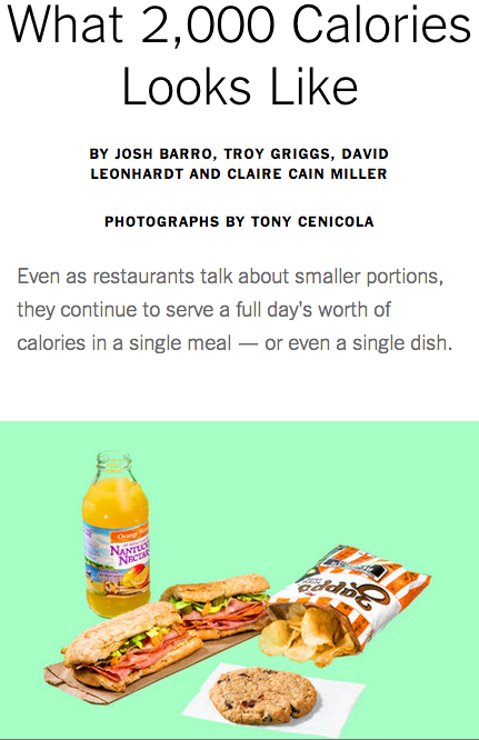
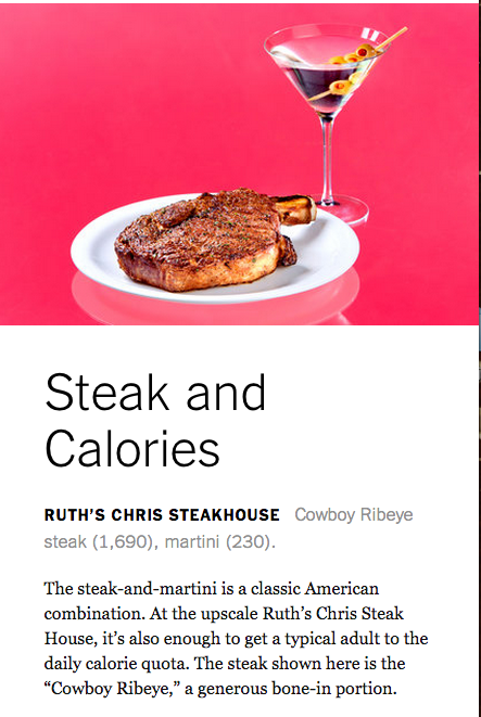
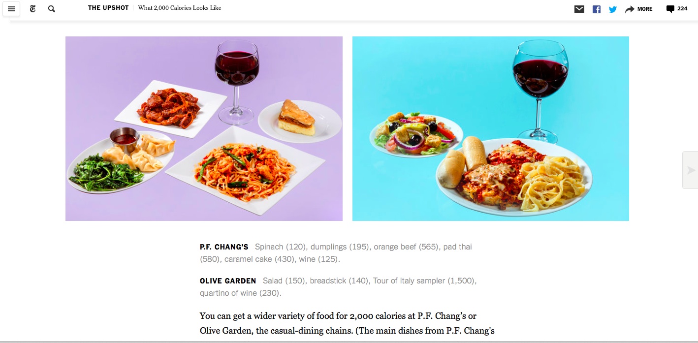
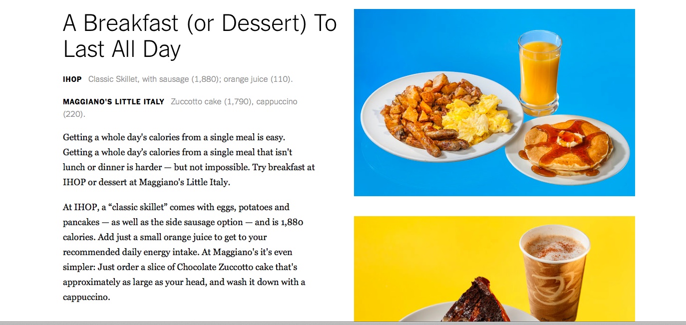
The Upshot set out to show us what 2000 calories looked like—it isn't pretty, but the photos made it all real.
The headline: What 2,000 Calories Looks Like
The text:
The nation’s largest restaurant chains have made a big deal in recent years about introducing smaller portion sizes. McDonald’s eliminated the Supersize menu, while T.G.I. Fridays and others have introduced small-plate items. Yet the restaurants have also been doing something else, with less fanfare: continuing to add dishes so rich that a single meal often contains a full day’s worth of calories.
Here, we show you what roughly 2,000 calories looks like at some large chains.
The result: Engaging and easy to grasp key elements of the story.