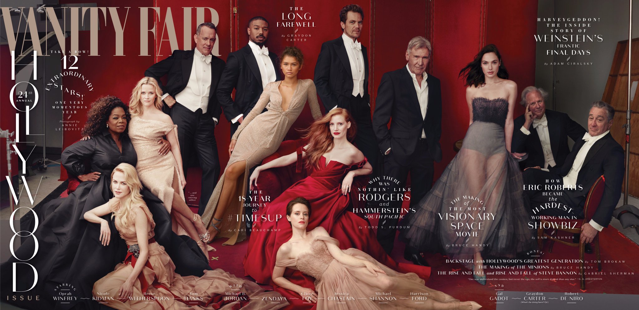
I like this new cover (a double one) for Vanity Fair and its annual Hollywood. Along with the celebrities and luminaries on the cover, one bit of design interest: the word Hollywood set vertically.
This is, indeedm a rare occurrence for Vanity Fair: vertical type used on the cover. Designers can debate this strategy for years (they have!), and I will show it to my Columbia students with my two cents, which is:
*In our culture and language we read from left to right, but there is nothing wrong with ONE word highlighted vertically. End of debate for me! Your take?
I definitely would not want a full sentence set vertically, but, one word, no harm done. I think this looks nice and plays well in that one corner of the cover.
Mario’s Speaking Engagements
April 18-19, 2018-–Newscamp ,Augsburg, Germany.

May 26, 2018 —Associacion Riograndense de Imprensa, Univesidad de Santa Cruz (Unisc), Brazil

June 3-6, 2018—The Seminar, San Antonio, Texas.

Garcia Media: Over 25 years at your service

TheMarioBlog post #2767