TAKEAWAY: As we mature in the way we approach magazine content for the tablet, let’s reflect on what’s essential. The Vanity Fair Hollywood edition provides a good springboard for this discussion.
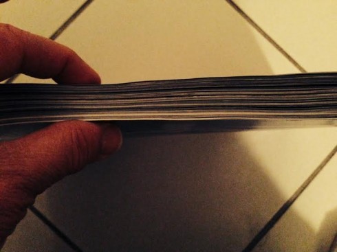
The print edition of Vanity Fair this month is a robust 410 pages. This is how it looks when you hold it in your hand
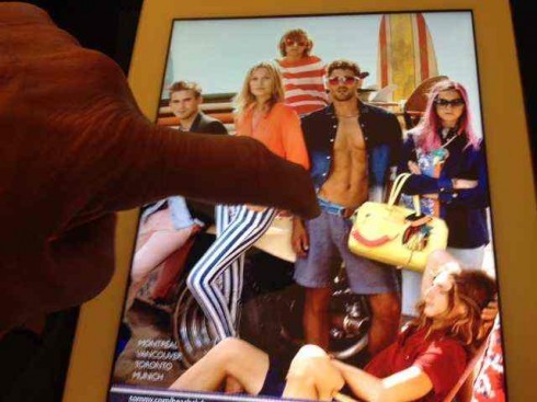
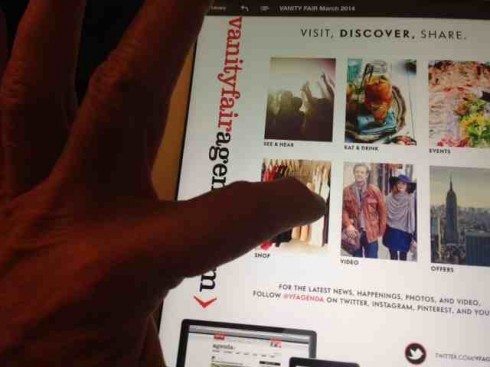
Many great possibilities for engagement and interactivity go wasted, as we see above

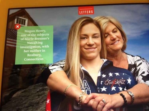
An area of interactivity: click on button, get a caption for image
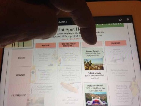
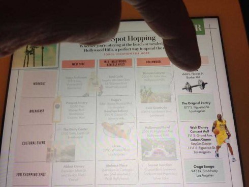
Here is a section with some interactivity
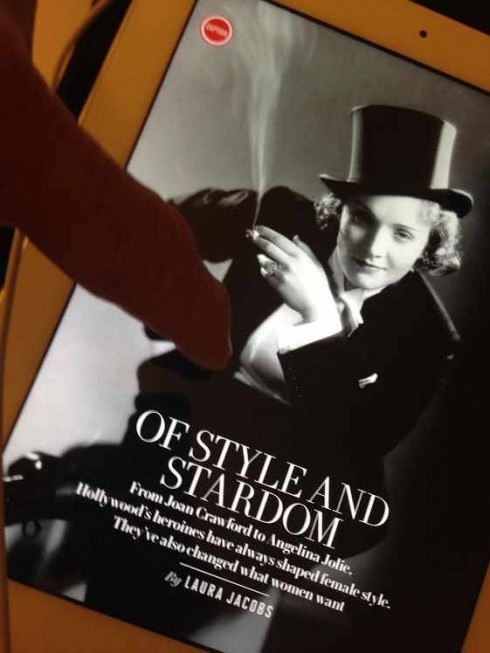
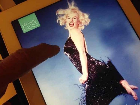
It was a frustrated finger for me as I tapped and tapped on pictures of Marlene Dietrich and Marilyn Monroe
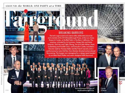
Fairground, the society section, is fertile ground for tablet and finger friendly treatment
The other day one of my Columbia Journalism School students asked me:
How do you start to take a huge print publication like Vanity Fair, for example, to the digital platforms?
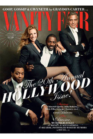
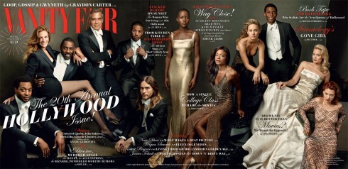
As I thought about the question, I reached out for my coffee table edition of this month’s VF. It’s the 20th Annual Hollywood Issue, complete with a star-studded cover that includes Julia Roberts and George Clooney in their best poses. For Julia, it is those Pretty Woman legs.
At 412 pages, a thick and powerful print edition. With print, the reader immediately gets the feel for what’s in store. He knows that this is a robust read, with probably over 50% of the glossy pages of the legendary magazine taken up by luscious advertising from such brands as Gucci, Prada, and Dior—and that is only the first 10 pages of the edition.
Lost in translation
It’s best not to think in terms of “translating” a unique print experience to the digital platforms. As a bilingual person I know that sometimes a phrase gets “lost in translation”. In a few occasions, there are phrases in one language for which there is no real translation in another. The same applies in the relation of print to digital.
As I thought of how to answer the student’s question, I took it upon myself to do a dissection of the latest Vanity Affair to which I subscribe.
First, I decided to dive into the huge print edition, one too heavy to put into my briefcase and take it on a flight with me. But what joy to flip through the pages of this Vanity Fair, rejoice with the use of photos, typography and overall design.
Not to mention the occasional perfume ad where one can rub the edge of the page and get the scent of a new cologne, for example (sorry, can’t do that YET while reading VF on your iPad!).
Second, I turned to my iPad and downloaded this edition. That, I must add, was a rather slow process. It took time to get the entire contents of the magazine downloaded. I lost my patience a couple of times, too.
Vanity Fair and the 7 deadly sins of its tablet edition
So now I had downloaded the VF Hollywood edition into my iPad and spent considerable time dissecting it.
Some observations first, then a couple of meditations about the state of tablet magazine editions.
1. Vanity Fair takes the pages of its magazine and puts them on the iPad. It’s as simple as that. The photos, advertisements, and the great type use look good on the screen, and no one can dispute that. I found myself reading at least three articles that I had missed on the huge print edition where the advertising is omnipresent and, I may add, sometimes too in your face. In the tablet edition one can go quickly, via vertical navigator, to an article of interest. For a man of a certain age like me, making the type bigger is a big plus.
2. One major difference between print and tablet editions: the sharing buttons. Share that story about Hollywood leading ladies via Facebook, Twitter or email. This is the biggest different between the print and tablet editions, I am afraid. And that, as you can imagine, is NOT a big enough difference.
3. Not enough effort to make the finger happy here. From time to time, the finger is given something to do: click on a button and a caption appears near a photo.
4. It’s all too static. While the tablet edition is as much a photographic feast as we are accustomed to enjoying in the Vanity Fair print edition, I found myself touching many of the photos to see if something else would happen. No such luck.
5. Those precious videos nowhere to be found. I was ready to give up on finding a video here, but, finally, a video appeared: indeed, the cover story about Oscar contenders was shot by the famous Annie Leibovitz. This story carried an entertaining video of the stars during the Leibovitz photo shoot. I kept wondering why more videos were not included, especially on an issue devoted to Hollywood.
6. Ignoring opportunities. Obviously, not every story needs to have a “tablet-ready” feature. It is not practical, nor something the user would desire. However, I particularly missed such treatments for a story about Hollywood’s leading ladies of another era, including Marlene Dietrich and Marilyn Monroe. I kept hoping that if I touched the photos, Marlene would appear singing her melancholic signature song Falling in Love Again . And how about Marilyn doing Diamonds are a Girl’s Best Friend? I would have settled for her Happy Birthday, Mr. President classic clip in that tight dress sewn on her body?
7. Those static ads; The luscious print ads are just that in the tablet edition——luscious and static. I kept hoping for something more than a model wearing Prada or Tommy Hilfiger, but they were frozen in print time. This was really disappointing. Lots of unexplored and wasted possibilities.
In 2014: what should a tablet magazine edition be like?
And so, now that we have covered what I have aptly named the seven deadly sins of the VF edition on the tablet, let me confess a couple of meditations I had after examining both the print and tablet editions for the Hollywood issue.
First, a question?
What do readers want when they encounter their favorite magazine on a tablet?
Honestly, they probably want to see as much a replica of the print edition (if they are used to one) as possible. In the case of Vanity Fair, which is so well designed, with exquisite typography and unique photography, I found myself enjoying it all, stopping to read, and maneuvering around the issue with more ease than I had the huge and bulky print edition.
As we continue to dissect publications and how they take their content to digital platforms, I think, at least for the immediate future, there is nothing wrong with taking the exact pages from print to digital. However, as I have insisted since I first set eyes on an iPad, when one takes a publication to the tablet, one must design for engagement.
Keep the finger happy, I always say, and the crowd laughs. This, however, is NOTHING to laugh about. It is essential that some stories MAKE the finger happy. I want to hear Marilyn sing when I touch an audio icon; I also would take that society (Fairground) section of the beautiful people mingling at high society parties and would add some interactive touches there, as well.
This VF tablet edition is ONLY a few steps away from providing a totally satisfying experience, no doubt. It falls short in exploring the new platform and its richness. It needs to analyze the contents for each monthly edition and decide which are going to be the tablet-unique stories that it can enhance.
It does not have to be more than five or six, perhaps. I am certain that loyal readers (and new ones, as well), would appreciate to have the exciting content of this iconic publication served in an enhanced way.
While the magazine transfers 60% well to the tablet, I don’t think it would rate as well when transferred to the smaller screen of a smartphone. For there, VF would have to reinvent itself, abandon the notion of monthly publication, and go daily or weekly with a few, highly selected items where the smartphone’s potential—-and how we use it—-would determine how the magazine would translate itself into that new and vibrant medium.
“It may just be that big fat magazines don’t work as iPad magazine apps. I think that’s the real question. Maybe it’s not a matter of execution; it could just be that the format doesn’t work. And you don’t even get into the mobile question….can you imagine this issue on your iPhone?,” says Bob Newman, the veteran magazine designer who has created and consulted on magazine apps for Reader’s Digest, AdWeek, and AARP.
It is 2014 and nobody expects a magazine with the legacy of Vanity Fair to abandon what it does best when it transfers its contents to a digital platform.
It is also 2014, a time in which we have learned that it is not all about bells and whistles to demonstrate what the technology allows. It is the start of the maturing of translating legacy publications to digital formats. Compromise is the key word.
And don’t forget that the finger wants to do things. You must provide the opportunities.
As for that student at Columbia who asked me how to take a publication like Vanity Fair from print to tablet? Come to think about it, that would make for a great class project.
Of related interest:
Marlene Dietrich singing Falling In Love Again
Marilyn Monroe singing Diamonds Are a Girl’s Best Friend
https://www.google.ch/search?client=safari&rls=en&q=marilyn+monroe+diamonds+are+a+girl’s+best+friend&ie=UTF-8&oe=UTF-8&gws_rd=cr&ei=crcEU5mNLOT-ygPgtIHAAw