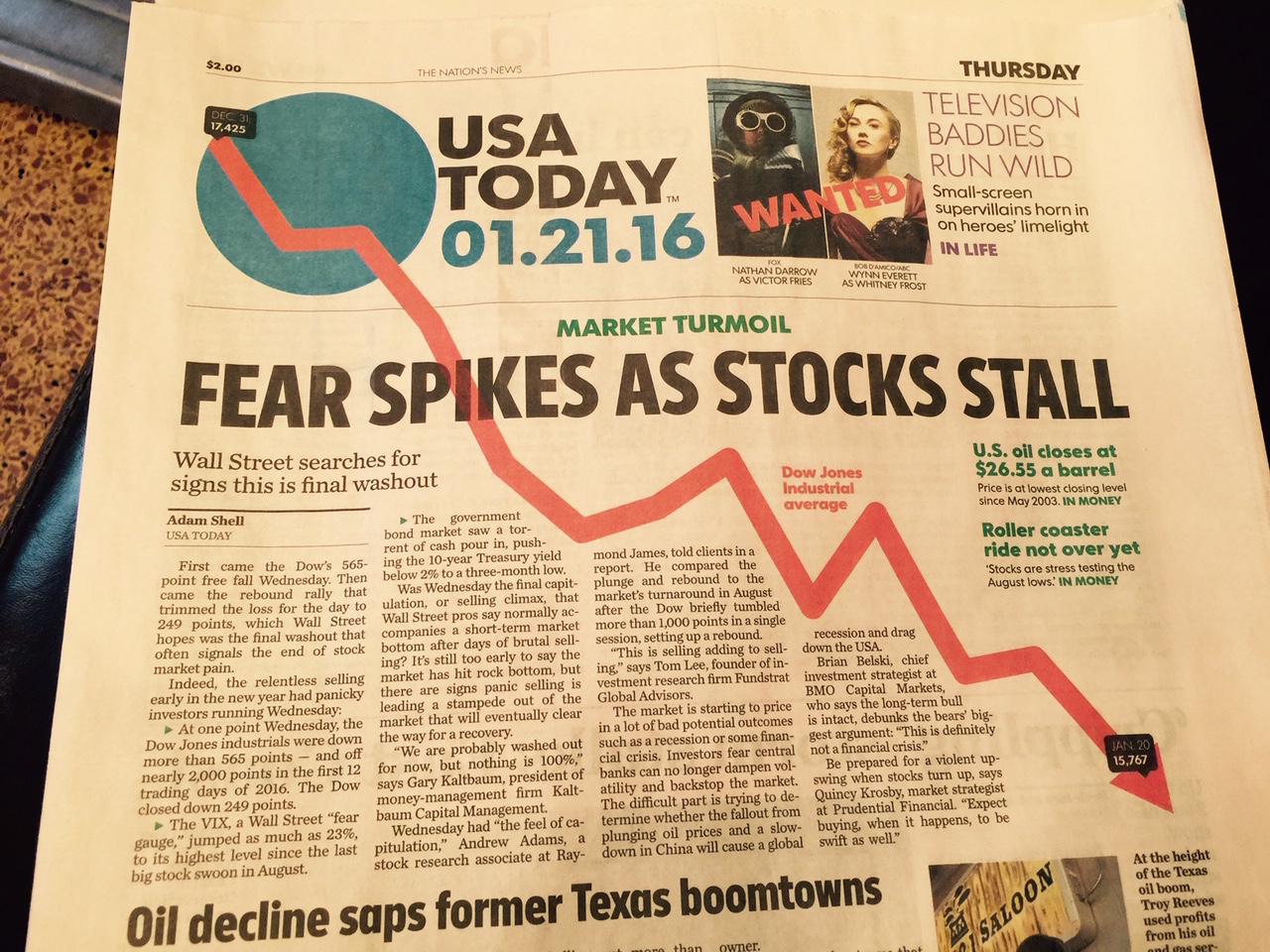
My eye gravitated toward this front page of USA Today recently as I had lunch with a client at a busy Upper West Side restaurant. Apparently the person sitting directly next to me at an adjacent table had put down his newspaper to continue eating.
We all know that USA Today's big blue ball of a logo can surprise with visual content. I thought it was a clever idea when the newspaper introduced its rebranding strategy, but has found that many times, it is as if someone forces a visual element onto the blue circle. Then, of course, whatever is there becomes decoration, with no specific and functional role.
This time, however, my eye moved to and stayed on the front page where the circle became the departing point for an arrow indicating the drastic drop of the stock market the day before.
Integrating the logo with a visual that resonates with the story below seems to be more effective than putting an element on the logo that forces the reader to guess how it relates to anything on the newspaper that day.
That, in my view, is what makes it a tricky option to create a logo that rarely stands on its own. Again, I like that this logo is not static. The visual surprise can be a good thing. Sustaining such a visual strategy is a different story.
Last week, however, USA Today got it right!
Blizzard kept the Sunday Times delivery guy away

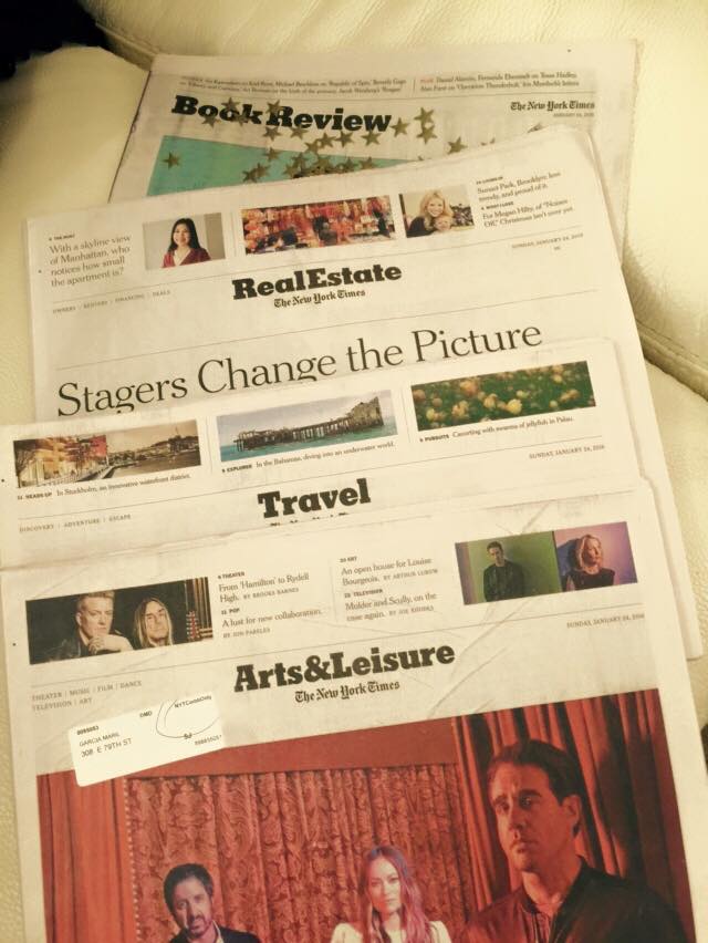
The New York Times after the Blizzard of 2016: Some of the news that’s fit to print, minus the news sections
I opened the door of my apartment Sunday morning to pick up my copy of The New York Times, but it wasn't there.
A few hours later I received an email from the NYT Customer Service telling me that Sunday's copy of The New York Times will be delivered today, Monday, January 25, 2016, for the following reason: Bad Weather.
But, alas, all is not lost as I could read today's Times online. And, as usual, I had received the feature sections Friday. I did not miss the printed news/sports sections today simply because I had access online, and I still could enjoy the “lean back” sections in print. This is looking at the future of printed newspapers, via #JonasStorm 2016.