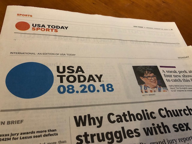
It’s been a long time since I held a copy of the print edition of USA Today in my hands. Gone are the days when I would go to the concierge at whatever hotel I was staying at, to guarantee that I would have a copy of the international edition of USA Today at my room’s door as early as possible the next morning.
Digital editions, the iPhone and life progress in general got between me and my addiction to the print edition of USA Today.
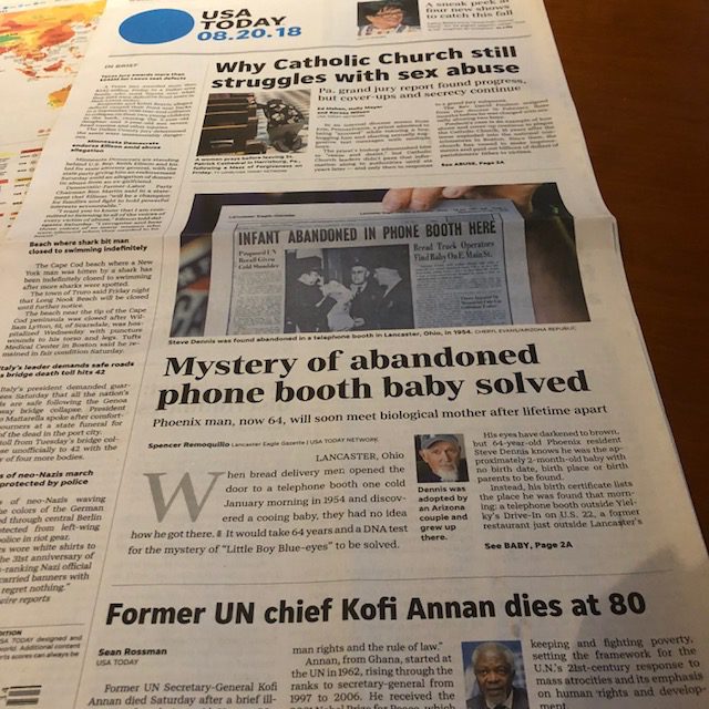
However, as I was enjoying a quiet happy hour in the lounge of the Park Hyatt Hamburg this week, I turned my head only to see a copy of USA Today to my left. I picked it up and it immediately felt anemic, a flimsy version of its colorful, vibrant past. As I turned the pages of this two-book, 16-page newspaper, I soon realized that if newspapers ever entered a hospice environment waiting to expire, this particular edition was at the doors of the hospice.
Here is the front page:
And here is the opening of the second section, Sports:
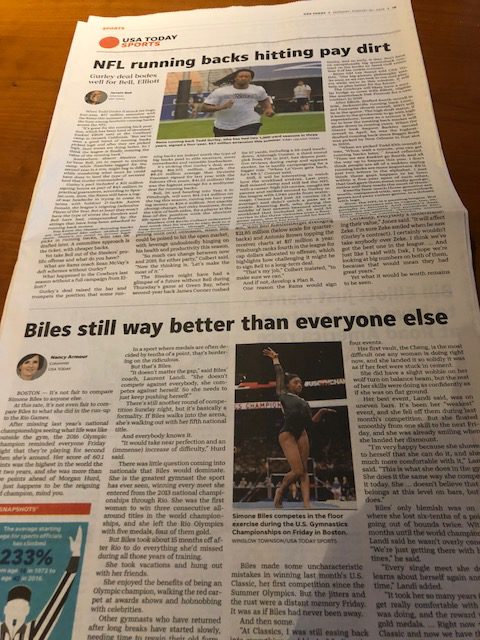

Whatever happened to the vibrant USA Today? Whatever happened to the newspaper that set the trends for the use of infographics to enhance stories? Whatever happened to secondary readings that expedited the process of getting information? And, yes, whatever happened to subheads, pulled quotes, and many of the other visual elements that made USA Today the darling of editors and designers everywhere, or who prompted others to call it the McPaper?
50 shades of gray
What I found were long columns of text, without any breaks, along smaller photos, tons of black and white, and nothing that resembled the USA Today that we all remember and wrote about it extensively.
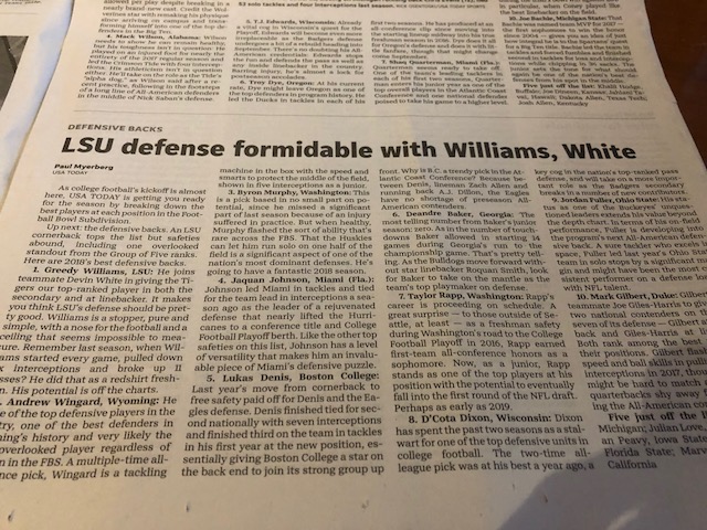
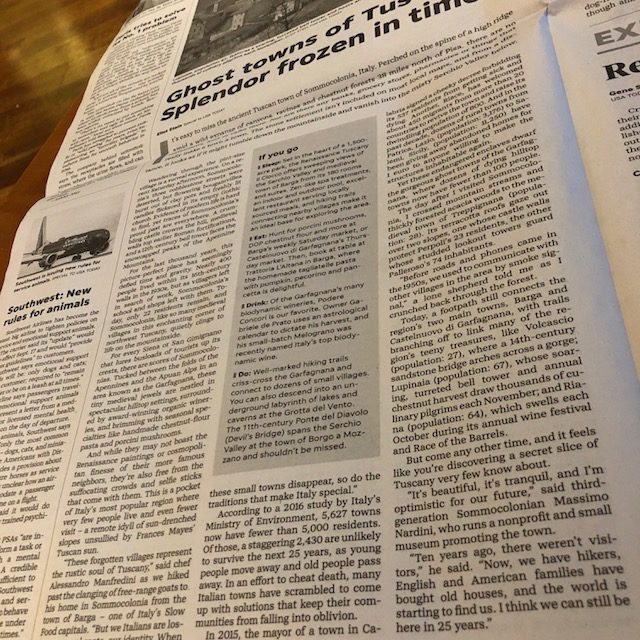
Indeed, it is good that theUSA Today International edition is here. But judging by this particular edition of August 20, for how long? The design of this newspaper looks more like that of a regional or suburban newspaper in the USA of 1992. It is obvious when the element of passion is missing from an edition. I felt that way about this one.
Thanks for that weather map
But, alas, suddenly there was the famous USA Today weather page, complete with those maps that made such a splashy and imitated visual statement when USA Today premiered on September 15, 1982. This reminded me of a Cuban lady friend of my mother, in those early days of exile in the Miami of 1963. The woman had been Havana society , but that rank had been snatched away when Castro came to power, communism took hold of the island, forcing my Mom’s friend to become a refugee, like a million others, in Miami. She had saved one thing from her past, a string of real pearls. She now worked in a factory, her fortunes had turned upside down in exile, but, alas, she still wore those pearls with pride.
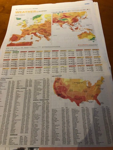
The weather map on the last page of the second book of this thin USA Today is like that string of pearls on my Mom’s friend. It reminds us of what was. It makes us cling to a glorious past. It is a sort of “I Am Still Here” chant.
There was also a salute to the past via a photo page, an obituary tribute to Kofi Annan, former UN chief.
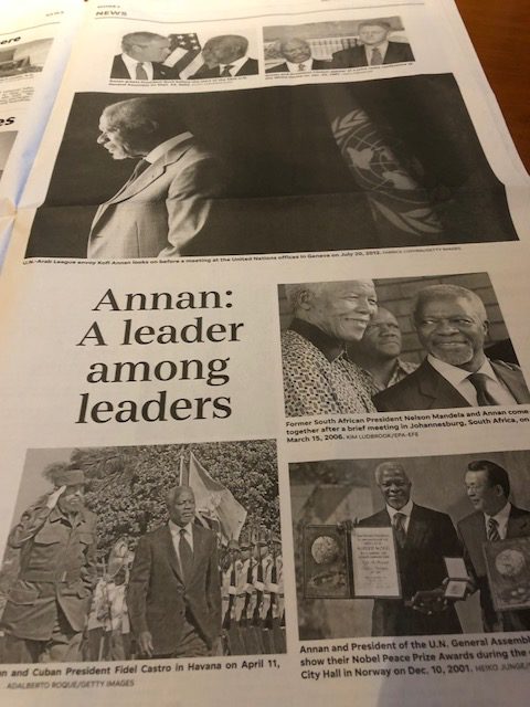
However, it makes us ponder the question: but for how much longer?
One for the history books
It is rare for The New York Times to display a six-column all caps headlines across its front page. It happened today. Perhaps a collector’s item, and one for the history books, for sure.

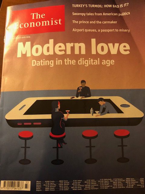
A clever cover from The Economist
Mario’s Speaking Engagements
October 6, 20, 27–King’s College, New York City
The Basics of Visual Journalism seminars

October 25, Eidos Media Keynote, New York City

Garcia Media: Over 25 years at your service
