TAKEAWAY: Reed Reibstein, a rising junior at Yale University, and our Garcia Media summer intern, has just returned from a one-week short course titled TDi (“Type Design intensive”) at the University of Reading, England. Reed shares highlights of what he learned there, especially as it applies to editors and designers. ALSO: Pure Design download: Web design; think books?
Highlights of the TDi course

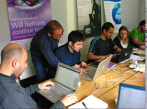
Course director, Gerry Leonidas, advising a course participant on his typeface.

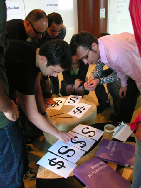
The group placing bars back on dollar signs

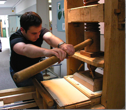
Here is Reed pulling (very hard!) on the Gutenberg press.
All photos by Dan Rhatigan.
I have asked Reed to summarize for us highlights of all he learned during his week at the University of Reading, where he was totally submerged into the fascinating world of typography. As Reed communicated with me during his time in England, all I kept saying was: I wish I were there. So, it occurred to me that the next best thing would be to turn the blog over to him so that all of us could take a quick sneak peak at what is happening with type and how it affects the work we do each day.
Here is Reed’s report:
Last week I printed with a reproduction of Gutenberg’s press, learned to identify at least nine Indian scripts, discussed the intricacies of the Greek letter “alpha,” and began my first typeface.
These experiences occurred during my five remarkable days as a participant in the TDi (“Type Design intensive”) short course at the University of Reading. The university’s department of typography & graphic communication is one of the very few that offers a master’s degree program on type design, and this summer, the core faculty offered a “condensed – but not abbreviated” version of the master’s program for the first time.
Having long been an admirer of the results coming out of Reading, I was thrilled to hear about this new course – and a bit perplexed as to how so much typographic ground could be covered in just five days. I signed up the day after it was publically announced, and in what seemed like no time at all, I found myself an hour outside London beginning what would be an unforgettable few days.
One of the most extraordinary aspects of the course was the people I met. The ten participants and five faculty members comprised a truly diverse group, coming from twelve different countries and speaking nearly as many different languages. A few of the participants had significant experience designing type, but most of us were graphic designers who had only experimented with typeface design. Despite being from such different backgrounds, we all shared an abiding love of letterforms, and that gave us plenty to talk about.
We got down to work shortly after we arrived, with course director Gerry Leonidas directing us to decide which paragraph of text was the darkest and to replace the crossbars on amputated dollar signs. Though the first day’s pace was more relaxed than I was expecting, the following four days more than lived up to the “intensive” appellation.
The two major elements of the course were lectures and practical sessions, with the lectures dominating the first couple of days and the hands-on experiences growing more important toward the end.
Learning from Dutch type designer Gerard Unger
With an expert faculty, the lectures were anything but dry. The famed type designer Gerard Unger (well-known in the newspaper world for his typefaces Swift, Gulliver, Capitolium, and Vesta) delivered four lectures (and a couple more impromptu ones), with subjects ranging from recent developments in type design to the inspirational designer and puppeteer WA Dwiggins. Fiona Ross, former manager of Linotype UK and non-Latin type expert, discussed the intricacies of designing for Bengali, Telugu, Tamil, Arabic, and many other scripts. The University of Reading houses thousands of archival objects, from original drawings for the most common Arabic typefaces in the world to spacing tests for the complicated conjuncts (or ligatures) found in Devanagari. And in addition to keeping everyone organized and leading practical sessions, Gerry presented us with the entire run of the influential digital typography magazine Emigre and gave us an abbreviated overview of the history of Greek typography.
“Creating my first typeface”
For me, the only thing that could top the lectures were the practical sessions. Working particularly with Gerry and Gerard, I progressed from a few rough pencil sketches to the rudiments of my first typeface in mere days, learning many hints and tips along the way. While my end result is far from being complete or usable, I feel tremendously satisfied setting paragraphs in letters that, though imperfect, are wholly my own.
Some wonderful dinners full of discussions about type – and about everything but type – rounded out the five days. A week later I am still catching my breath and processing all that I learned, but I knew one thing as soon as the course had ended: This was a spectacular experience, one that greatly enriched my understanding of typography and, most importantly, exposed me to what type design is truly about.
Indian scripts: much to learn here
With each day so chock full of lectures and practical lessons from our instructors, we were exposed to much more than I could recount above. I have listed several interesting tidbits below:
—The Indian scripts are almost all read from left to right. The northern Indian scripts were mostly written on birch bark, while the southern scripts originated on the palm leaf. The palm leaf is a more delicate medium than birch bark, meaning that the southern scripts could not employ as many straight strokes as their northern relatives.
—The Indian scripts are largely syllabic, and occasions abound when multiple letters combine into conjuncts or ligatures. This feature requires advanced control of kerning and positioning beyond that needed for the Latin script.
—The key to type design is consistency. Each letter must look distinct yet feel like part of one alphabet. One approach is to regularize, repeating every detail wherever possible. The opposite approach is to bring in detail wherever possible, for a “controlled irregularity.” The former approach can create a smooth page, but one perhaps lacking in excitement, while each detail in the latter must have a good reason for its existence.
—Typography multiplies small changes on a page. Making an “a” slightly thinner, for example, can drastically improve a typeface’s readability – or destroy it.
—When one uses an accurate reproduction of Gutenberg’s press in the summer, the wood will have expanded. The result is that the person pulling the arm of the press needs to put a lot of muscle into his or her effort. The extreme forces required left no doubt as to why these presses are typically depicted anchored to the floor and ceiling.
—Legibility studies conducted for signage at Heathrow Terminal 5 suggest that condensing a typeface to make more letters fit is equivalent to simply decreasing its point size.
Unger on 21st century type styles
—According to Gerard, some of the developments in type design since the beginning of digital typography have been cut and paste/blended type (e.g. Fudoni by Max Kisman), random type (e.g. Beowolf by Letterror), the extended type family (e.g. Thesis by Luc(as) de Groot, Knockout by Jonathan Hoefler, Twin by Letterror), and grades (e.g. the Poynter faces from Font Bureau). Gerard also sees a twenty-first century style, exemplified by FF Meta Serif: slightly condensed and angular, with low contrast, short serifs, and a regularized character width (compared to the traditional widely divergent character widths in typefaces such as Trajan).
—Gerry told us that there is no traditional concept of italics in Greek typography, as Greek typefaces have been made both upright and slanted throughout the last 500 years. The Greek script is already quite cursive, so making an italic companion that is more than just slanted is a challenge. There have been several attempts at differentiating the roman and italic in recent years, e.g. using alternates for the “beta,” “theta,” and “phi” in the italics for Microsoft’s ClearType collection.
Where to go for more information
Information on the Typography department and the TDi short course:
http://www.reading.ac.uk/typography/
Specimens of typefaces designed by graduates of the MA program:
http://www.typefacedesign.org/
Introductory reading list for MA students (and anyone looking to dive into typography):
http://leonidas.org/dokuwiki/doku.php/library/introductory_matd_booklist
Several useful dissertations by MA students:
http://leonidas.org/dokuwiki/doku.php/library/matd_dissertations
Pure Design: Web design; think books?
Twitter with me

Follow me at www.twitter.com/tweetsbydesign
Follow the Marios

Two Marios. Two Views.
Follow Mario Jr. and his blog about media analysis, web design and assorted topics related to the current state of our industry.
http://garciainteractive.com/
Visit Mario Sr. daily here, or through TweetsByDesign (www.twitter.com/tweetsbydesign)
In Spanish daily: The Rodrigo Fino blog
:
To read TheRodrigoFino blog, in Spanish, go:
https://garciamedia.com/latinamerica/blog/
TheMarioBlog posting #305